Stories
Refreshing the Henderson Brewing Brand
Brand Evolution for one of Toronto’s Most Popular Breweries
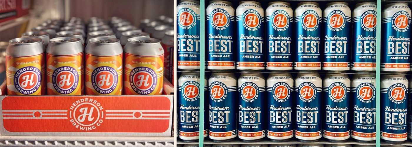
Henderson Brewing is one of Toronto’s most popular breweries (and one of the fastest growing businesses in Canada). We recently worked with their team on a brand refresh spanning their core identity, packaging and merch.
Why a refresh if their beer is phenomenal and sales are strong?
Like many breweries in the 5–10 year old range, the Henderson team felt they had outgrown their foundational look. It was at odds with the trajectory of their business and current positioning. It was a little dated. And it was a little too inconsistent.
We caught up with Henderson’s Creative Director, Tony Halmos, to discuss this project as well as what’s on deck for Henderson as we make our way into 2022.


Tony, it’s a pleasure! First of all, introduce yourself, and outline your role at Henderson. Describe your day-to-day at the brewery for all the folks out there.
 Tony
Tony
Likewise! I’m the Art Director at Henderson and I’ve been involved in the creation and production of pretty much every visual communication piece of the past six years since we opened our doors, from product packaging to ad campaigns, print collateral, POS displays, online content, promotional goods & apparel. I’ve also been responsible for a good deal of copywriting.

Henderson Brewing has grown into something of an Ontario mainstay, particularly in Toronto. I remember seeing you guys everywhere up there, way before we worked together. What has it been like, watching the brewery grow and evolve?
 Tony
Tony
Never a dull moment, that’s for sure. We’ve made the “Canada’s Fastest Growing Companies” list for a couple of years running, but that growth was always part of the plan, so it’s the evolution of the character of the brewery that’s been most fascinating for me to experience, as we’ve navigated challenges, won some and lost some and, along the way, grown into our identity.

So, on the topic of the brand refresh. We worked with you guys to polish and optimize the Henderson brand identity in some pretty subtle ways. What kind of problems were you running into before the refresh? What were you guys hoping to solve?
 Tony
Tony
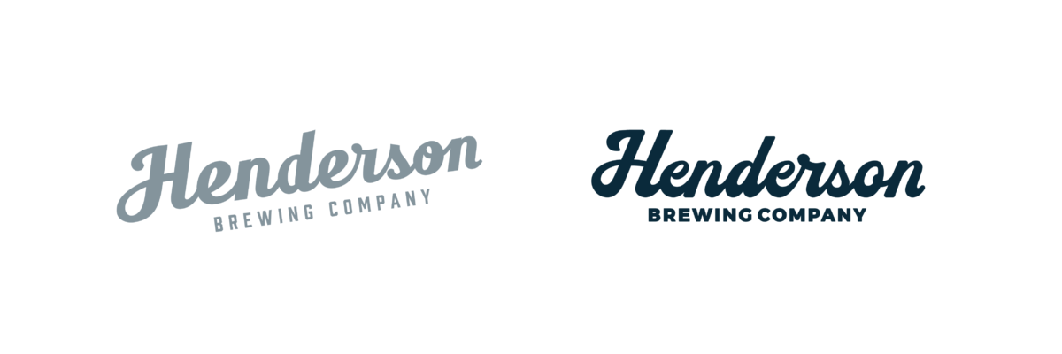
When we launched our first beers six years ago, we wanted to distinguish ourselves from the trend-chasing pack by communicating to customers our more classic approach to brewing beers. We opted for a buttoned-down, old-school look and feel, one that we hoped felt like we’d been around a while. The strategy worked and we landed the loyal drinkers we were looking for, but after five years, the craft beer scene in Ontario had evolved and we agreed that the time had come to signal to our customers that we had evolved, too. We were maybe more relaxed, friendlier, more comfortable in our own shoes and less concerned with defining ourselves in opposition to others.

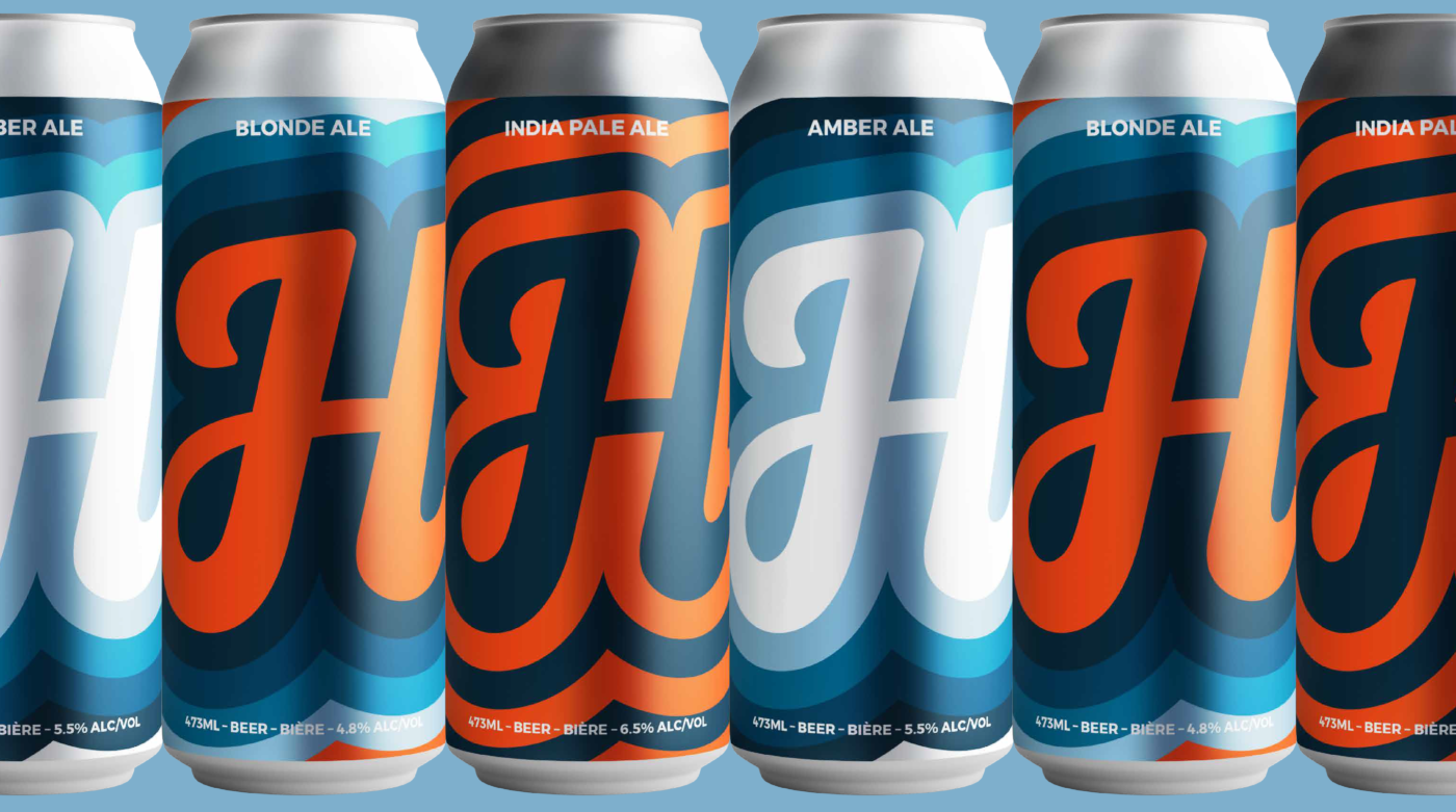
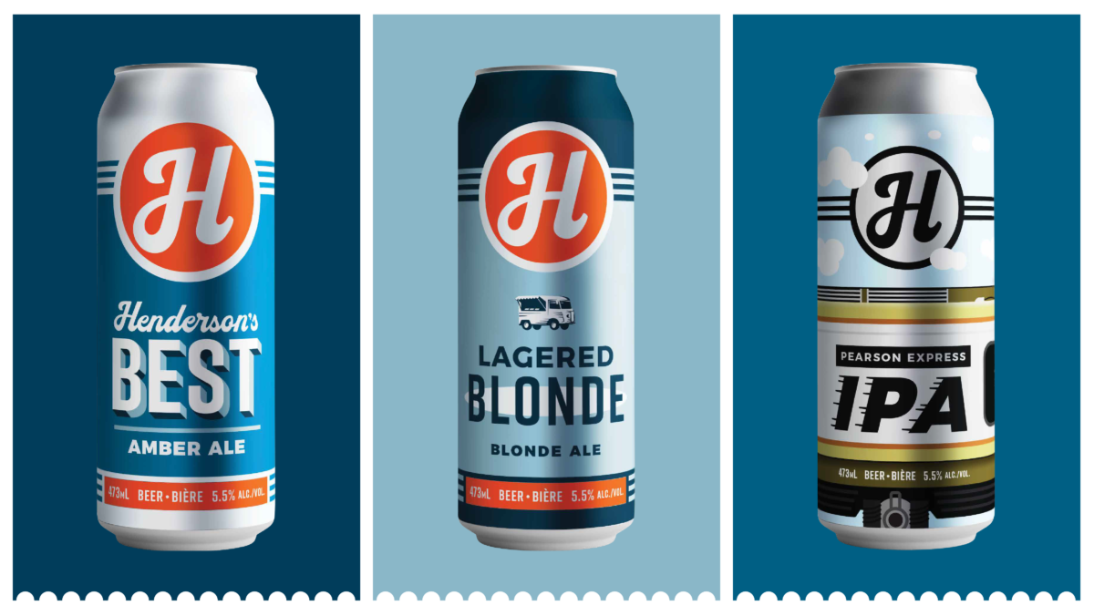
We also got to put our touch on what I consider to be an iconic Toronto beer, Henderson’s Best. This is another case where the visual updates were subtle, but very intentional. What has been the reaction to the updated cans?
 Tony
Tony
Our flagship, Henderson’s Best is definitely in a category of its own and, in particular, was successful in attracting a loyal drinker. But, as with our other core brands, it was important for us to come across as reliable, but not staid or stuck in our ways.

Shifting to another beer, let’s touch base on Food Truck Lagered Blonde. This one is perhaps Henderson’s PBR killer? Maybe that’s not the most diplomatic thing to say. But to my mind, that’s very much what it is: A crushable lager aimed at the young and young-at-heart. This beer was definitely less cemented than Best in terms of market share and reputation. What was the goal with this update, and how have people reacted to the change?
 Tony
Tony
Our Lagered Blonde has always been positioned as our most approachable beer; one that the Untappd crowd were never going to spend too much time on. And it was selling, for sure, but the story behind the Food Truck name hadn’t really developed a life of its own and we opted to focus more on the appeal and drinkability of the beer style.

Build a stronger brand.
Sell more beer.
Join 7,500+ other beer industry folks and sign up for our monthly Beer Branding Trends Newsletter.

Beer Branding Trends 2.0

Ok, this doesn’t have anything to do with our work per se, but I have to ask. Tell me about the RUSH collab—a golden ale for perhaps the most notable prog rock group of all time?! How did this happen? What was it like to navigate the partnership and execute on this, frankly, in my mind, perfect partnership? Did you get to work on the can design?
 Tony
Tony
In November of 2016, as part of our monthly “Ides” series, we brewed an Imperial Stout called “Put a Scarf On, Geddy.” This release told a story, as each of our Ides beers do. In this case, it was the possibly-apocryphal story of how Rush’s vocalist and bassist became known as Geddy. Word of the beer (then the beer itself) reached Rush and they, in turn, reached out to us with their idea of releasing a Rush beer. They liked that we were a homegrown Canadian brewery and that we liked Rush enough to brew a beer “about” them. Various events, including the untimely passing of their incredible drummer, Neil Peart, conspired to put the initiative on pause for a few years and, frankly, we thought the project was kaputt, but we connected with them again last year and voilà. As always, I was involved in the design, perhaps more as a production artist since it was really about pulling from Rush’s stable of visual identity elements and arranging them on a can in a way that appealed to their management.

Henderson does a lot of curious one-off style production as well, and I want to give people an idea of what the portfolio is like outside of the big mainstays. Im specifically thinking of the “Myth of Permanence” series, although you end up releasing all sorts of other stuff. What is your creative approach to designing labels for these limited releases? How do you keep things fresh and keep coming up with new inspiration as beers come off the line?
 Tony
Tony
We found that having something new and interesting in our online shop helped drive home delivery sales of all our beers, and our brewery-only release schedule became pretty manic. A lot of fun but also, frankly, fairly exhausting. In 2020-2021, I worked on around 45 beer can/label projects per year. Almost one per week! My best answer to your question around freshness and creative approach is: improvisation and fearlessness. I mean, there was rarely time for any other approach. The Myth of Permanence lager series, though, was one time this approach kind of bit me in the ass. I came up with this quasi-Buddhist existential concept and designed a label featuring an elaborate sand castle about to be wiped out by a wave. Hilarious, right? Then I realized…it’s a series! I was going to have to come up with an illustration of the The Myth of Permanence every month in perpetuity. Fifteen months later, The Myth of Permanence series itself is coming to an end. We’re working on another lager series for 2022. One of the wonderful things about small batch beer brewing is the chance to be fluid and ever-changing. It’s a real-life illustration of the transience of all things.

I want to shift back to our work together, and touch on one of my favorite pieces of your brand iconography. While generating merch ideas we keyed in on a specific tagline that you guys have used for a while. “Henderson Delivers.” We love this message for multiple reasons, but I want to ask you: What does the promise of “Henderson Delivers” mean to you, and what do you think it means to your customers?
 Tony
Tony
Reliability is definitely one of our most important brand values. Where our core beers are concerned, that reliability means never stocking out of the beers and delivering consistent quality. When COVID restrictions were put in place, our online sales surged and we began a home delivery service. I figured the service ought to have a name and Henderson Delivers seemed like an obvious choice to me because of the double entendre in which we literally deliver beer but also allude to the idiomatic usage of “delivers,” as in “come up with the goods.” I hope that’s what it means to our customers, too. 2020-2021 was a challenging time to reach new customers but an excellent opportunity to foster loyalty.
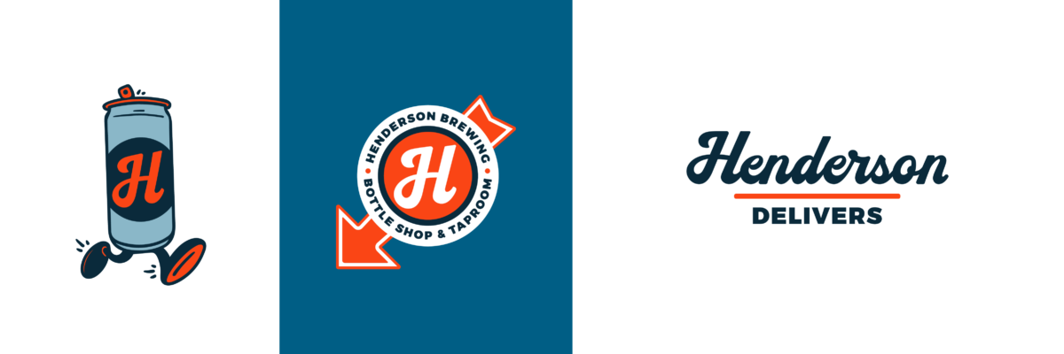

Which brings us to the Running Can Man. You guys used a version of this guy in the past, and we came back in and gave him a fresh coat of paint to use for merch and other promotion. I love this little guy as a mascot for the brewery. He really exudes a sense of hustle and service. Where did the idea for this originate? What does this little dude mean for the brewery now?
 Tony
Tony
Steve, our GM, had been pleading with me for…probably years, actually…to create an anthropomorphized “beer thing”: a hop with legs or a barley sheaf with arms. I don’t think it mattered to him what it was as long as it was a beer-related “character.” To be honest, I wasn’t charmed by the idea and kept stalling. But the home delivery service presented a stronger argument for a creation of this sort, so the running can came about, but still in a tentative way. The way I remember things, your upgrade of the running can wasn’t really an “ask” on our part, more of a bonus track on your album of offerings. It was a nice surprise, and they (is the can really a man? I can’t make out any gender-identifying parts) look great on merch, too. We’ve never really had a “mascot.” You guys helped give us our first mascot!

Tony, this has been wonderful. One more question: What’s around the bend for Henderson? Any cool new projects or releases you can hint at? Will you guys be throwing your hat into the seltzer or RTD game? Or perhaps another collab with a second multi-platinum musical act? What’s on the horizon for you guys?
 Tony
Tony
Never say never, but I think you can count our loyalty to beer among our traits of reliability. I think you can also count on us to open the door when opportunity knocks.

Build a stronger brand.
Sell more beer.
Join 7,500+ other beer industry folks and sign up for our monthly Beer Branding Trends Newsletter.

