Stories

Rebranding NoDa Brewing

Rebranding to clarify your message, increase sales and maintain momentum

Legacy Breweries are facing a unique set of headwinds today. 

They’re big enough that they have to compete with much larger Big Beer brands off-premise, but still small enough that they compete with smaller, more nimble (and in many cases, more relevant) local breweries in the on-premise. 

In addition to these challenges, Legacy Breweries are often facing some sort of identity crisis.

This can range from a surface level issue (e.g. a severely disjointed brand identity and packaging where nothing hangs together) to a more existential crisis where founders and leadership are questioning what they stand for, where they want to take the business and even what to focus on on a day-to-day basis.

We’ve made it 15, 20, 30+ years, but don’t know where to go from here.

NoDa Brewing was somewhere in the middle here—not quite wrestling with existential problems, but not quite crystal clear on next steps either—when they reached out to CODO to discuss a rebrand back in 2022.

NoDa founded in 2011 in a vibrant Charlotte, North Carolina beer scene.

And they’re a perfect example of CODO’s expanded Legacy Brewery definition (founded around the start of the beer boom in a market that has since exploded with new entrants). 

NoDa was dealing with several compounding factors that lead them to the realization that they needed to make some major changes for the longterm health of the business. 

They developed a multi-pronged plan (to address production, distribution and hospitality issues), and tagged CODO in to help frame their Brand Strategy en route to a brand refresh and package design overhaul.

This case study will cover the following:

– NoDa’s background and project context (including pain points & opportunities)

– NoDa’s Brand Strategy (and defining their visual equity)

– A walk through their brand identity and package design process 

Let’s get into it. 

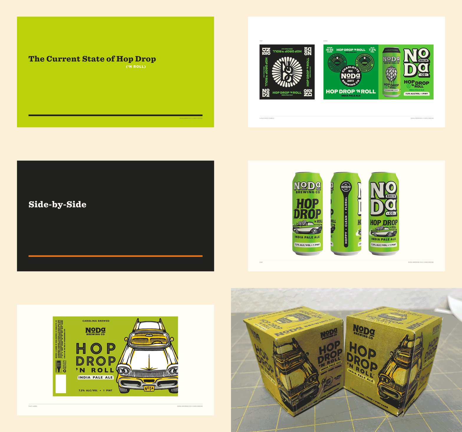
NoDa’s previous branding and (all over the place) packaging.

The situation on the ground (a handful of problems)


1. A shifting meaning of the NoDa name

NoDa was founded in the North Davidson neighborhood in Charlotte (hence, NoDa). Or technically, the brewery was founded near the NoDa neighborhood. 

If you want to get really pedantic technical—they’re about a block from the *officially* defined neighborhood border. 

And as they’ve continued to expand, opening additional production facilities and taprooms, being tied to a specific neighborhood became less important.

Overtime, the NoDa name has come to reflect more of the breweries core values (and how they overlap with the broader neighborhood itself) than a particular neighborhood or street.

In Jacob’s words:

“What NoDa stands for aligns with the ethos of our brewery and is a big reason why we wanted to refresh the brand. Being the arts district, NoDa has always been an inclusive, creative and edgy spot. 

Our approach to beer, our brand and our taproom has always been to create a quality experience and product that is welcoming and approachable for people from all walks of life.

Beer is our art; regardless of whether or not we’re still on North Davidson street.

As our brand aged we felt that it had lost some of the edgy / artsiness that NoDa is known for and we wanted to bring that back by emphasizing street art style illustrations on the packaging.”


2. Stock illustrations & dated visuals 

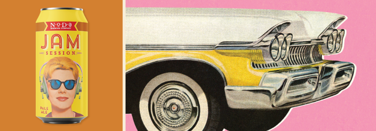
NoDa has used stylized 1950’s illustrations across their packaging for years. 

This Mid-Century aesthetic was very on trend back in the early 2010s.

In 2024, it just feels dusty (and not at all aligned with the exciting things happening at NoDa).

Another issue on this front is that some of NoDa’s primary imagery—including their best selling Hop Drop brand—is comprised of stock illustration that anyone can buy online. And they’ve built several major brands around these assets. 

This means that any other business, including a brewery, can use the same assets on their packaging. 

The takeaway here is that you shouldn’t build your identity around stock assets. You can’t police any of it from an IP standpoint, and you can’t build any unique visual equity either.

Using stock assets in your identity will always be a liability.


3. Charlotte as a rapidly changing community 

Two breweries existed in Charlotte when NoDa opened shop in 2011.

Today, there are more than 100.

In that span of time, each new brewery opening meant more niche, more hyper-local and more on-trend craft beer hitting the market.

And elder outfits like NoDa inevitably were seen as less novel and less (for lack of a better word) relevant.

All of this lead to NoDa being regarded as….


4. “Grocery store beer”

NoDa came out swinging and found early success (particularly with their renowned Hop Drop ’n Roll IPA). 

That brand—awarded best IPA in the world back in 2014—allowed their beer to become ubiquitous throughout Charlotte, and eventually North and South Carolina. 

Today, NoDa is widely regarded as making some of the best beer in a state that’s lousy with great beer. 

But, in a weird quirk that plagues anything just outside of the mainstream (music, art, film, fashion), NoDa’s success cuts both ways.

In our field work and interviews, we heard people pejoratively describe NoDa as “Grocery Store Beer,” as in, NoDa isn’t authentic, local, independent (capital C) Craft Beer anymore. 

(Your reward for blazing a trail in a market is that you get punished for being successful. Great.)

Jacob had an interesting perspective on this in our podcast (this topic starts around the 14:30 mark).

He views being carried in grocery stores and chains as a signal that you’re reliable—that your brand can be depended upon to deliver. Every time.

(I agree with this, for the record.)

But Jacob and I don’t speak for the broader North Carolina beer drinker.

So the challenge remains: How can NoDa stay relevant while continuing to grow and build a successful business?

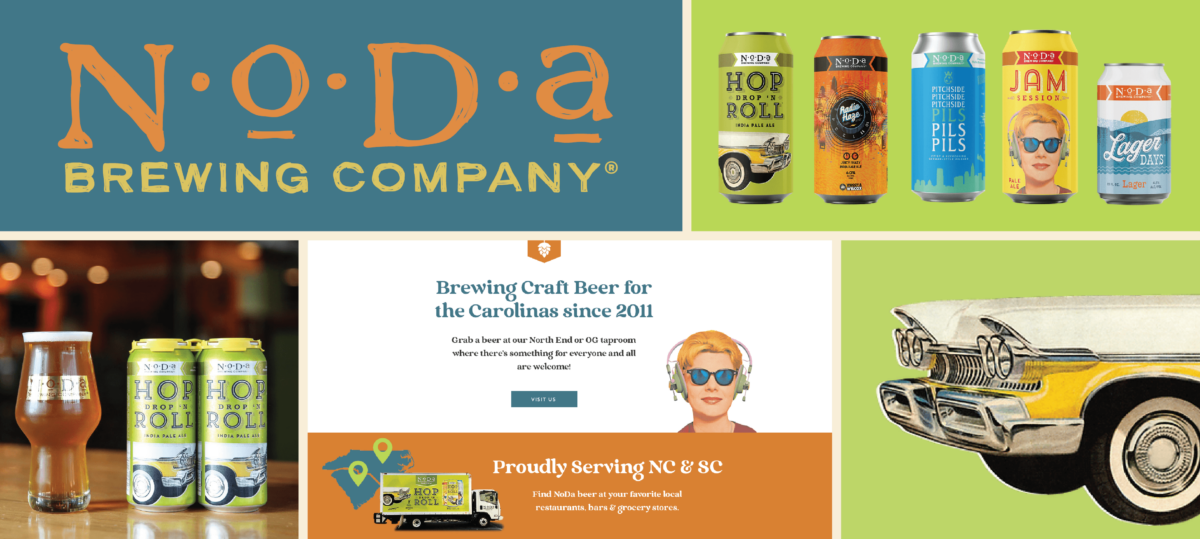
 

The NoDa team wanted to move away from stock assets and create unique, ownable illustrations and IP through this process. 

Now that we’ve covered NoDa’s primary pain points, let’s explore their Brand Strategy and design process.


NoDa’s Brand Strategy & Positioning 

Three big ideas emerged from all of our fieldwork and stakeholder interviews:

1. NoDa is an epicenter for all the cool, creative stuff happening in Charlotte. 

2. NoDa is your reliable, local brewery. No trend hopping here: Just well-executed styles. Again and again and again. 

3. NoDa is your companion for whatever outdoors pursuit you choose in the Carolinas. 


A quick note on these ideas:

These are all classic craft beer tropes: Celebrating the local community, making quality beer and a love of the great outdoors. 

From a positioning standpoint, hanging your hat on a trope doesn’t mean that an idea isn’t true.

But what’s more likely is that any number of other local breweries can also claim to operate by the same ideas. 

To wit: How many California breweries talk about the beach or surfing? And how many breweries in Colorado adorn their labels with mountains?

There’s nothing wrong, or untrue about these things.

But it’s our job to figure out which idea a brewery can most credibly claim, that they’ve historically stood for, and have materially supported over time.

(Oh, and that actually matters to consumers.)

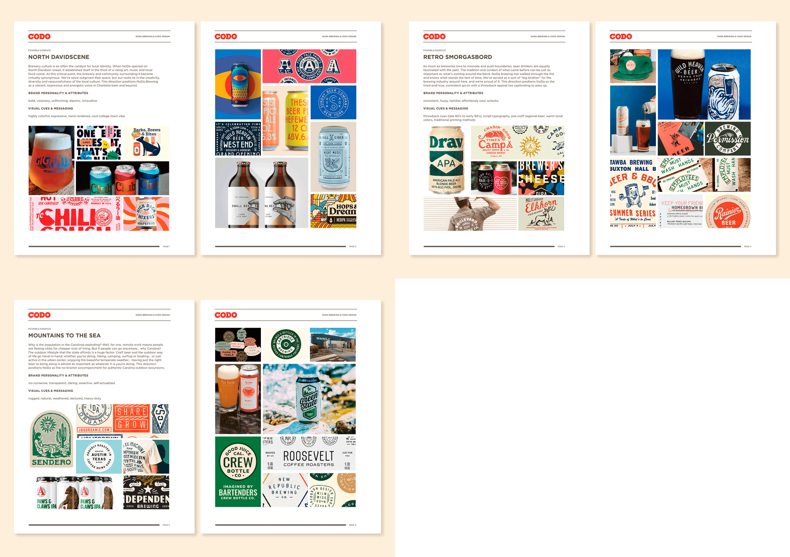
The first Brand Essence — “North Davidscene” — checked all these boxes and resonated the most with the NoDa team. 

They’ve always viewed beer as a through line in the emergent local art, music and food scenes. 

And this idea best aligned with their values (that is, how they operate their business, including behind the scenes moves that no one will ever know about), plus where they wanted to continue taking the brand in the future.

In other words, it is the most distinct, defensible, ownable and true idea that NoDa can build on. 

This direction positions NoDa as a vibrant, confident and progressive voice in Charlotte beer.

A few pages from NoDa’s Brand Strategy doc. These Brand Essences include a preliminary writeup, including brand voice and personality attributes as well as visual cues. They also include mood boards to art direct the idea itself so the NoDa team can understand what a direction could look and feel like.

Defining NoDa’s Equity & Tackling Their Identity Refresh 

With Brand Strategy and art direction set, we now get to dig into NoDa’s brand identity and packaging update. 

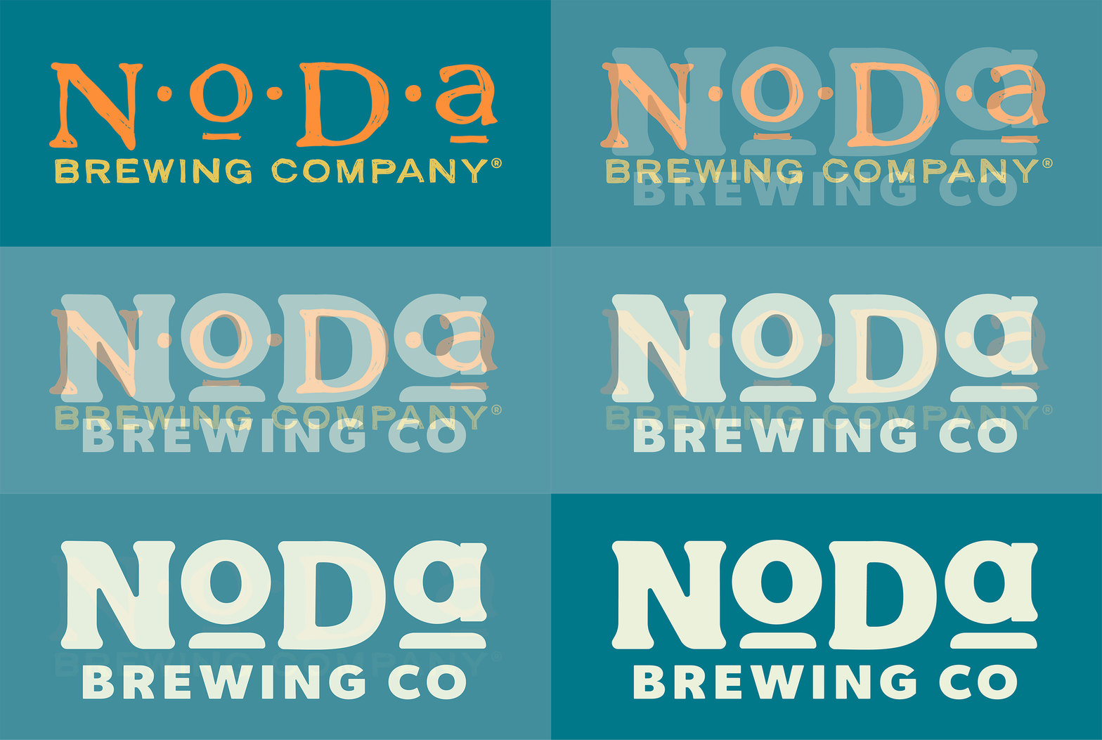
Location issues aside, NoDa’s previous logo was somewhat sacrosanct. (They’ve used it since founding, tens of millions of people have seen it and it’s plastered across their market on POS, vehicles and merch). 

Our job was to evolve it in this new brand voice and look and feel: To give it more heft and make it look more intentional.

So how can we beef up their core identity while building out a more utilitarian system of secondary iconography?

Our initial concepts ranged from a straight-line evolution to a more quirky option that leaned into the local art and creativity idea.

The NoDa team favored the more clear evolution so we rolled right into revisions. 


*Note to reader: I’ll fast forward here. Basically, we spent a million hours (approx.) refining their main mark and rounding out their Modular Brand Identity System.


Initial concepts, including a whoooole lot of rejected work from our first identity presentation.

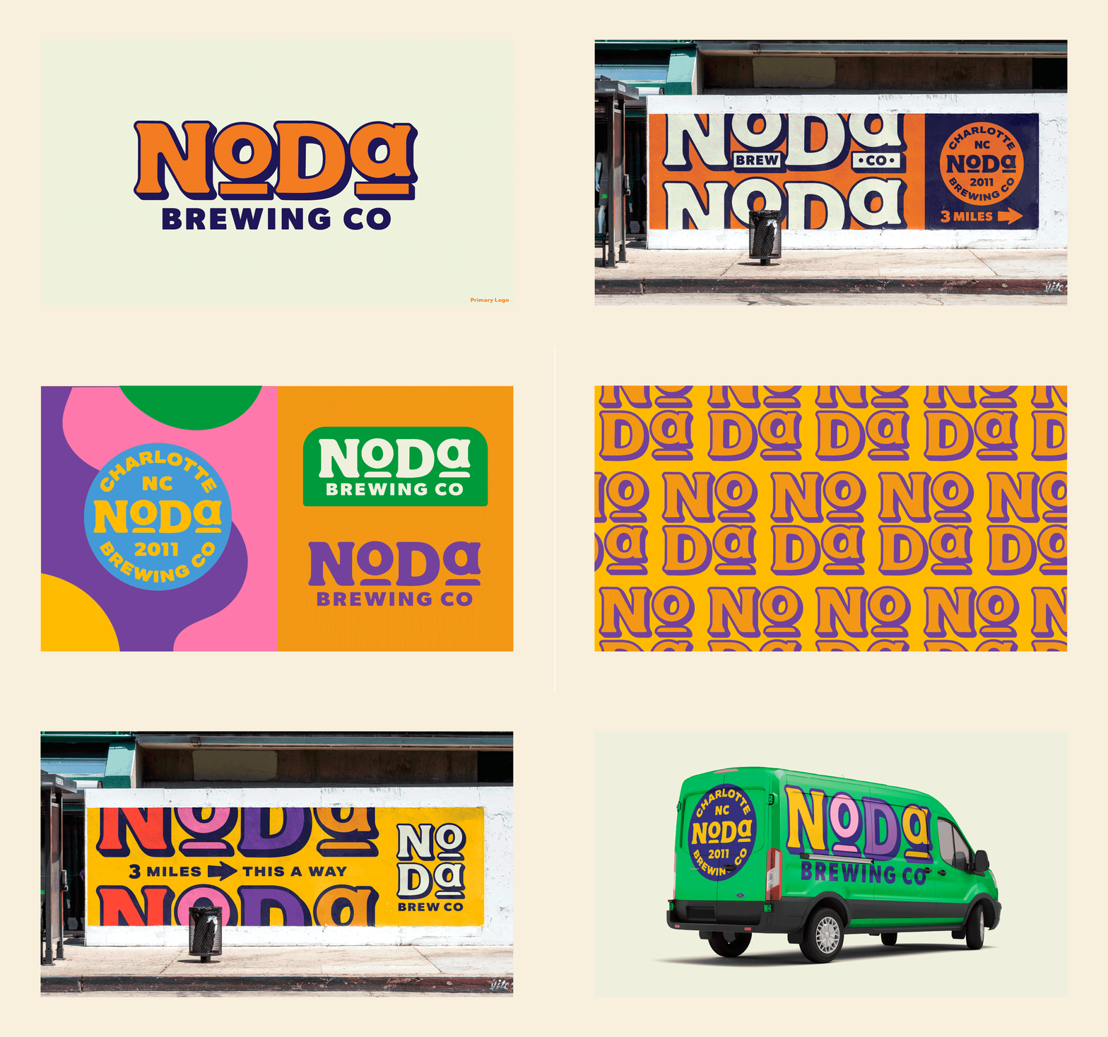
A few things to highlight as we wrapped up revisions: 

– The more expressive colors called out in our Brand Strategy work are now able to come to life in NoDa’s identity. This punched everything up and kept it from being too staid. 

– The core mark became more simplified as we made our way through the revisions. I remember a great conversation with the NoDa team where we discussed how you communicate the idea of confidence. 

Our answer?

Talk less.

Simplify the system.

And let the beer speak for itself.

The Package Design Phase

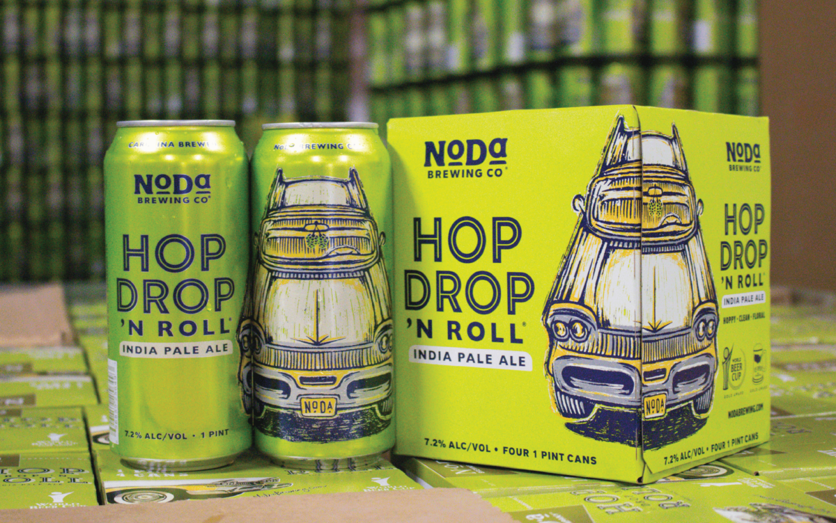
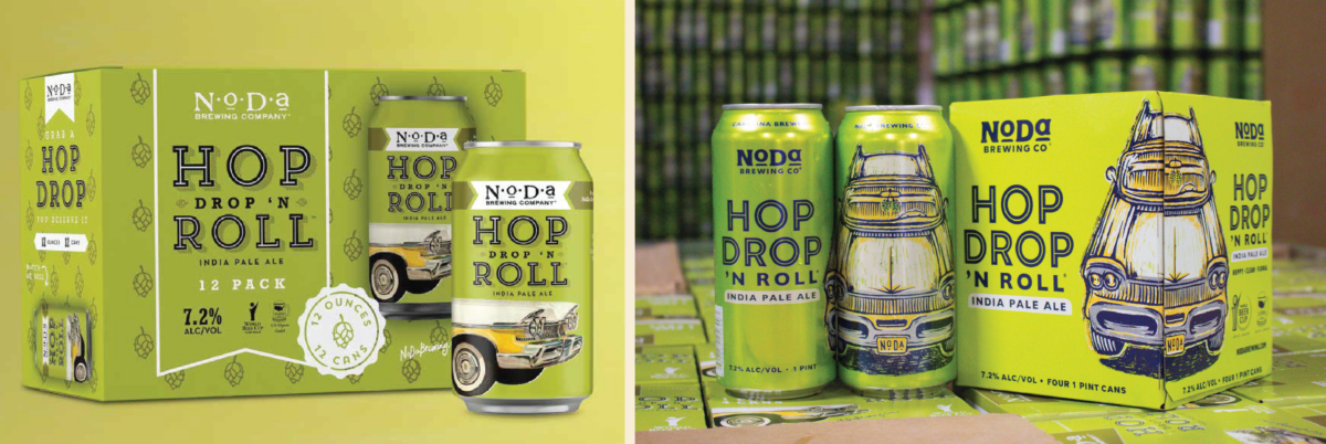
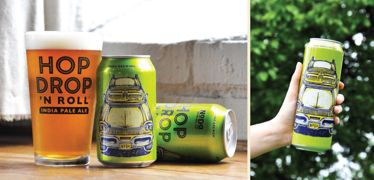
We kicked off the packaging phase by focusing on NoDa’s best selling brand, Hop Drop ’n Roll.

We explored several different ways to evolve their dated (and stock) late 50’s Mercury illustration style.

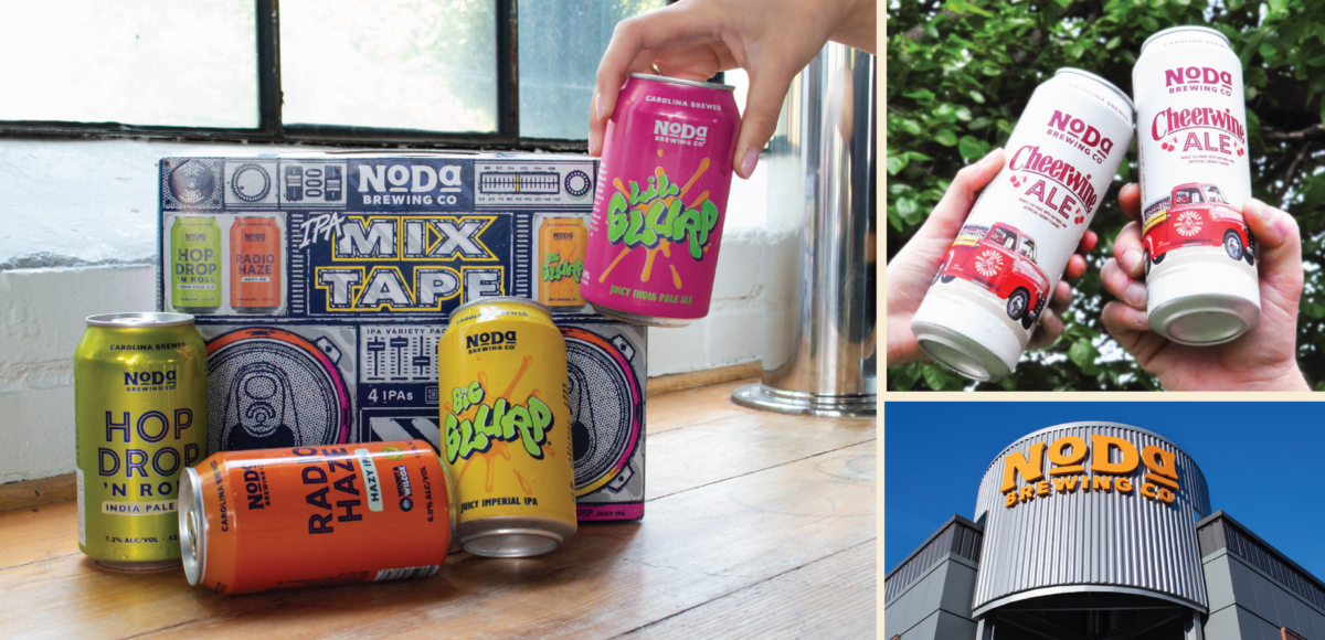
It took a few rounds to get the composition and illustration style itself nailed down. But once we got there, knocking out the rest of their portfolio was fairly straight forward. 

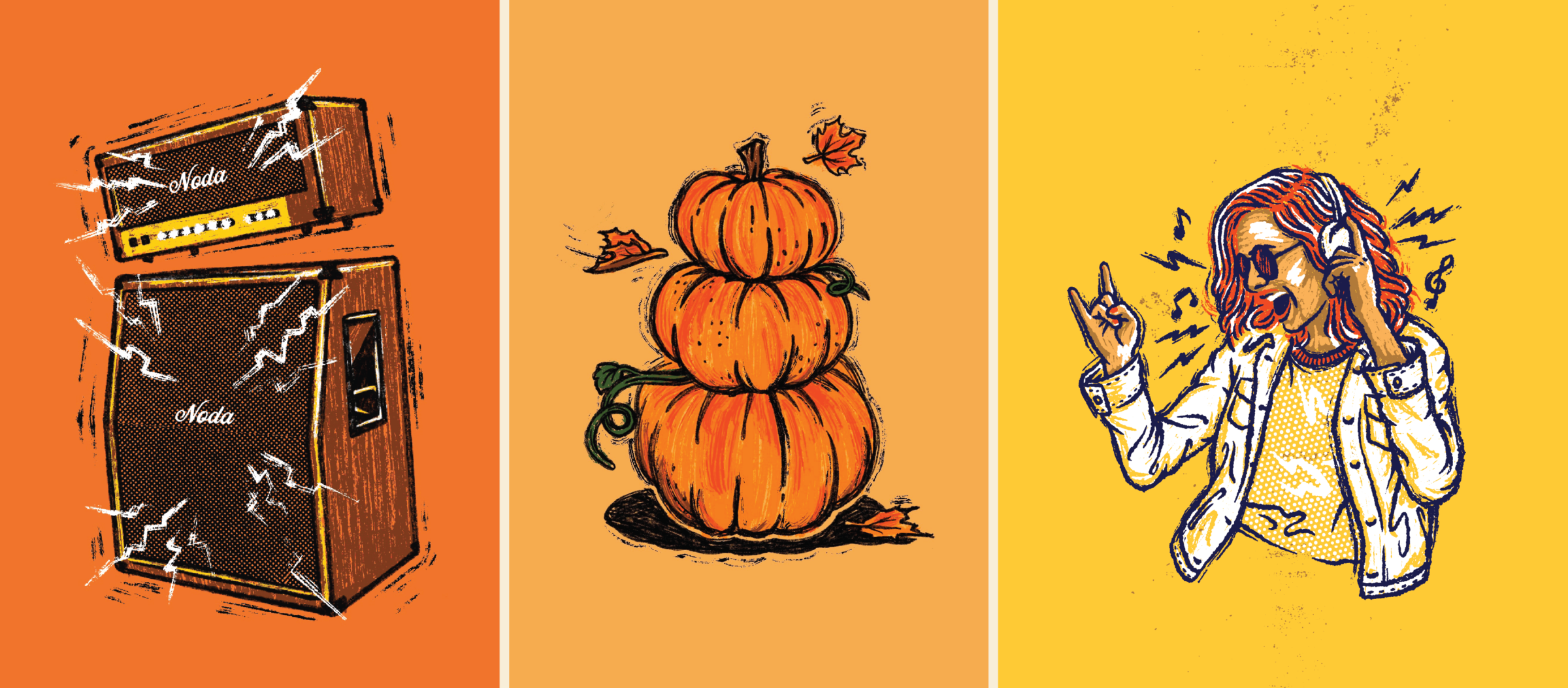
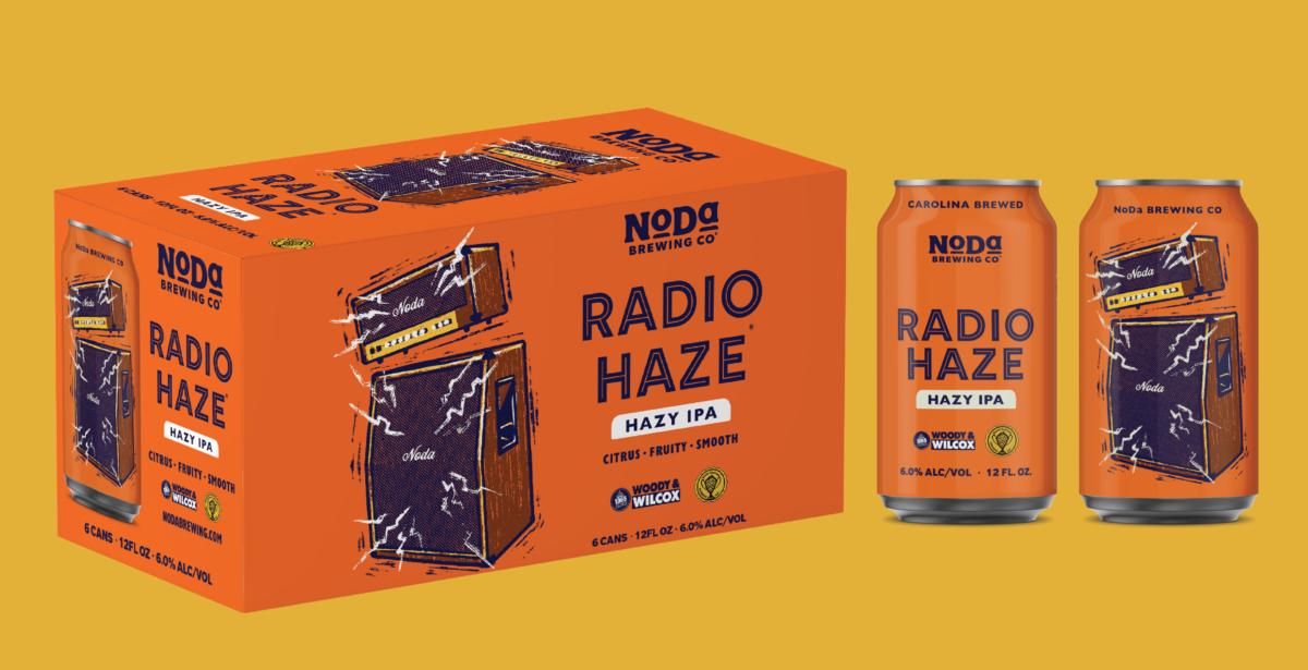
Here’s a glimpse at some of what we looked at along the way, including initial sketching, revisions, illustration evolution and several follow on brands (seasonals, variety pack, etc.) we developed after NoDa’s initial scope was wrapped up.

Brand Launch & Beyond

We opened this case study by outlining the (many) challenges Legacy Breweries face every day.

But as we wrap up, I wanted to say that a rebrand is NOT a panacea. A rebrand won’t solve the problem of having too many competitors. And it won’t magically make younger drinkers start clamoring for your beer.

But done properly, a rebrand is an opportunity to concretely define who you are and what your brewery stands for. It’s a chance to plant a flag that welcomes all comers to the fold, old fans and new. 

And if you get all that right, a rebrand is an opportunity to drive an increase in sales, even in this challenging market. 

NoDa knew all of this and we’re proud to have helped them chart a path for their brand moving forward.

Build a stronger brand.
Sell more beer.

Join 7,500+ other beer industry folks and sign up for CODO’s monthly Beer Branding Trends Newsletter.