Initial sketching
Here are a few points to highlight from our initial sketching.
1. Hierarchy was important: These cans had to immediately read as an AleSmith product, while at the same time, clearly read as being hard cider.
It’s important for AleSmith fans to not mistakenly grab a cider, thinking it’s beer. And on the flip side, we need to tell AleSmith’s regular drinkers that this hard cider is good to go because it’s made by AleSmith.
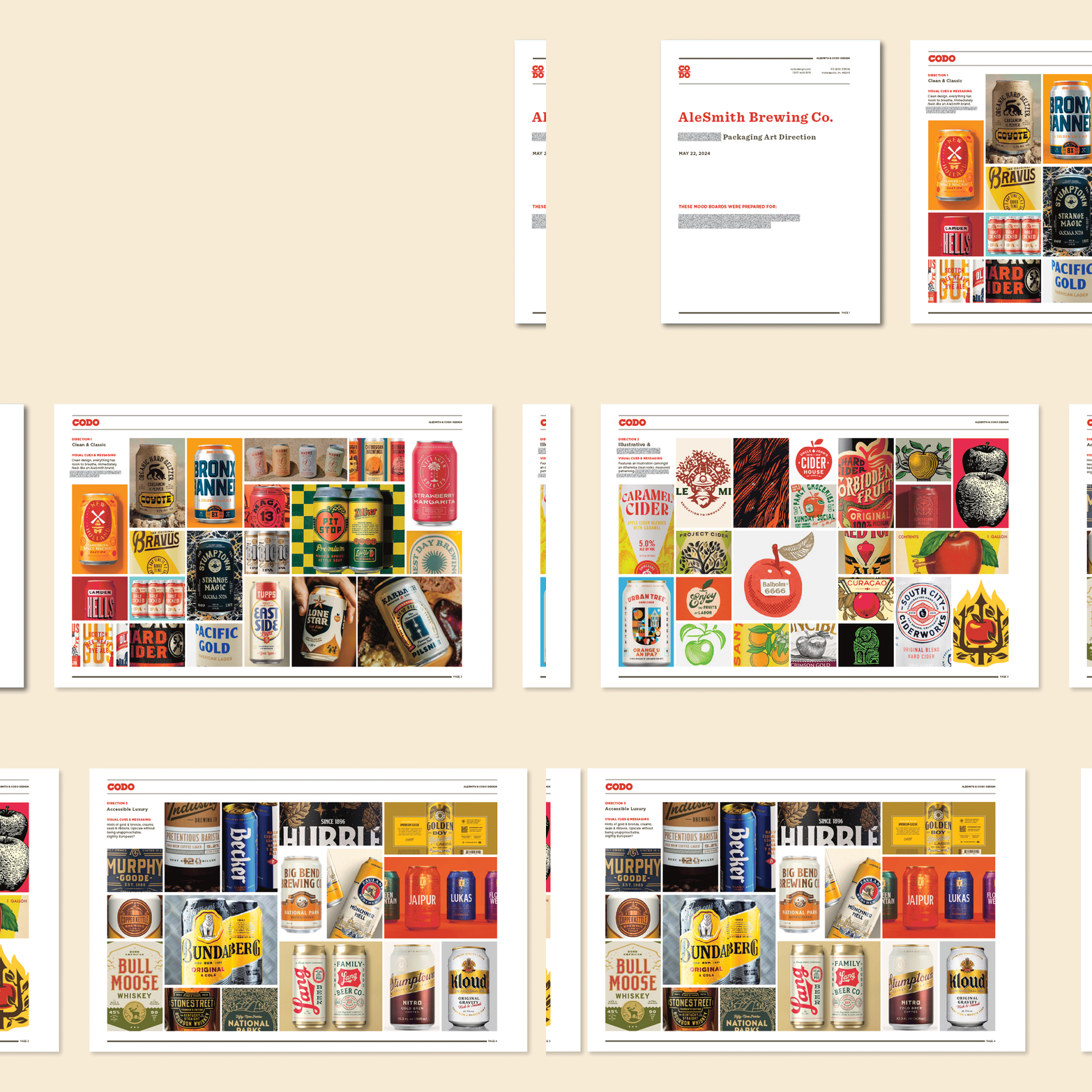
2. Industrial vs. Traditional (on adhering to, and rising above, category canon): This was a dueling idea from our Mood Boarding process. AleSmith has an enormous production facility with acres of beautiful stainless tanks — someone called it a “Willy Wonka beer factory” during our initial research. And their internal team likes this sort of messaging as well.
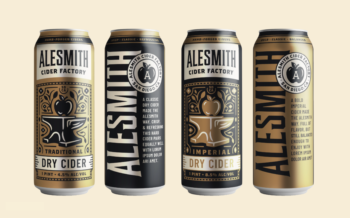
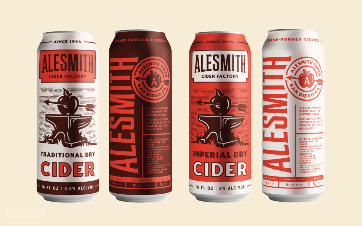
Here, “industrial” or “factory” doesn’t mean bland and mass market, but rather, efficient, clean and rigorously made. So one of our directions leaned more into this idea while the other explored a more traditional look you might expect in the hard cider category — more texture, more organic detail and more provenance.
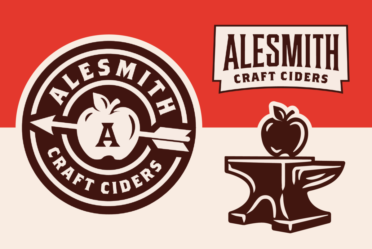
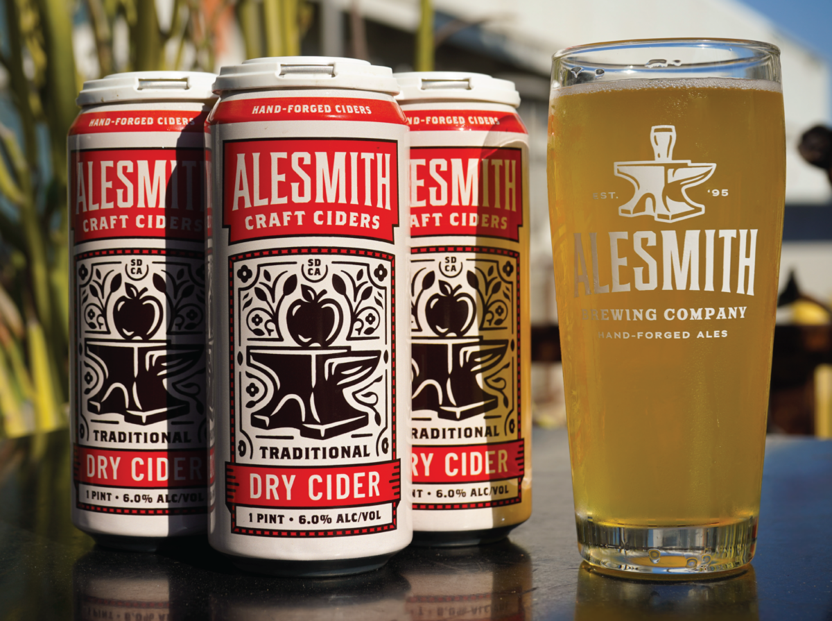
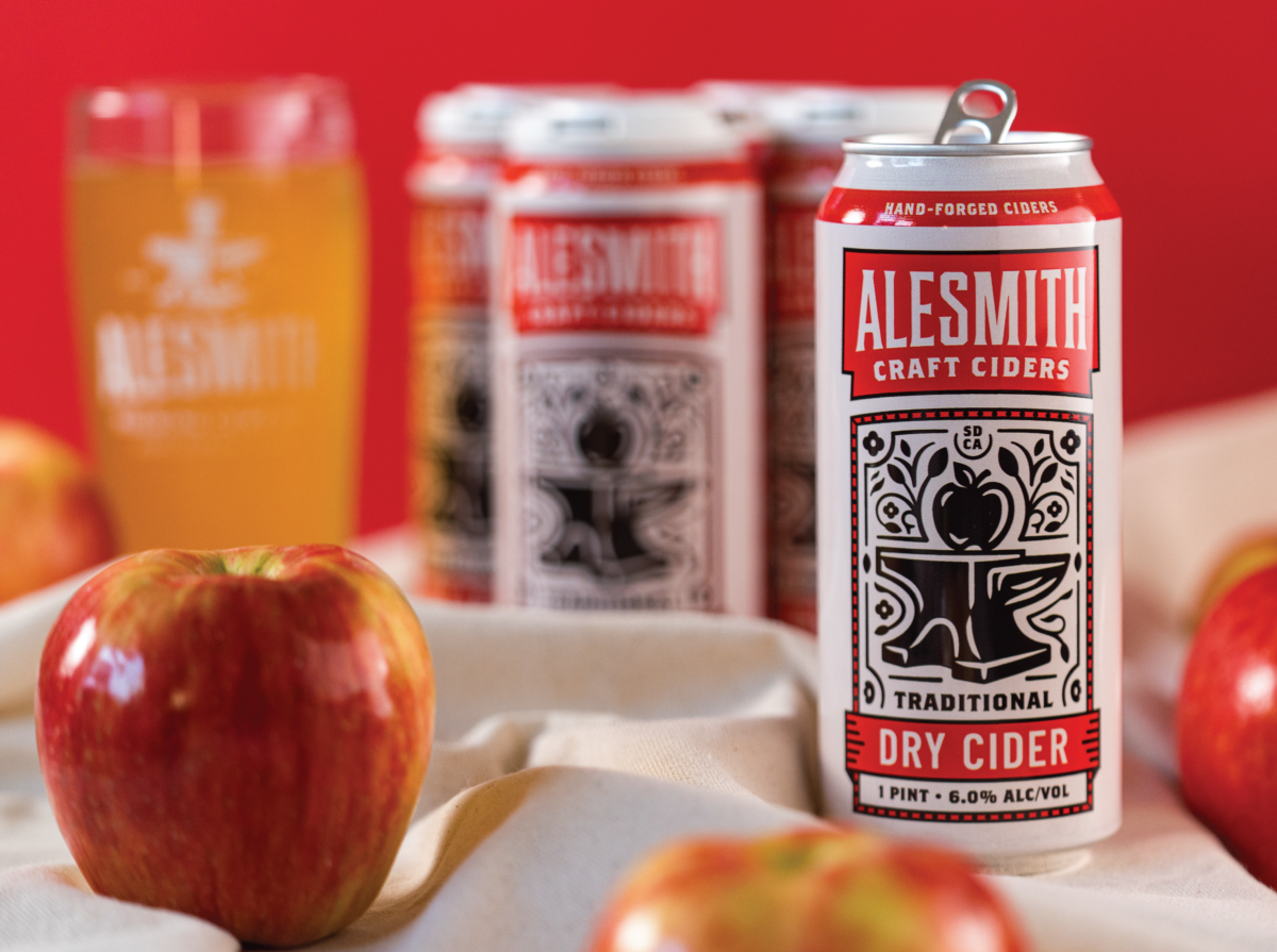
3. Riffing on their logo (and more hierarchy considerations): We knew we wanted to replace the glass in AleSmith’s iconic logo with an apple. This is a fun, if slightly on the nose way of immediately orienting someone looking at this packaging in a cold box — Ahh, it’s a hard cider!
This presented another hierarchy challenge: This is a subtle change, so we probably need to blow this thing up to be the main art on pack so people actually see it. But then, does that compete with the existing AleSmith logo? And the style (Imperial, Traditional Dry, etc.)? And the ABV?
This balance doesn’t seem like that big a deal, but if you get it wrong, even slightly wrong, the entire composition can fall flat.
This doesn’t just mean your packaging isn’t as beautiful as it could be, but that someone might be less inclined to pick it up and throw it in their cart when shopping. So getting this squared away is a big deal.
4. How to differentiate within a Branded House: One challenge you can run into when building a Branded House is that over time, it becomes harder to create entirely new, compelling packaging that doesn’t look like something you’ve previously released.
This doesn’t mean the baseline design doesn’t work well, but functionally, there are only so many colors you can choose before your cans start looking similar to another existing SKU or just unattractive (due to clashing colors).
This issue is exacerbated when using a Monolithic Branded House template, where everything looks nearly identical, save for color and copy changes. (e.g. Rhinegeist, Monday Night, Prost).
We can’t use that green because we used it on an LTO can last spring. Or, this shade of red is too close to our Hazy. (Etc.)
—
This was an issue here because AleSmith has a diverse portfolio with hundreds of individual cans developed over the years. And at a quick glance, there’s not much obvious white space for their next release, beer or beyond.
One opening we saw within AleSmith’s broader portfolio — and their broader competitive set — was to use patterning as a focal point.
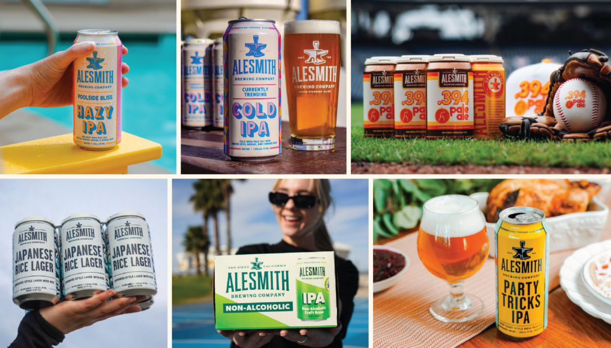
Their cans all lean clean and classic, with their core logo front and center and a fanciful name and style across the bottom. There’s some variance here and there, but by and large, you know an AleSmith can when you see one.
—
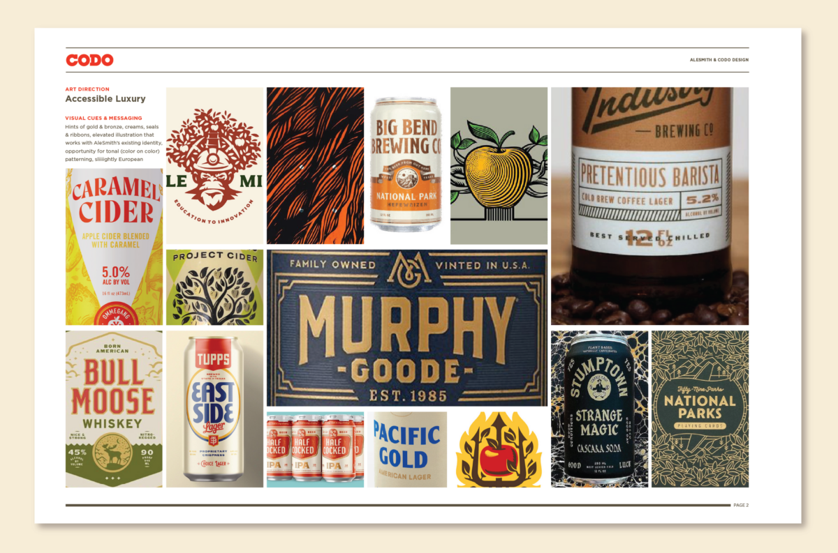
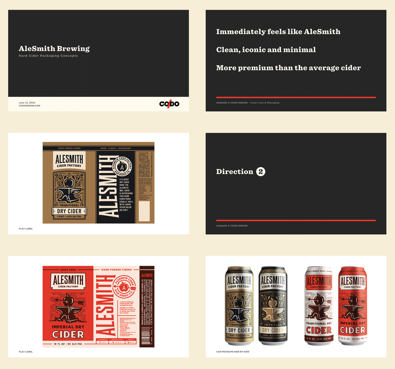
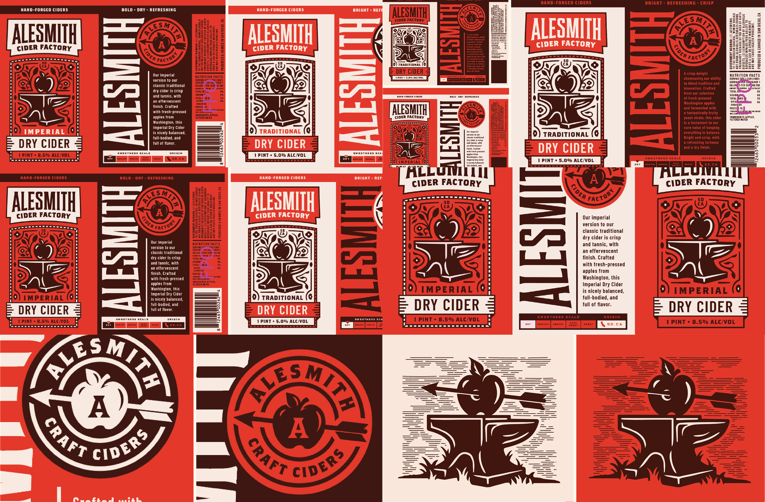
These points, along with our refined Mood Board guided our initial concept development.
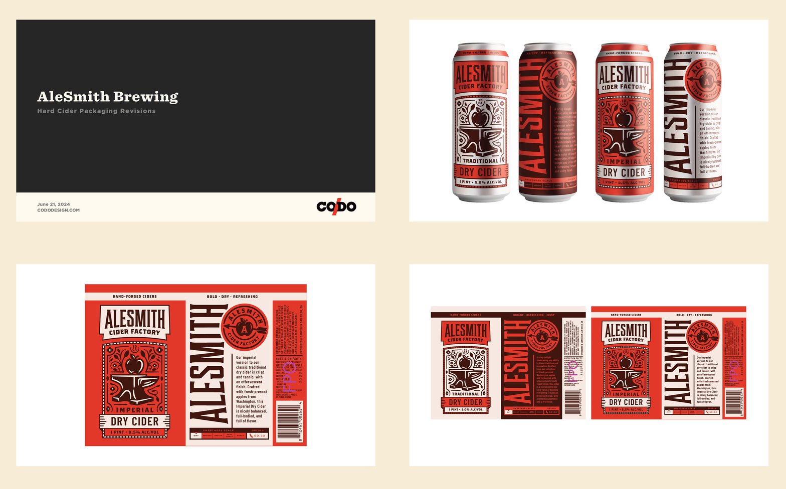
We presented the work (see below), the AleSmith team LOVED it, and we moved directly into revisions.
(Shoutout to veteran CODO Senior Designer Ryan H and recent hire Brock for absolutely housing this project. Great design work all around.)

