Starting out ( on pain points and opportunities )
PK and team have built a robust business. So this wasn’t a rebrand driven by panic or existential threats — it was more a process of addressing persistent pain points and growing opportunities.
Here are a handful of ideas we heard in our early discovery:
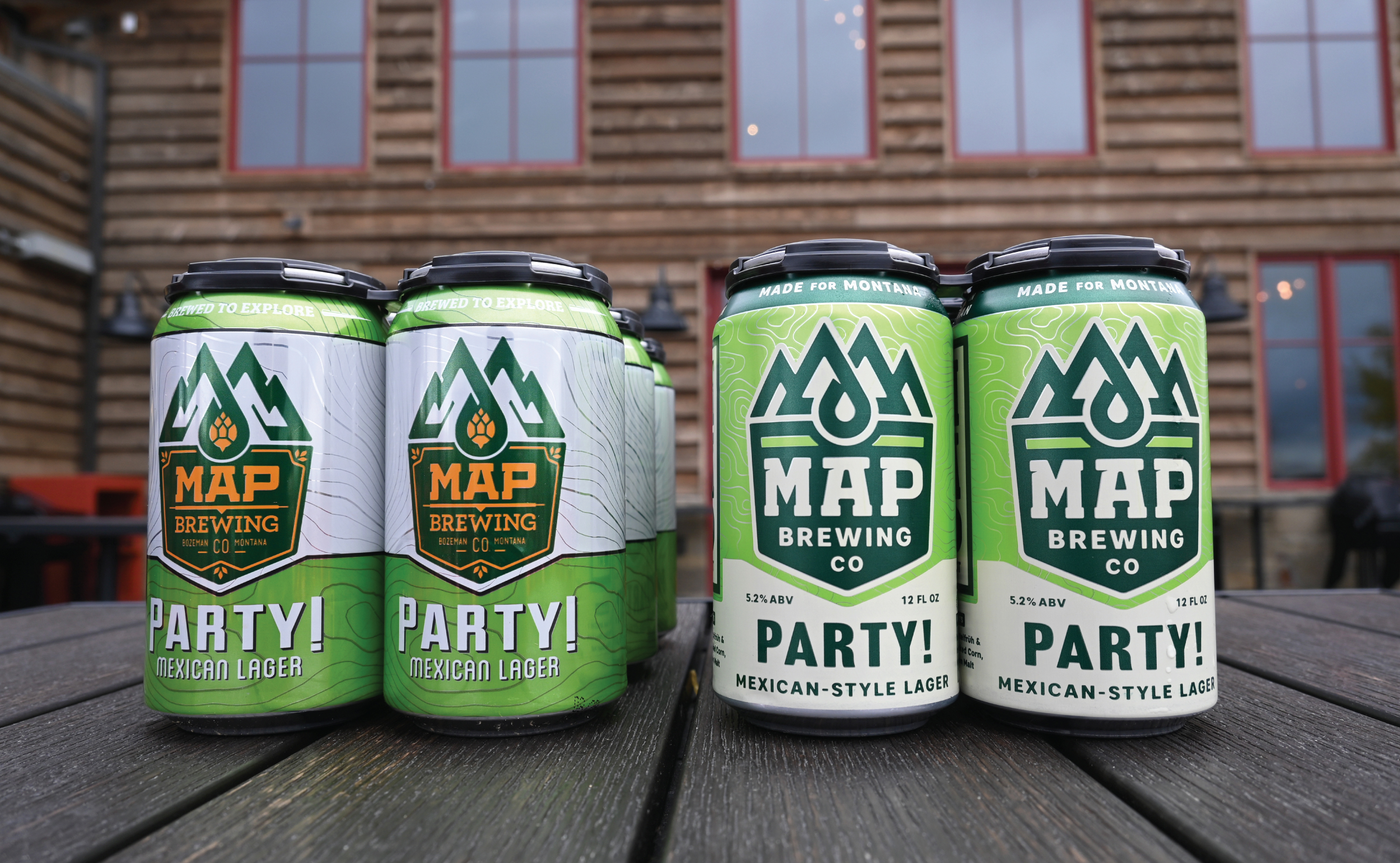
– “After 10 years, it’s just time. Everything feels a little tired.”
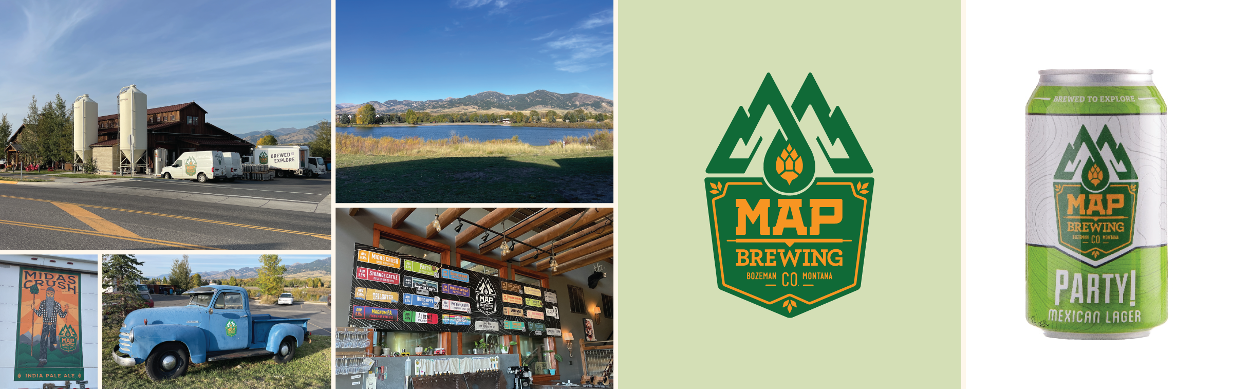
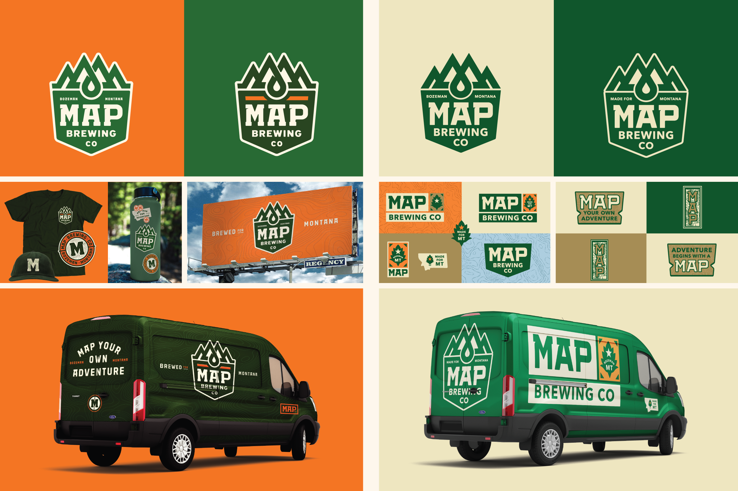
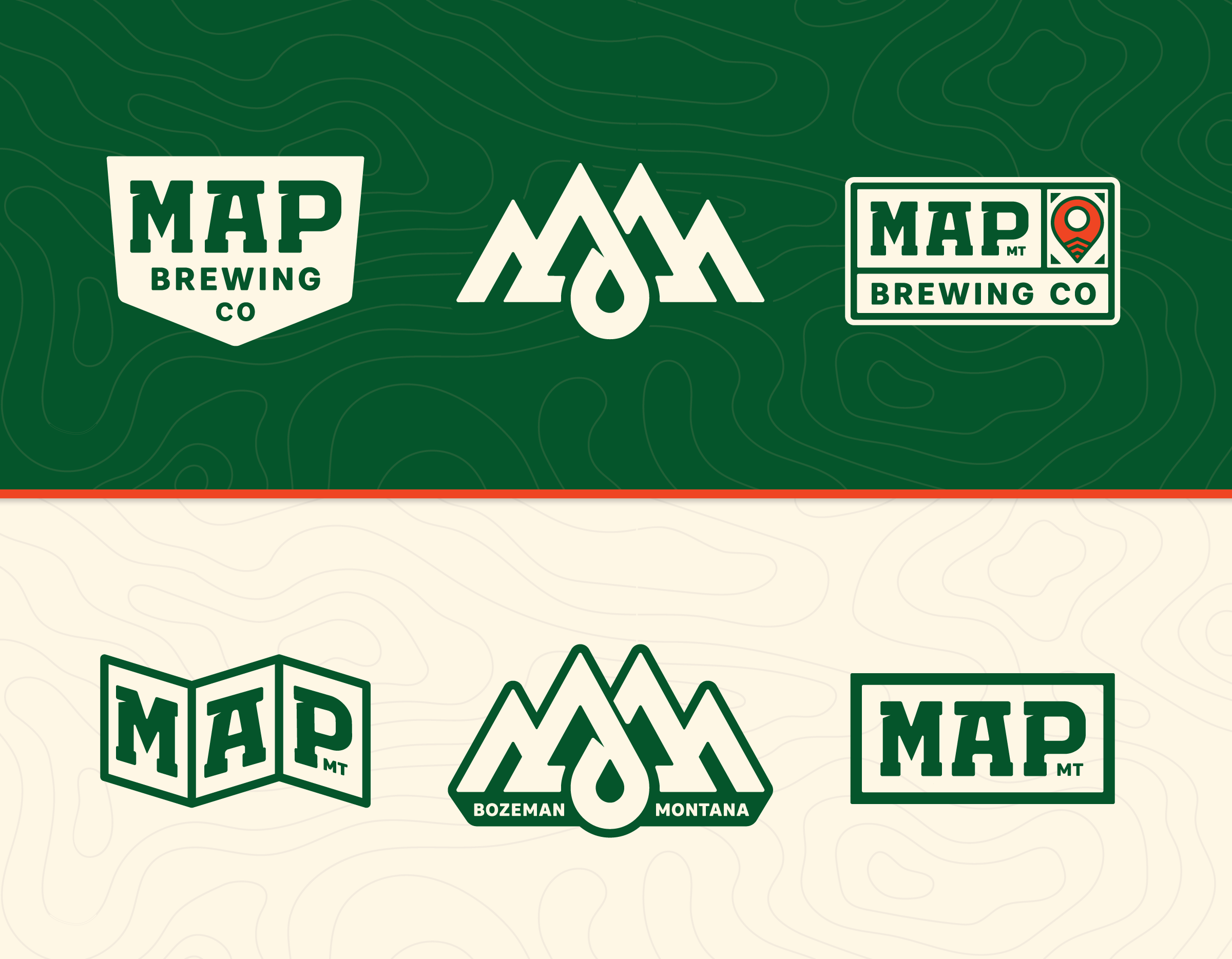
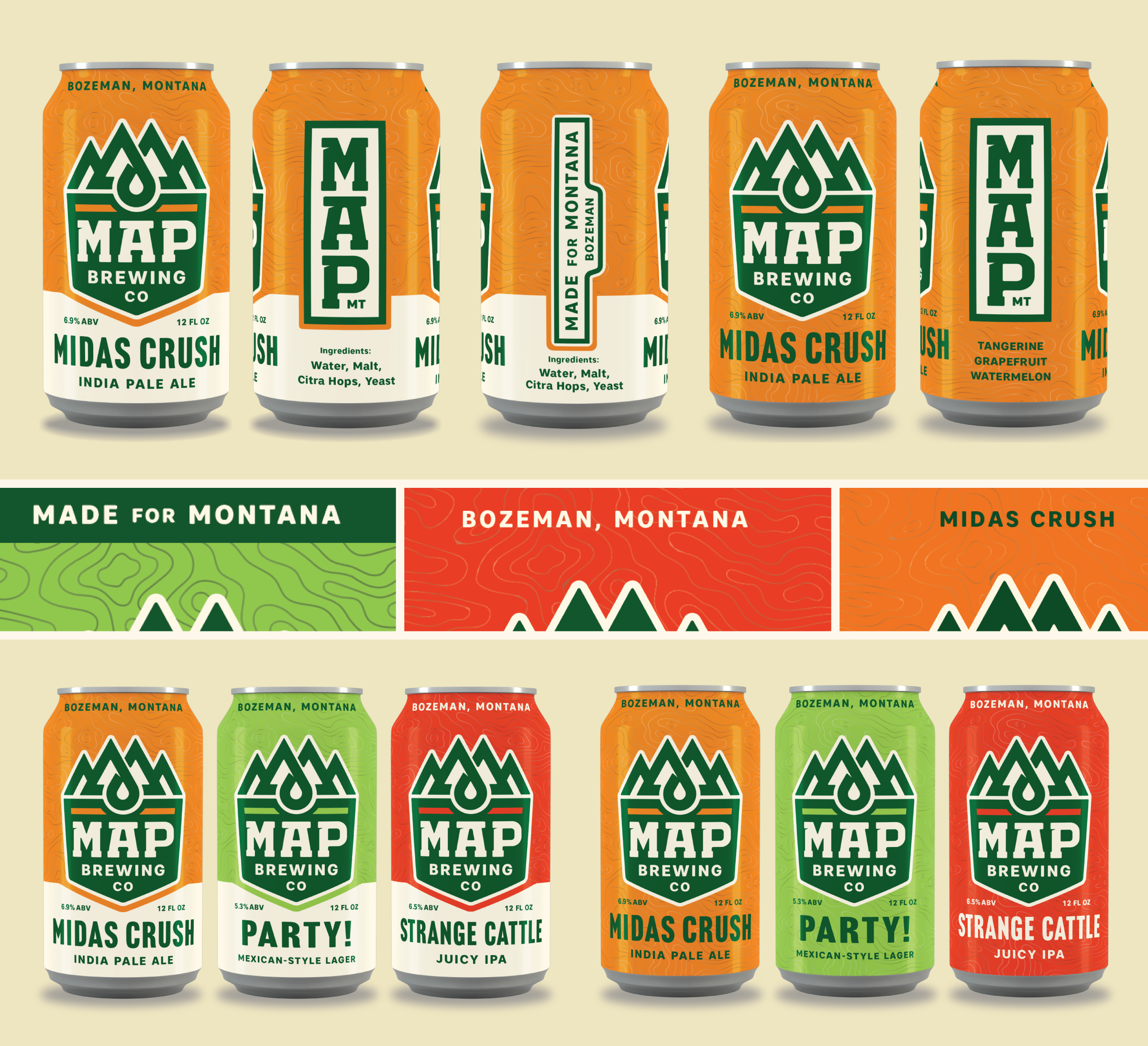
– The brand is “spaghetti on the wall.” And you can see clear fingerprints from all the different folks who have touched it over the years — a mix of Deadhead, Rasta, outdoorsy themes, fanciful names, a tangle of typography, etc.
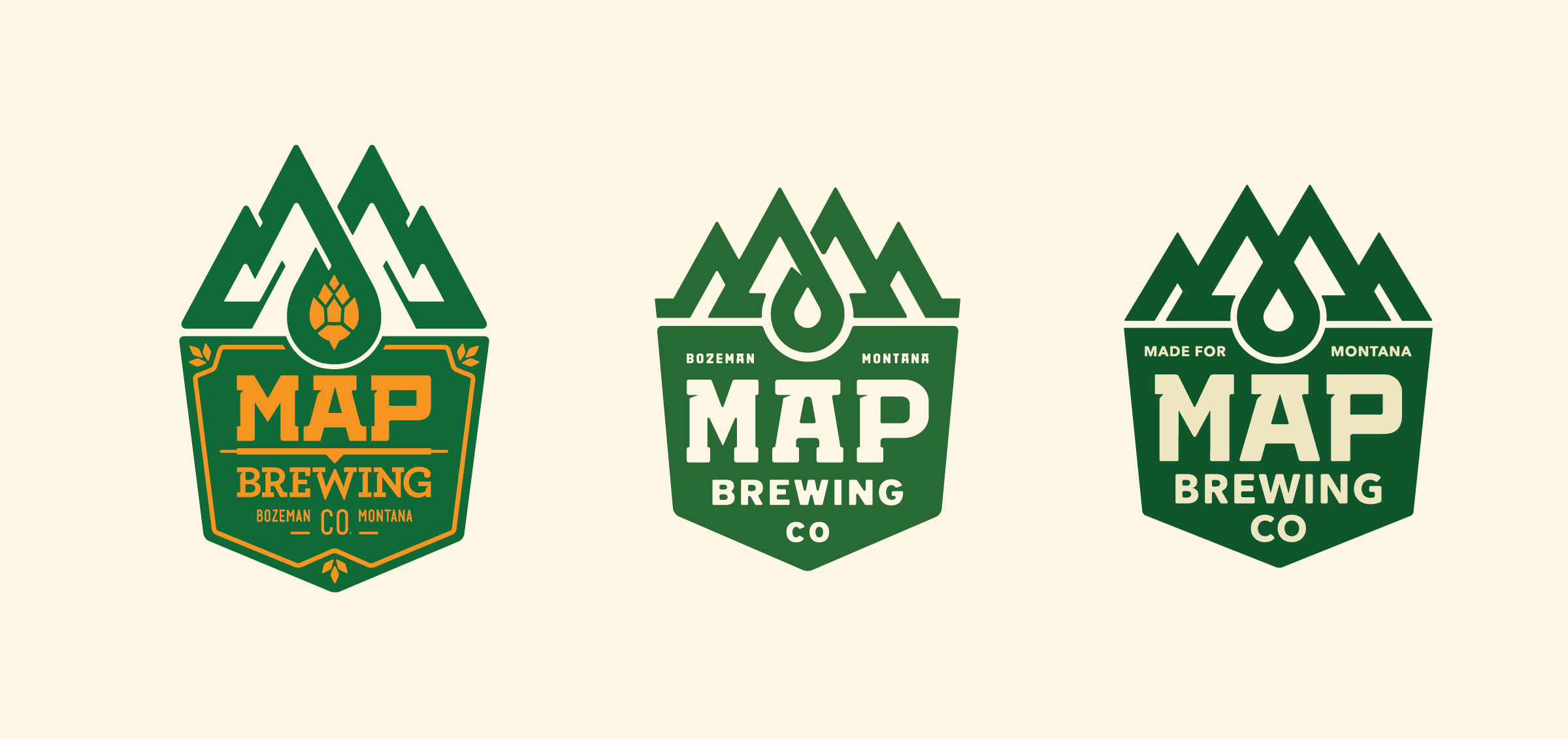
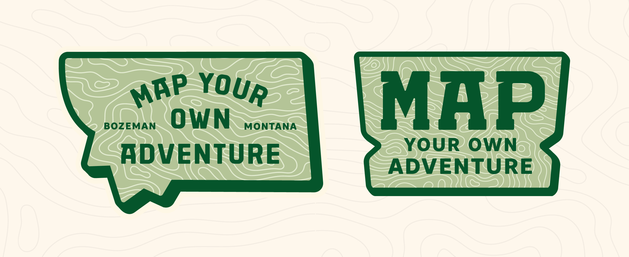
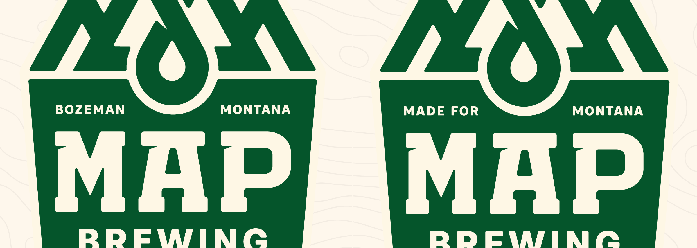
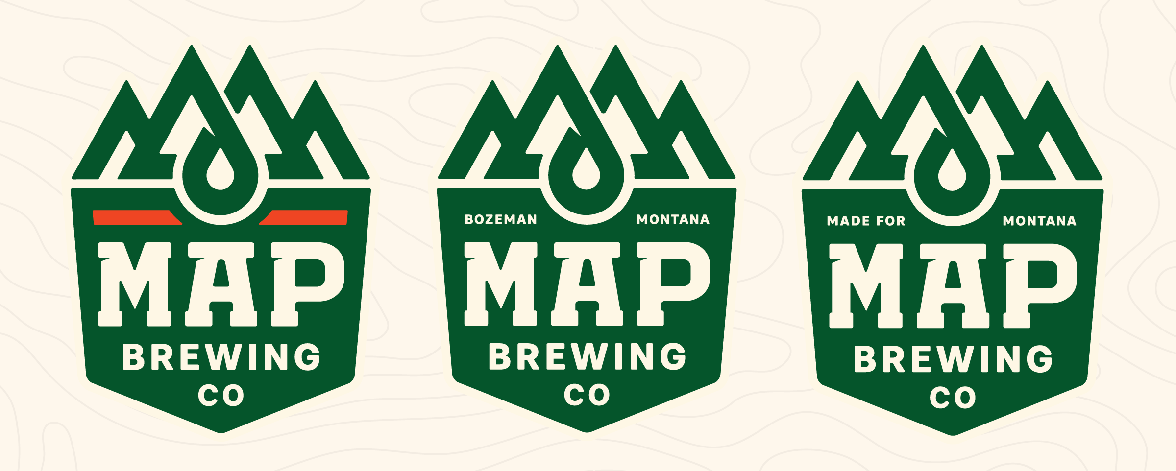
– The identity itself was shallow with an awkward, tall mark and no deeper bench of secondary iconography.
– MAP has operated without a clear set of brand guidelines (which exacerbates all of these other issues).
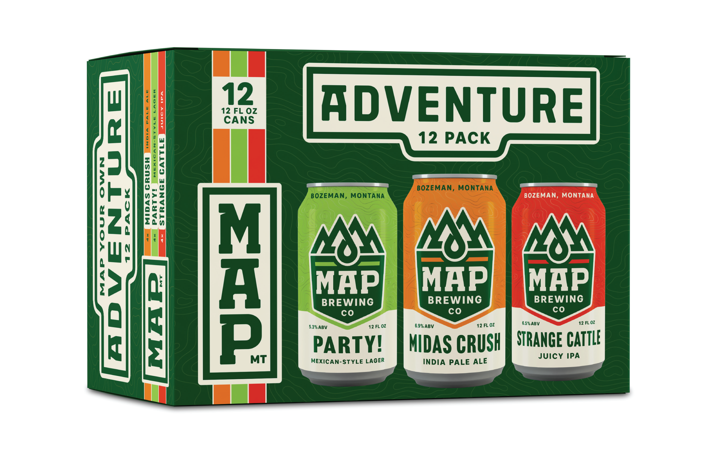
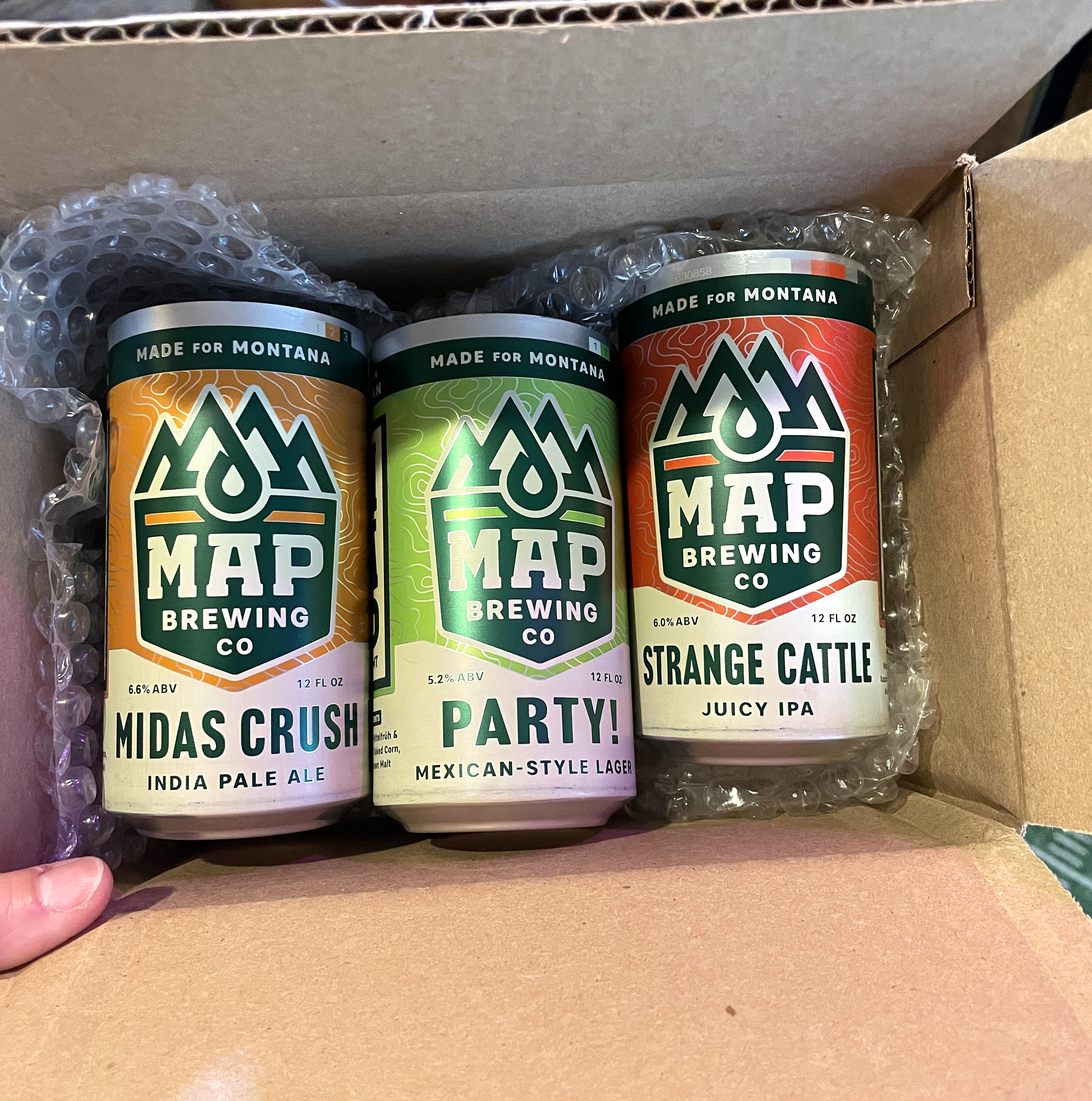
– MAP wanted their packaging (including a new variety pack) to work harder for them and increase sales, particularly as they venture further afield and have to vie for attention from folks who aren’t as familiar with them as a Bozeman local.