The advent of craft beer has affected a sea change in the bar/pub aesthetic. And it’s all gotten fussier, hasn’t it? We’ve gotta have our reclaimed wood. We’ve gotta have our Edison bulbs popping out everywhere like little steampunk gophers. And just uh, build something out of old shipping pallets, I guess, because the Blue Collar look is au currant, I guess. At this point, someone is going to have to say the word “hipster,” accompanied with a self-indulgent guffaw, because hey, why wouldn’t they? Hipsters. Haha, oh man.
Point is, for the sake of this argument, there’s a defined, ubiquitous look to the spaces that we visit when we want to drink craft beer. You might call it baggage. But this baggage means that craft beer consumers arrive pre-loaded with a set of expectations regarding their drinking habits, and by extension, the places where they plan to do their drinking. For the sake of people who are passionate about this industry, there’s a tremendous opportunity in understanding, dissecting, and responding to customer expectations with an increasingly nit-picky resolution. More on that ahead.
There’s a lot of talk about a “Craft Beer Bubble”: AKA, the notion that the craft beer industry will become so overcrowded with competition that breweries will inevitably fail by virtue of sheer market saturation. But all this talk of a bubble makes a crucial mistake in viewing craft beer as a commodity… like crude oil, or tonnage of raw steel, or Edison bulbs. This reductive viewpoint doesn’t leave us with much room to articulate what is actually happening as new breweries pop up all over the country. Right under our noses, breweries are developing into highly individualized lifestyle centers that defy the overly-simple thinking of commodity economics. Presenting craft beer as a commodity is a short-sell. By reinforcing this idea, we don’t allow ourselves to invest much thought into the elements that makea craft brewery. The granular stuff, the details, the component pieces, the nit-picky stuff, the culture. And incidentally, it’s these things that matter the most to many beer drinkers who often have dozens of places they can visit for good beer within minutes of their home.
To put it another way: we’ve taken the idea of how a brewery (and by extension a craft beer bar) is supposed to look—reclaimed wood, a dim, rustic atmosphere, beards and flannel everywhere—and packaged it, inseparably, with craft beer itself.We’ve stereotyped these ideas to the point that they’ve become an easy target for competitive lampooning. We assume that they’re essential; that they’re just another checkbox on the list of How To Pass As Craft Beer. And we’ve done this under the auspice that craft beer is a commodity. But craft beer isn’t a commodity (not yet, anyway). And these ideas are not essential to a brewery’s success. Culturally, we’re guilty of an unfortunate oversimplification—albeit an oversimplification that heralds an incredible opportunity. If we know how we’re expected to look, then we know how to defy that expectation. By extension, we know exactly how to stand out. And amidst the burgeoning craft beer marketplace, knowing how to stand out is pretty damn important.
In the case of Big Lug Canteen, and often without even realizing the magnitude of the task at hand, we wound up wrangling with some pretty high-level questions. Such as:
How can another craft brewery stand out in an energetic, fiercely competitive market?
and
How might you delight a customer by playfully defying their expectations?
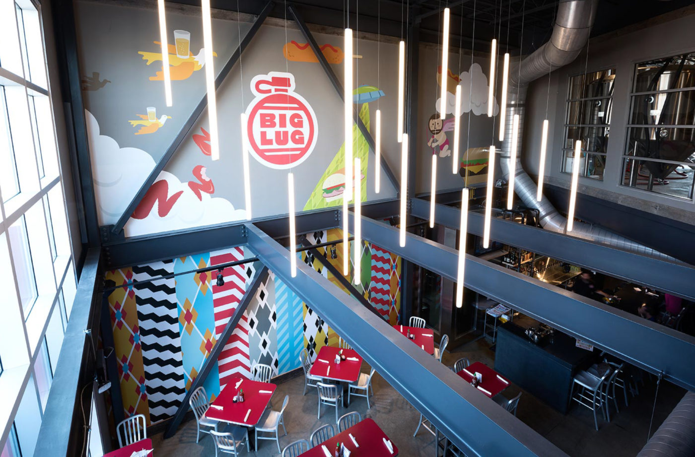
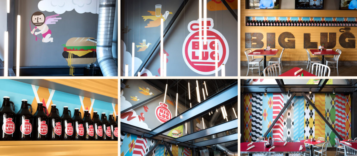
Or to put it more plainly: What if we didn’t encrust every inch of the tasting room with black pipe, dark wood and too-cool-for-school glowering Edison bulbs?


Enter Eddie Sahm and Scott Ellis. Eddie hails from the Sahm restaurant empire, a multi-generational old-time Indianapolis holdover with about a dozen locations and counting. Scott is an accomplished brewer with past gigs at The Ram in downtown Indy, Oaken Barrel in Greenwood, and Thr3e Wisemen in Broad Ripple.
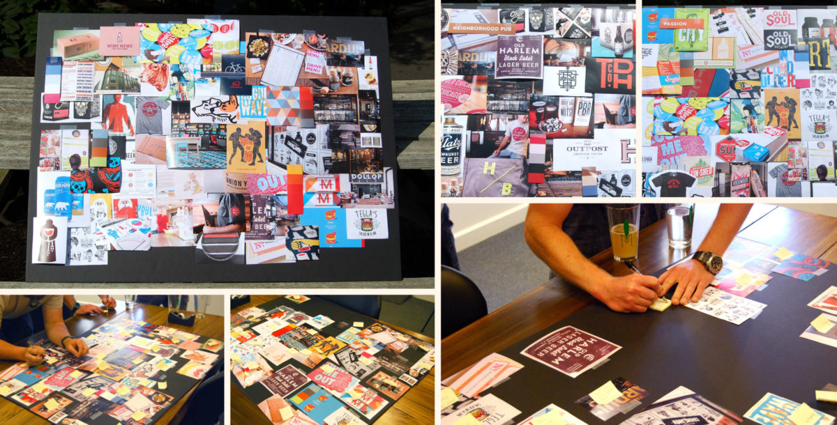
We first met these guys in March of 2014. It was cold out, and we gathered in one of those dim, archetypal taverns to discuss their idea for a new brewpub. A brewpub that would stand out in a sea of idealized, hyper-masculine wooden beer dungeons. A brewpub slated to open in Nora, Indiana—one of Indianapolis’ older suburban communities.
The idea was to create a two story production brewery (10bbl system) overlooking a restaurant that features ever-so-slightly-elevated-yet-not-intimidating bar food. The beer itself would be supremely balanced, leaning toward milder and more approachable British styles. The place would be called “Hoss Canteen” in honor of Eddie’s grandpa—“Hoss” was his nickname. Hoss was a respected man in the Central Indiana community, a family man, and in staying true to the Sahm name, was one hell of a character. “Canteen” is a word Eddie and Scott cottoned to immediately as a refreshing way to categorize a watering hole just off of the popular Monon biking and jogging trail. They appreciate the novelty of the word “Canteen,” which is rarely used as a qualifier outside of Mexican restaurant concepts (think “Cantina”).
Eddie and Scott have forgotten more about their industries than we could ever hope to know, so we worked directly with them on research, conceptual framing and positioning of this community-calibrated concept.
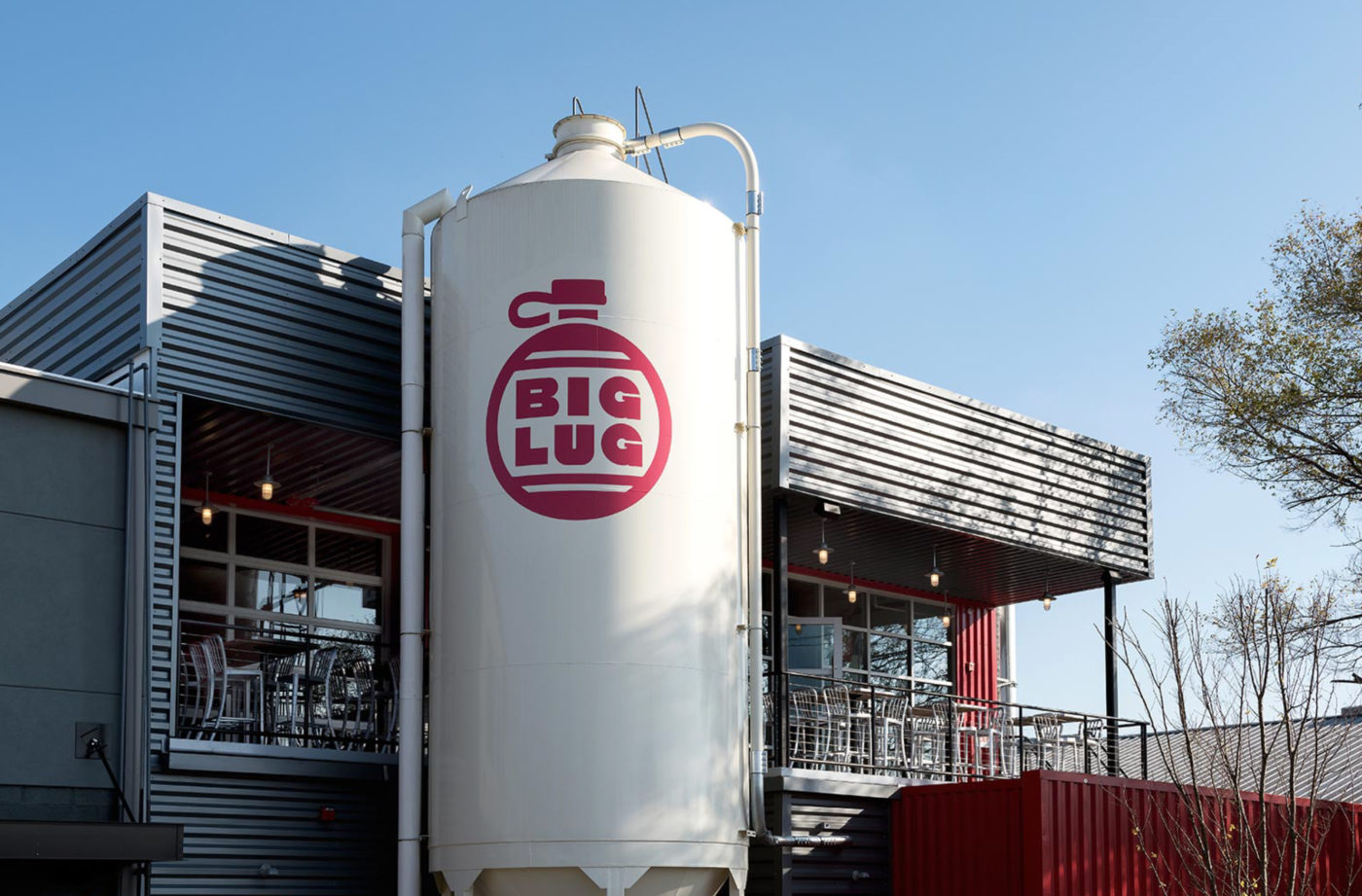
First and foremost, Hoss had to be a place for the people of Nora. Indianapolis proper has enjoyed a recent explosion of bars, restaurants, breweries, and food artisans that rivals any city in the country. However, much of this activity has occurred within our core metro area, leaving sleepier suburban communities like Nora with a prohibitive 20 minute drive between itself and all the action. Not to say that Hoss Canteen (Later to become Big Lug; we’ll get to that) was conceived in an attempt to make Nora seem “cool” or anything so ambitious. Rather to say, the place needed to serve as the type of comfortable, one-of-a-kind neighborhood craft beer hangout that the local community could easily adopt as its own.
An integral part of the Hoss conceptual process was embracing Nora as a sort of “stomping grounds”—and accepting the community for what it is. It’s not a place for the young, swill-pounding Butler University Bros who descend every weekend upon Broad Ripple, a village community about eight minutes to the south. It’s not a place for the intentionally shabby aesthetic of the fashionable Mass Ave or Fountain Square hot spots. No, far from it: Nora is a realm of aging vinyl homes, quality schooling options, and 37 year old accountants in need of a few beers following an intense lawn-mowing sesh. It’s a place known for being safe, but not so much for being “hip” or “with it.” (I think this is what the kids say).
If Hoss Canteen couldn’t ape the style of the typical beer geek dungeon in good faith, then how exactly was it supposed to look? Eddie and Scott were adamant in their ‘high-quality with no frills’ approach to beer and food. Traditional, quaffable beer, approachable “gastro pub-esque” food presented honestly, without defaulting to buzzwords like “artisanal this,” or “locally-grown that.” And this idea would permeate the entire Hoss brand: a small, focused selection of quality offerings. Straight-forward and to the point. This no-nonsense approach toward food and beer folded seamlessly with the visual design of the restaurant brand. Clean, simple, sort of industrial-ish design, but not really. Sort of IKEA-ish, but only not quite. Cooler than a chain restaurant, but not so cool that your Aunt wouldn’t feel welcome eating there. It’s not a difficult balance to strike, and after overthinking it for a while, we became resolute to avoid overthinking it.
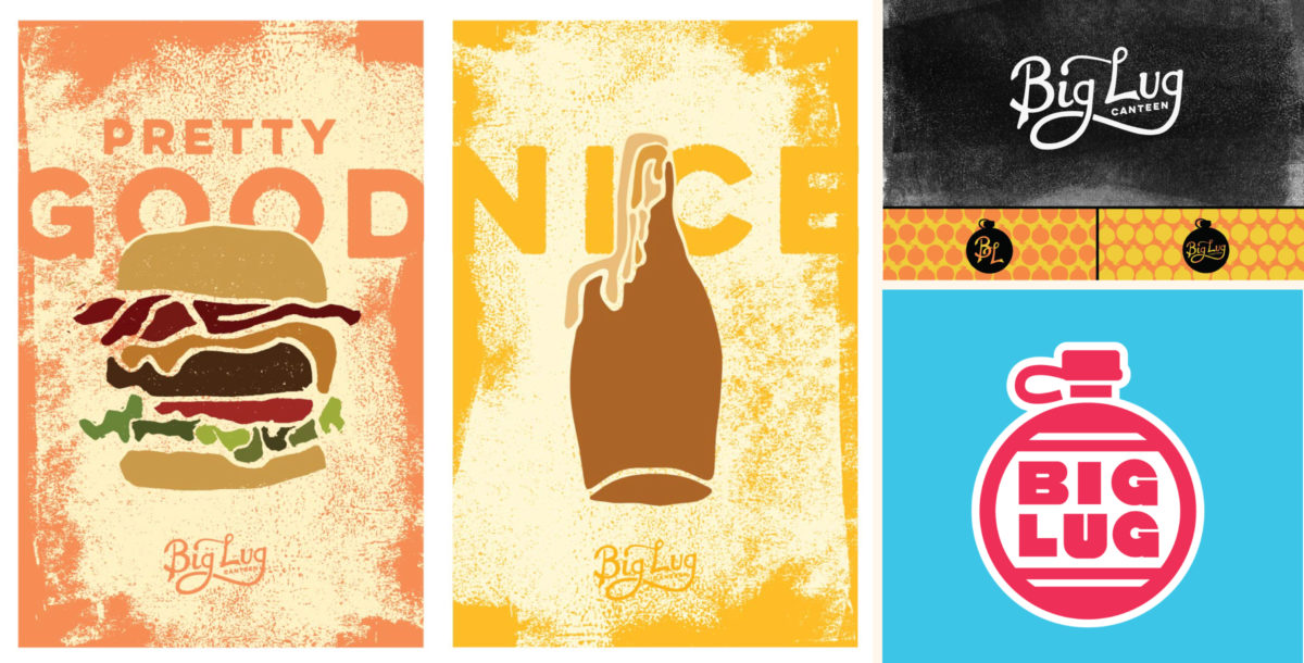
Finally, there was the passion of Eddie and Scott as creative individuals and entrepreneurs to consider. Both of these guys are young, hard-working, successful people. They both have playful senses of humor. Eddie’s the type of dude who hates to let the conversation die, and so he talks, and talks aplenty. Scott is in many ways the opposite; reactive, quiet and thoughtful. They both like to laugh, and they both have warm, witty, not-so-serious personalities. If the branding didn’t land as a bit goofy, a bit fun, and a bit like when your dad wears a pair of just-too-short shorts only because he knows it embarrasses you, it wouldn’t reflect who these guys are. And it wouldn’t capture the essence of what made them excited about Hoss in the first place.

