Stories

Helliwell Hall: Designing for shelf and taproom in Ontario

On- and off-premise — how to connect them, and when to break the rules

Niagara Oast House Brewers is one of the Niagara region’s longest running breweries in Ontario, known for farmhouse ales, saisons and using local fruit from the surrounding wine country.

They recently opened a new brewery in downtown St. Catharines called Helliwell Hall. It’s an expansive concept — a music hall, elevated food program, lively downtown taproom and a production brewery all rolled into one.

They reached out to CODO to help establish packaging for their LTO program and a few flagship lagers.

Today, we’re giving you a behind-the-scenes look at the process and a few of the things we had to sort out along the way. This was a fun project, but more importantly, I think there are some useful takeaways in here, no matter what scale you’re brewing at. 

Let’s get to it.

Oast House’s brand identity and packaging.

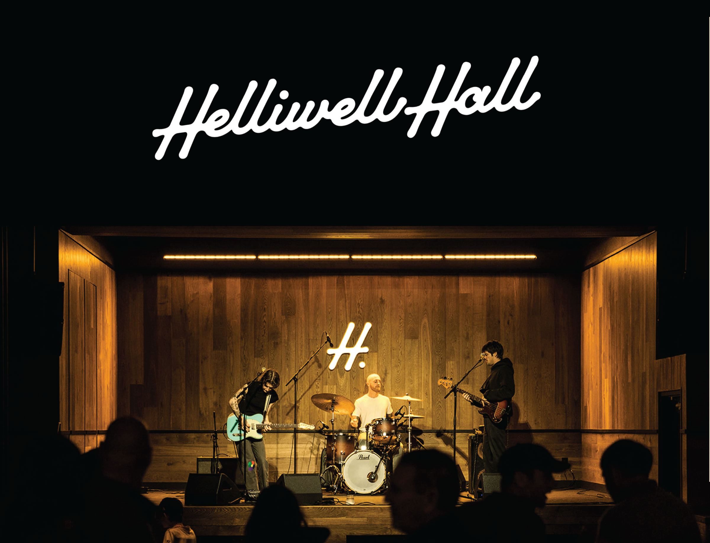
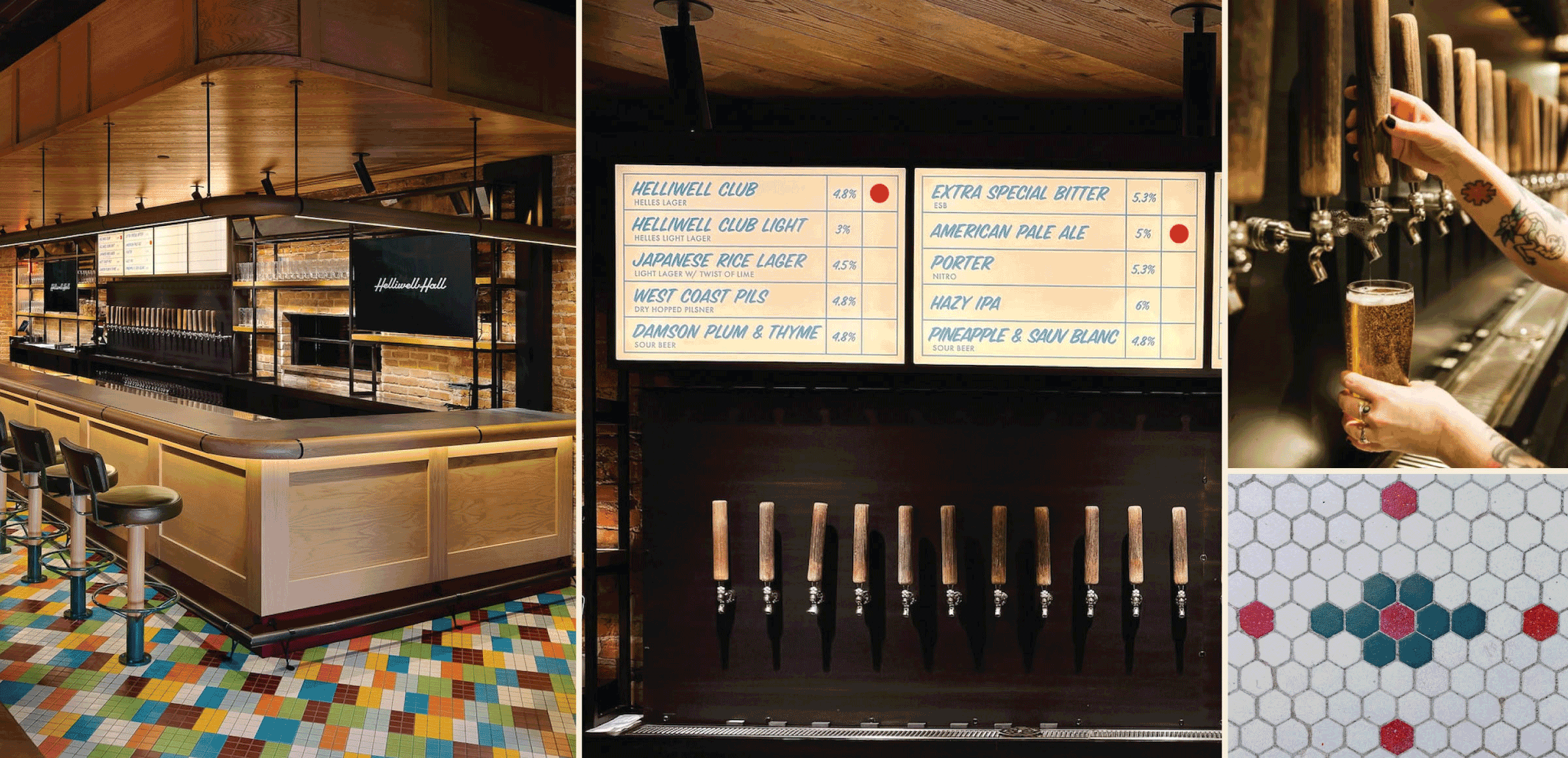
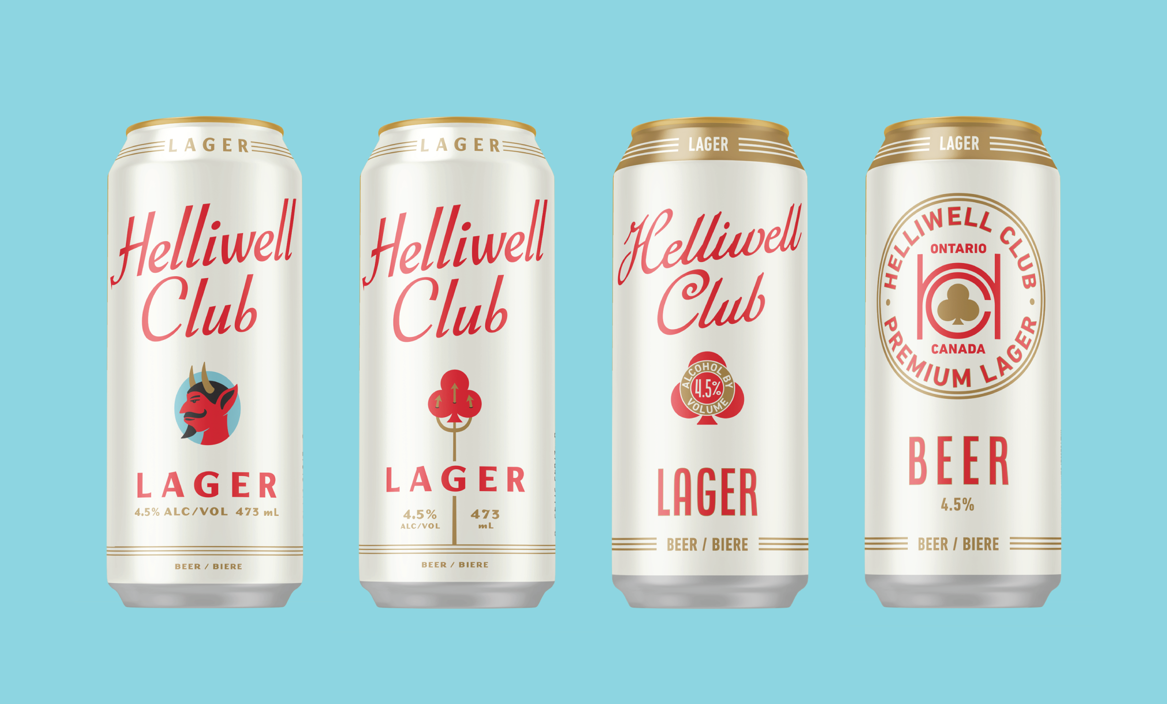
Overall positioning & Architecture 

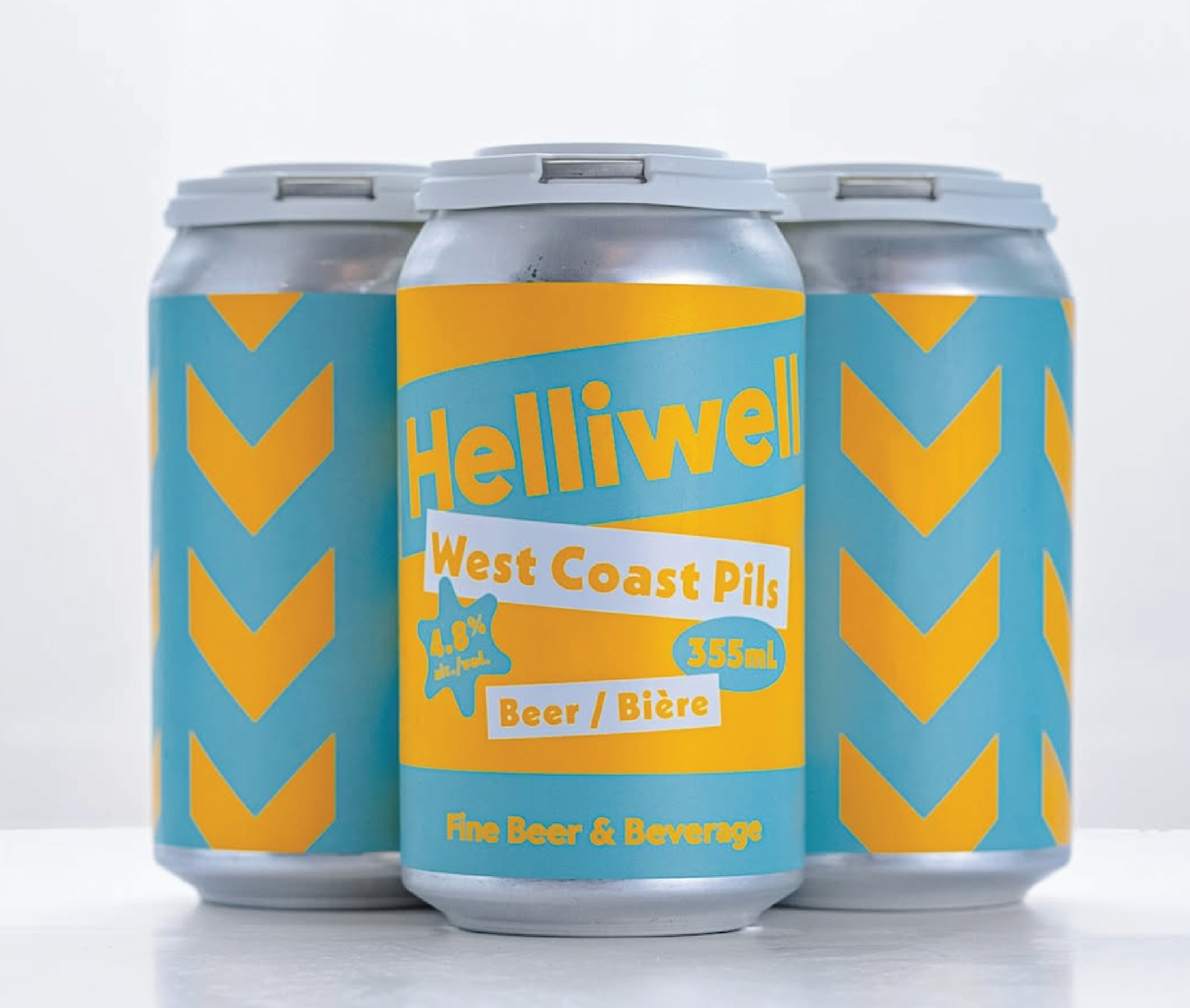
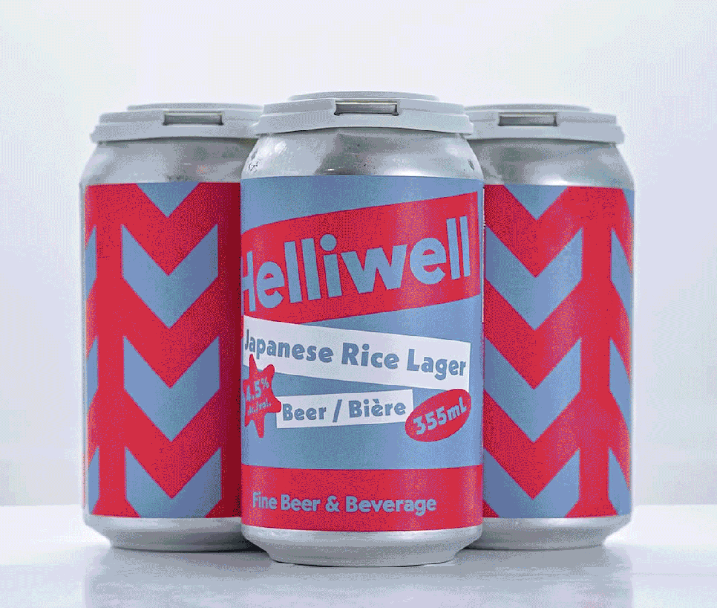
A quick note here that Helliwell Hall is a completely separate brand from Oast. Different location, different vibe, different audience and a different vision for how their beer should show up in market. 

I wanted to pull this out because we help breweries think through how to name, position and structure the relationship between their parent brand and a new location all the time. (This is a super common Brand Architecture problem we see in our project work.)

The Oast team had already made this call before looping us in, but their reasoning is instructive.

Helliwell Hall is a place — a specific concept built for that specific building. It’s a one-off. So should it still be tied to Oast in some way? Only from a Shadow Endorsement standpoint, and not because there’s anything wrong with linking either brand together. It’s simply that they serve markedly different audiences with minimal overlap. So there isn’t much utility in linking them more directly.

Helliwell’s interior design and identity. They came to the table with this work already in place — killer starting point. It’s always nice when we have a good foundation to build from.  

Art Direction 

Helliwell came to us with an established identity, which freed us up to focus on expanding that system into packaging. We started by exploring art direction and developed three main mood boards:

Classic Club — premium but approachable, cream and gold trim, timeless lager cues

Creative Hotbed — downtown St Catharines’ arts, music and cultural mash-up

Everyday Elevated — clean, modern, easygoing premium

Their feedback was straightforward: Lean into premium and modern, avoid anything too rustic or too “brewpub,” and make sure the flagship feels like something Niagara could rally behind. And then cut loose with the LTOs.

So without really meaning to, we ended up art directing both the flagships and LTOs in one fell swoop.

Collaborative Art Direction. Mood boards are a phenomenal tool for working with a partner to get their vision on paper and pressure test other ideas before diving into the creative sprint. 

On Helliwell’s flagships

We’ve already covered that Helliwell Hall is built around a place. So why not follow the typical taproom playbook of an ever-rotating cast of small-batch releases?

Because for Helliwell, the flagship serves a bigger purpose.

The team felt that anchoring the brand around a flagship lager was a no-brainer. Packaging is often the first way someone encounters your brand (beyond social), and a flagship gives you something you can push in market, build equity around and use to connect the destination brewery back to the LCBO shelf.

So in practice: “Oh, Helliwell Hall? I’ve had Helliwell Club before. Let’s check this place out.” (Or vice versa.)

And this is a crucial insight: With so many breweries and so much choice in Ontario, you can have a killer location and people may still miss it. Packaging becomes a way to market the place itself — a physical billboard out in the world that introduces the brewery to people who might never find it otherwise.

The goal was clear. Make Helliwell Club and Helliwell Club Light recognizable, premium and consistent so they can do that job.

Initial flagship concepts.

How far can we push Helliwell?

“Helliwell” literally translates to holy well, and the name comes from a fabled artisan well located in the brewery’s basement.

We wanted some way to reference this story and kicked around several ideas — a halo, a well, a subtle devil wink (including a pitchfork, a lightning bolt and perhaps not so subtle a mid-century profile of the big bad man himself). 

But when we showed these more devil-y concepts, even in a stripped-back form, they just didn’t quite land. Everyone liked the idea, but it didn’t feel as appropriate as a clean typographic system or the elegant playing-card-style iconography that ultimately won out.

Helliwell’s final flagship lineup.

On Helliwell’s LTO program

Helliwell will be releasing a steady stream of new beers, and their grab-and-go cooler is projected to be a major revenue driver for the business. So the LTO packaging needed to work hard operationally while still feeling exciting.

We built this system around a few key criteria:

Easy for their team to update (swapping color, beer name & style info)

Easy to differentiate between SKUs

Parent-brand-forward, but visually distinct from the flagships

Flexible enough to support fast rotation without visual fatigue ( a handful of templates with various ID treatments and violators ) 


A quick note on seasonals vs. flagships

We help our partners work through this all the time as well. Some breweries tie their LTO / seasonal packaging tightly to the flagship system, others give them a completely different look. 

There’s no universal best practice here (I’d tell you if we had one). Instead, it all comes down to your brand and Brand Architecture, your competitive set and what you want those beers to signal.

For many breweries, a seasonal line benefits from staying visually connected to the parent brand.

But not always.


Why Helliwell’s LTOs are allowed to “let their hair down”

Helliwell’s LTO cans will be sold exclusively in the taproom, not on the LCBO shelf. That changes this process.

Because these beers won’t be competing on a crowded retail shelf, we weren’t bound to the same visual discipline as the flagships. No need for strict SKU blocking. No need to optimize for long-distance readability. No need to maintain a rigid flagship system. (Or to nail all of the LCBO packaging guidelines.)

This meant we could go more art-forward here and lean into the fun stuff their existing identity was doing. 

As long as the parent brand remains present, the rest can be expressive, loose and fun.

We love how these turned out. 

Helliwell’s LTO template. Our usual guidance on packaging hierarchy can be fudged if you’re not out in retail. We love how elegant and fun these are.

Wrapping up

Helliwell Hall is a great example of how Brand Architecture and channel strategy can shape your packaging. 

Their flagships needed to carry the weight in the LCBO. The LTOs could loosen up and reflect the creative energy of the taproom.

The result is a system that knows when to be buttoned-up and when to have fun — and one the team can build on as they grow into their spot in downtown St Catharines.

Build a stronger brand.
Sell more beer.

Join 7,500+ other beer industry folks and sign up for CODO’s monthly Beer Branding Trends Newsletter.