Stories

How we rebranded Wachusett Brewing

Breathing new life into a beloved Massachusetts beer brand

Wachusett Brewing was founded in 1994 in the beautiful Westminster, Massachusetts countryside (“Central Mass” in local parlance). In their early years, they became known for making better beer than the other Craft microbrewed offerings available in the region. This led to a lot of growth through the 90s and 2000s, up through the start of the beer boom in 2010.

Wachusett is a fun, legacy brand. They’re known for hosting raucous outdoor music festivals at the brewery. And above all, they’re known for their flagship Blueberry Ale, a lovely, fruited beer that drinks well year-round. 

While Wachusett had a head start on the thousands of other breweries that came after them, they weren’t immune from the market challenges that arose from those same entrants.  

We can fast forward here and hit some highlights to bring you up to current day: 

– Through the 2010s, Wachusett’s sales grew to nearly 70,000 bbl (2018) before cratering to ~15,000 (2024).

– In 2021, the original founders sold the company to another group. 

– This group then rebranded Wachusett. 

– This move had zero impact on the sales front.

– In early 2024, Finestkind (the owners of Smuttynose and Five Boroughs Brewing) acquired the brand. 

And here we are. 

After getting their feet under them, one of Finestkind’s first orders of business was to refresh Wachusett’s brand identity in a bid to regain the volume they lost over the last decade. 

They partnered with CODO for this project and I’m excited to walk you through that entire process today. 

Let’s start by examining one of the most important things any Legacy Brewery needs to consider when embarking on a revamp: How to (or not to) evolve its Brand Equity. 


*** We recorded a podcast with Rob Day on what went into Wachusett’s rebrand. Rob is one of the best marketers in the beer industry, so do yourself a favor and listen in if you’d like more background context on this revamp.

Wachusett’s early brand identity and packaging. 

Brand Equity vs. visual equity 

One of the first things CODO does when rebranding a brewery (Legacy, or otherwise), is review all of their historic packaging. We do this to get a sense of how the brand has evolved over the years so we can 1) logically evolve the identity if that makes sense, and 2) see if there’s anything magic hiding in the archives. 

In reviewing Wachusett’s original brand identity and packaging, we found that everything was pretty much par for a brewery that came to market in the 90s. Homespun labels consisting of inelegant images and clunky typography abound. This was so long ago that it doesn’t warrant critique. (And besides, there’s a certain charm that usually comes with beer branding from this era.)

But while there was a certain charm here, interestingly — quizzically? — we found that there weren’t actually any strong visual elements that defined the brand. It was all bland enough that nothing stuck out. (The fact that they grew as big as they did at their peak is a testament to their beer itself and how the brewery enmeshed itself throughout New England.)

Wachusett’s latest (pre-rebrand) packaging.

All of this added up to one of the most interesting situations we’ve seen in nearly 16 years of business. 

This is a 30+ year old brewery with no visual equity to speak of. Out of everything we reviewed, we only found these elements were worth retaining and exploring:

– The arched typography 

– The barn (while not historic, this has been around for a minute (since their previous rebrand), so there is some familiarity in the market place. Plus, it speaks to their broader positioning in a compelling way. More on this in a sec.)

That’s it for visual equity. But what Wachusett lacks in visual equity, it more than makes up for in Brand Equity. 

> Learn more about how we think about Visual vs. Brand Equity here

We highlighted this up top, but the brewery is known for fun outdoor concerts, the beautiful Central Mass countryside (and all the fun activities that come along with that) and Blueberry Ale. 

Wachusett’s Blueberry Ale is such an important part of their business that this entire project revolved around its packaging. This is a monster brand — comprising ~85% of their sales — so this packaging was every bit as important as their brand identity itself. And the real opportunity at hand is for Wachusett to completely own the blueberry / fruited-beer segment throughout New England.

With these messaging and visual parameters in place, we rolled right into art direction. 

A quick look at Wachusett’s 2021 rebrand. We heard near universally negative feedback on this work during our initial research, including such doozies as, “It lost its soul,” and, “It’s too sterile,” and, “The packaging is abysmal.” (Ouch.) 

Art Directing Wachusett’s rebrand 

At this point, we shift gears and start to explore how all of these ideas can come to life visually. Through this, we explored three big ideas that came from our conversations with Wachusett’s distributors, retailers and the Finestkind team. 

Red Barn Romanticism: Centers around the rustic, pastoral central Massachusetts countryside. This would feature faded colors, worn textures and nostalgic farmers market iconography.

Boot Stompin’ Good Time: Celebrates the idea of enjoying live music and drinking beer with the sun in your face. This would feature expressive, fun typography and illustrations you might find on screen printed concert gig posters. 

Outdoors Escape: Positions Wachusett as a companion for all of your central Mass outdoors adventures. Fill your cooler with Blueberry Ale and spend the day kayaking, catching bass and hiking beautiful old growth forests.

While all of these ideas were true, and appropriate for Wachusett, the second direction was the most fitting. The first concept left out the important idea of outdoors music and fun, while the third direction pushed into the overly-trod outdoors trope you find throughout craft beer. (How many outdoorsy beer brands can you think of in your market?)

“Boot Stomping’ Good Time” meshed well with Wachusett’s existing “Commonwealth Country” Essence. This allowed for a blending of the first and second mood boards into a nice mash up that felt authentic and defensible from a positioning standpoint. 

From here, we begin sketching.

Initial sketching 

We explored two fully-developed directions consisting of a Modular Brand Identity system and packaging concepts for Wachusett’s #1 and #2 brands, Blueberry and Wally. 

The identity options each explored the arched typography in their own way, and the supporting iconography fleshed out a handful of other compelling claims we framed during our up front conversations, things like:

– “Catch a good time” (tagline)

– Bringing the barn back (in some form)

– “Every season is blueberry season” (vs. “It’s always blueberry season”)

– “Around here since 1994” (one of my favorite lines we’ve ever developed)

Direction 1 leaned more into the rustic, textured farmers market aesthetic you’ll find throughout Central Mass, while the second direction leaned into the warm, expressive typography you find on screen printed gig posters.

All of this work was well received, but the real star of the show — the reason we’re all working on this — was the packaging revamp itself. So let’s discuss that now.

Blueberry 

Each packaging direction followed its respective brand identity’s look and feel. The first direction looked like something hand painted on a country-side U-Pick operation. 

The second direction presented a much bigger leap from where Blueberry has historically been. Here, we’re intentionally positioning the brand to look less like a beer and more like a more mainstream CPG beverage. 

This was by design. 

This brand has an opportunity to continue speaking to Wachusett loyalists, while reaching beyond the beer aisle and grabbing people who are interested in familiar flavors and experiences, but may not otherwise know, or care, that much about Craft Beer. 

> We discussed this tension, and the resulting conversation the Finestkind team had in our podcast with Rob. This segment starts around the 28 minute mark. Listen to that here.

This can easily spin into a deeper conversation about where the beer and Bev Alc industry is headed right now, so I’ll cut it short and offer that this direction is a move meant to meet a potential customer right where they are. Be that at a grocery store, a liquor store, a C-store or digging around in a battered old cooler tucked up in the shade on a sand bar on a river day). 

This is a blueberry beer. Period. 

We don’t need to worry about style names and IBUs and SRM and all that traditional Craft Beer baggage. If you like Blueberries, then give this a shot.

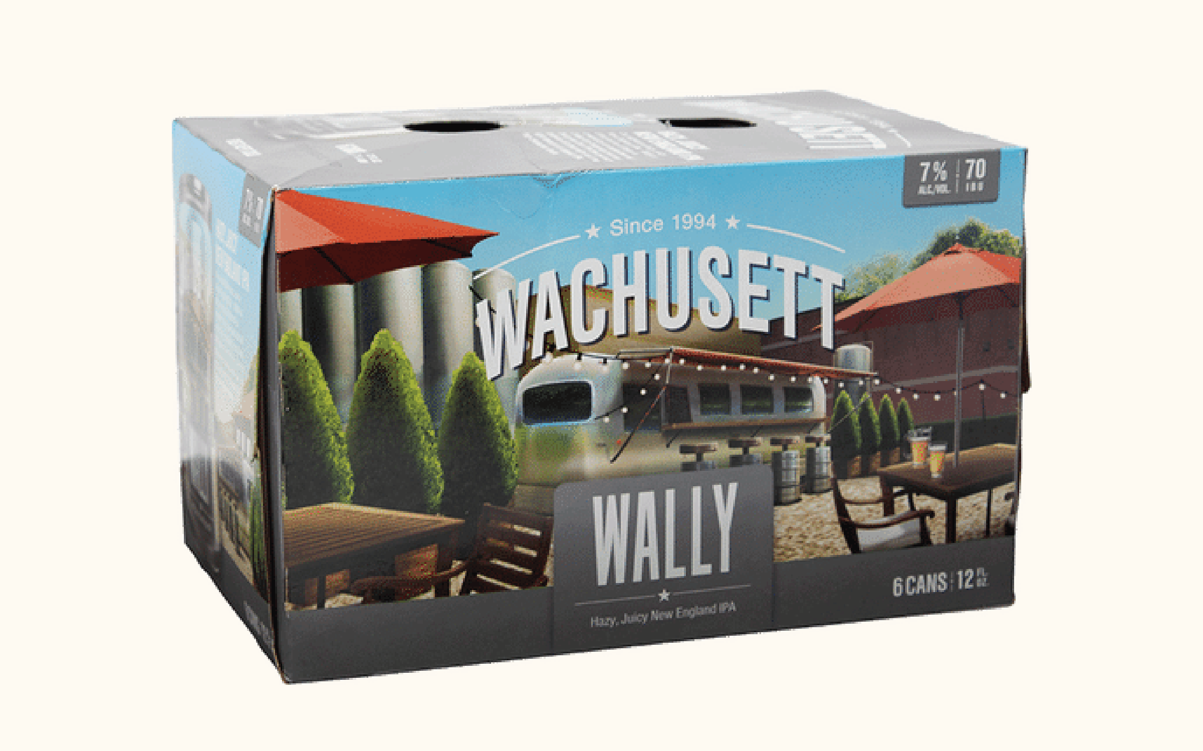
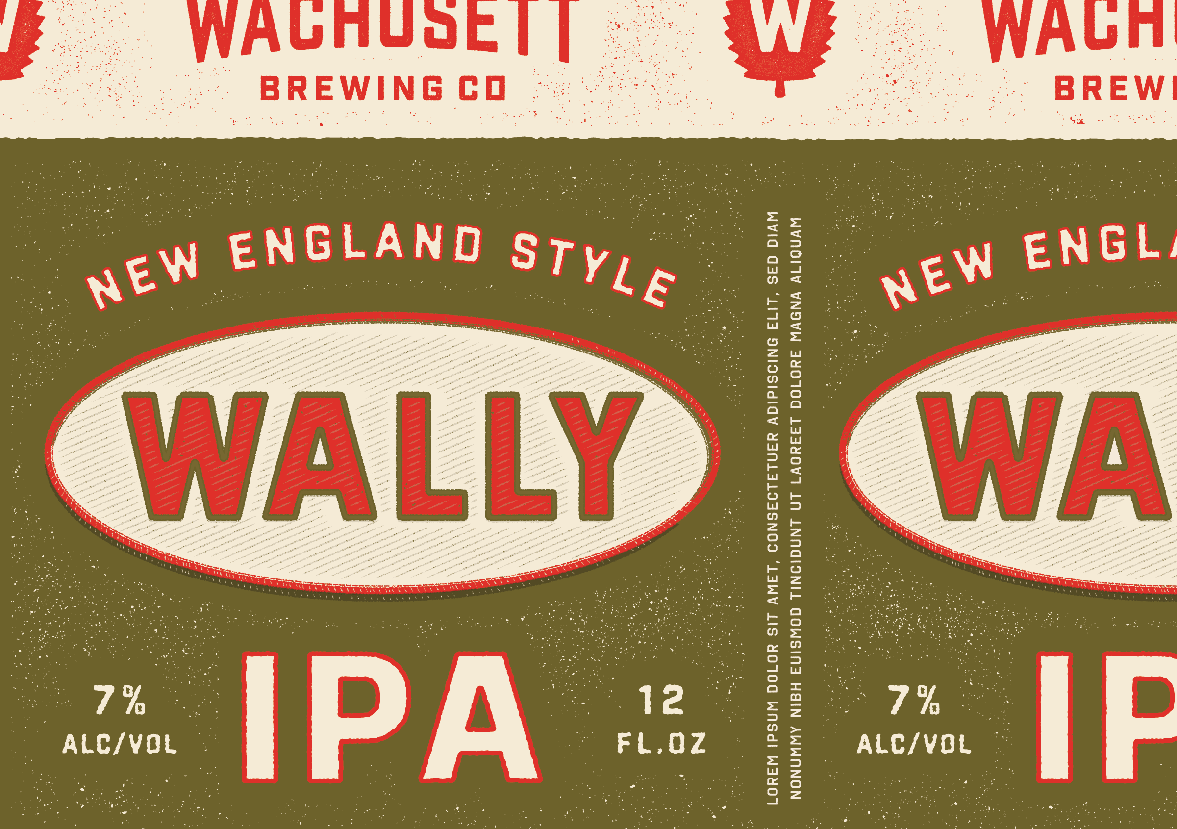
Wally (Navigating an esoteric brand name)

Wachusett’s #2 brand is a New England IPA named Wally. I would’ve mentioned this up top, but wanted to call it out specifically down here. 

(If the challenge of figuring out how to work around an esoteric brand name doesn’t apply to your brewery, skip ahead to the revisions section. If this does interest you, here are some more strategies for combatting this issue.)

Okay, Wally gets its name from the founder of the iconic Airstream Trailer, Wally Barnes. The Wachusett founders were fans of Airstreams, so they named their beer after Mr. Barnes.


What does all of this have to do with Wachusett Brewing? Or Central Massachusetts? Or live music in the sun? Or, anything at all relevant to craft microbrewed beer?

These are all great questions. 

Nothing. (The answer is nothing.)

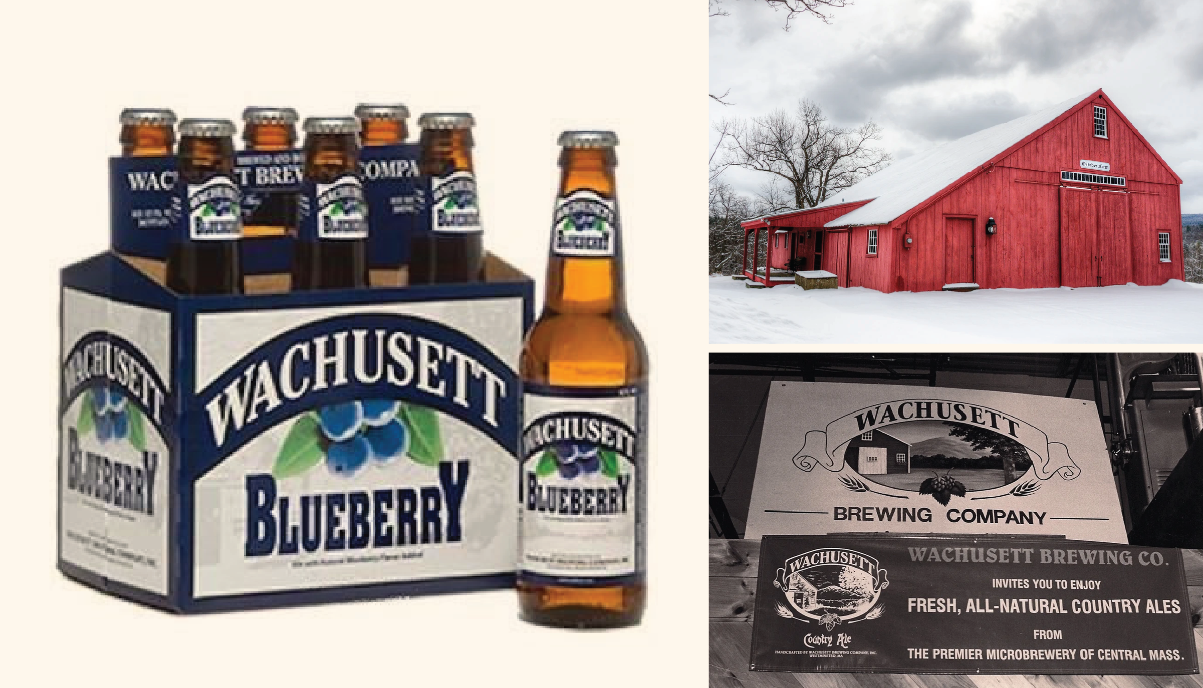
This is just an esoteric name that was floated at one point, and then stuck due to the beer itself becoming popular. (I’m sure that’s happened at your brewery a time or two over the years.)

We briefly discussed the merits of rolling their entire portfolio over to a Monolithic Branded House to follow the Wachusett Blueberry nomenclature, so Wally could become Wachusett Juicy IPA, etc. But the Finestkind team kiboshed this idea because we were already making some substantial changes. And there is equity in this name, plus a good deal of existing sales volume and maybe a good story to spin. So even though keeping this name in the mix might not be as cohesive as it could be, the risk of jettisoning it altogether was worse.

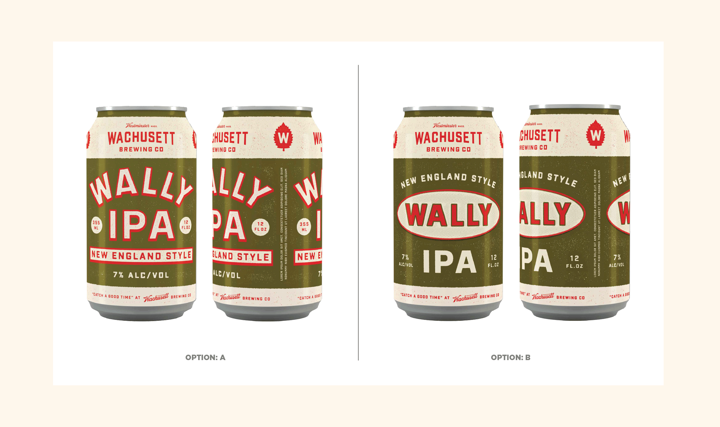
Okay, so we’ve got this name. So should we, uhh, put an Airstream on this can? Or a woodcut illustration of Wally Barnes himself? (And gird ourselves for the inevitable C&D that would come from that…)

Nah. 

Instead, the Wachusett team suggested we humanize Wally. Instead of some bygone founder, he’s a carefree regular guy who likes to get wild on the weekends. He’s your trusted local mechanic. Or that old friend who you can pick up right where you left off, no matter how much time has passed since you last spoke. 

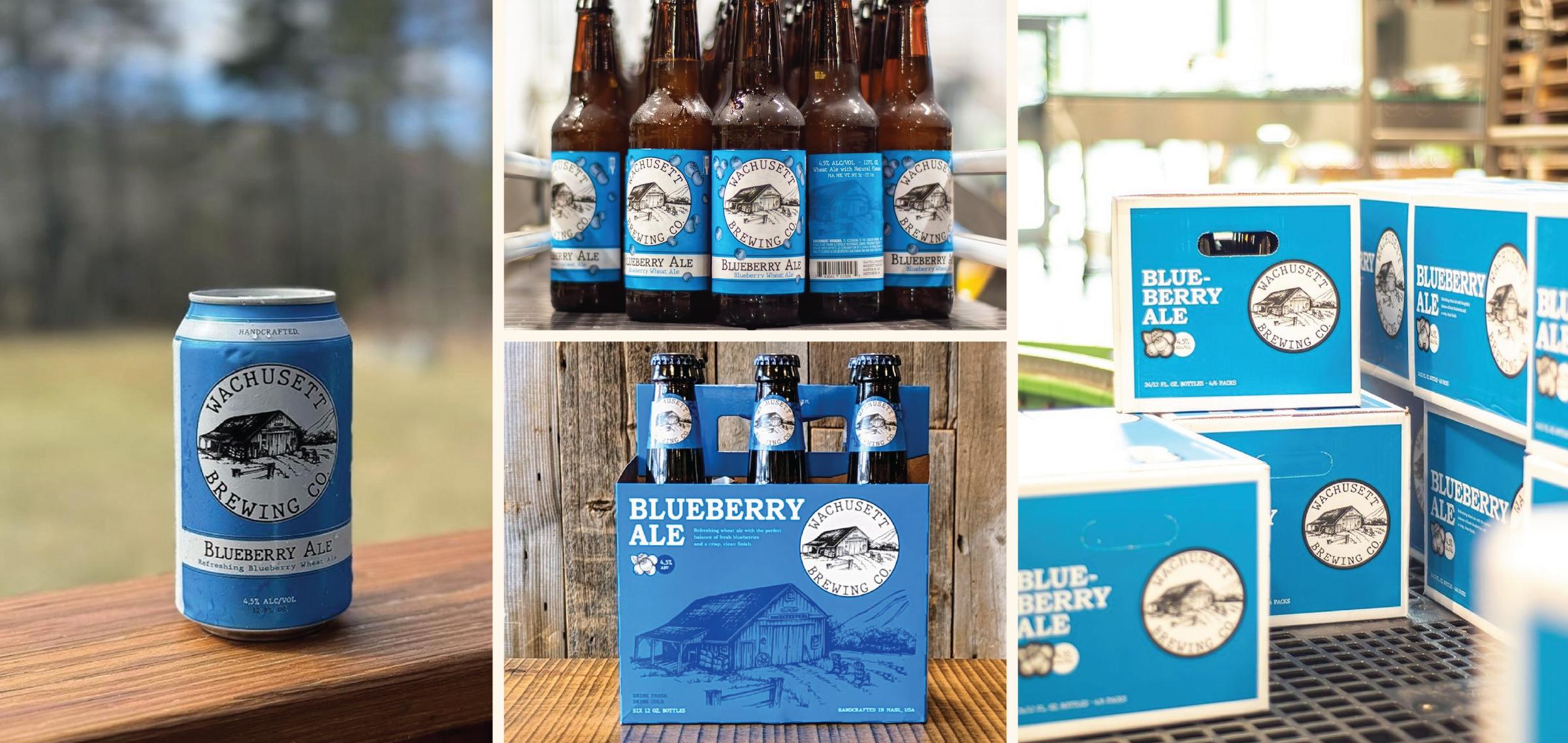
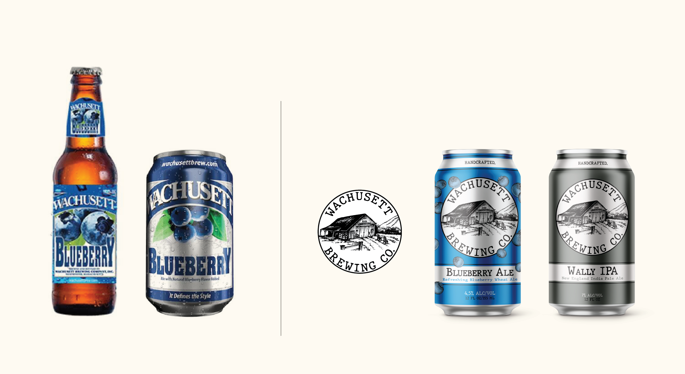
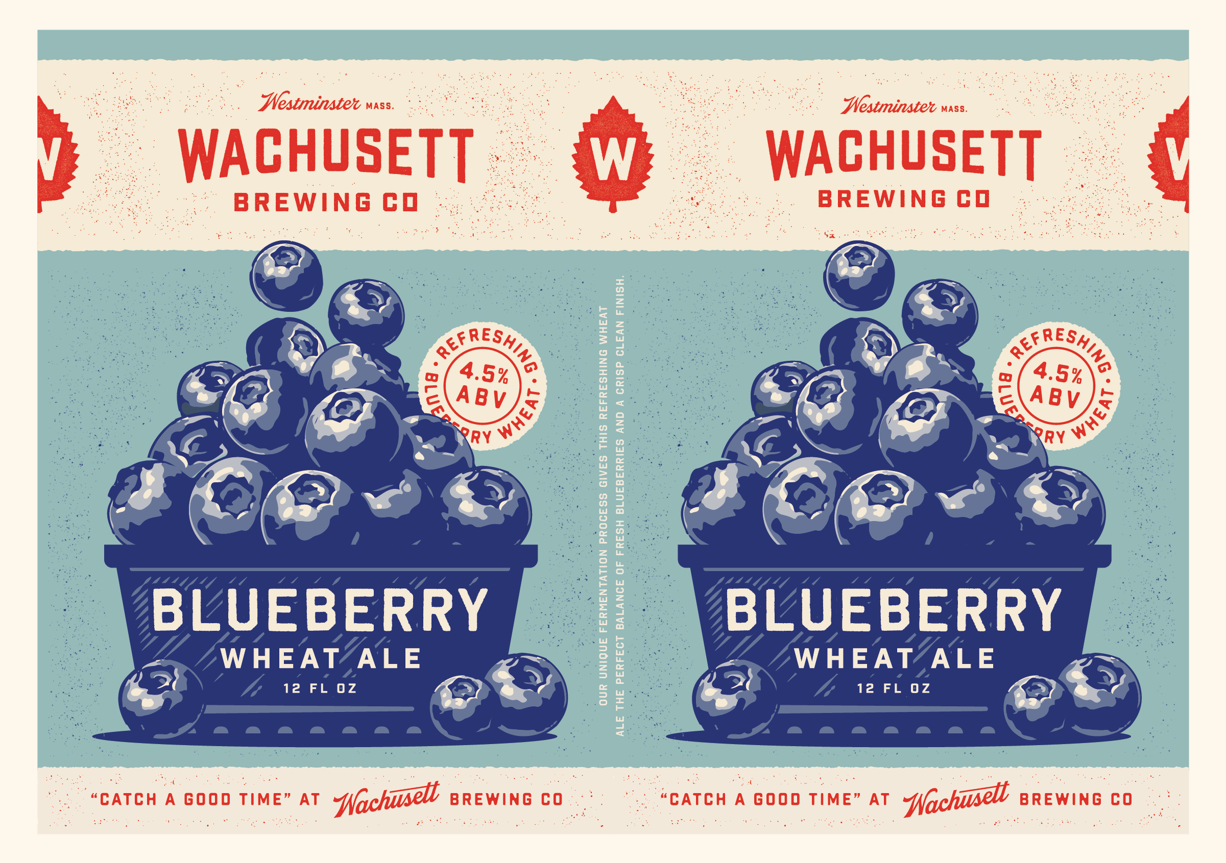
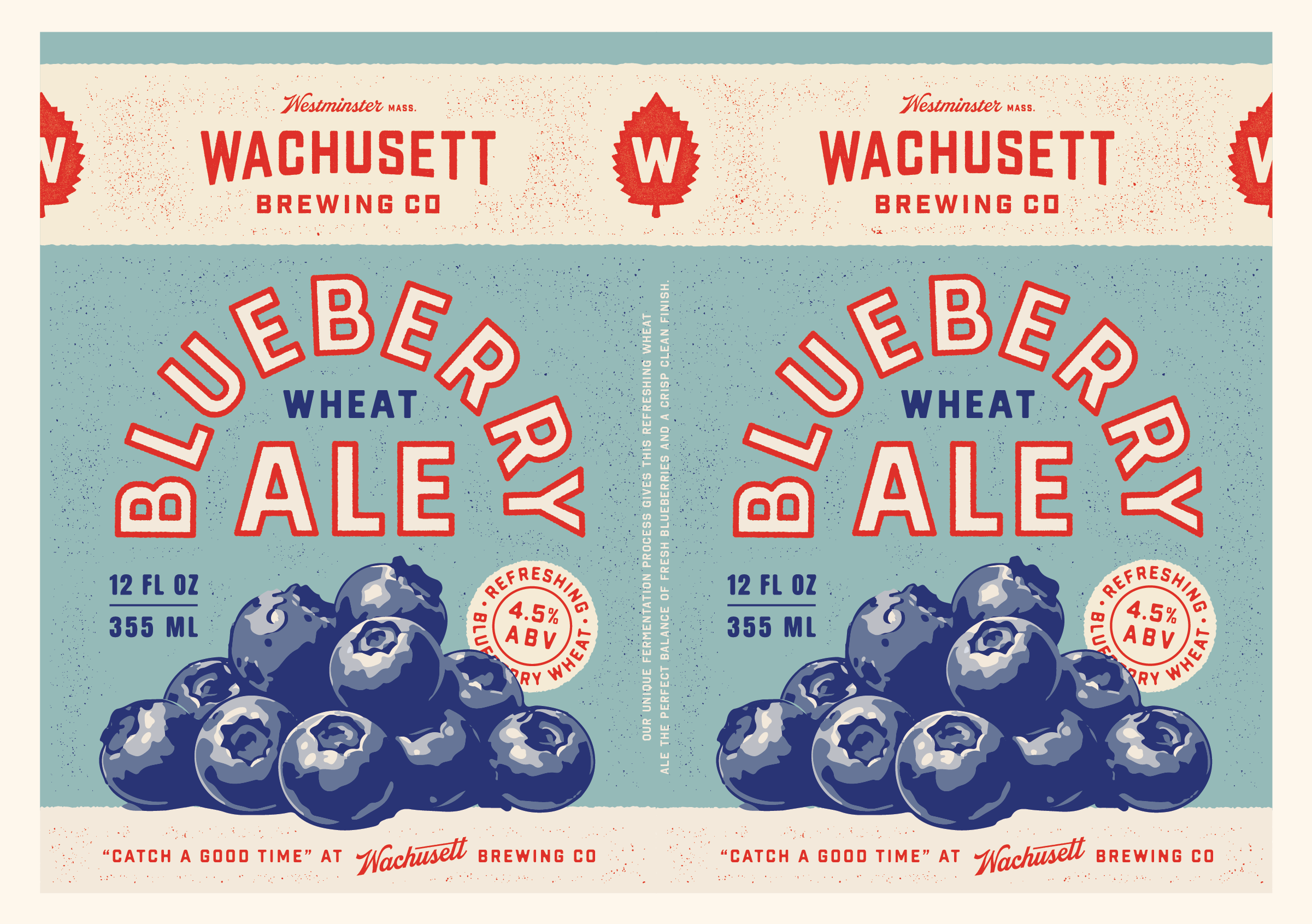
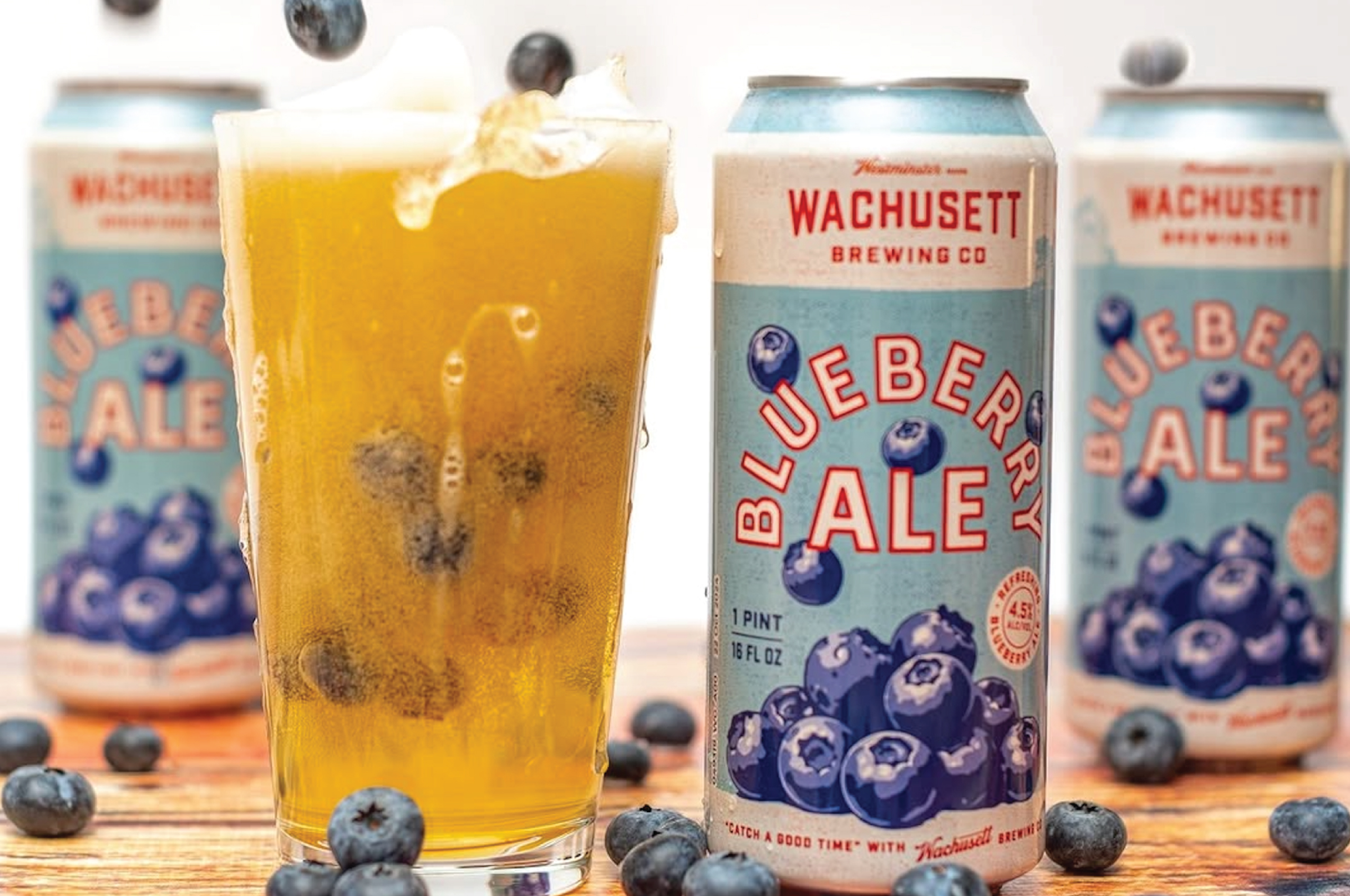
We landed on a fun name patch exploration to speak to this, and love it. It’s blue collar and approachable and friendly and it pairs well with the new Blueberry can design.

Revisions

I’ll skip right to the point here. The Finestkind team fell in love with the second direction, almost lock, stock and barrel. 

There were a few items from the first direction they wanted to see incorporated into the final identity, so our revisions mostly centered around getting all of those assets brought in line with the second direction and squared away for production.

We made our requisite million changes that no one will ever notice (kerning, subtly shifting the color palette, adjusting grit levels, etc.). And we focused on developing a few other supporting icons that highlight Wachusett’s history. 

(Again, this line, “Around here since 1994” is one of my favorite things to come out of this process.

Wrapping up

At this point in the process, we wrapped up Wachusett’s brand identity and style guide while their in-house team took our packaging concepts and continued revising internally. All of this work was completed on a super tight timeline in order to reintroduce the Wachusett brand to their distributors during ABP season. 

I’m happy to report that this new direction was resoundingly well-received internally, including amongst Wachusett old timers and during a handful of critical ABP presentations. 

That means this new look is rolling out as we speak in Massachusetts and across all of New England, and should be fully out in the market by Spring 2025. 

Here are a few snapshots of major placements that are happening behind the scenes. (It’s always fun seeing these roll in.)

Shoutout to the Barrel One sales team for grinding it out and earning tons of important new PODs during the launch period.

A few big takeaways (because this case study isn’t already long enough…) 

1. Your visual and Brand Equity are important elements of your rebrand. If you’re thinking about revamping your brewery’s identity, you need to honor where your brand has been, but only if this helps you steer the business where you want to take it. 

2. There will be a lot of Legacy beer brands on the market in the coming years. If your team is built for it, there will be some fun opportunities to build a larger portfolio with this IP. Stay tuned for a larger series exploring this idea this summer. 

3. And finally, the beer industry is facing a rapidly changing market. And we all need to work hard to ensure that we’re actively speaking to new drinkers, whether that’s lapsed fans or a newly LDA twenty-something. In either case, style names, highlighting a beer’s flavor and familiarity itself are all compelling levers you can tinker with to reach out to new folks, bring them into the fold and sell more beer.

Build a stronger brand.
Sell more beer.

Join 7,500+ other beer industry folks and sign up for CODO’s monthly Beer Branding Trends Newsletter.