Stories

How we Refreshed the Alewerks Brand

A proactive move to breathe new life into a Legacy Brewery Brand

There are hundreds, if not thousands of older breweries across the United States right now quietly having similar, pressing conversations behind the scenes. 

– How do we recruit new, younger drinkers? 

– How do we make our packaging stand out in retail?

– How can we get our distributor(s) to care about our brand again?

– How do we stand out from the dozens (or hundreds) of local options?

– What even is our story today, XX years in?

This weariness is particularly prevalent amongst older, mid-market breweries: Outfits who are ~10 to 20+ years old and making anywhere from ~5k to 15k+ bbl per year. In many cases, they’re no longer seen as cool, or romantic, or sexy.

But, perhaps most painful of all, you have a growing number of lapsed fans — folks who have moved on to drink beer from other breweries, or beyond beer products, or, less alcohol in general.

This leaves you on an island, unsure where to go from here.

We have all this history, this legacy. We have this volume, (though it’s slowly eroding). What do we do?


***

We recorded a podcast with Michael Claar, Operations Director at Alewerks. Give this a listen for more background on why their team felt now was the right time for this move.

Okay, enough editorializing.

I’m excited to walk you through our recent brand refresh work with Alewerks Brewing because they fit my rambling prologue to a tee.

Let’s look at their stats:

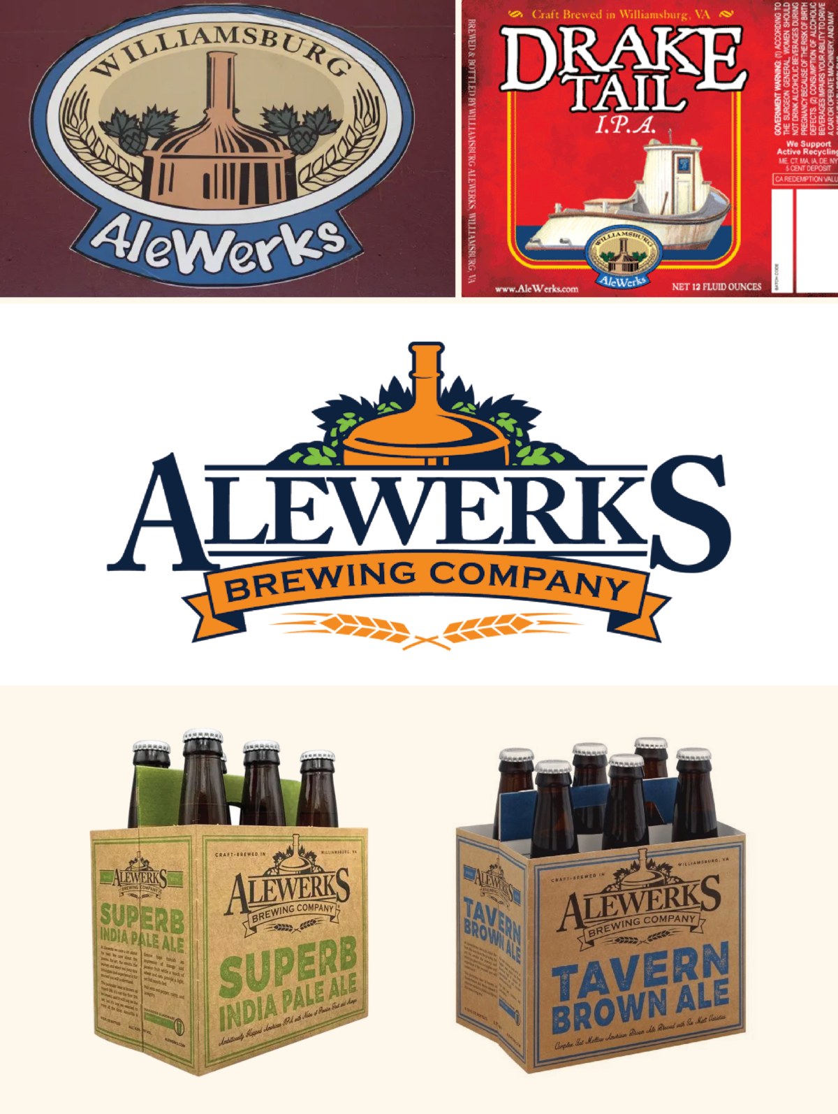
– Founded in 2006 in Williamsburg, Virginia as “Williamsburg AleWerks.”

– They’ve grown to be one of the state’s largest breweries. 

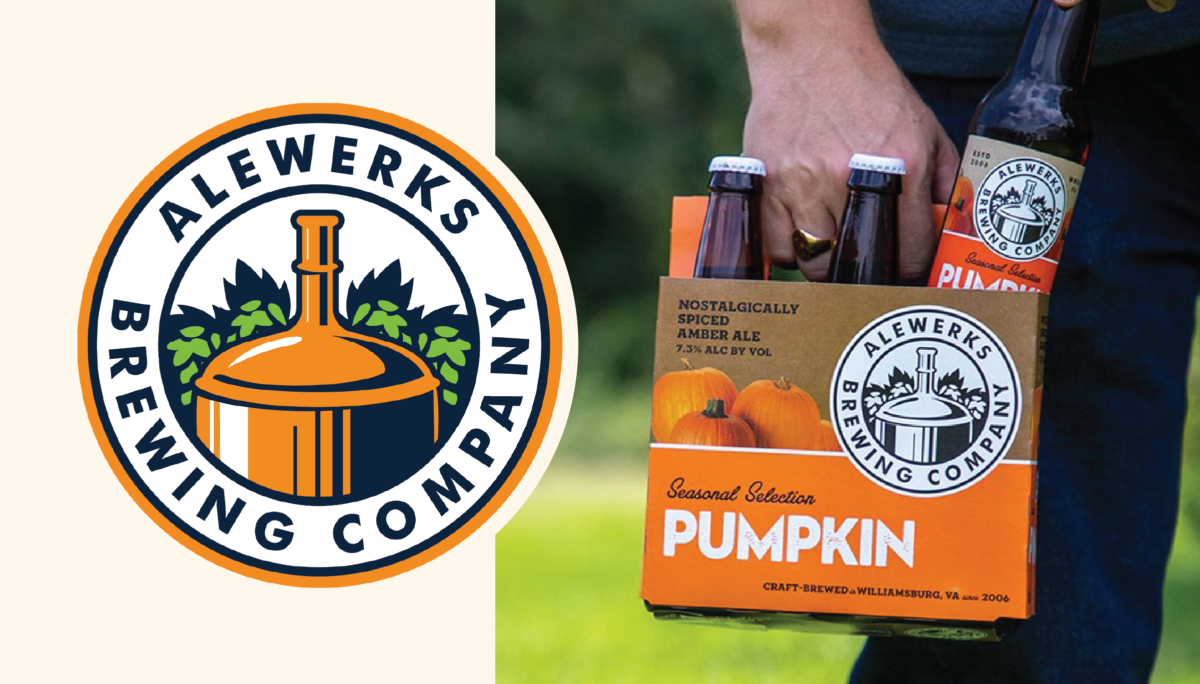
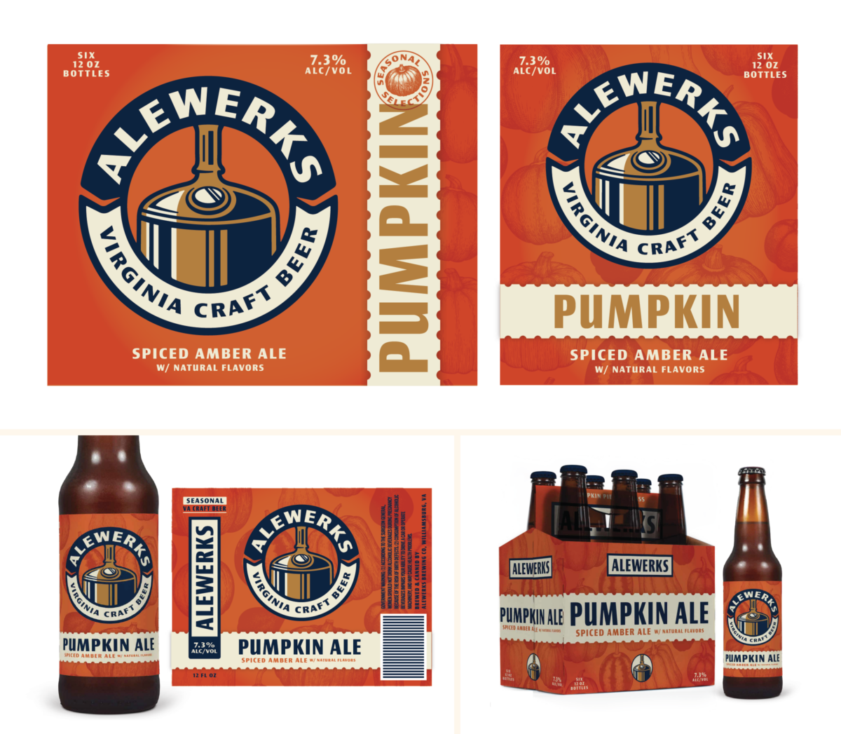
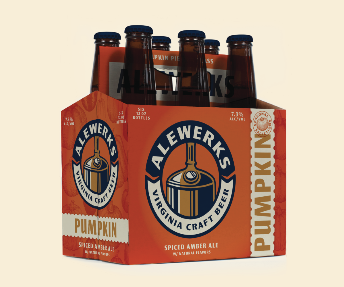
– They’re known for making phenomenal, dead reliable, classic beer styles, including their regional cult classic Pumpkin seasonal.

– They’re also a brewer’s brewery, with several previous employees going on to build wonderful careers after their Alewerks tenure.

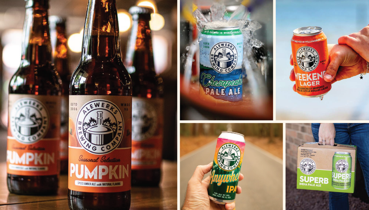
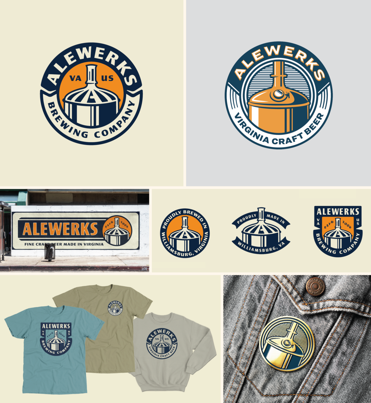
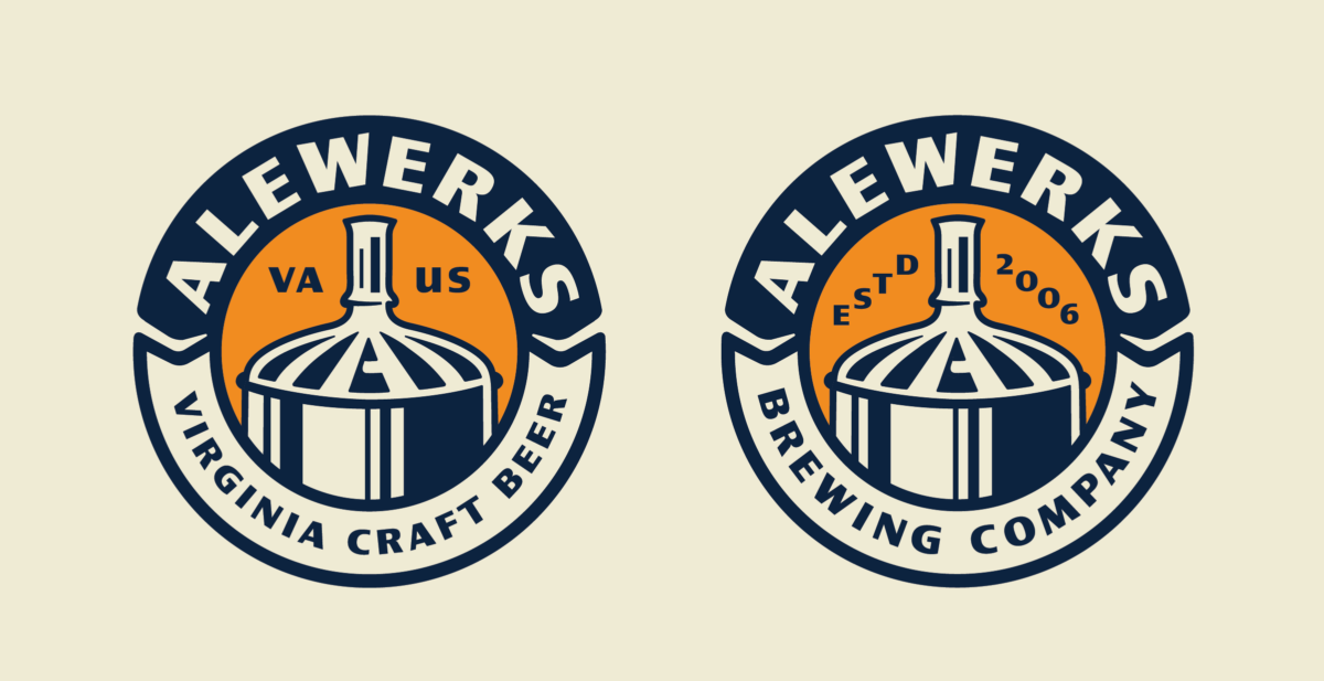
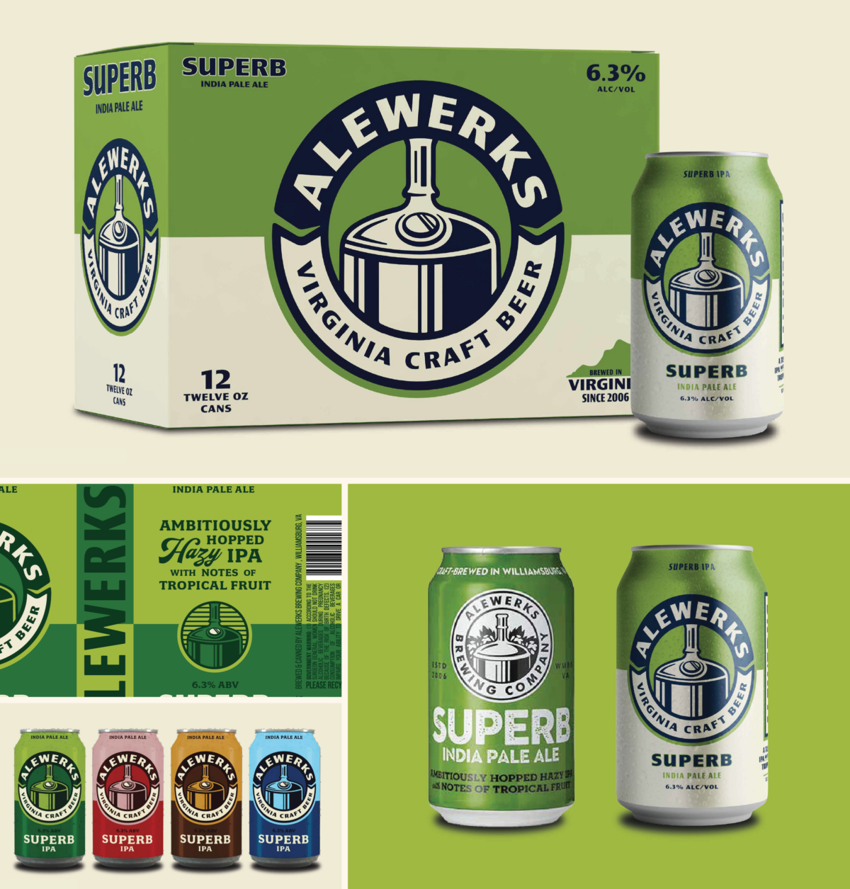
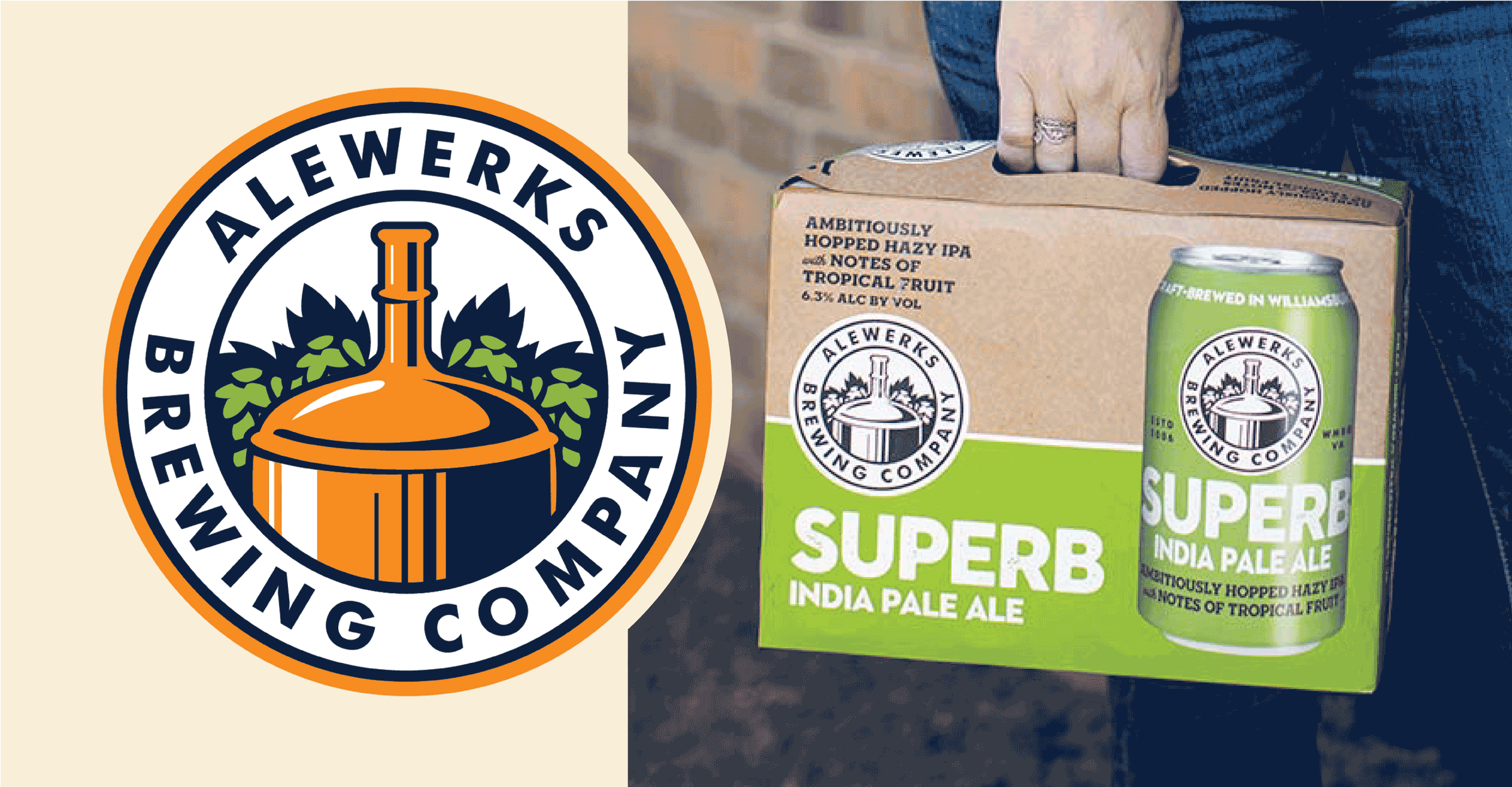
– In 2012, they changed their name to “Alewerks Brewing Co,” and have since undergone a series of smart identity and package refreshes. (See the art below for reference.)

– Their sales are flat (though holding steady at a time when many other breweries are actively losing volume).

Taken in aggregate, it’s clear that Alewerks wasn’t facing an existential crisis. They’ve got a well-rounded portfolio. They’re invested heavily in their local community. And they have a squared away team and run a solid business behind the scenes. 

Alewerks is, by any measure, a successful brewery . But they ultimately want to move beyond this plateau and get back to consistent, sustainable growth. 

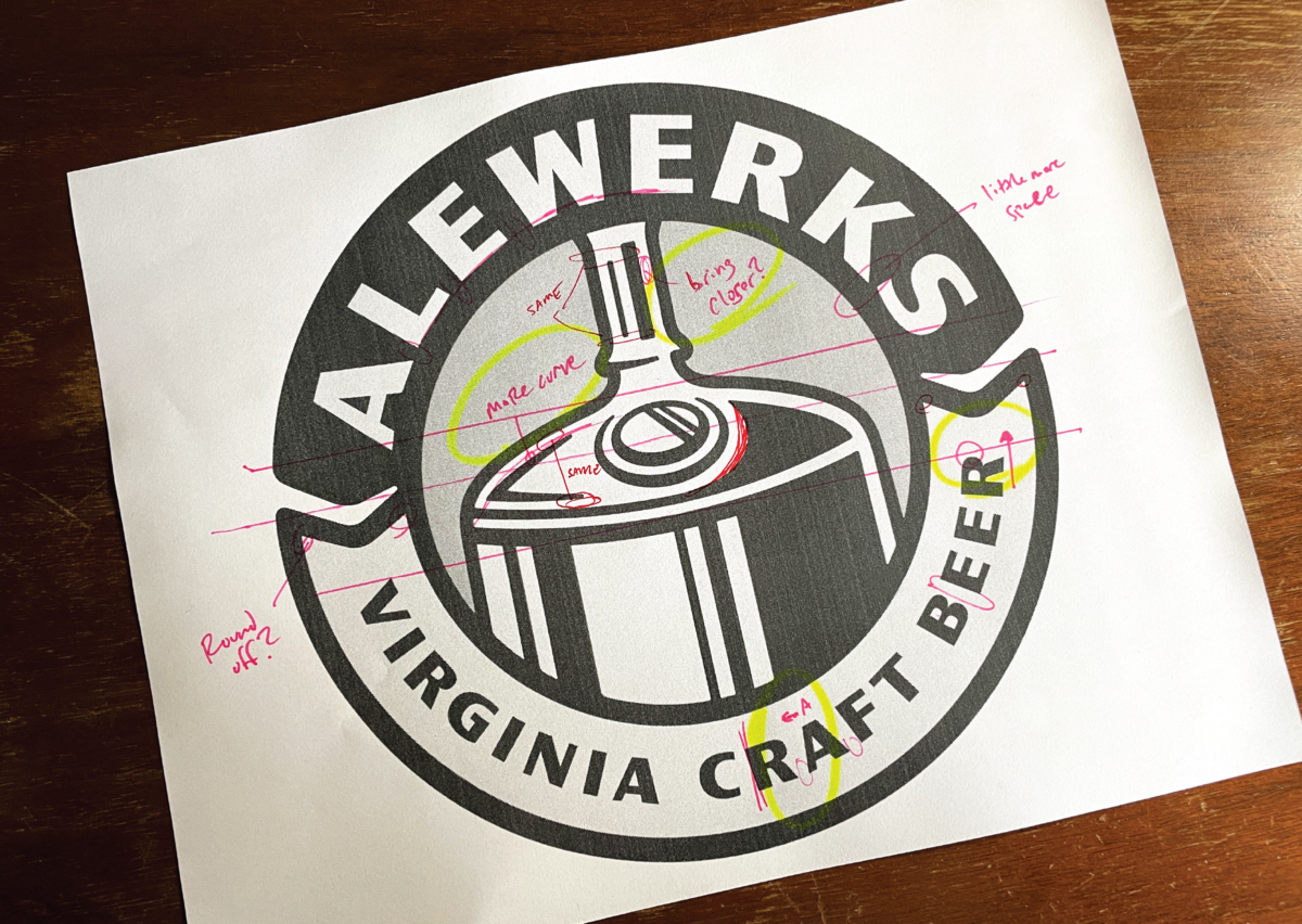
Their team determined that the first step on a long path towards that goal is a sweeping brand refresh.

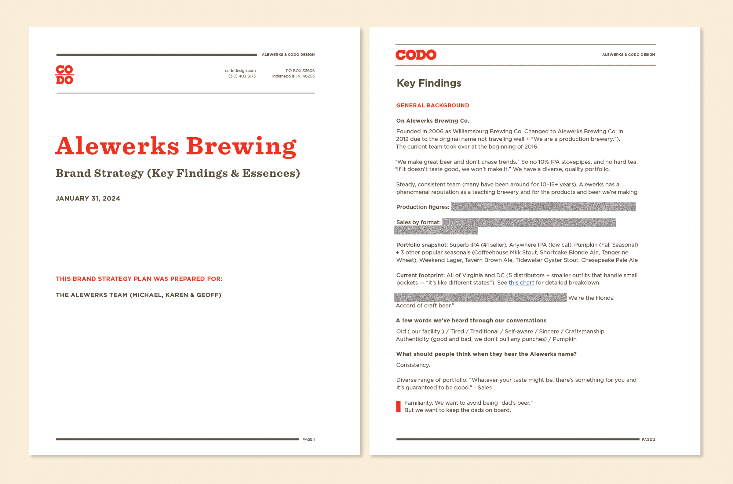
In late 2023, Alewerks reached out to CODO to discuss this revamp. And we’re going to give you a candid look behind the scenes at that entire process today. 

Alewerks’ name, brand identity and package design evolution through the years.

Let’s start by looking at some highlights from our Brand Strategy work.

Alewerks’ biggest pain points & opportunities 

We’ve already outlined a few of Alewerks’ problems above. Here are a few quotes pulled directly from our Strategy doc:

– “Alewerks has a solid rep throughout our market. But we also have a rep for being around for a long time. We’ve seen others like us not evolve. And we’ve passed them by. So we have to evolve. We have to give people something new — a different way of thinking about us.”

– “This is a proactive move to reinvigorate Alewerks’ brand before we start sliding. Prioritizing this rebrand as a capital investment (vs. adding sales staff, upgrading equipment, chasing niche consumers with nano-trend releases, etc.) demonstrates our commitment to playing the long game.”

– “It’s time. [Plus,] we’ve seen the power of this sort of move in the past.”

– “Our brand has become tired.”

– “People assume we’re smaller than we are, but we’ve been a top 10 Virginia brewery for years.”

— 

In addition to these issues, the Alewerks name itself is a challenge. First, there are umpteen number of XYZ Aleworks breweries out there, including a few in Virginia. But beyond that, their purposely misspelled name is (wouldn’t ya know) often misspelled out in the wild (e.g. capitalized ‘W,’ split into two words, or using an ‘O’ instead of ‘E’). 

But a bigger issue is that their name, translated literally, means “Brewing Company Brewing Company.” We made a bold recommendation to address this in our Brand Strategy doc, but I’ll save that for the design presentation section below. 

Evolution vs. Revolution ( Is this a rebrand or refresh? )

Figuring out whether a revamp is a refresh or a formal rebrand can be kind of a semantic exercise. Some people use the terms interchangeably, and indeed, there’s a lot of overlap between the two processes (weighing and evolving equity, etc.). 

That being said, we do like to clearly lay out how we’re thinking about the project as an opportunity to hear what our clients think and gut check everything. This is a great opportunity to hash out any remaining thoughts, concerns, or opportunities before moving onto the identity design process. 

Here are a few lines pulled directly from our strategic recommendations:

We recommend a clear evolution of your current logo, centered around the kettle. We will explore interesting ways to turn this into a badge that can be pulled out as a standalone icon. 

Beyond that, we will explore different typography and core colors (currently navy and gold) throughout your packaging. While this combo looks good in a vacuum (website, etc.), these colors seem too staid. Punchier alternatives will give a better shelf presence & presentation. 

TLDR: There was just too much equity — nearly 20 year’s worth — in their core logo to jettison it. 

Alewerks’ most recent (pre-refresh) package design system.

Brand Essences & Mood Boards 

After organizing our findings, Strategy and recommendations, we next had to art direct all of these ideas. Three recurring, compelling themes (Brand Essences) came up through the course of our due diligence.  

The first, “Beer Ex Machina,” was an ode to Alewerks’ behind the scenes production rigor and SOPs. 

The second, “Craft University,” was a nod to Alewerks’ focus on traditional styles as a foil to late stage craft beer where styles (and sometimes decorum?) don’t really matter. This direction focuses heavily on customer education as a way to bring craft back down to where the Alewerks team believes it should be: Well-made, reliable, approachable beer.

The final Essence, “Cream of the Keg,” is a to-the-point way of highlighting Alewerks’ never ending focus on quality. This includes lots of fun visual premium indexes like seals, ribbons and gold and copper highlights. 

After a few great conversations and giving their team time to sit with this, we ended up moving forward with the “Craft University” idea.

Their final brand voice included attributes like: Authoritative, Established, Idealistic, Experienced, Sincere. Proud not arrogant. Confident, not cocky.

This is a subtle change from what we originally presented, but ultimately perfectly appropriate for their team and brand. 

At this point, our Brand Strategy work is wrapped and we get to roll up our sleeves and begin sketching on their brand identity.

Initial Branding Presentation

We developed two initial directions to share with the Alewerks team. Here are a few notes on this presentation.  

1. Direction 1 was a lovely update to their current mark. Warm, with subtle rounded corners and attractive, familiar colors. Direction 2 featured a more stylized, retro look — like a brewery identity from the mid-2000’s, but reimagined in a cool way. 

2. We added differing levels of detail to the brew kettle in each direction in a bid to make it not look like a 5 gallon water jug. The first direction featured a hidden ‘A’ in the kettle highlights whereas the second direction grounded the illustration with a viewing port (to help new people understand what they’re actually looking at). 

3. I mentioned above that we made a recommendation on how to handle the “Brewing Company Brewing Company” issue. Let’s talk about that now. 

We recommended that Alewerks colloquially go by that single word alone. So, drop the “Brewing Co.” qualifier from their name and identity wherever possible. 

In its place, they should use “Virginia Craft Beer” in a bid to proudly claim where they’re from, who they serve and position Alewerks as one of the state’s foremost breweries. 

To our surprise, the Alewerks team loved this recommendation. But again, their team was looking to make some decisive moves through this process, so good on them for being open to a bold change like this.

Build a stronger brand.
Sell more beer.

Join 7,500+ other beer industry folks and sign up for CODO’s monthly Beer Branding Trends Newsletter.

Note the subtle shift from the “Brewing Company” tag to “Virginia Craft Beer” along the bottom of their core mark.

This eliminated the “Brewing Company Brewing Company” issue while being more vocal and ardent about Alewerks’ positioning as a leading Virginia brewery. 

Let’s fast forward a bit here.

Alewerks loved the first direction, almost lock, stock and barrel. (Chef’s kiss emoji.)

The only real feedback was to lose the hidden ‘A’ and bring the port over from the second direction. 

From there, we made (approximately) a million changes to get this up to CODO’s standard. Things that no one other than our team will notice like tweaking how the kettle nests in the badge, “melting” the typography, adding some line and texture details (originally from the second direction) and building out the rest of their Modular Brand Identity System.

Once we wrapped their identity, we rolled right onto packaging.

A snapshot of Alewerks’ Modular Brand Identity System.

Packaging Presentation

Earlier in our Brand Strategy work, we determined that building a monolithic Branded House would work best long term. Alewerks was already working under this system for their flagships, so the continuity would be good. But beyond that, everything they brew is true-to-style, so flying all their products under a singular banner will help to build overarching Brand Equity. 

So when we got to tackle their packaging, we felt that a classic, bifurcated look would let their newly-refined logo shine while standing out from the rest of their competitive set and carrying though enough equity from their previous iteration. 

We explored different ways of handling their tasting notes: Straight and to the point (like their team), and another option with a little more swagger and personality.

And we worked to ensure the beer name and style itself came through clearly, particularly on the 12pk cases, for better merchandising.

Revisions were straightforward and mostly focused on dialing in colors and getting everything consistent across their various formats (including 12oz and 16oz cans, 4-pk, 6-pk and 12-pk boxes, 12oz bottles and 6-pk carriers).

Pumpkin Ale ( & remaining seasonals )

We’ve covered a lot of ground here, but before we close, I’d like to talk about Alewerks’ Pumpkin seasonal. This is one of their most important brands, and it was crucial to get this packaging right. 

This was an interesting challenge from a portfolio standpoint. It needed to clearly look like an Alewerks brand (so follow their newly-refreshed look and feel and live under their Branded House), while at the same time, stand apart as being more premium and limited. 

Here are a few ways we accomplished this:

– We brought in tasteful, etched illustrations to highlight the particular adjunct.

– We added a subtle scalloped edge (more familiar in spirits packaging) along the name and style strip to set this off from the background in a lovely way.

– We added a subtle vignette around each carrier panel for more tonal depth.

– We developed a fun seasonal badge to serve as a violator and draw more attention on the shelf.

– And finally, we used metallic gold foil in a few select spots on the pack. (Again, chef’s kiss emoji.)

Once the Pumpkin Ale packaging was squared away, we were able to knock out the remaining seasonals in short order.

(Follow us over on Instagram. We’ll share these there as they debut throughout 2025.)

We wrapped this project up by building a simple set of Brand Guidelines.

Let’s bring this home

Alewerks’ new look will hit the market starting early 2025 and should be out in full force by Spring. 

In an era where legacy breweries are grappling with shifting consumer tastes and fierce competition, Alewerks stands as a prime example of how to adapt and thrive. By investing in a comprehensive brand refresh, Alewerks is taking bold steps to revitalize its image and reconnect with longtime fans, lapsed customers and new drinkers alike. 

This willingness to evolve — from refining their identity and packaging to positioning their brewery as a stalwart of Virginia craft beer — demonstrates that established breweries can reinvent themselves without losing their core identity. 

As their new look hits shelves in 2025, Alewerks is sending a clear message: Established doesn’t mean outdated. In an industry that often chases the new and novel, they’re doubling down on quality beer, consistent service and smart branding. 

And I bet this pays off. 

If you’d like to breathe new life into your brewery’s brand, drop me a line. We (CODO) would love to help you with that.

Build a stronger brand.
Sell more beer.

Join 7,500+ other beer industry folks and sign up for CODO’s monthly Beer Branding Trends Newsletter.