Stories

How we built the Jest Hard Tea Brand

How Big Ditch Brewing built a modern hard tea brand designed to scale

Big Ditch Brewing is one of the largest breweries in New York. Based in Buffalo, they’ve been open since 2014 and on a tear ever since on the back of their popular Hayburner IPA. 

In late 2025, their team reached out to CODO to discuss how they could bring a new hard tea brand to market — a differentiated one with a clear POV.

We’re going to walk you through this entire process today, including:

Determining the product’s overall positioning

Brand Architecture decisions 

Go-to-market planning & trade messaging 

Name development 

Identity & package design

Balancing claims (on primary & secondary packaging)

We’ll go deeper on a few of these along the way, as they’re particularly instructive for any brewery looking to launch a new brand, beer or beyond, today. 

Lots to cover. Let’s get to it. 


***


We recorded a podcast with Big Ditch founder, Matt Kahn. Give it a listen for more background context on this new brand.

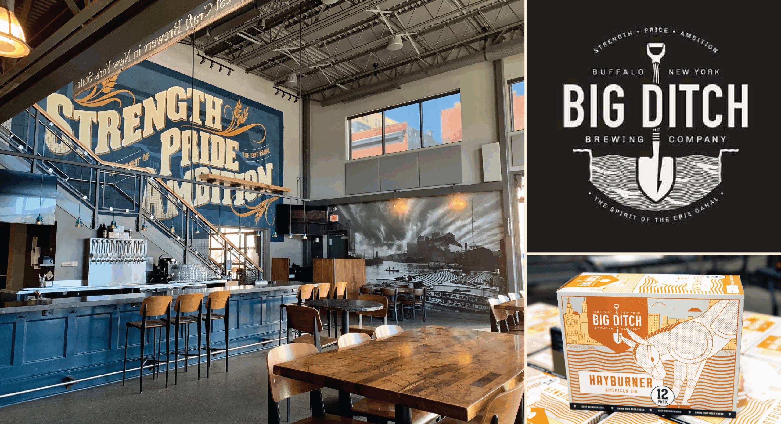
Big Ditch Brewing in Buffalo, NY.

Project background


Big Ditch has been trialing hard tea in their taprooms for the last year and has seen great traction. They have a handful of product specs and claims that create a clear POV and set their brand apart from a sea of nearly identical offerings:

Brewed with real tea (black, white, hibiscus and green) and unexpected fruit combinations — not a copy-and-paste product

Non-carbonated — critical for the target audience and drinking occasion

Vodka-based, not an FMB

A flavor system that felt clean and modern, not syrupy or novelty-driven

Low sugar and calories

A short, readable ingredient panel with minimal “chemistry” showing up on label

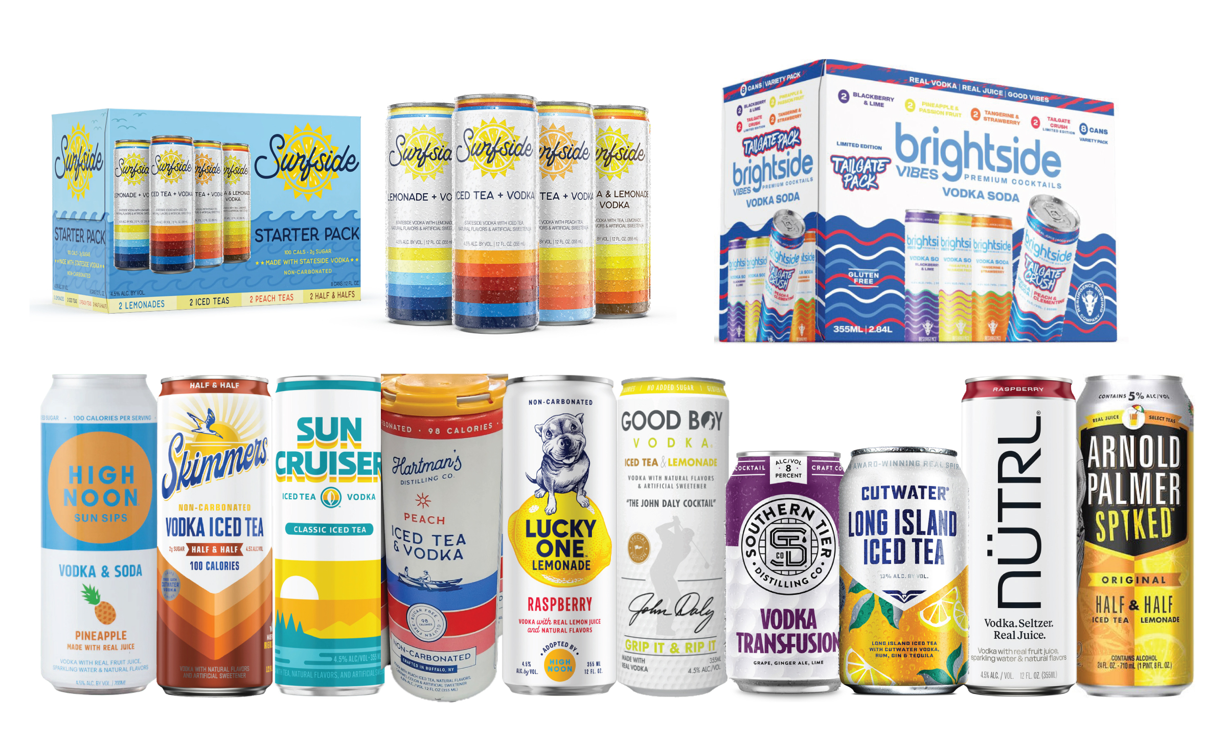
Just as important, they didn’t want packaging that blended into the category. At shelf, hard tea is dominated by white cans, color stripes and predictable visual formulas. Big Ditch wanted something that felt contemporary, confident and unmistakably different at a glance.

Brand Strategy 


Positioning & Brand Architecture (to Buffalo, or not to Buffalo)

One of the first — and most consequential — questions we needed to answer was whether this hard tea should be:

A Big Ditch product (living as Sub or Endorsed Brand), or

A completely new, standalone brand

Closely tied to that was another question: Should the brand lean into Buffalo, or be positioned more broadly for growth across markets and channels?

We pressure-tested both paths. 

Leading with Big Ditch would provide instant credibility, but it would also constrain how far the brand could travel — both geographically and across future formats. Not to mention the possibility of muddying their messaging while reaching out to a different audience than they’ve traditionally courted. 

Our recommendation was two fold: 

Build a standalone master brand, with a subtle Big Ditch Endorsement. This is important for trade messaging (e.g. getting your distributor’s buy-in to push the product as well as giving buyers a trusted signal from a popular local brand to drive initial trial.

Paired with a subtle Big Ditch endorsement, this positioning gave the brand the best of both worlds: Hometown trust at launch, and the flexibility to grow without needing to rebrand or walk back its origins later.

In short: build from Buffalo — but don’t get stuck there.

Brand Strategy, Architecture and strategic recommendations. Looking through a 15 page PDF isn’t super riveting, but if you don’t start here, you’re just throwing shit at a wall later on in the design process. This phase allows our teams to clearly define the overall positioning and spot other opportunities out in the market.

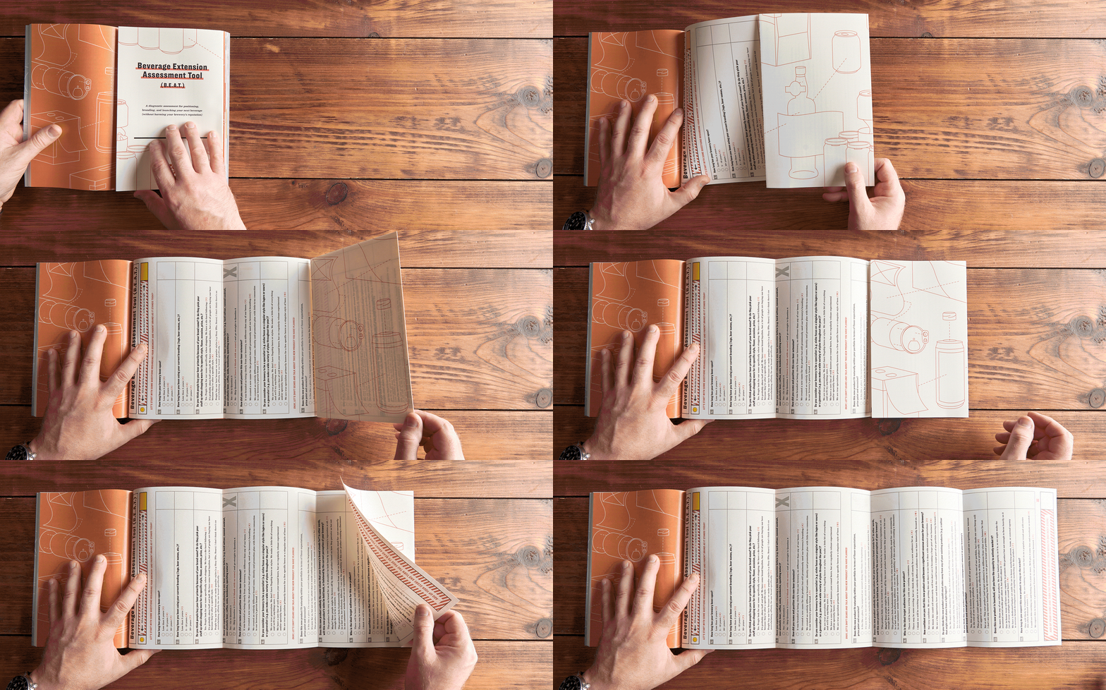
Check out the Beverage Extension Assessment Tool (B.E.A.T.) from The Beyond Beer Handbook for a purpose-built diagnostic tool to help you position, name and brand your next brand.

Naming

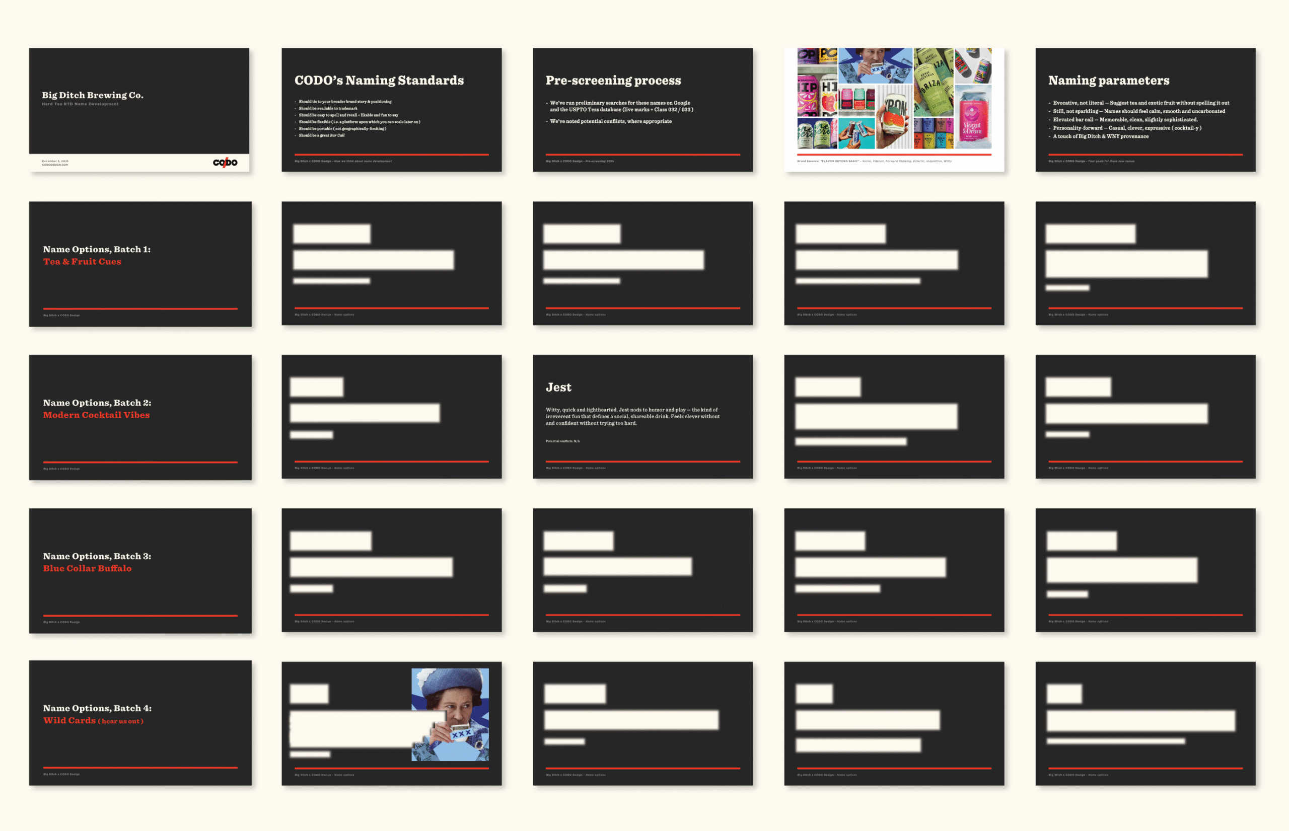
We explored several name buckets, including options rooted in blue-collar Buffalo, more cocktail-y territory, names tied to tea culture itself plus a handful of fun wildcards. 

After two full rounds of exploration, we arrived at Jest (Hard Tea). 

Jest doesn’t describe the product. It sets the tone. The name feels social, energetic and flexible — something that happens between people — which makes it well-suited for a brand designed to live across occasions and formats without semantic strain.

Brand Essences

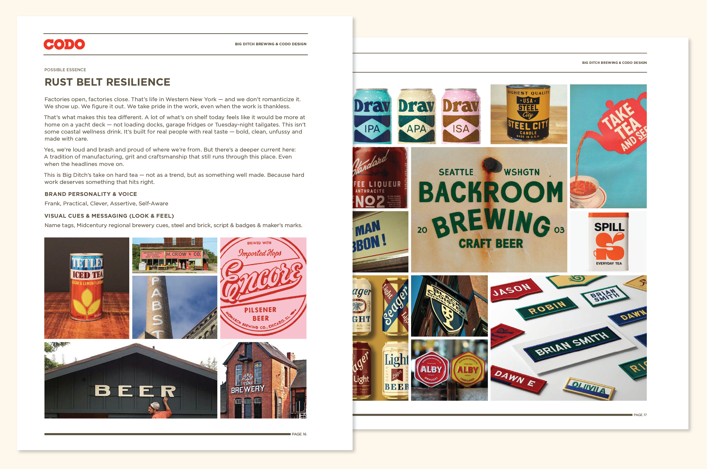
We explored three distinct Brand Essence directions to help the team pressure-test what this brand could be — and just as importantly, what it shouldn’t be.

Rust Belt Resilience: The first leaned into regional pride and resilience, drawing from Western New York’s industrial roots and work-first ethos. It framed hard tea through a sense of place, grit, and craftsmanship — familiar territory for Big Ditch, but applied to a new category.

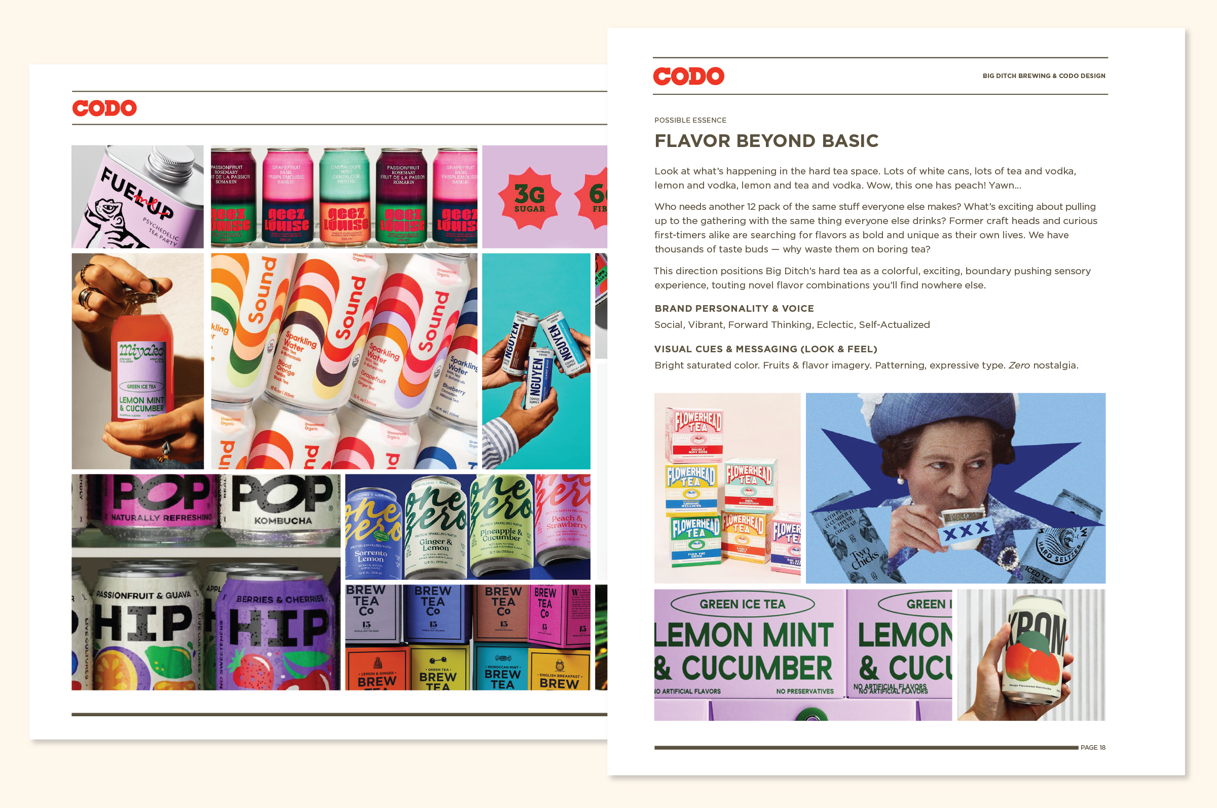
Flavor Beyond Basic: The second pushed in the opposite direction, reacting against the sea of interchangeable lemon-and-tea offerings dominating the category. This direction focused on flavor beyond the basics — bolder combinations, brighter color, and a more expressive, energetic posture designed to stand out in a crowded set.

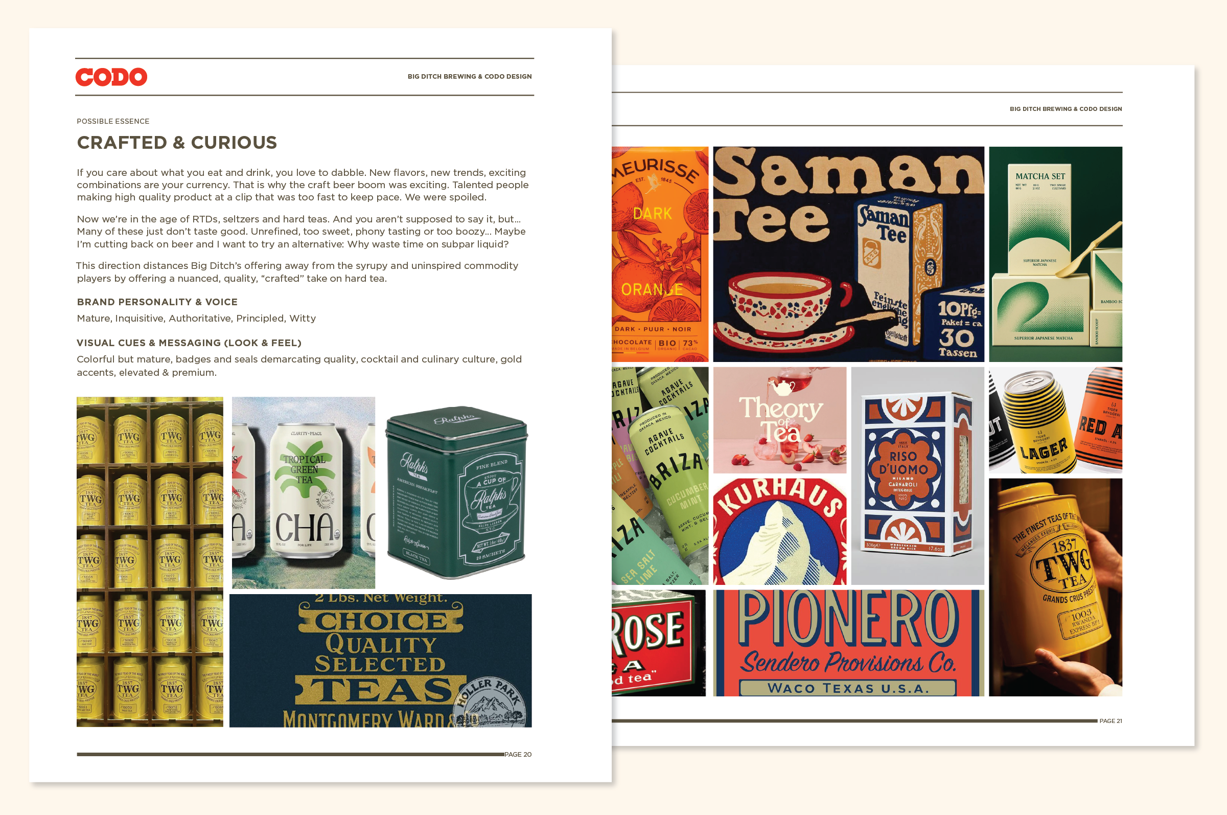
Crafted & Curious: The third centered on exploration and elevated taste, positioning the brand around curiosity, nuance, and more upscale flavor pairings. It leaned into a craft mindset without nostalgia, appealing to drinkers who care deeply about quality and intentionality.

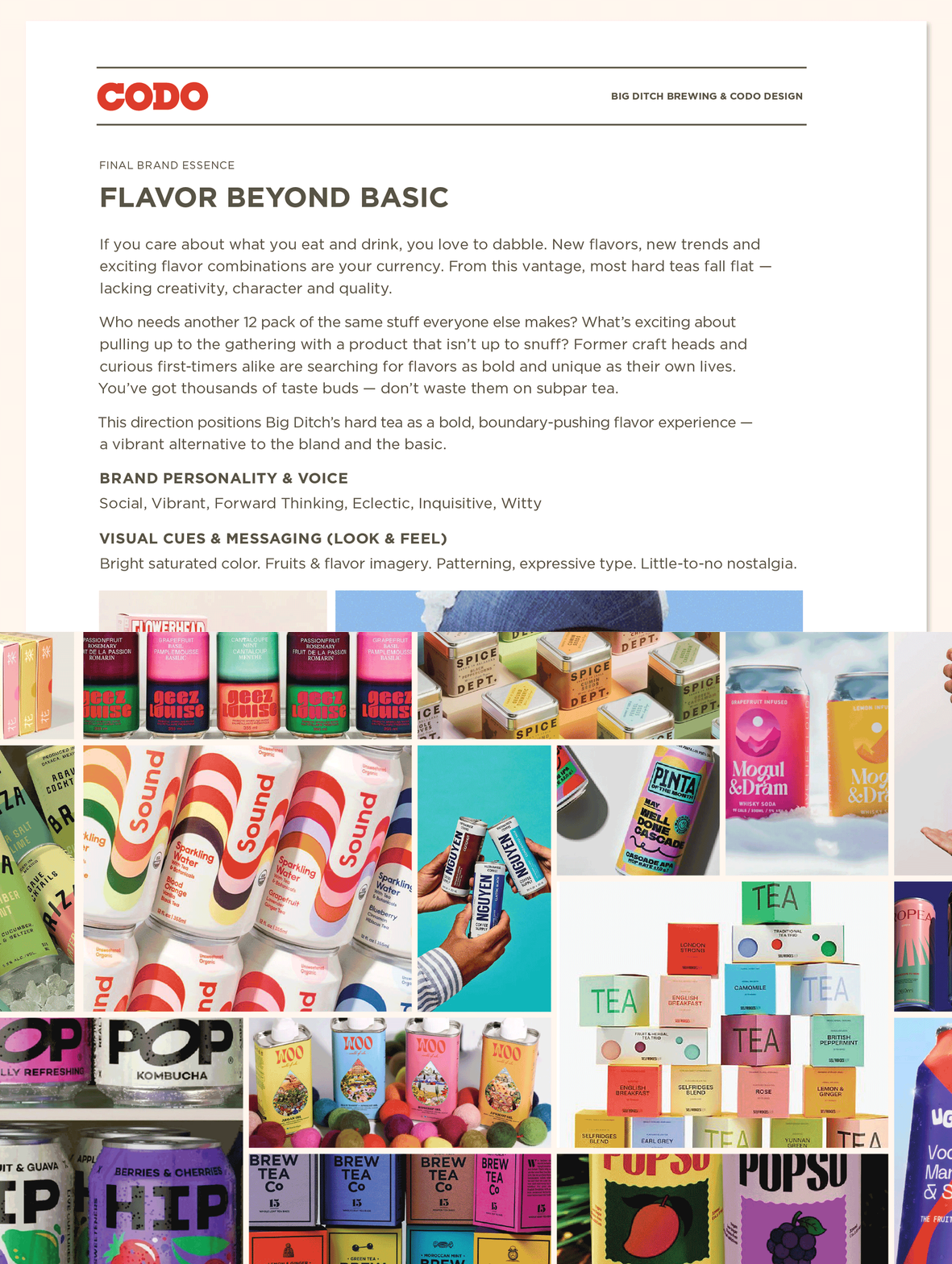
After exploring three options, one clear winner emerged: Flavor Beyond Basic.

This direction captured exactly what Big Ditch wanted to build — a hard tea defined by bold, expressive flavor in a category dominated by safe, interchangeable options. Rather than leaning on place or nostalgia, it positioned taste as the point of difference, appealing to curious drinkers who care about quality and aren’t interested in settling.

Just as important, this direction created intentional distance from Big Ditch’s existing identity. It gave the brand permission to feel brighter, more social and more forward-looking, with a visual language built around saturated color, expressive type and little-to-no nostalgia — all designed to stand out on shelf.

Additional positioning decisions worth calling out


Jest Hard Tea vs. Iced Tea + Vodka 

As we moved toward launch, one important category question surfaced: how should this product be named on shelf? 

Much of the competitive set leans on some variation of “Iced Tea + Vodka,” and the Big Ditch team wanted to pressure-test whether that framing was the right move here.

Our recommendation was to lead with Jest Hard Tea at launch.

While “Hard” has roots in FMBs, consumer usage has evolved. Today, “Hard Tea” functions as clear category shorthand — regardless of base. It’s how people shop, talk and search.

Just as important, Jest Hard Tea sounds natural and colloquial. “Jest Vodka Tea” may be technically precise, but it adds friction and isn’t as punchy.

Related reading: The evolving role of style names in brand positioning


Tagline Exploration 

We explored a variety of different taglines through this process and arrived at a handful that we think can work. To be clear, this decision isn’t settled, and from a process standpoint, we usually give our partners a handful to use over the brand rollout process. 

At this stage, the goal wasn’t to crown a forever tagline — it was to give the brand multiple on-ramps for real-world testing.

Why? Because one might stick, and another might end up being confusing. 

Giving your team options allows you to A/B test in realtime what messaging works in various channels and adjust as needed. 

We’ll explore this entire process in an upcoming BBT issue. 

For now, here are the three we landed on: 

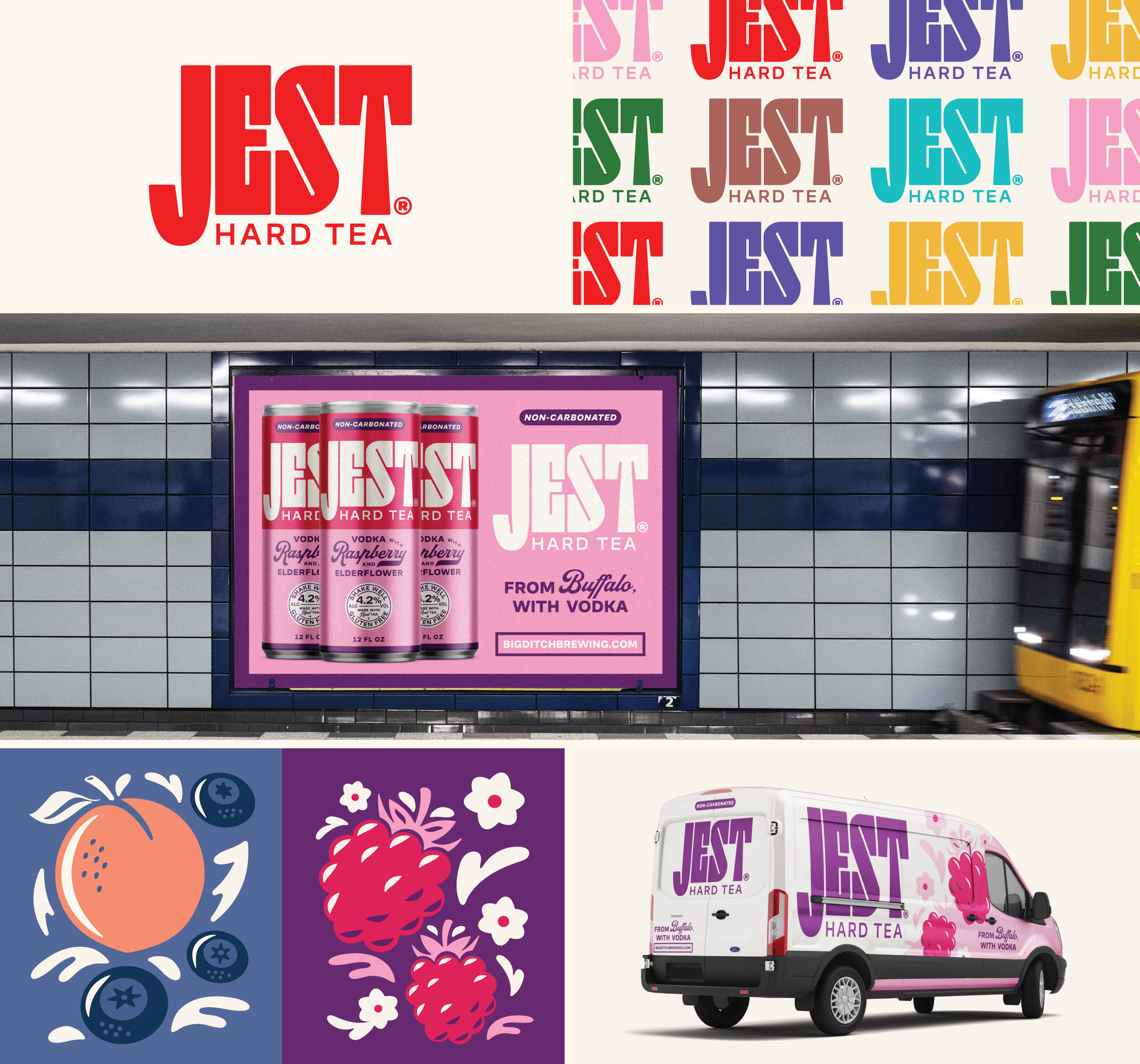
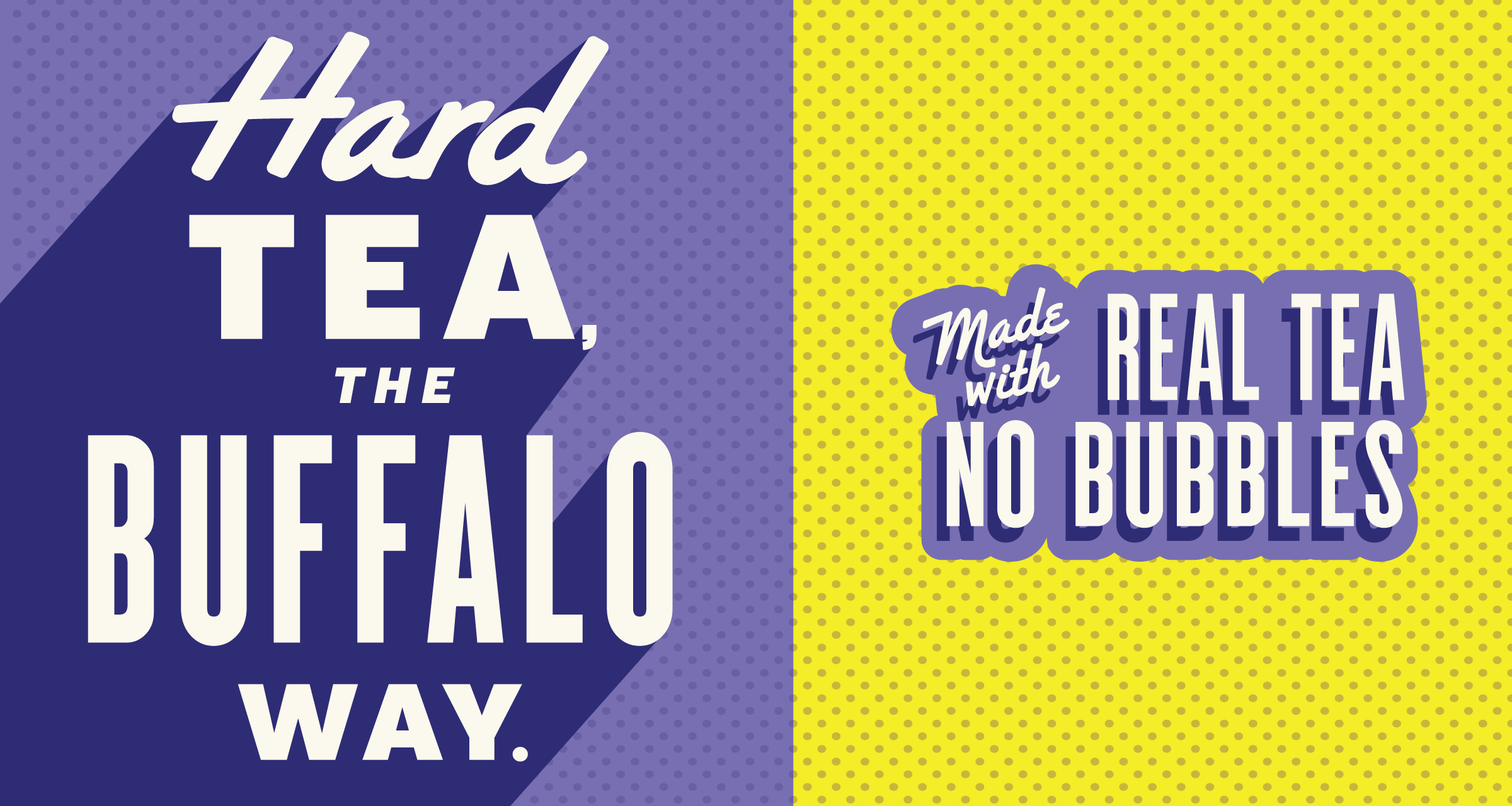
Hard Tea, the Buffalo Way

Jest Hit Different

From Buffalo, With Vodka 


Half & Half 

This wasn’t a full definition project where CODO helped Big Ditch build the product from the ground up. Their team already had a strong product and opportunity clearly mapped out before reaching out to us.

That said, there were still moments where brand strategy meaningfully shaped go-to-market decisions. One of the clearest examples was our early recommendation that a Half & Half needed to be part of the launch lineup.

From a branding standpoint, Half & Half offered a familiar entry point into a more expressive flavor system — lowering trial risk while still signaling differentiation. The team initially disagreed, but ultimately came around after working through the flavor combination itself, including how a hibiscus tea maintained an elevated ingredient panel while pouring a striking pink color.

We discussed this in more detail on our podcast episode with Big Ditch, if you’re interested in how branding and positioning can directly inform product formulation.

Related reading: The Half & Half Opportunity


Art Direction Sprint

With the strategy locked, we rolled into the hard work of making all of this strategy come to life through beautiful branding and package design.

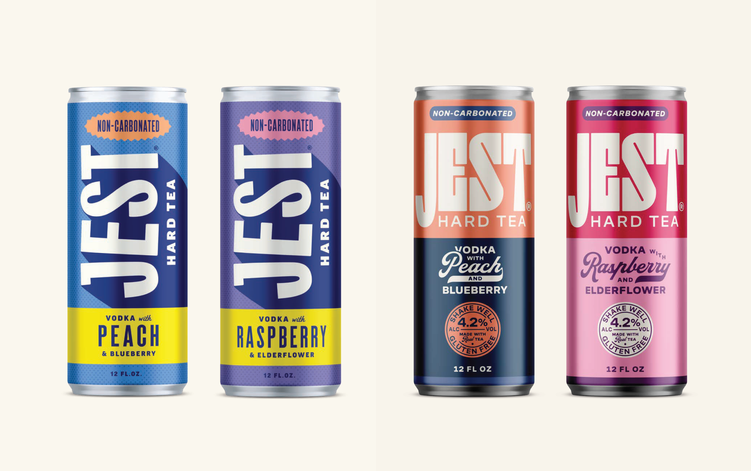
We shared two directions.

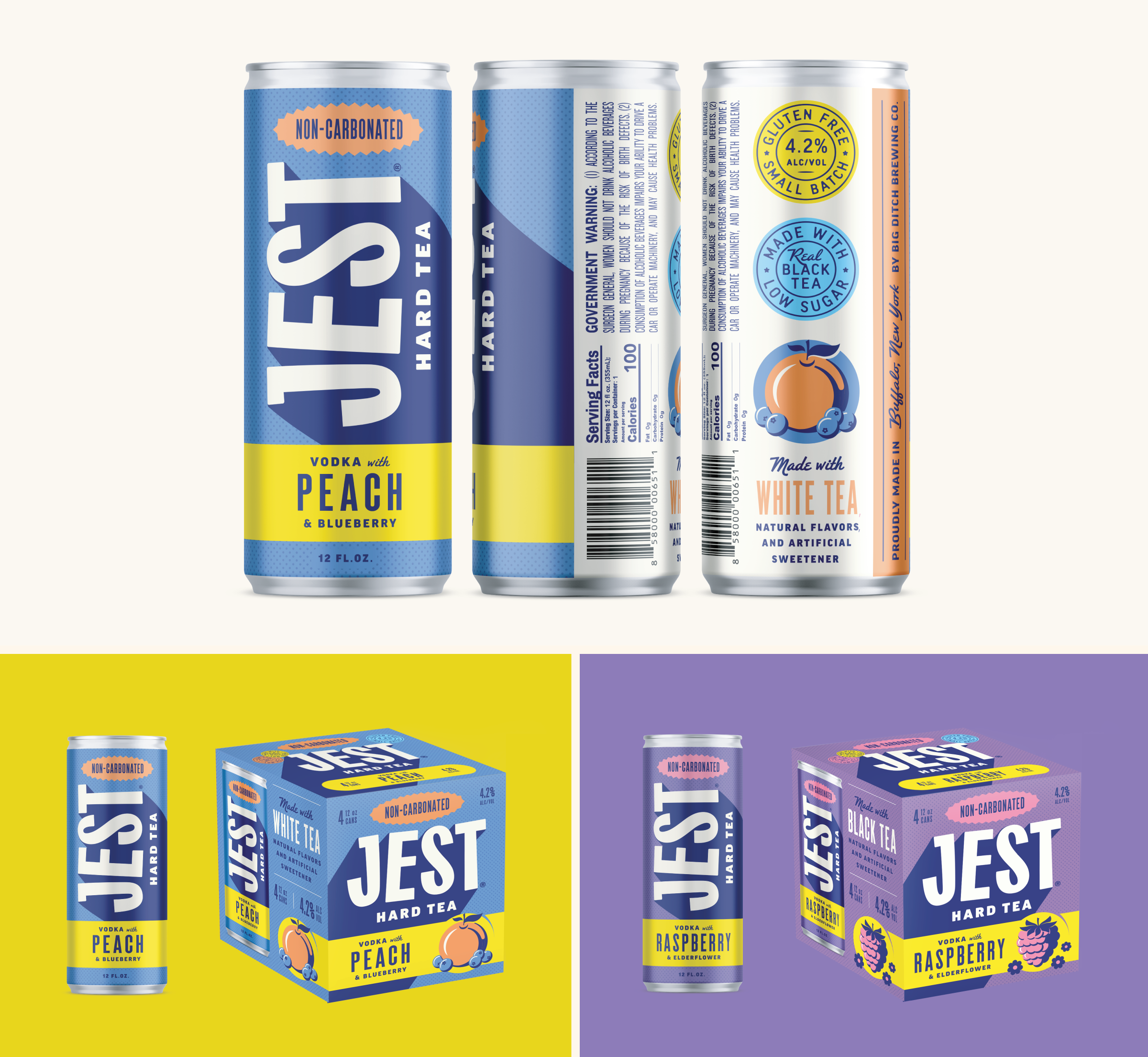
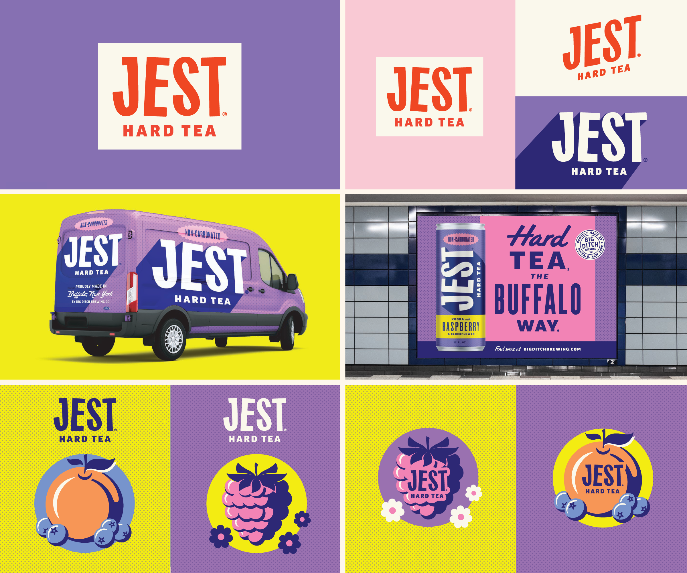
The first was poppy and bright. Large, high contrast typography (on a dancing baseline), dimensional shading as a cool visual element and clear claims callouts.

The second was more premium — a little more buttoned up with a custom word mark, tonal color palette and expressive illustrations.


It was a close race, but Big Ditch ultimately preferred the first direction due to the high contrast it provided on shelf. Put simply, a dark background with white type could billboard well and allow secondary colors to help orient customers to grab exactly what they’re after.

Collaboration 

When possible, CODO prefers to handle everything in-house, end-to-end. 

But for this engagement, Big Ditch has a talented in-house designer in the mix — shout out to Donna! — so we handled the initial concept development presentation and then handed that off to their team to revise and finalize the remaining cans and 4-pk cartons.

This is a great way for us to collaborate with in-house teams and when it works (like it did here) it works great.

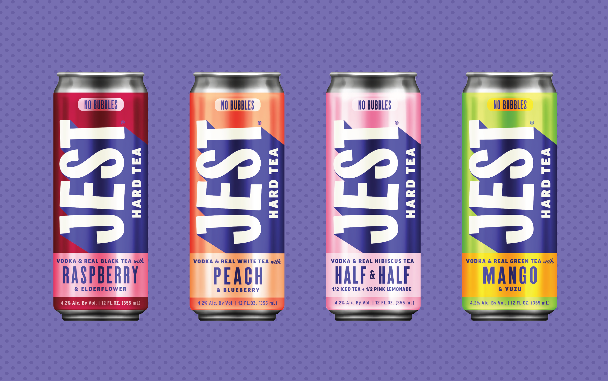
Good looking lineup. We’ve been enjoying these around the shop — I’m partial to the raspberry.

Variety pack execution

Due to a capacity crunch on Big Ditch’s side, CODO stepped back in to design the variety pack under a tight deadline.

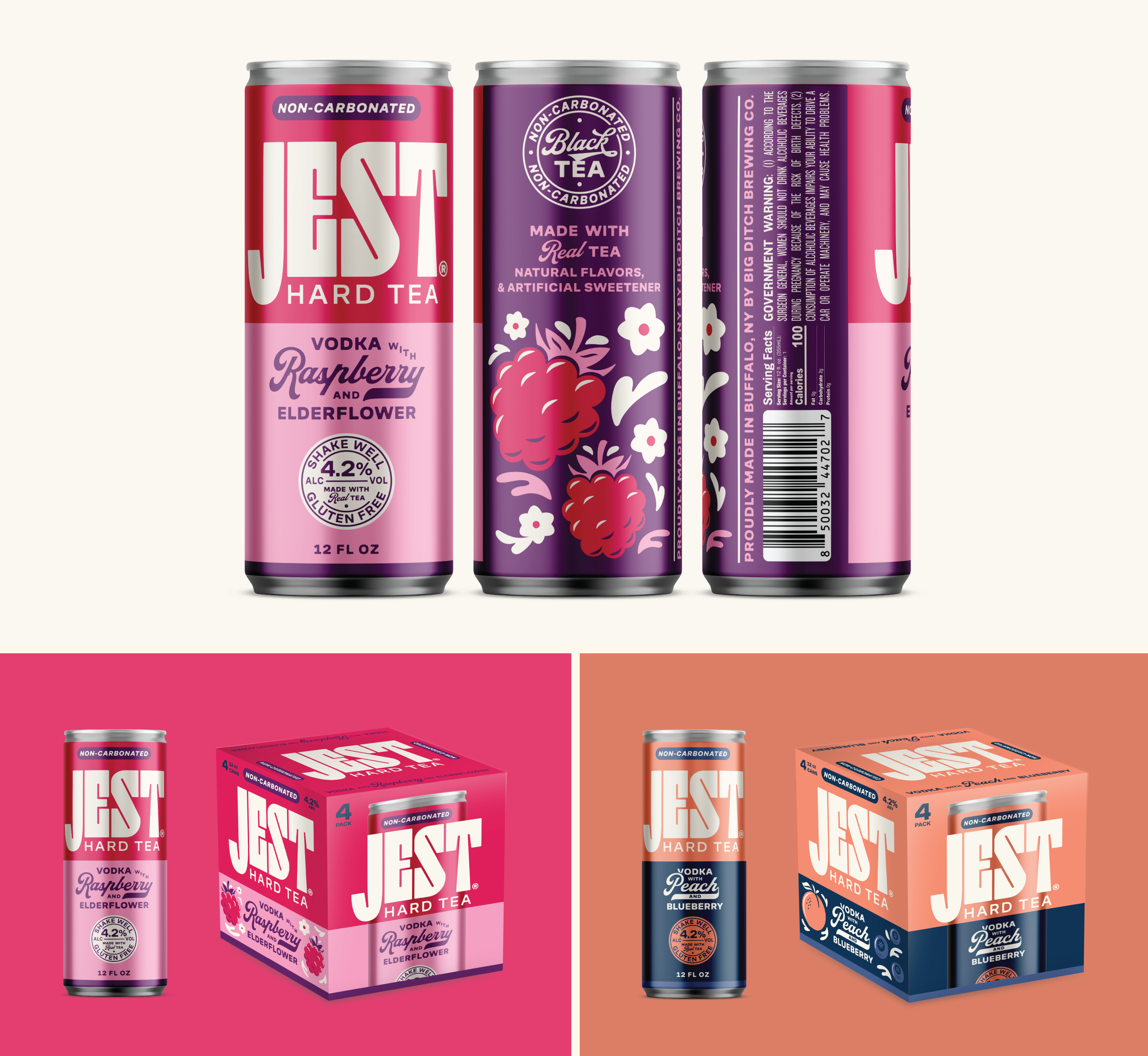
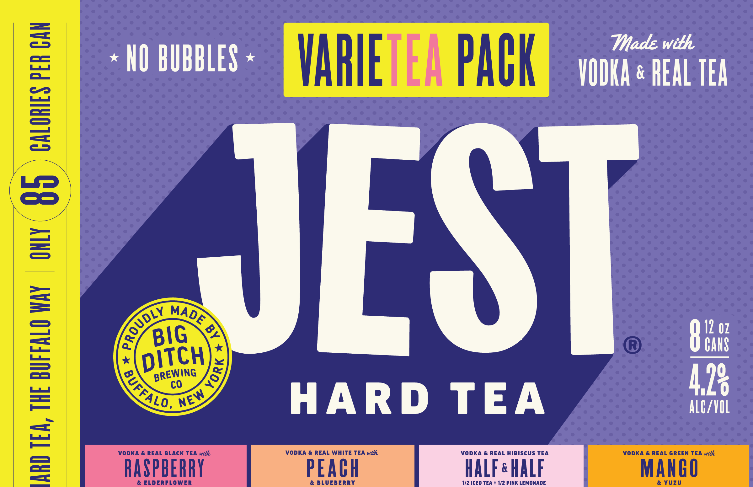
Variety packs introduce a different challenge: Reinforcing the master brand while clearly communicating flavor differentiation — all without visual clutter. 

These are always tough: Do we put the cans on every panel? How do we balance claims with the brand itself? What do we do if the cans are highly templated? 

We stripped this back and went ID-forward on the main panel, making sure we clearly called out a handful of claims:

Made with vodka and real tea

No bubbles

85 calories

The Big Ditch Endorsement

Wrapping up

Jest wasn’t built as a surface-level extension or a design-first exercise. The work started upstream — with positioning, Brand Architecture and naming — and those decisions shaped everything that followed.

Because the strategy was clear early, it influenced more than just how the brand looked. It informed how the product was framed on shelf, how flavors were prioritized, how claims were balanced and even how the liquid itself came together.

That’s the difference between design as decoration and branding as an operating tool.

By treating Jest as a platform, Big Ditch has built something with room to grow. The brand can scale geographically, flex across formats and evolve over time without needing to undo or outgrow its original decisions.

The result is a hard tea brand with a clear point of view — one where strategy, design and formulation are pulling in the same direction, and where every choice supports long-term relevance, not just a successful launch.

Build a stronger brand.
Sell more beer.

Join 7,500+ other beer industry folks and sign up for CODO’s monthly Beer Branding Trends Newsletter.