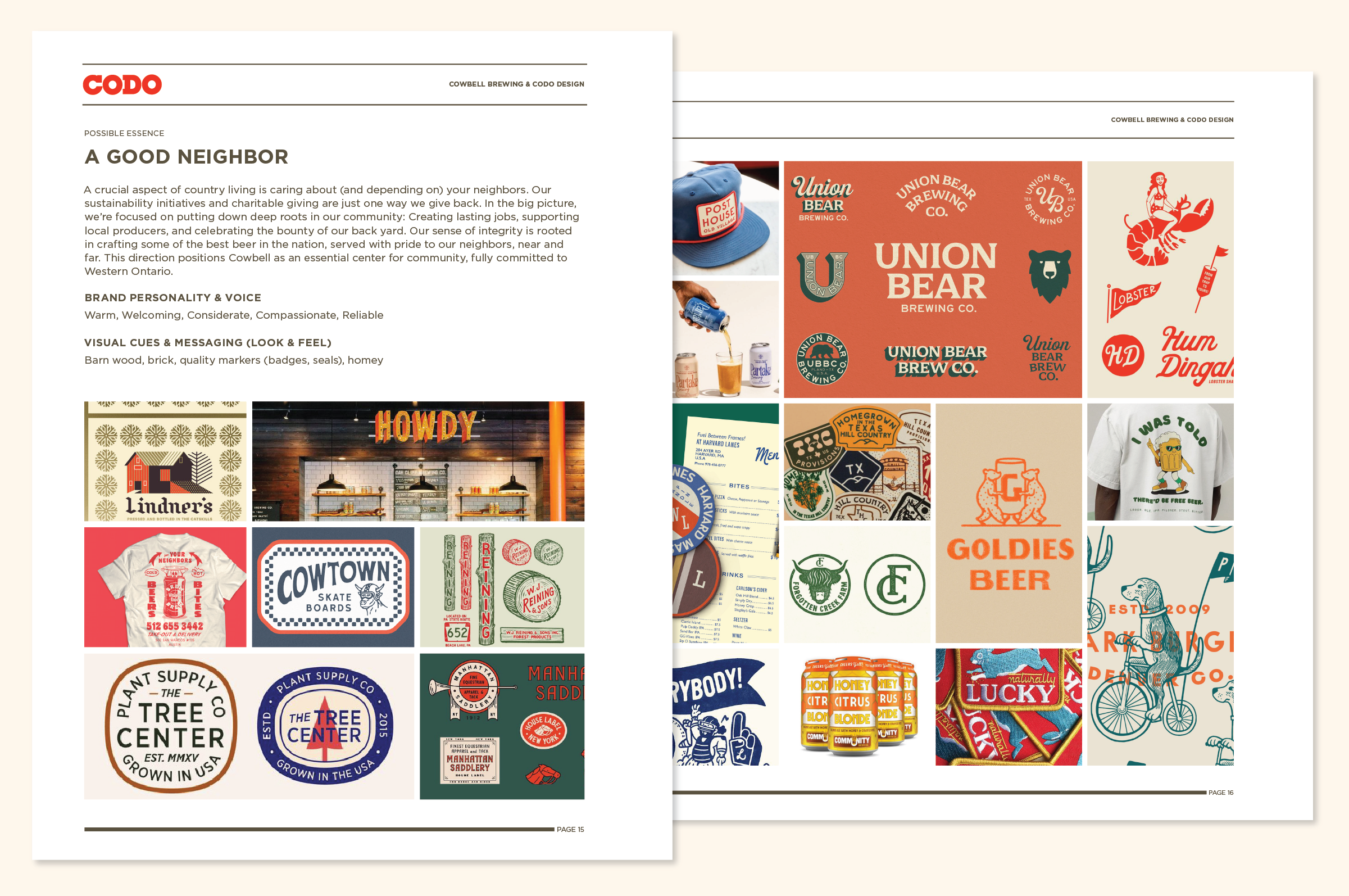
Background Context
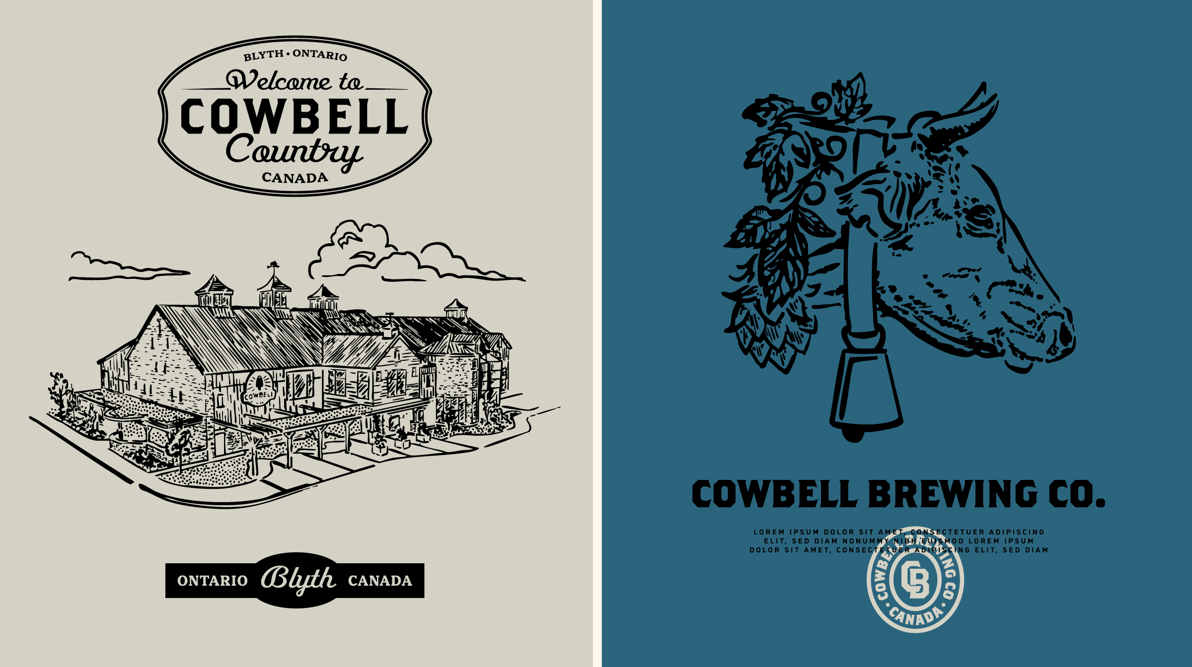
The most striking thing about Cowbell is their facility itself.
It’s a stunning, 26,000-square-foot “cathedral to beer,” purpose-built for sustainability, nestled on a 144-acre property in Blyth, Ontario.
Not in bustling Toronto, not in Hamilton or Ottawa.
Blyth.
Surrounded by farmland and friendly cows, Cowbell’s brewery feels almost mythical in its rural setting. That contrast — a state-of-the-art brewery in the peaceful countryside — makes Cowbell one of the most fascinating breweries we’ve worked with.
—
Cowbell first reached out to CODO after resolving an IP dispute. This set a few constraints during the identity phase. But that issue only scratched the surface.
Early pain points we identified included:
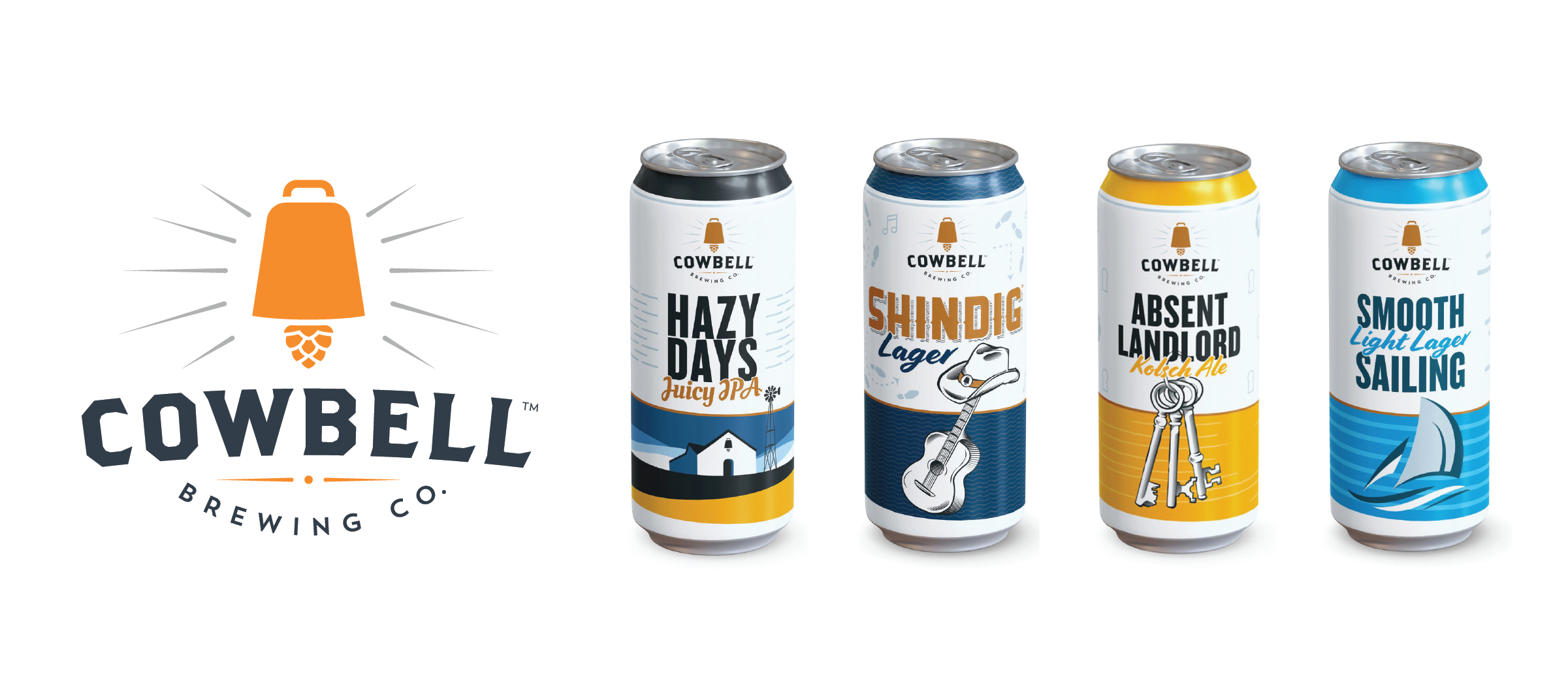
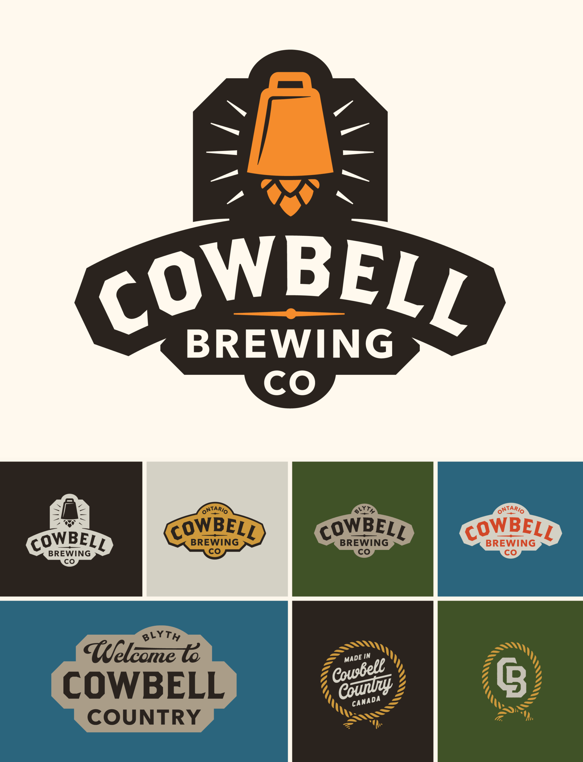
– A shallow identity system (essentially one logo)
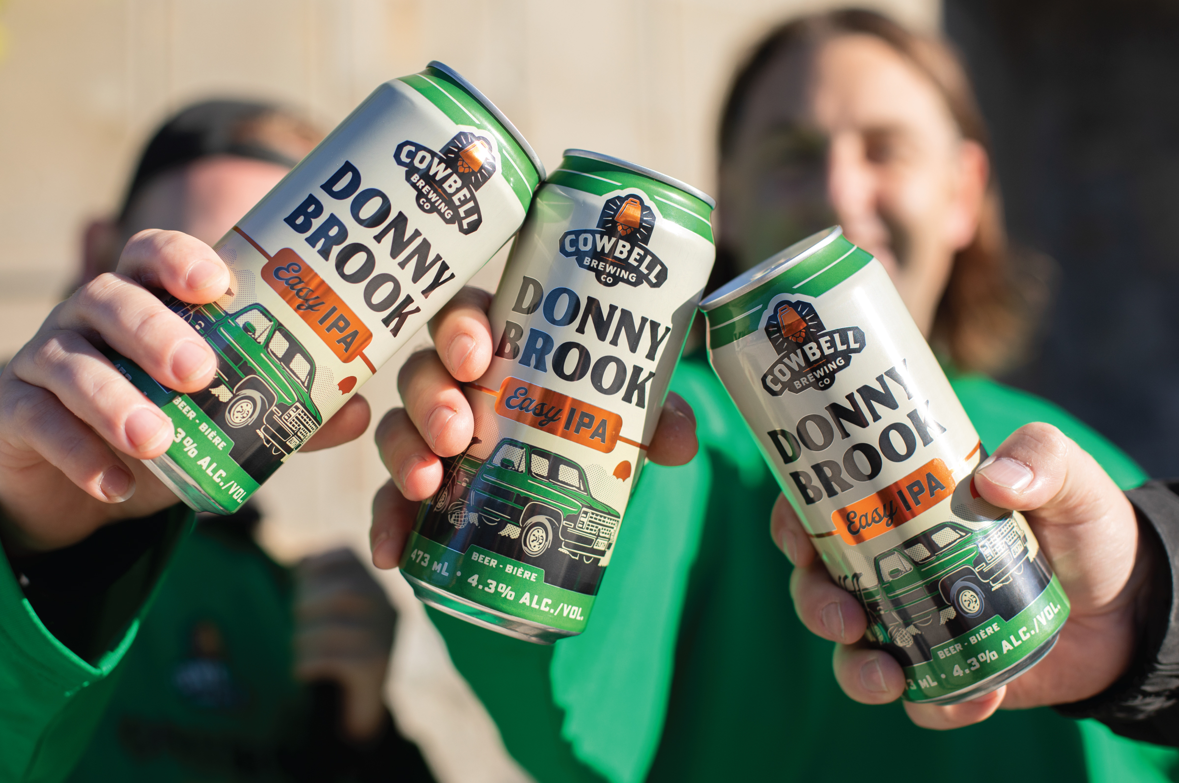
– Inconsistent packaging, featuring “cheap clip art” illustrations that didn’t reflect the beer’s quality
– A portfolio overly-focused on lagers — raising questions about whether they needed to diversify with more contemporary, on-trend styles to better match today’s Ontario market
– Packaging wasn’t optimized for the important LCBO channel
Beyond these, Natasha (President), Emily (Brand & Packaging Designer), and the rest of Cowbell’s executive team viewed this as a chance to unify the brand internally. A quote from our kickoff research sums this up:
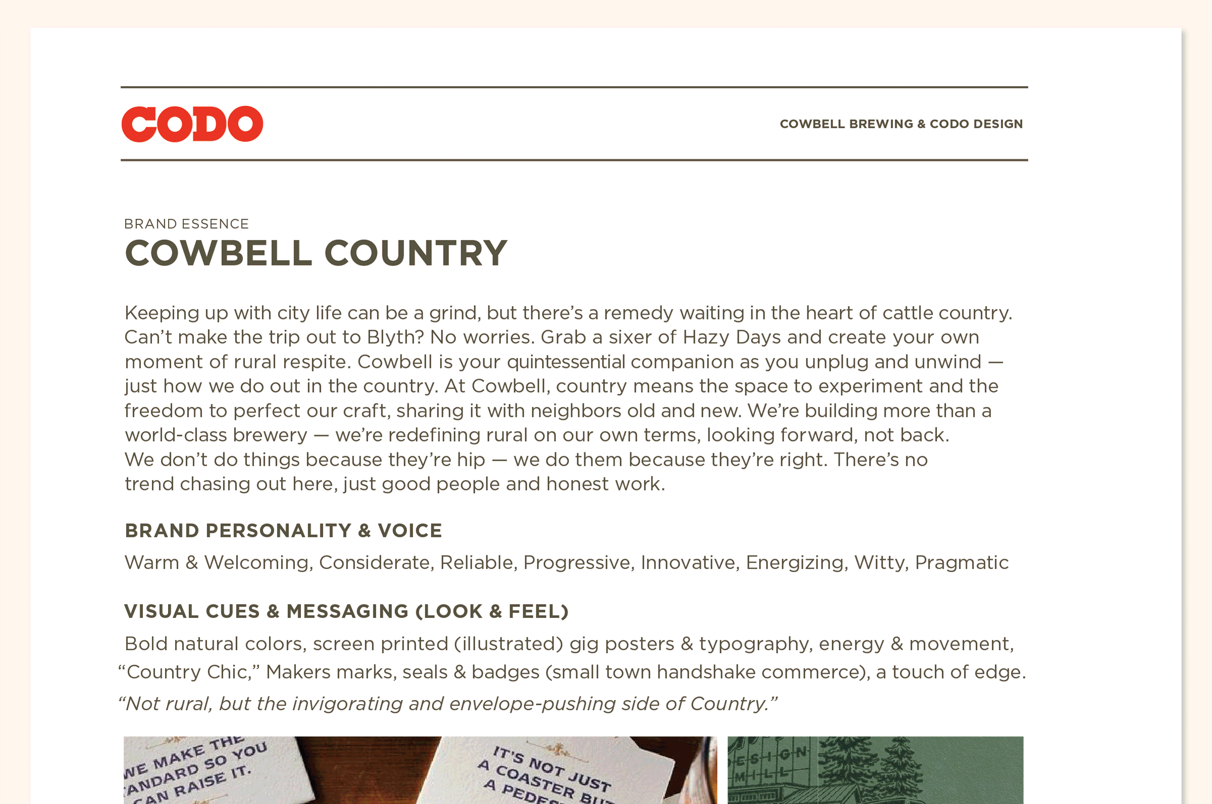
“This spans brand identity and goes deeper into the company culture itself — what are we all here working toward? What is our rallying cry?”