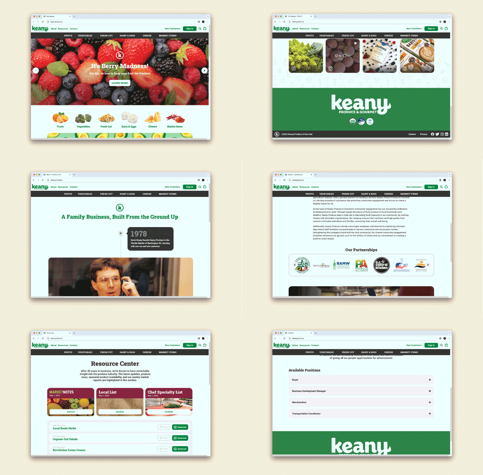
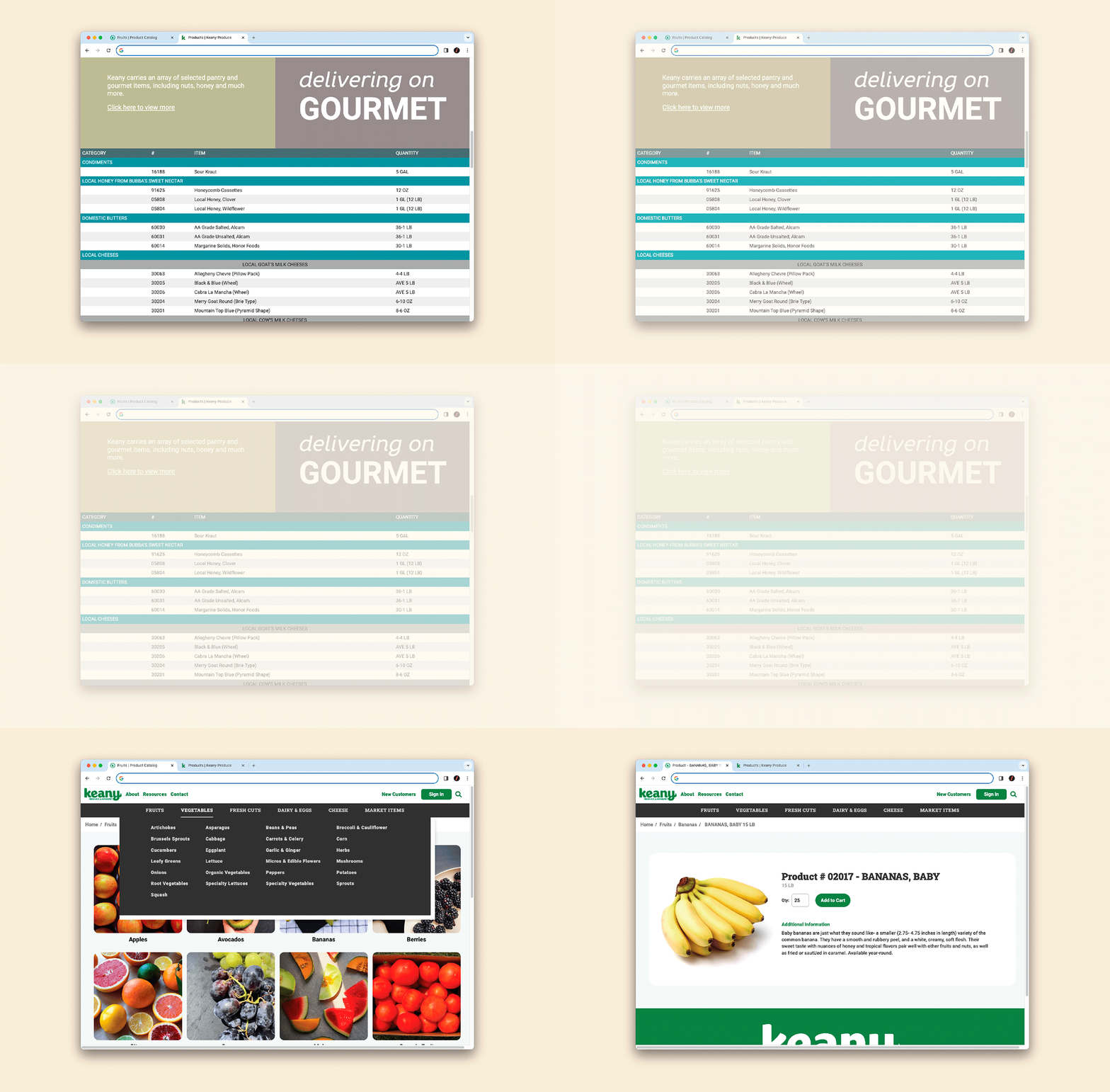
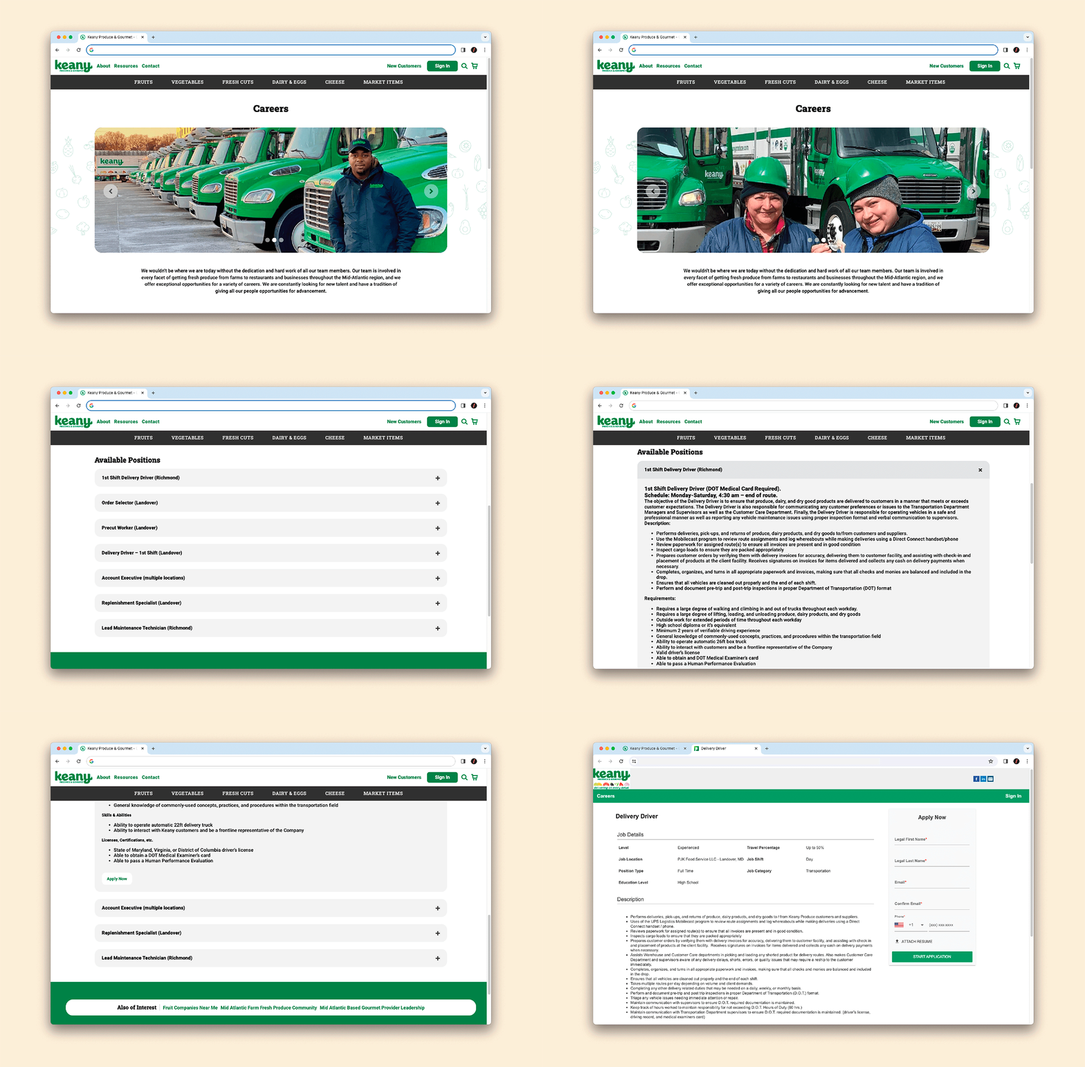
Phase 1: Site Mapping & Information Architecture
We kicked this process off by meeting with the Keany team and asking them a whole lot of questions. Our aim was to identify how we would approach organizing and developing their website to accomplish their goals.
In terms of everything we could show you in this case study—proposed (and summarily rejected) design work, pencil sketches, totally not staged war room walls covered in Post-it notes, flashy parallax animations, etc.—site mapping is about as unsexy as it gets.
But it’s a crucial step towards ensuring we understand your customers and how we can tailor your website to better serve them.
Some key questions we’re asking here:
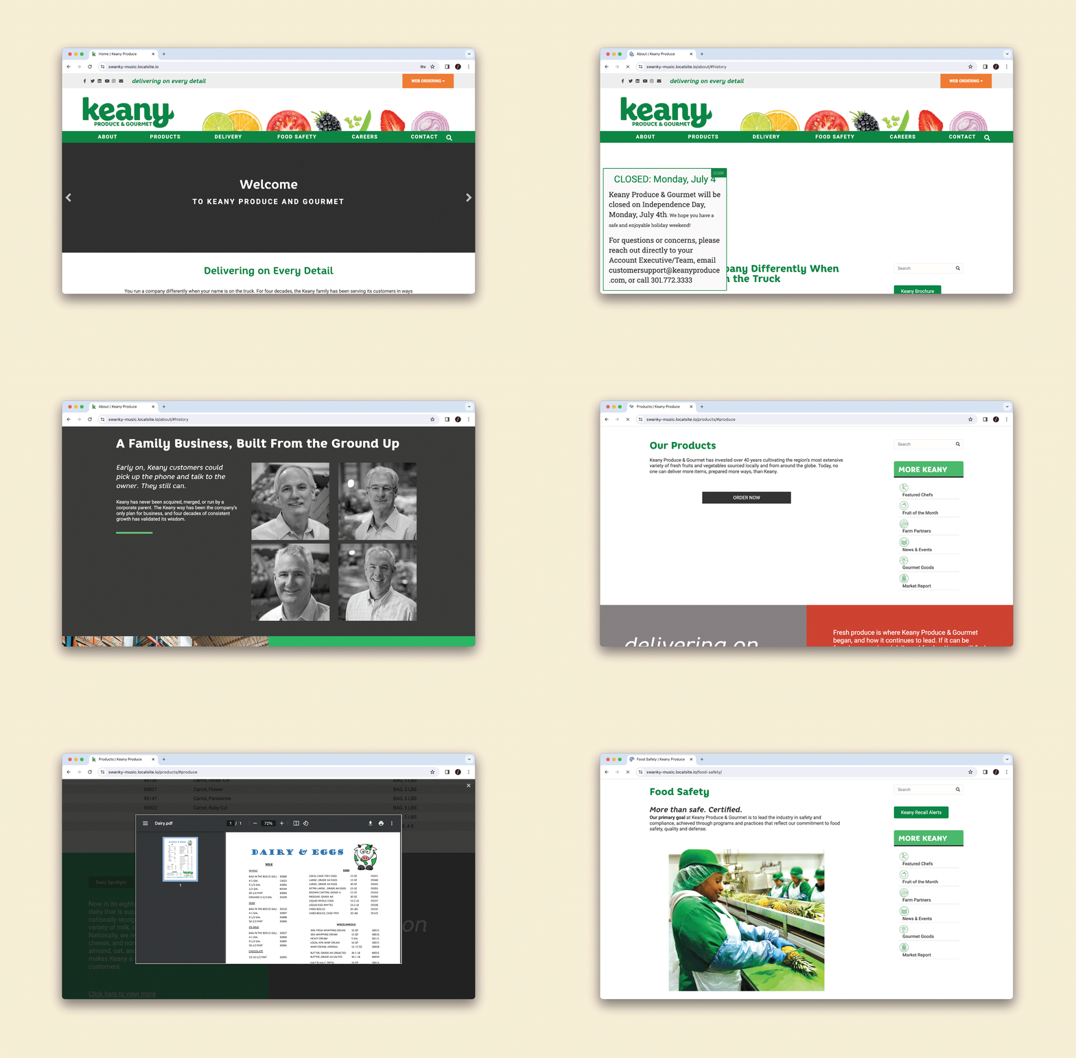
– Will we keep the structure of your existing site, or rework it into something new?
– What content will we need and how should we organize this across your new site?
– What big-picture Keany initiatives can we bolster using the site redesign as a platform?
– At the most fundamental level, what should this website accomplish?
– How can this website increase sales (while making your life easier)?
We were also able to use this step to involve the broader staff at Keany by sending out a survey to the sales team and other key stakeholders. This input helped us make sure we were successful in building a website that makes everyone’s lives easier (and ultimately, sells more produce).
A quick aside here: We can’t overstate how important it is to talk with stakeholders at all levels of your business during this process, from the C-suite down to front line delivery folks and customers. We’ve been working in the produce industry for nearly 15 years now and have, time and time again, found some of the most compelling insights to come from these additional conversations.
A great example of this that came up during Keany’s site revamp:
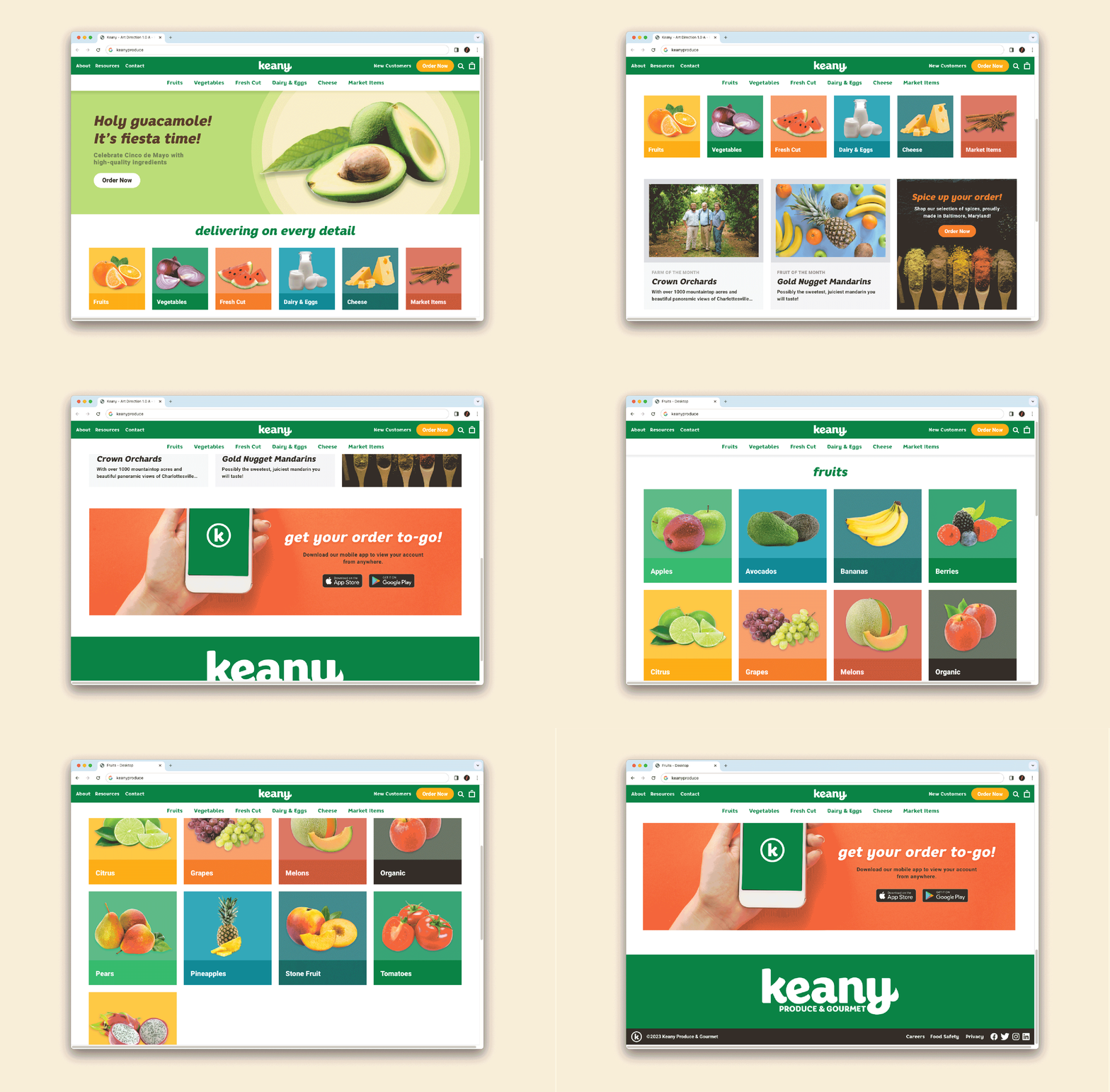
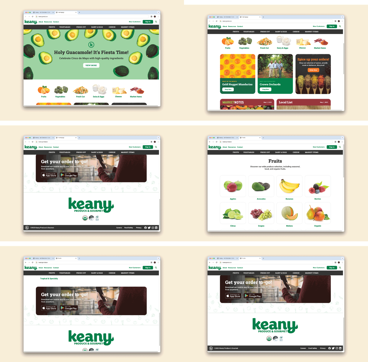
“What if we moved away from the industry standard site structure: A rote navigation bar listing “Home, About, Order, Contact…”, and instead, structured the site around the products and brands that Keany sells?”
That way, when a harried Head Chef (capital H, capital C) at one of the nicest restaurants in town needs to place an order ahead of service, the entire menu of options is instantly presented as soon as she hits the website.
In this way, Keany used the Information Architecture phase to dynamically reshape their core experience and the site’s value prop.
—
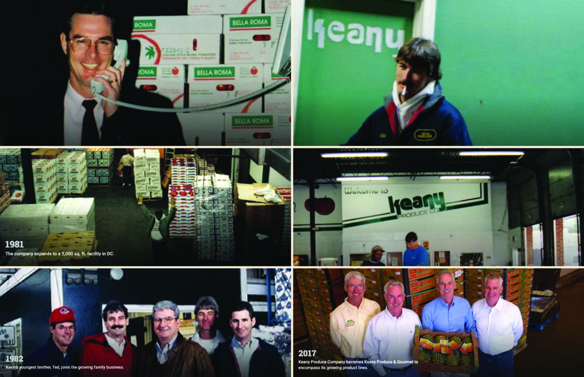
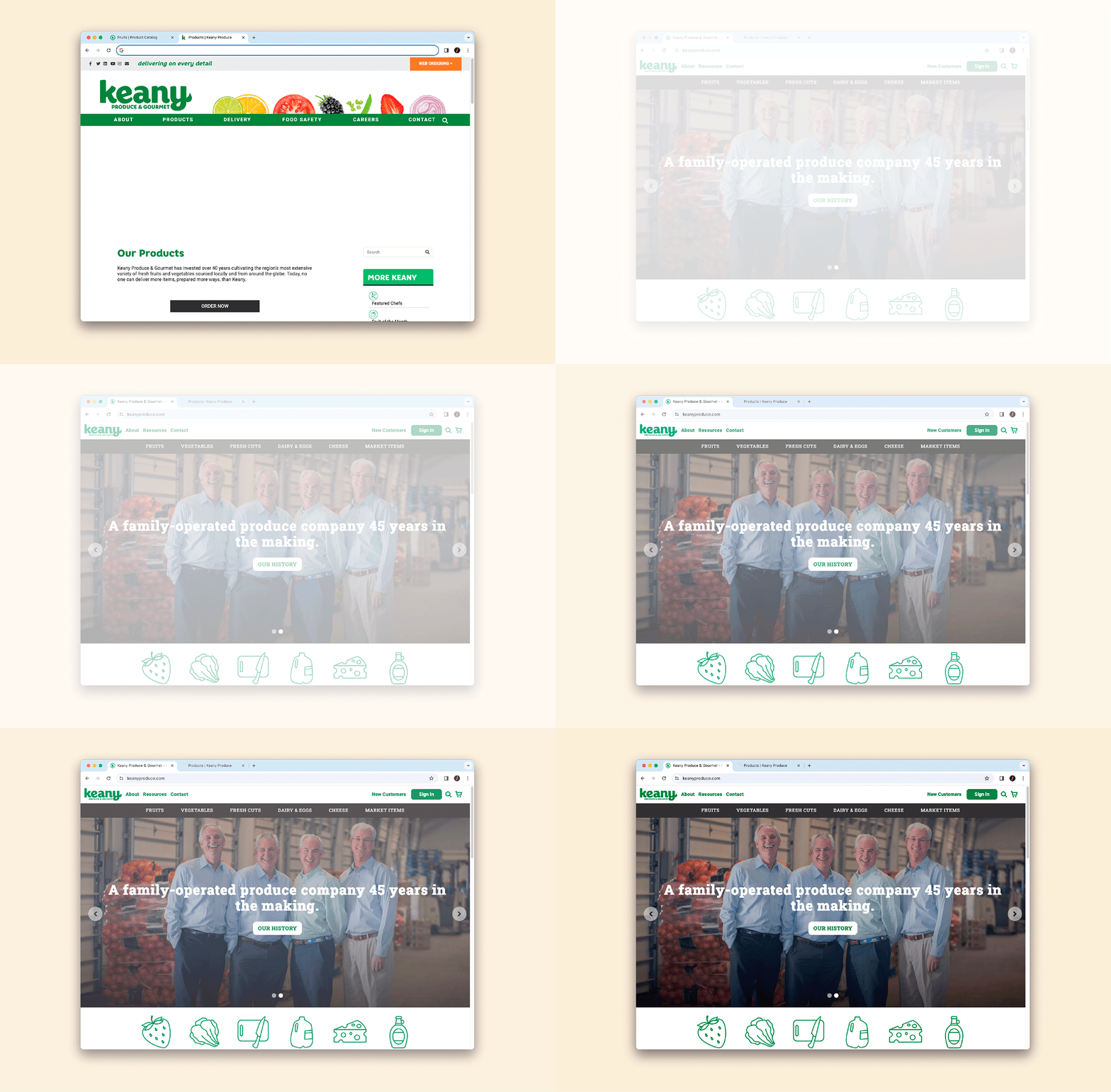
Alongside the site mapping process, we also used this time to take stock of Keany’s existing visual assets. So, what videos and photos have they gathered over time, including product photos, but also behind the scenes shots that illustrate their fun history?
This allowed us to maintain that approachable, affable family-owned feel (key for differentiating from the faceless Broadliners) while fundamentally reimagining Keany’s digital presence.
With their content inventoried and Information Architecture mapped out, we rolled right into art direction.

