Stories

How we Refreshed Fernson Brewing’s Packaging

Sub Brands as a long term brand building pillar

In our 2023 Beer Branding Trends Review we wrote about the merits of fanciful beer names (e.g. 60 Minute IPA, Pivo Pils, Cold Smoke) vs. a more monolithic, parent brand-forward naming convention (e.g. Prost Pils, Birdsmouth Dunkel, Plain Spoke Mojito).

This parallels another trend we covered as well: An increase in the amount of consumers who report shopping and making purchasing decisions based on brand more than style.

If we extrapolate these trend lines out over the next 5 to 10 years, it becomes clear that breweries with a distinctive (and compelling) brand identity, a clear point of view, and individualized beer brand names will be in a stronger position than groups without these foundational pillars in place.  

Today, we want to share a case study for a recent project with Fernson Brewing out of Sioux Falls, South Dakota that illustrates all of these ideas. 

For podcast fans, we recorded a conversation with Fernson founders Derek Fernholz and Blake Thompson on this topic as well. Give it a listen for more context in their own words. 

Okay, let’s get into it. 

We designed Fernson’s flagship cans back in 2015. (And we handled their foundational branding back in 2013.)

This original packaging was tailored for a mid-2010’s beer market. Bifurcated and minimal, each beer got its own SKU color, but the emphasis was on building Fernson’s parent brand first and foremost. 

To that end, and importantly for today’s conversation, these early releases all eschewed beer names. So you had Fernson IPA, Fernson Farmhouse Ale, etc. 

This packaging worked really well at the time. Especially in a then nascent craft beer market like South Dakota (and later, as Fernson expanded, neighboring Iowa and Minnesota).

Fernson’s original flagship cans.

But a few things happened over the intervening years that highlighted the need for more individualized beer brands and packaging. 

1. We already mentioned a broader trend that shows consumers increasingly gravitating towards individual brands over styles. So that’s still at play. 

2. Along the way, Fernson employed a series of talented in-house designers that did a bang up job of evolving and solidifying Fernson’s brand voice and ongoing package design aesthetic. 

3. And finally, the beer industry just became more crowded (scaling from ~4,000 breweries in 2015 to over 9,500 in 2023 will do that). 

But perhaps more importantly, great design in the beer industry has (thankfully) become far more commonplace. As has new SKU churn (sometimes called “Rotation Nation”) and an overall hastening of the rate at which breweries refresh their packaging. 

That’s a long winded way of saying that packaging, even when well-designed, tends to get lost in the fray much sooner today. 

A collection of packaging developed by Fernson’s in-house creative team over the years.

So several years of new in-house label design work + an evolving beer market spurred the Fernson team to start introducing fanciful beer names around 2017.

This happened accidentally at first with the release of Lion’s Paw Lager (currently, ~60% of their revenue). 

This lead to renaming a few other flagships to match. So Fernson IPA became Shy Giant IPA. Fernson’s Porter became Wagonplane Porter. And their popular Sour Ale became Curio. (These are all strong, strong names.)

It’s important to note here that these names were introduced on their original flagship cans. So while they were taking a step toward what would eventually become an important trend—developing fanciful brand names and stories—the change wasn’t really that impactful. (You’ve got a great name, but on shelf, you just added two words to the same templated can. Big deal.)

So after 8 years of service, these flagship cans were looking tired. They were tired when compared to their broader competitive set. And even more so when compared to the rest of Fernson’s portfolio. 

There was a pressing opportunity to make Fernson’s packaging work harder for them out on shelf while also setting the stage for deeper storytelling and long term brand building. 

If handled right, this move sets Fernson up for potential line extensions and even scaling some of these beers into more fully-developed Sub Brands down the line.

So that tees up our project. Now that you know the top line context, let’s jump straight to a few early concepts we presented and discuss some important considerations we discussed along the way.

I’m sure you already know the folktale behind the Lion’s Paw name, but if not, read more here.

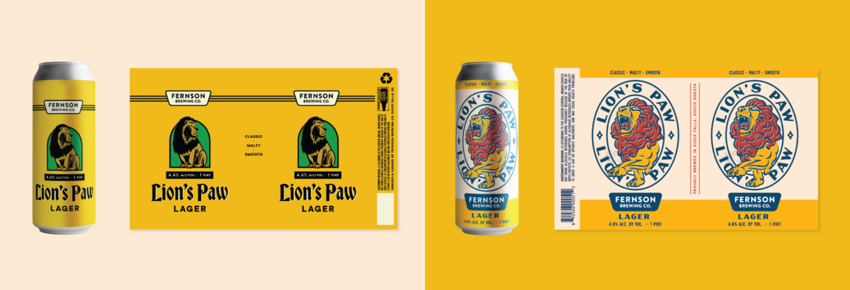
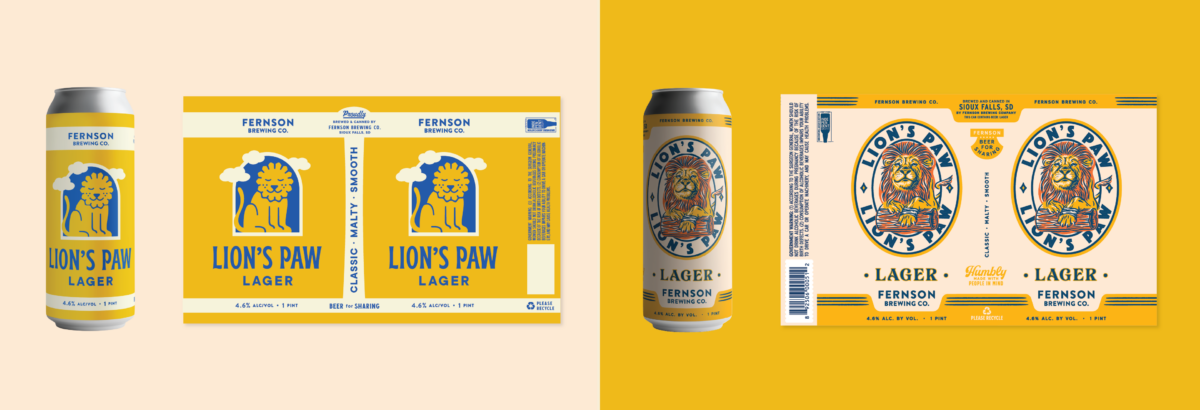
We shared two directions initially, one of which (above, right) featured a beautiful custom lion illustration.

We were really excited about this direction, and the art itself. It’s beautiful, it would translate well to a painted can, it lends itself to merchandising and POS opportunities, and on and on.

But as excited as we were, it didn’t quite land with the Fernson team. 

(A foghorn bays mournfully in the distance. Another slice of my beard turns ashen.)

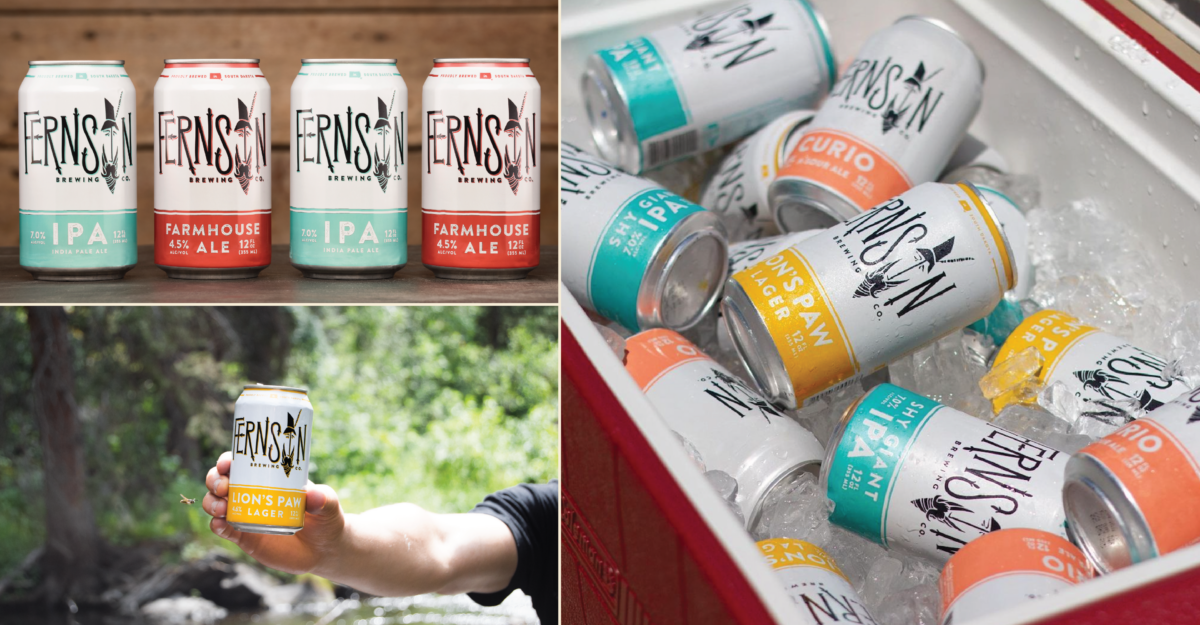
They liked the illustration, but felt like it departed too heavily from their established aesthetic (i.e. all those great in-house cans and releases I mentioned earlier).

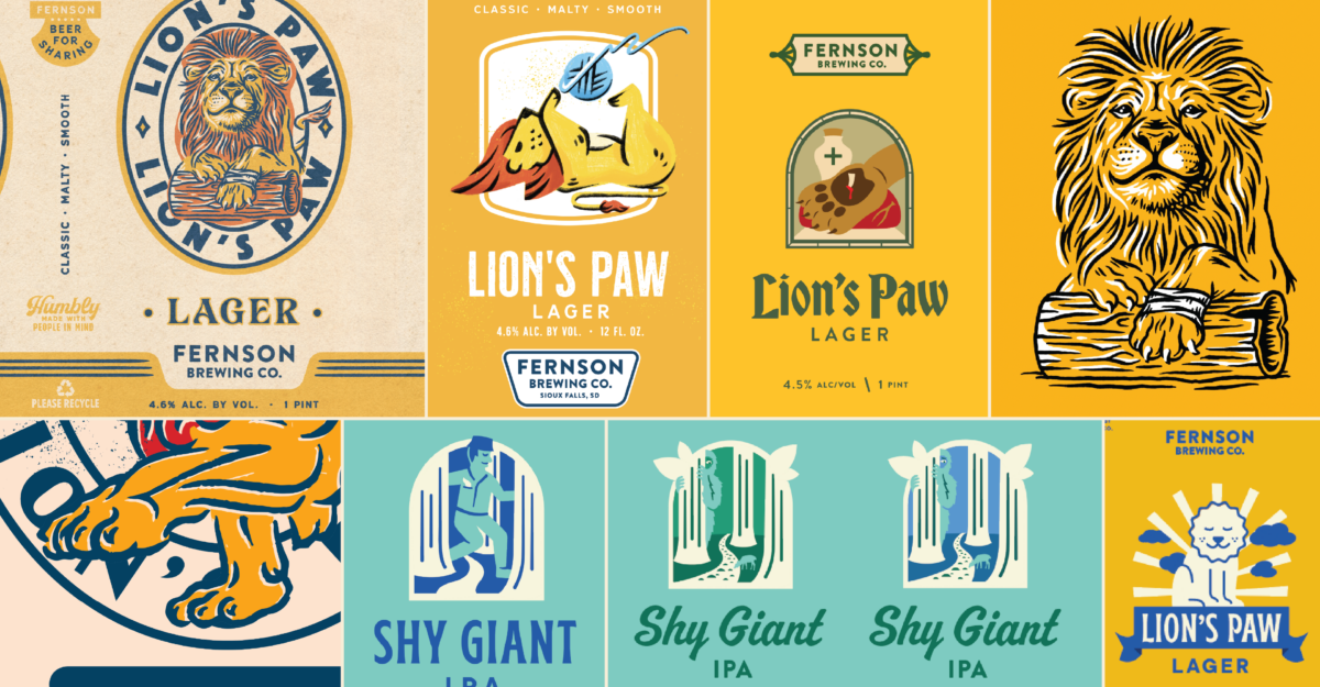
Another consideration, though not as immediately pressing as the previous one, is that this illustration style is fairly complex. This means you have to have a specific set of illustration skills in order to create follow-on labels. 

This is an important parameter that we end up discussing frequently in our work.

We have to balance creating something beautiful and compelling that stands out on shelf, but that, in an ideal world, will also be able to be replicated by your in-house team. 

While CODO (and any designer worth their salt) wants to design every single label your brewery puts out, this often isn’t financially prudent. It doesn’t take many label design projects before you start to seriously consider hiring an in-house creative.

Anyway, I’ll fast forward here through revisions and share round 2 concepts.

Various illustration styles we explored through the revisions phase. The lion shifted dramatically from complex and ornate to minimal and iconic. This ended up being a better fit with Fernson’s broader aesthetic. 

Round 2 was warmly received.

The chosen direction’s canvas (above, left) is much more simplified. We dropped the texture and grounded the illustration in a fairytale-ish picture frame to add some compositional logic and make follow-on in-house label illustrations more manageable. 

I’ll fast forward to the final cans here because our revisions were fairly minimal and mostly focused on dialing in the illustrations (e.g. “Should we break the frame with leaves here?” or “To be clear, the giant shouldn’t be fully nude, correct?”) and finding the right supporting typography.

Fernson’s updated flagship cans

Our engagement covered Lion’s Paw Lager and Shy Giant IPA, and we’re proud of how these turned out.

But more importantly, from an ongoing perspective, Fernson’s in-house team was able to use these as templates and develop a few labels (Farmhouse and Curio) in this new style in short order.

So that’s another important project goal that was achieved.

Follow-on flagship labels created by Fernson’s in-house team

We talk about brand building a lot. And indeed, there’s a lot that we’re leaving out of that conversation here: The importance of marketing and sales and distribution alignment. Field activation. Community partnerships. Positioning. Brand voice. Brand Architecture. Consistency. And on and on. 

But before all of that, you need phenomenal beer. And that beer needs a compelling name. And it needs badass packaging. 

These are all foundational.

And once they’re in place, you can build anything you can dream up.

Build a stronger brand.
Sell more beer.

Join 7,500+ other beer industry folks and sign up for CODO’s monthly Beer Branding Trends Newsletter.