Stories

Rebranding KettleHouse Brewing

Evolution vs Revolution in Montana Craft Beer

When you think of craft beer in the United States, your mind likely jumps to a short list of specific markets—Colorado, the Great Lakes, the Pacific Northwest, New England. It’s understandable. Brewers in these markets have pulled off an economic revolution of sorts, and the entire world has taken notice.

What you may not realize is that there are other areas where people brew and drink beer. Crazy, I know. Less attention is paid to these “flyover” markets—the Midwest, Plains States, the burgeoning South. Even less consideration goes to western states that aren’t Washington, Oregon or California. Despite a comparative lack of national buzz, a number of excellent breweries hail from these uncharted lands. And some of these guys have been kicking out high-quality beer (and winning over loyal fans) for decades.

These under-hyped markets are fascinating to us. Limited exposure, low population density, and at times literal geographic isolation (think flatlands flanked by gorgeous mountain ranges and pristine trout waters) have created discrete (but not insignificant) parallel universes for craft beer. Particularly for older operations out west, distribution is often limited to state lines—not in the near mythical sense of New Glarus’ Wisconsin focus, but as a simple matter of practicality. Loyal, local beer drinkers are purchasing enough of the stuff to generate steady, organic growth. So keep it local, and keep local weird, man.

While we love to don our (strangely frilly?) philosopher robes and ponder these delightful microcosms, the self-sustaining nature of craft beer has forced us to ask ourselves some tough questions. We work in branding, marketing and design. Let’s say that a brewery has been around for 20+ years, has a solid customer base right in their own backyard, and has never put much thought into branding in the first place. What purpose would a rebrand serve? Assuming you’re selling everything you brew and are growing at a steady clip, why go through the effort of redesigning your packaging or revamping your website?

When we’re fortunate enough to land a rebranding project with one of these breweries, a persistent issue that arises is the concept of “Evolution versus Revolution.” In other words:

Is our client fundamentally rethinking their approach from the ground up? Is it our task to scrap everything (visuals, naming, etc.) outright, and start from scratch, to let customers know that a fundamental shift in the company has occurred?

OR…

Is our client building on decades of hard work, reputation and customer goodwill? Would it be a misstep to jettison the visual signifiers and stories behind the company as it stands? Does it make more sense to build upon, hone and enhance what already exists?

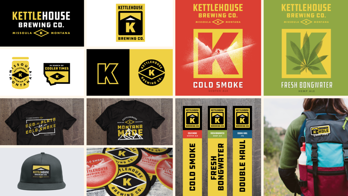
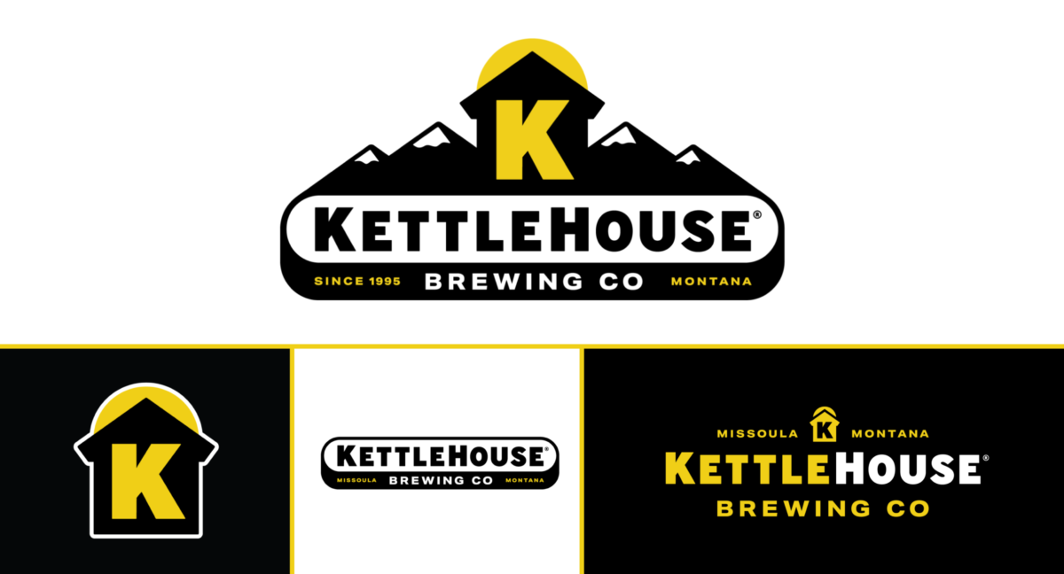
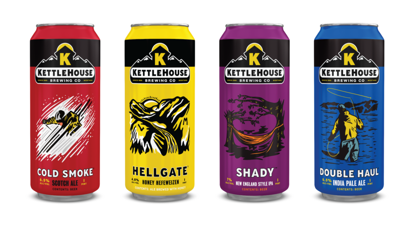
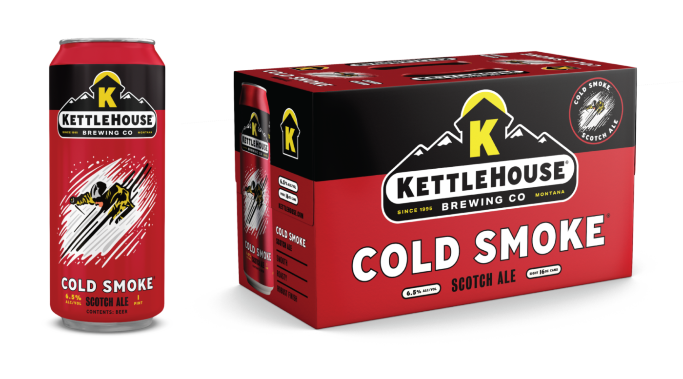
With few exceptions, we’ve found that the latter approach—Evolution with a capital E, if you’re keeping score—makes the most sense for breweries who have been around a while. If you’ve operated for longer than a decade, factors like stellar beer quality, a rock solid executive team, and a sizable distribution footprint are commonplace. But, through the course of those years, it is also common for brand aesthetics to wander, and eventually grow inconsistent, or of equal concern: to appear dated and irrelevant. This can happen due to frequently switching creative partners, or never contracting one in the first place. In either case, we often find older breweries with visuals that lag behind the expectation of an otherwise high-quality, beloved product.

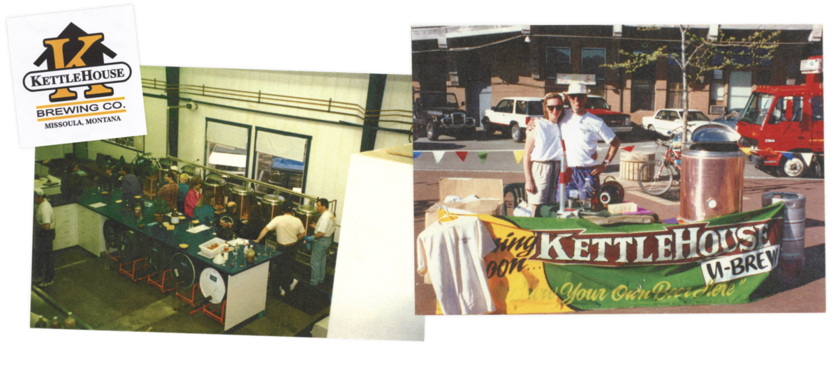
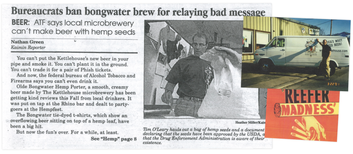
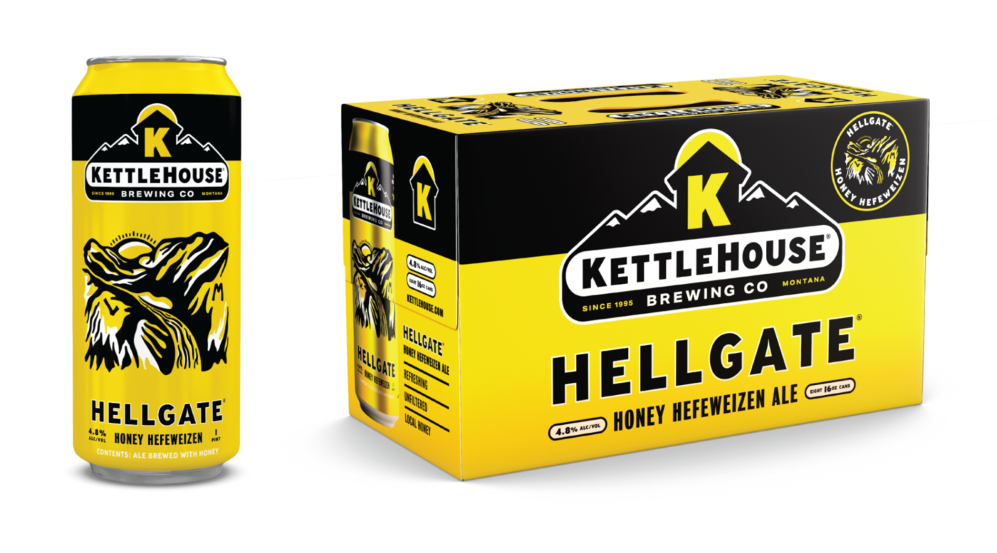
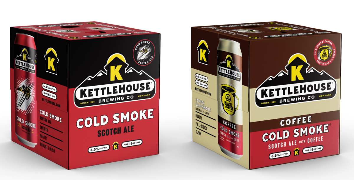
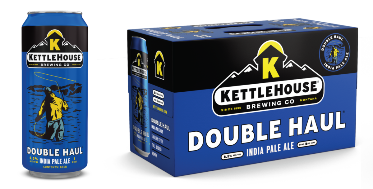
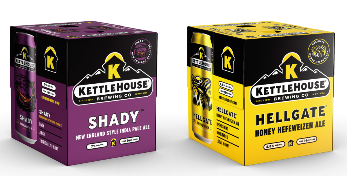
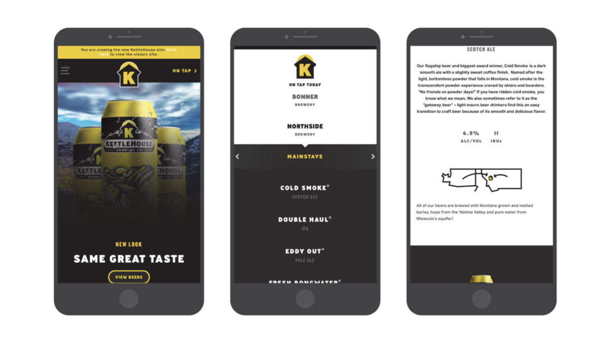
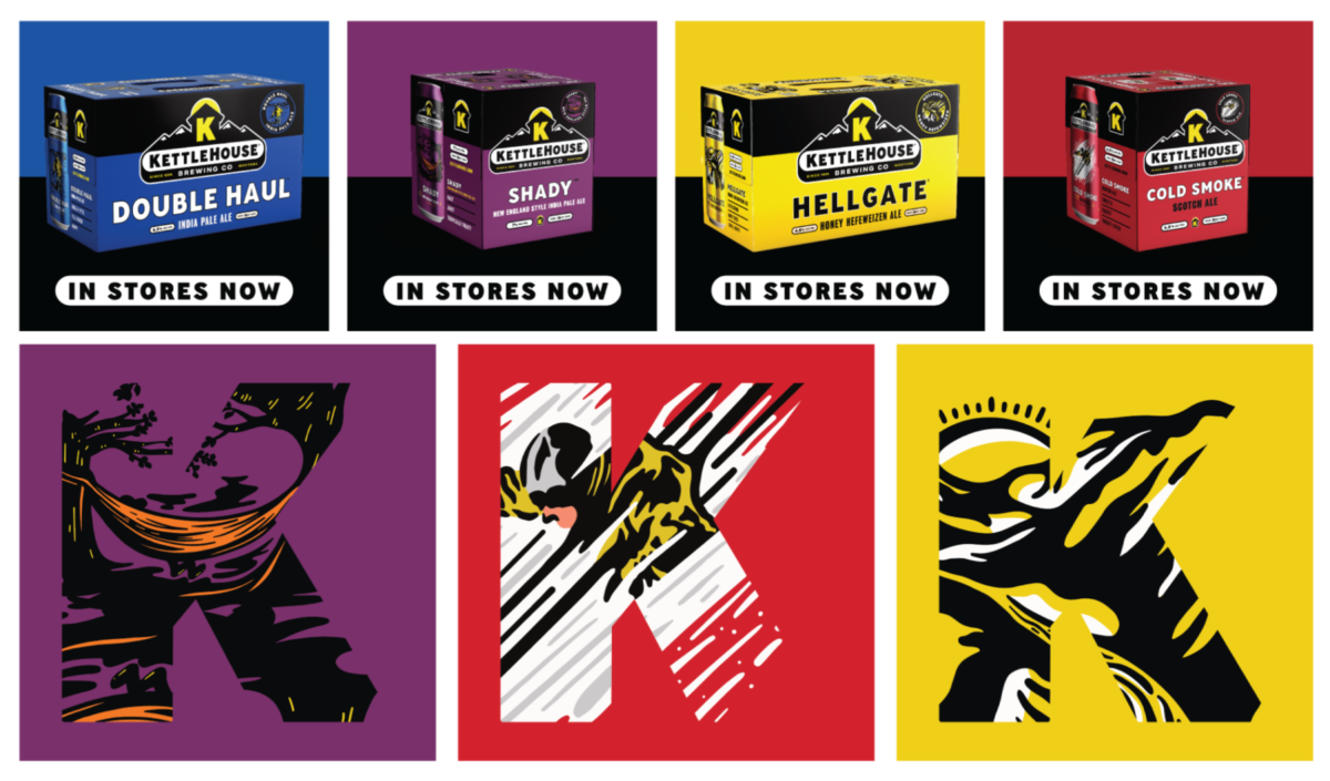
At 23 years old, this is exactly where KettleHouse Brewing found themselves when reaching out to discuss a rebrand.

KettleHouse Brewing was founded by Suzy Rizza and Tim O’Leary as a U-Brew (a “brew your own pilot batch” concept) facility in Missoula, Montana, all the way back in 1995. They proceeded to open the first brewpub in Montana (pushing legislation that would pave the way for others in the state), became among the first in a handful of craft breweries in the nation to adopt canning as a primary mode of packaging, and were one of the first craft brewers in their region to install a brew lab for quality assurance. Phew.

Since then, KettleHouse has grown to employ around 50 people across three distinct locations, running the gamut from a lived-in dive bar to a beautiful repurposed railway terminal-turned-tap-house. Their new, purpose-built production facility in Bonner (about twenty minutes outside of Missoula) adjoins a breathtaking outdoor music venue that is gaining recognition as one of the hottest new amphitheaters in the country.

When asked directly, Suzy and Tim aren’t exactly sure how they landed in Missoula. It likely had something to do with a combination of skiing and snowboarding opportunities, kayaking and rafting, fly fishing in blue ribbon trout streams, mountain biking, and the opportunity to drink beer around campfires under clear starry skies. Immediately apparent is the fact that KettleHouse was never strictly a business endeavor. Granted, these guys can interpret a P&L report. But their chief motivation is the outdoor lifestyle Montana affords, great beer, and the people who rabidly enjoy both of these things—not branding or flashy marketing.

Take the KettleHouse flagship (and best selling craft beer in Montana), ‘Cold Smoke®.’ It’s a sought-out cult classic with a dedicated following along the lines of Spotted Cow. People make a day trip out of filling their trunks with the stuff to trade and enjoy with fanatics in other markets. This type of dedication is typical among the craft beer faithful, save for one eyebrow-raising fact: Cold Smoke® is a scotch ale. You read that correctly: the number one selling craft beer in Montana is a scotch ale. It’s a testament to the craft behind KettleHouse’s beer that Cold Smoke® remains an unlikely horse in the era of ‘Rotation Nation’ and IPAs, hazy or otherwise.

Other KettleHouse favorites include Bongwater Hemp Ale® (a beer that earned them national attention and a run-in with the Feds back in 1998 due to its use of, gasp, hemp seeds), Double Haul IPA®, Eddy Out Pale Ale®, and Northwest IPA.

All of these beers sell exceptionally well. Even as the competitive set continues to expand—with more national brands coming into Montana and new upstarts joining the scene—KettleHouse keeps growing. So, on paper, they didn’t need our help. Why rebrand now?

As much as I’d like to conjure for you, dear reader, a dramatic scenario where the crack team at CODO flies across the country to face a communication crisis head-on, the real catalyst is much more mundane—and probably all-to-familiar for many older breweries. After 23 years of shooting from the hip, KettleHouse’s branding and packaging had grown inconsistent. Incremental in-house revisions and a lack of broader vision resulted in a failure to tell a coherent story. Most remarkably, there was a clear disconnect between so-so package design and the stellar beer contained within.

Here’s some more context directly from KettleHouse cofounder, Suzy Rizza.

We started working with a consultant in 2017, and one of their first recommendations was to redesign our packaging. As we reflected on it, we realized we hadn’t had a graphics update in about 10 years. And A LOT had changed in this time—we were the first brewery in Montana to package its beer in cans, and among the first handful of breweries nationally, but we’re certainly not the only brewery in cans today. The craft landscape had become much more competitive, our existing customer base was aging, and new customers were aging INTO the craft demographic.

Additionally, throughout the past 10 years, we’d had a number of different artists design our different labels. We felt our brand was starting not just to drift, but be chaotically redesigned without an intention to do so. We also had some other particular issues like inconsistencies among each package—the logo in the upper right on this package and in the upper left on that package, for example. Another interesting phenomenon that we were running into had to do with our flagship beer, Cold Smoke Scotch Ale®. Our sales team was letting us know that when they would make a sales call and introduce themselves as being from KettleHouse Brewing Co., they would get a blank stare. But when they clarified they were from “the Cold Smoke brewery,” they heard “Oh yeah! Awesome!” This effectively set the stage for our rebrand.

KettleHouse’s Previous Packaging

More egregious problems included differing versions of the KettleHouse logo in use across can designs, inconsistent packaging, dated illustrations; and a website that hadn’t been updated in nearly 10 years. In summary: compounding issues that cause minor headaches on a daily basis.

We kicked off this project with a (much needed) several-day trip to beautiful Missoula, Montana. There we spent time with Tim and Suzy, Al, Zeb, Erin and a cavalcade of brewery staff / tasting room folks / distributor partners / retail and off-premise accounts. KettleHouse staff guided us on a tour of local bottle shops and restaurants to get a feel for the vibe and snoop on the competition. We spent a good chunk of time at each KettleHouse location drinking our way through their respective tap lists, all the while marveling at the understated grandeur of the surrounding Montana landscape.

We wrapped our field work and begrudgingly returned to (oh-so-flat) Indiana in order to process everything we’d learned. While KettleHouse was doing everything right beer and community-wise, there were plenty of opportunities on the branding and positioning front. A few of our goals included:

  • Bringing consistency to the KettleHouse brand
  • Updating the identity and packaging to better stand out on-shelf
  • Driving home the link between KettleHouse and the splendor of outdoor Montana
  • Reinforcing KettleHouse’s positioning as Montana’s beer
  • And finally, to evolve the brand in a way befitting of a 23 year old brewery

This work culminated in the newly defined brand essence, ‘Montana Roots.’ Montana Roots tells the story of an independent (if not contrarian) brewery that has grown up alongside Missoula. It’s the go-to beer in local dive bars and it’s the beer you gift to family during the holidays. But most importantly, KettleHouse beer is the perfect accompaniment to all of your outdoor pursuits; none of which are complete without a cooler full of Cold Smoke.

KettleHouse Brand Essences

With this brand strategy in place, we began working on the KettleHouse logo. We found significant equity (read: two-decades worth) in the big, bold yellow “K-on-a-black-house” icon. Anyone who knows Montana beer knows this mark. Other important elements to retain included main brand colors (yellow and black), an iconic tap handle design, plus many SKU-specific colors, names, and accompanying illustrations. It proved helpful to identify a short list of “must-keep” elements prior to penning a single sketch.

Our first explorations broke into super-contemporary territory, reminiscent of technical outdoor brands. While this stuff looks really cool, it proved too slick and unfamiliar for a legacy brand like KettleHouse—something from that ‘Montana Roots’ essence was lost. By contrast, the final logo system serves as a clear evolution of the original mark. We addressed hierarchy issues by removing the awkward layering of the K/House icon, and reigned in the number of typefaces being used across the board.

With the identity updated, we developed an in depth set of brand guidelines to keep everything consistent (over the next 23 years?) and moved on to design their flagship packaging. 

This was a rare opportunity to tackle from a design perspective. After working with nearly fifty breweries up to this point, KettleHouse is the first one we’ve met that exclusively sells 16oz cans in boxed 4 and 8-packs. This gave us loads of visual real estate for achieving billboarding in the off-premise set.

We revamped the illustration for each can to be more contemporary and consistent, while still nodding toward the original compositions. We simplified the tasting notes on the can from long paragraphs to a few bullet points—the idea being that the cases themselves would carry the brewery’s story.

KettleHouse’s brand launch was challenging due to their massive production footprint—they had ordered several truckloads of printed cans with old art before kicking off our project. That meant that there would be old packaging sitting next to new packaging on shelf for a few months. This isn’t ideal, but alas, it’s a real world issue you have to work through when you’re brewing at this scale.

What could’ve been a confusing situation was turned into a positive: we used this as an opportunity to celebrate the transition and better transition customers to the new look. We began this move with KettleHouse’s new website (fully-responsive, custom-designed and coded with a WordPress back-end). 

While we updated all of their packaging, only a few SKUs ended up in market at the time of site launch (again, there were hundreds of thousands of old cans to work through). We set their site up to feature existing cans alongside the new designs with a plan to eventually switch everything over as new packaging hits the market.

We shored this transition up by developing and implementing a social media teaser and launch campaign, giving people hints and peeks at the update long before the change took place. This campaign kept customers informed all the way up to launch day and beyond. 


The lasting effect of this rebrand is yet to be seen, but the initial response has been overwhelmingly positive. As much as we’d love to take credit for the accolades (and, hopefully, significant bump in sales), it’s impossible to discount the decades of hard work and passion that built the institution known as KettleHouse. In many ways, KH is the ideal project for us: here is a group that has done nearly everything right since the beginning. Their beer is top-notch. Their leadership team and staff is exceedingly competent. Their culture of hospitality and community engagement is self evident. They’ve got a great setting amongst the natural splendor of Missoula, and a great story as humble (yet legitimately visionary) iconoclasts. All they needed from us was a little help distilling and clarifying all of this impressive “stuff” into a workable branding package.

As more craft breweries are snatched up by Big Beer and macro-conglomerates and industry leaders tug nervously at their collars, KettleHouse stands as one of the most impressive clients we’ve worked with to date. They don’t set out to spark trends or generate headlines—although they’ve been right in the thick of both through the years. What they (and many breweries like them) have created is a legitimate expression of the local lifestyle: For people out west, filling up a cooler with Cold Smoke is as natural as spending an afternoon fly fishing or skiing down a mountain slope. This is the Montana way of life: and from what we’ve seen, life in Montana is lovely.

Build a stronger brand.
Sell more beer.

Join 7,500+ other beer industry folks and sign up for our monthly Beer Branding Trends Newsletter.