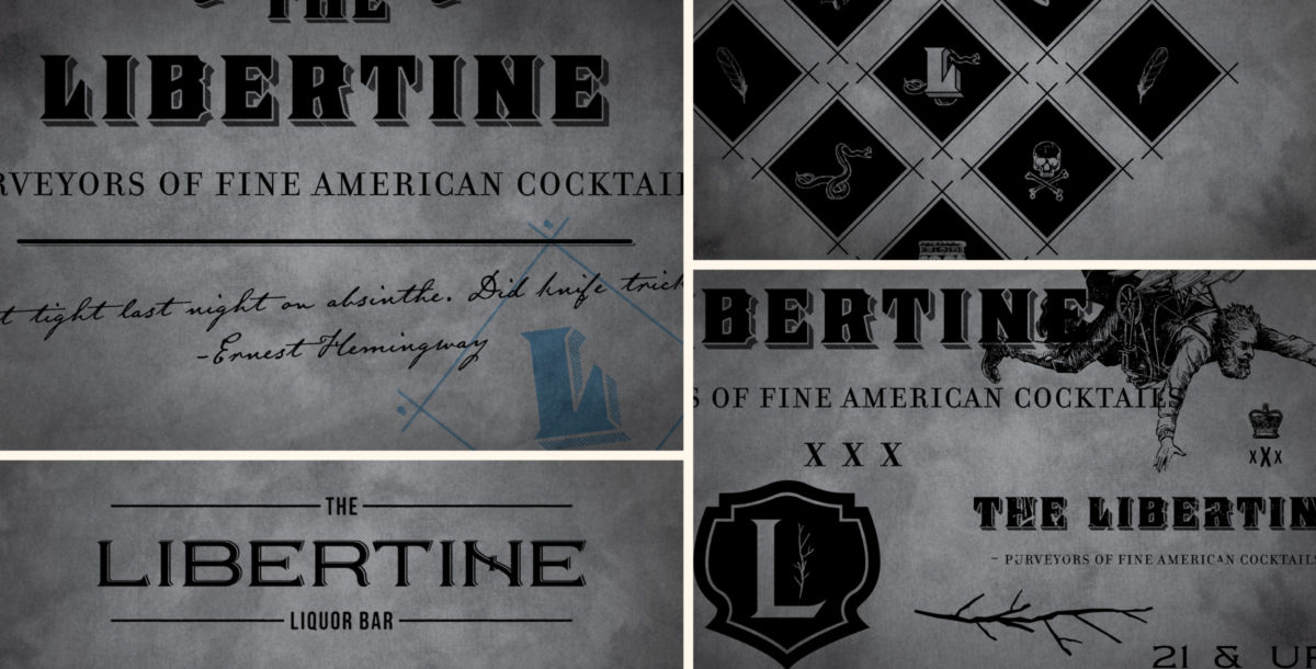
Indianapolis has historically shied away from anything that’s not friendly and warm, “Honest to Goodness,” and all of that. That left ample room for dark, mysterious and frankly, weird branding. A dimly-lit shotgun-style bar played perfectly with the visual mashup of botanical illustrations, ex-pat poetry, the occult, and what it means to be a Libertine—debauchery and deviancy in both sex and drink.


Over the last few years, our city, and The Libertine itself, have evolved. What was once an expensive, sometimes unapproachable standing-room-only restaurant experience loosened its collars (and vest buttons) to become a bit rowdier. Over time, it became a place where you could grab a shot and a beer as well as one of the best cocktails in America. And the food program that Erin Till and Neal architected developed a cult following—bacon flights will do that.
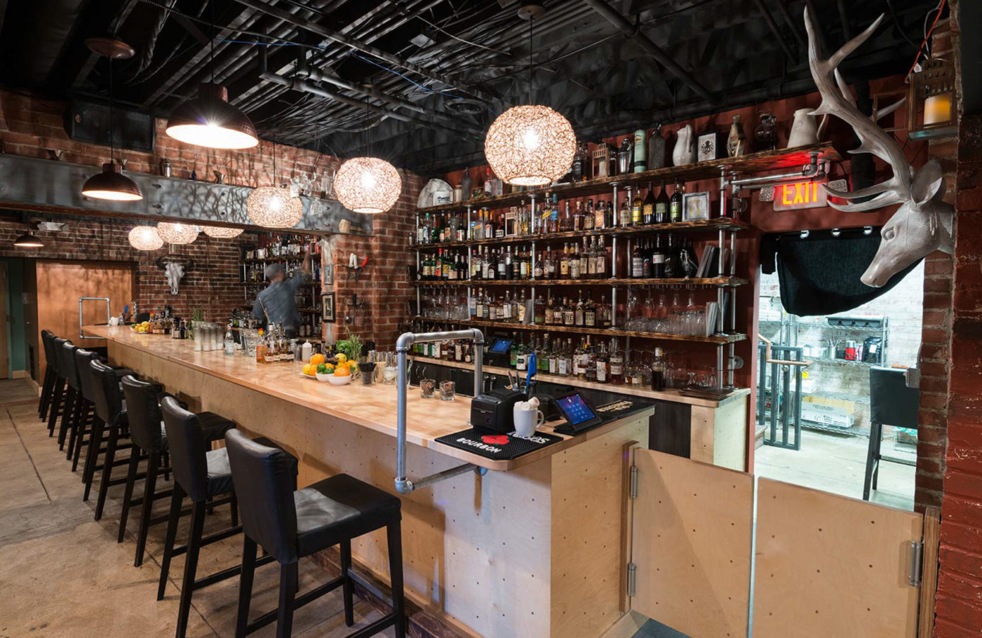
With all of these things going on, Libertine still had to contend with a less than ideal location. A dearth of close parking (which is a big deal in car-loving Indy) as well as physical building issues left a lot to be desired. So when Neal and company successfully launched the Pizzology Mass Ave concept nearby that featured an unused basement, he jumped at the chance to move the entire bar several blocks north east.
And with this move would come slight changes to the concept. The renowned cocktail program remains, as does the food program, albeit scaled back. Now, the Libertine is a place where you’re just as welcome to settle in for a few hours as you are just stopping in for a quick beer as you make your way down Mass Ave. This new positioning called for a complete rebranding.
So our challenge was: what would the Libertine look like as a fun bar? As a “bar’s bar.” A place that you could order that shot and beer, or three, and settle in. A place that would still feature some of the best cocktails and food in the country, while being confident enough to not scream that fact from the rooftops (with fancy pants botanical illustrations and whatnot). What does the Libertine look like if it’s more fun? More inviting? More relaxed?
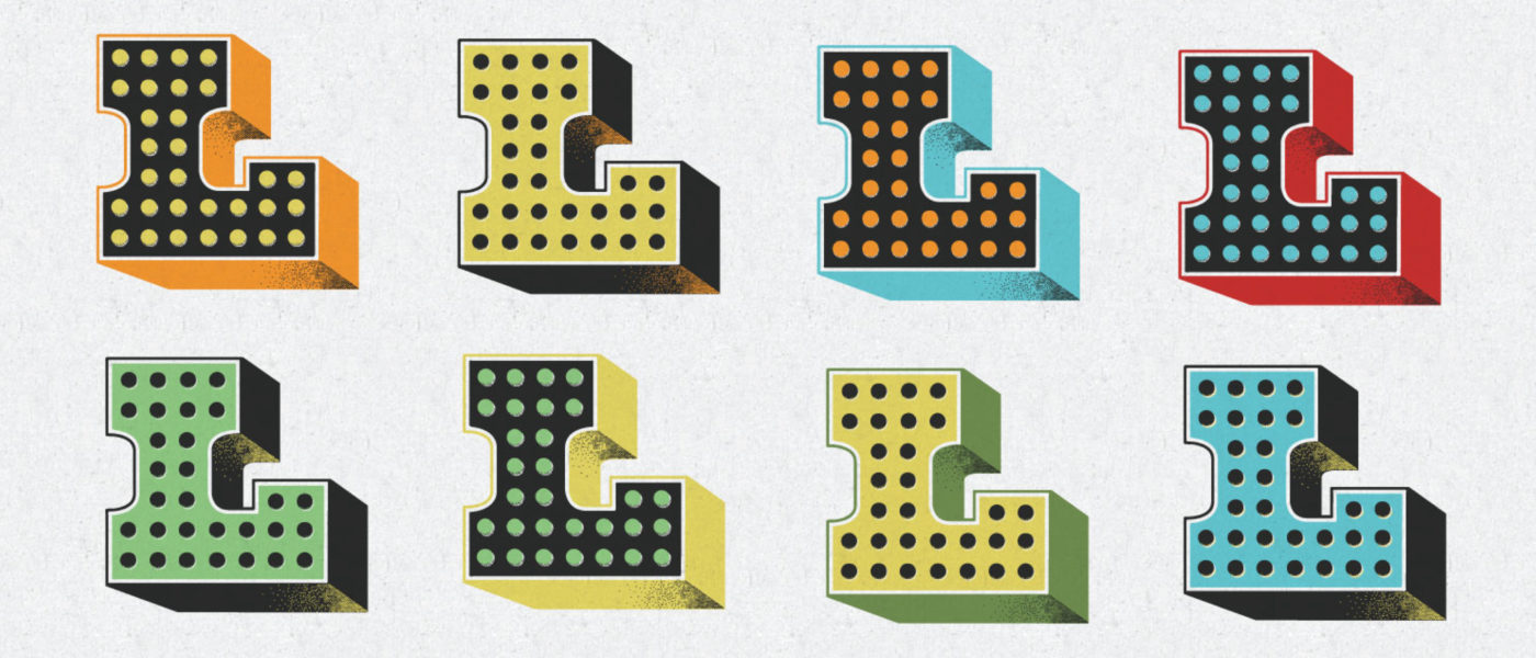
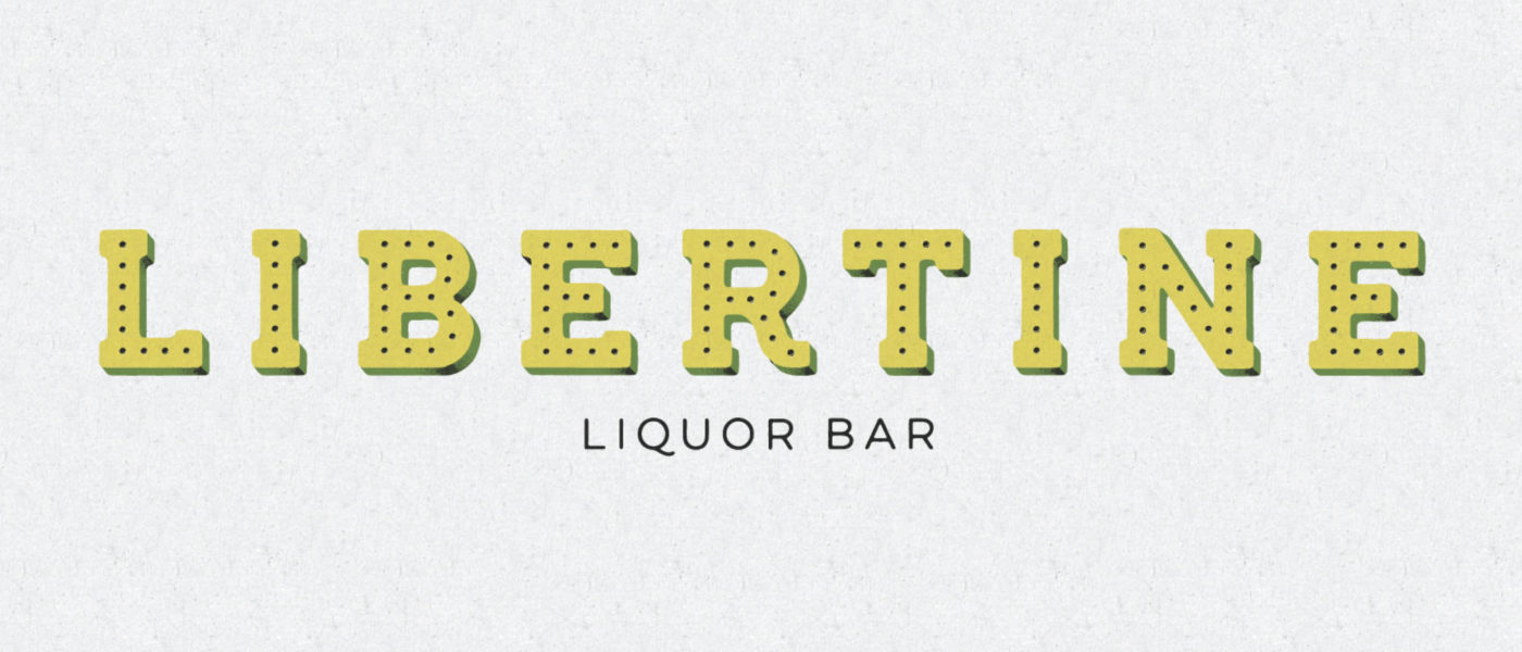
With that charge, we worked with Neal to take stock of everything we’d created for the original Libertine concept and decided that most of it needed to be jettisoned, starting with the dark, foreboding design work. A move to Mass Ave called for something brighter and more approachable. After a long identity design process, we ended up harkening to the same historic period of cocktail artistry, but dressed it down with a carnival-esque aesthetic—like a colorful old liquor bottle. And to our own chagrin, less snakes.
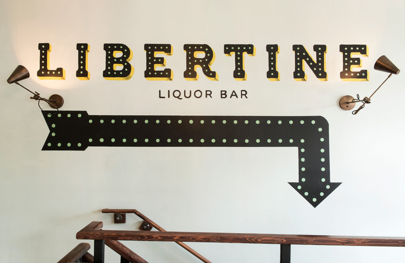
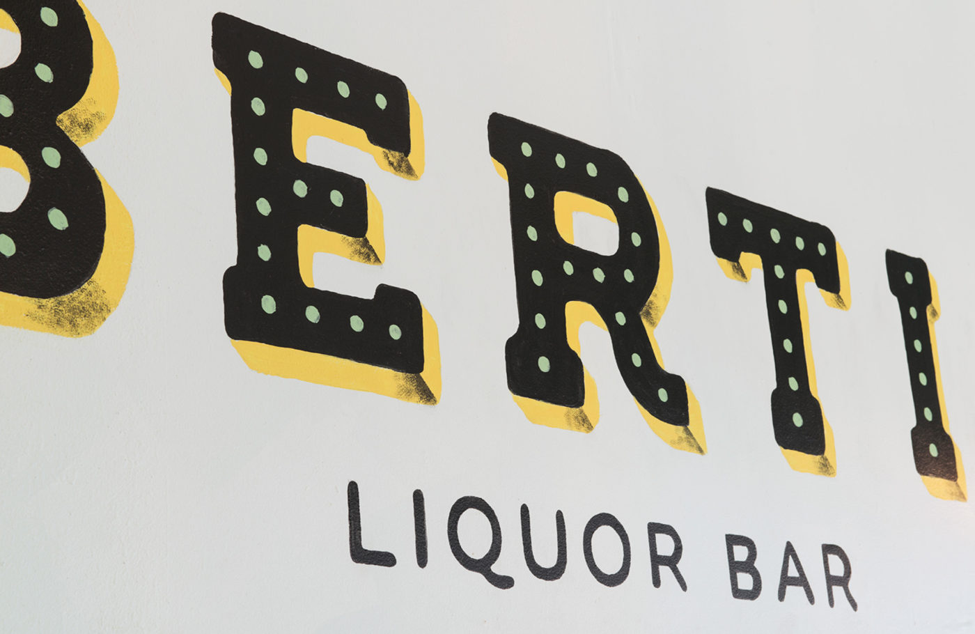
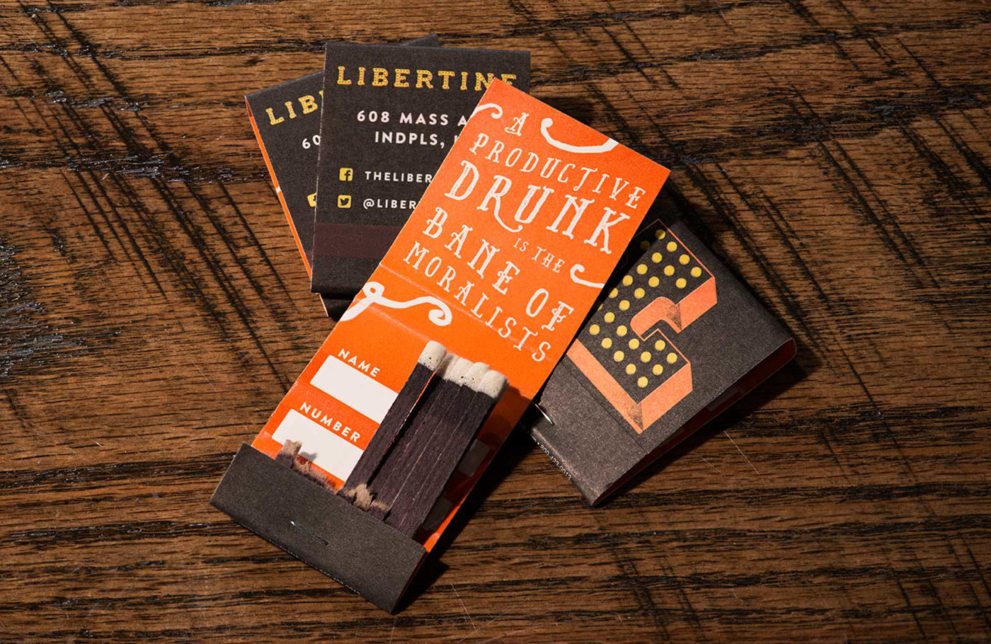
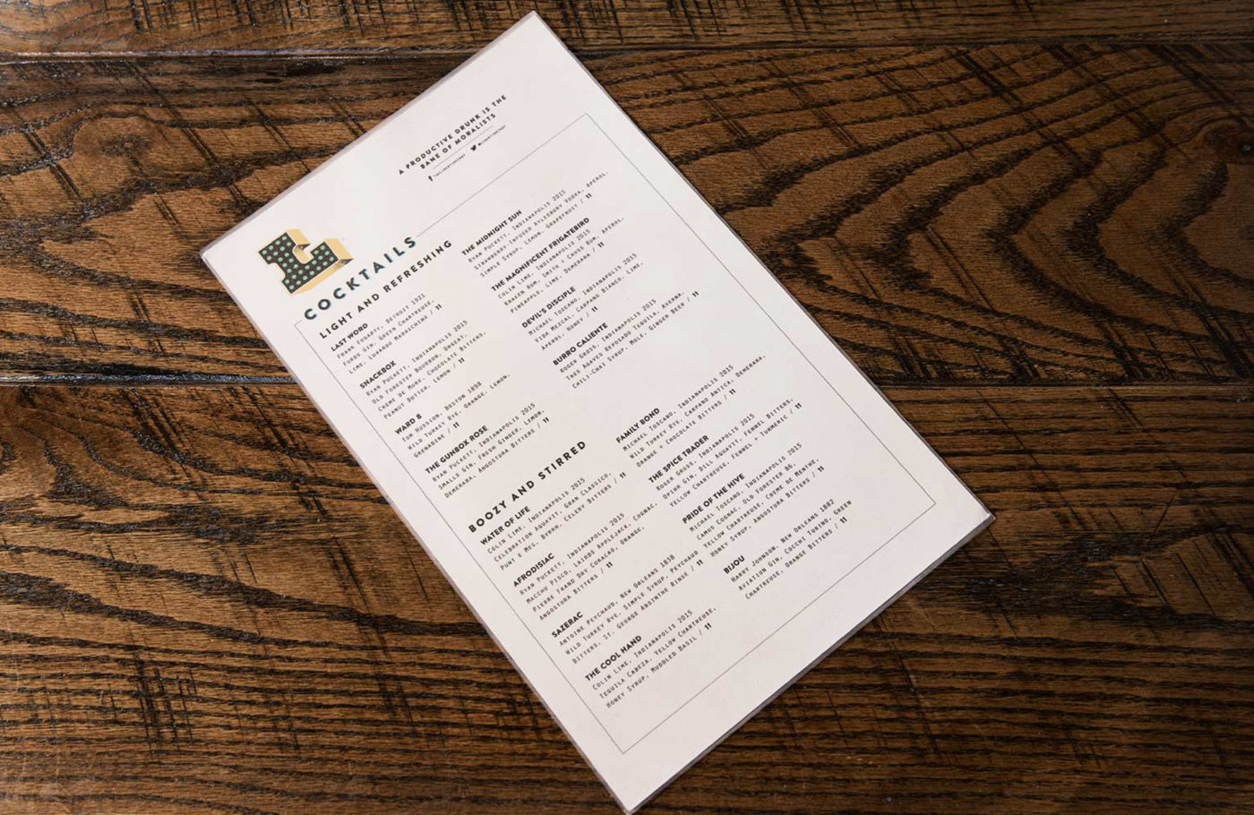
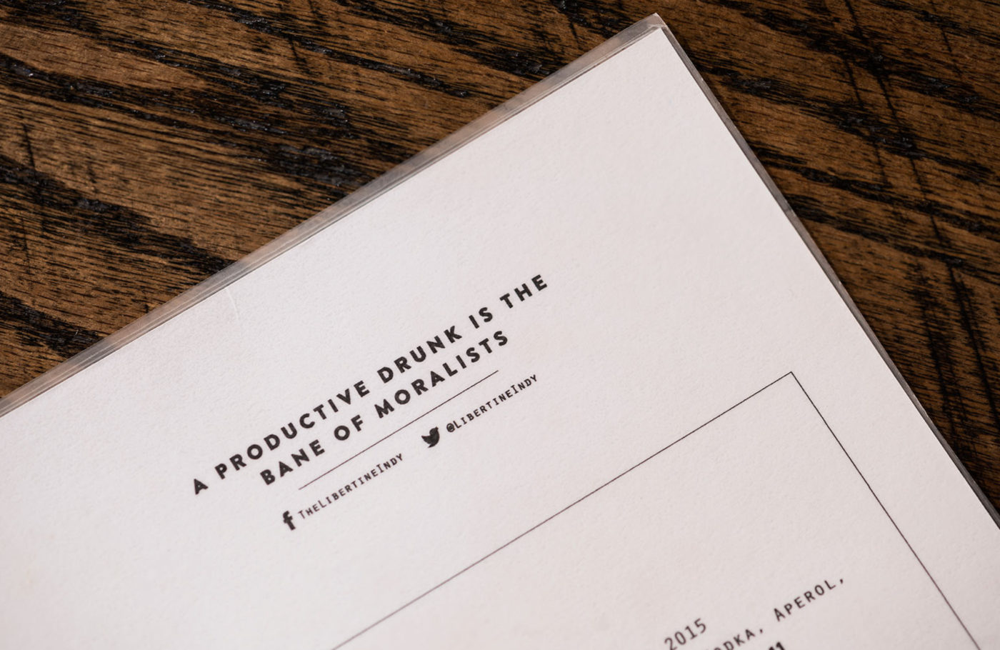
This culminated in an updated identity system (flexible type mark and friendly “L”icon), including a gorgeous hand-painted logo on the main entrance leading downstairs, subtle way showing throughout the space, a refined menu system, pared back, responsive microsite, and other fun ephemera like branded matchbooks.