***
A version of this conversation appeared in our Beer Branding Trends Newsletter. Subscribe for monthly tips on how to make better branding decisions and sell more beer.
***
Stories
Time Traveling with the Beer Can Archaeologist
Looking to beer’s past to understand today’s beer branding trends
I was digging into beer packaging from the 1930’s and 40’s recently (visual research for a legacy brewery brand CODO is reviving) when I stumbled across a fun scientific journal article about the history of beer cans.
The paper’s author, David Maxwell, is an archaeologist and avid vintage beer can collector. Back in 1993, he combined these passions to write the paper, Beer Cans: A Guide for the Archaeologist, and has been an internationally-recognized expert on the subject ever since. I’ll let him discuss this in the conversation below without giving too much away here.
But for now, why are we interested in this?
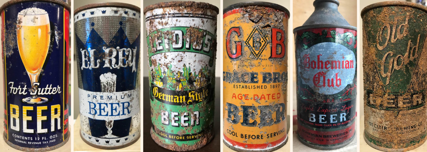
Beyond looking at beautiful examples of classic beer packaging (which is reason enough for reading on, I suppose), why spend the time to break them apart and clearly define each era’s visual vocabulary? As we were looking through everything David sent, and comparing it to the other several dozen design trends we’ve identified and defined over the last decade, we realized how very little packaging concepts and aesthetics are actually new today.
Minimalism, maximalism, typography-driven, bifurcation, patterning, scrolls, seals, ribbons, different size formats, label violators, spurious claims, funny lines—it’s ALL been done before. And by people who didn’t have computers, by the way—amazing.
Almost everything in contemporary beer packaging echoes the past in some way, even if the designer has no idea they are doing it. There’s a canon to beer packaging that finds its foundations in the earliest days of can manufacturing.
Let’s explore this concept in more detail with the Beer Archaeologist himself.

Hi David. Please introduce yourself and give us some background on this paper, why you wrote it and your favorite thing about collecting vintage beer cans.
 David
David
My name is David Maxwell, and I am a lecturer (teaching professor) in Archaeology at Simon Fraser University (SFU) in Burnaby, British Columbia. I received an MA in Archaeology from SFU, and a doctorate in Anthropology from the University of Arizona. I began collecting beer cans and other forms of breweriana as an 11 year old, obtaining most from the roadside near my parent’s cottage in Washington State. As I discovered that there were other can collectors—and as I started to find obviously older and very different looking cans—I became interested in the history of beer cans, initially just as a way of knowing approximately how old my own specimens were. When I was working on my MA, one of the professors at SFU was teaching a class on historical archaeology, and asked if I would give a short talk to his class about beer cans. When I was finished, he took me aside and suggested that I should really consider publishing a guide for historical archaeology. After a semester of research (at Arizona), I put together a paper for publication in the journal Historical Archaeology; this was reprinted in a special publication comprising “essential” readings in material culture put together by the Society for Historical Archaeology in 2000, and continues to be my most searched-for publication.

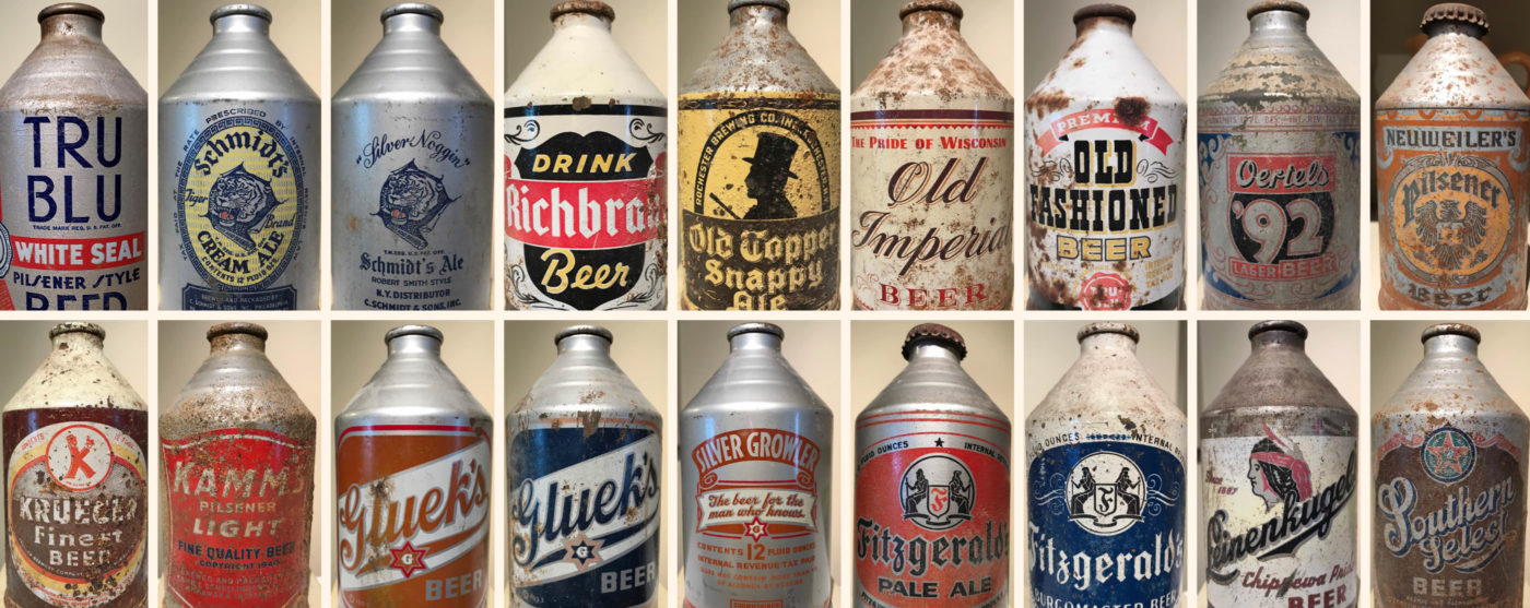
A small portion of David’s collection.
This paper’s thesis—using beer cans as tools to date historical sites or intrusion into prehistoric sites—is interesting. Do you know if beer cans and/or your paper have ever been used to date a crime scene or other historic site?
DAVID
I have no idea about crime scenes, but I do know that my paper has become a very common tool for field archaeologists, particularly those working as consultants in the Heritage Resource Management field (roughly 85% of all professional archaeologists in North America are consultants). US federal regulations under the National Historic Preservation Act of 1966 designate sites as eligible for protection once they are 100 years old; this means that sites containing old beer cans will become eligible in another 14 years. The California Environmental Quality Act requires documentation of materials greater than 50 years of age, which means that even cans of the pull-tab era are now something that must be documented by archaeologists working there.
From 2010 to 2020, hundreds (thousands?) of breweries came to market with vaguely retro / vintage / throwback branding. We always refer to this aesthetic as “Nostalgic Regional.” When you see a craft beer can today that carries historic design like you’re so well versed in—whether it attempts to genuinely look like it is from a certain era, or, it is a contemporary reimagining of a vintage design—what is your gut reaction? Is it positive or negative?
DAVID
My reaction is mostly quite positive. It’s funny, but about 20 years ago I was in a local antique shop and came across some older Canadian bottles, and thought it would be interesting if a brewer was to start putting out beers with the same names and labels as these long-forgotten brands.
I have noticed that there are quite a few brands in the US that have magically re-appeared after years (decades in some cases) of being non-existent. Some recent examples: Brouwerij West in San Pedro, California, did a nice job of recreating “Blue ‘n Gold”, a brand that dates to the 1950s at least; although I’ve only seen a small photo, the label from San Pedro looks an awful lot like the original version on my shelf. Similarly, it’s interesting to see the reappearance of “Mr. Boh” on National Bohemian (G. Heileman) cans, especially since the ones I have with Mr. Boh mostly date to the 1950s. A few years back there was even a can designed with opening instructions (Churchkey Pilsener by Two Beers Brewing in Seattle), which was fun to see.
My only negative reactions have been with some Canadian examples produced by the mega-brewers. In the early 2000s, both Labatt and Molson issued a series of cans showing their respective labels through time, and both of them got their own histories quite incorrect. Molson included a label that was never used on cans. Labatt omitted their wonderful “tulip” labels from the 1960s (and then claimed that their labels from the 1970s were from the 1960s). Quite recently, Moosehead did a very nice retro-style can label, although it was a design never actually produced on cans in the past.
The amount of cans that clearly state “BEER” is interesting. Education was a big theme in American craft beer over the last 10 years. E.g. there was a big push to educate consumers that cans are a better vessel than bottles. And now with a big shift towards putting 6-packs in boxes, you have to educate people that those boxes house cans. Were there any other interesting quirks surrounding educating the public? Maybe with pop tops or punch top cans?
DAVID
Absolutely, and there are many cans with statements designed right into the labels. In the late 1950s, a number of brewers started to use aluminum lids on their punch top cans, as these were easier to open than steel lids. These are often described as “soft tops” with this feature mentioned right on the label itself. When self opening cans were introduced in 1962, brewers pointed this out using a number of terms, again right on the can labels; one of my favourites actually tells the consumer to “Zip, Tip, and Sip” their beer. By the later 1960s (at least in the western US) and into the mid-1970s, some brands decided to inform consumers about what a bargain their beer was by incorporating the price right onto the label with statements like “6 for 99 cents” and so on. I don’t think it would be a bad idea to inform consumers that the 6-pack box houses cans.
Early cans had to clearly state their contents—”Beer”—because the format was entirely new.
Build a stronger brand.
Sell more beer.
Join 7,500+ other beer industry folks and sign up for our monthly Beer Branding Trends Newsletter.
Beer Branding Trends 2.0
< back
There are a lot of formats coming out today that are seemingly new. But they’ve been done many times before. E.g. 8oz., 32oz. 19.2oz—16oz pint cans are a craft staple—was this initially piloted by Schlitz to make up for revenue lost in a 1953 labor strike or were these different formats ever offered to give the consumer more choices at different price points? Or am I applying 2021 rationale to a decision made in 1954?
David
It does seem likely that different can sizes related to price point options, at least to some extent. A number of popular brands were produced in both 12 and 16oz varieties from the 1950s onward, and some even began using 7 and 8oz cans to go along with these. Lucky Lager was a very popular brand on the west Coast from the end of prohibition until at least the late 1960s (when it seems to have become more of a budget brand). By the late 1950s and early 1960s, Lucky Lager came in 7, 11, 12, 15, 16, and 32oz cans (along with bottles), which must have been about consumer choice and not just a bounty for future collectors (Lucky Lager quarts go for big bucks!).
Was there any aesthetic or messaging reasoning behind the transitional “cone top” or “crowntainer” cans or were they born out entirely because they would work with existing bottling lines with minimal modification? (It’s also interesting that the same discussions and decisions being made today about 12oz vs 16oz cans vs 12oz bottles and bottling vs canning lines, were the same discussions and decisions being weighed by breweries 90 years ago.)
David
Advertising from the 1930s directed at brewers indicated that consumers would prefer to drink beer from a familiar looking package, and attempted to sell breweries on the idea that cone top cans were essentially metal bottles. This may have worked to some extent, but I think price was the real driving factor, as Schlitz was the only major brewer (second in sales only to Anheuser-Busch in those days) to use cone tops. Both Pabst and Anheuser-Busch went exclusively with flat top cans; Miller and Coors were both only regional brewers in the 1930s, but they both went exclusively with flat top cans as well. I love the fact that craft brewers have the option of hand filling cans, making this option more affordable even for the really small brewers.
“Crowntainers” were adopted by breweries because they worked on existing bottling lines.
Tell me about the 1 gallon beer can (!!!). Was that a fluke used by one or two breweries during the early 60’s through the mid-70’s or was there a move to try to mainstream it?
DAVID
As I understand it, the US gallon size never really caught on due to issues with the kit required for tapping the cans; a number of gallons were produced during the 1960s-70s, but all by regional or local brewers and none for very long. Flash forward to the early 2000s, and suddenly a number of brewers were doing party cans (Molson referred to these as “Bubba” cans) with the tapping mechanism built in. I think the two issues with gallons (or 5 litres, as in the 2000s) are that (1) you pretty much have to drink all of the beer in a short amount of time; a 5 litre can is about the same amount as 14 bottles of beer and (2) these cans are huge, and take up a lot of space in the fridge. There seems to be a cultural component to it as well, as the bigger “party cans” have a long history—and continue to be used—in Europe, without ever really catching on in North America. I am a bit surprised that we do not see party cans coming out of craft breweries, particularly with the popularity of growlers (incidentally, some crowntainers were described—right on the label—as “silver growlers.”)
Your finding on thicker paint and lacquer better preserving cans from the 1930’s was interesting. Did you consider any other graphic design elements when developing this paper or were you primarily focused on the can fabrication itself? (It would be fun to work on a paper breaking down visual vocabularies for each specific era in American craft beer).
DAVID
As I was focusing more on the types of traits that archaeologists might be able to distinguish, even with poor (or no) label preservation, I did not really look that much at design elements beyond opening instructions. Certainly there are broad patterns through the decades of can design that likely reflect their eras:
1930s-1940s: metallic colours are common, along with either art deco-style labels or very traditional scenes, often showing connections to the “old country” with Bavarian costumes, etc.
1950s: more use of pastel colours (sometimes metallic, sometimes not), along with party-series cans – different colours & labels with features like cartoons, horoscopes, illustrations of facial characteristics & how these connect to personality, actual trivia, scenes of domestic activities (golfing, bbq), and even classic car designs.
1960s: some futuristic labels geared to the “space race” (Astro Malt Liquor, with a Gemini / Apollo-style rocket on the label or Orbit Beer, with its label depicting the Earth as viewed from the Moon).
1970s: dominated by cans celebrating the US Bicentennial, with some labels continuing this theme into the early 1980s.
Less time specific are social issues, which occasionally cropped up on cans. Nu-Deal Beer was produced during the late 1930s; Soul Malt Liquor was produced in Los Angeles in the late 1960s (right after the Watts riots, legend has it). By the early 1980s, “Wake Up America” became a recurring theme on cans produced by breweries owned by Paul Kalmanovitz, urging people to support domestic industry (such as pledging to make their next car an American car), and marking the most strident political messaging I have ever seen on a beer can.
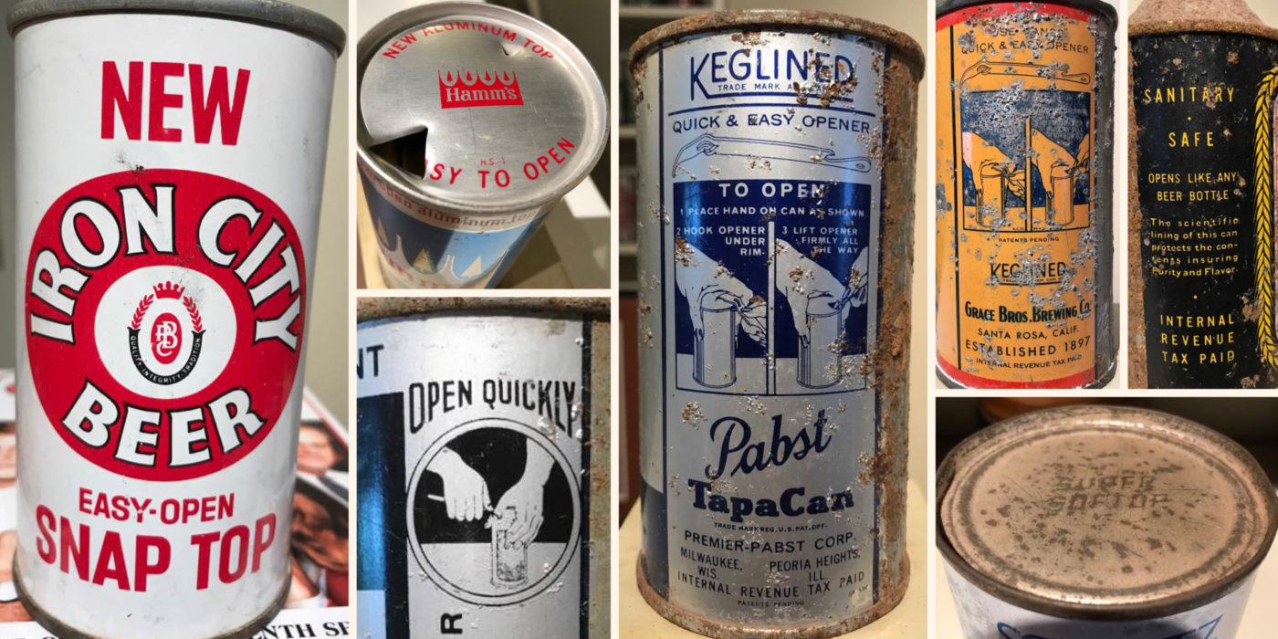
“Soft Top” and “Zip Top” cans became a differentiator and selling point for many breweries. But with that came the need to educate people on just how to open the can itself.
The camouflage / olive drab green cans produced during World War 2 are fun. I like the idea that you’re close enough to the enemy that they could spot your beer can, but not so close that you can’t still enjoy a nice cold beer (gotta wait for the lull in the fight to crack one open though). Are there any other major historical periods or events in American history that influenced beer cans and package design like this?
David
I guess the generic label varieties of the late 1970s and 1980s would come the closest. These labels – like the other generic products in the grocery store—were reputedly designed to sell what was inside, and typically consisted of black text on a white background. For a conference presentation in the 1990s, I tallied more than 60 different varieties of generic beer can in the US, begging an important question: if generic labels sell the product within, why are there so many label variations? My thinking is that beverages that are frequently consumed right from the container are something that people use to create part of their personal identity (unlike a bag of frozen veggies, where only the person doing the cooking knows the truth). Many people identify very strongly with the brand of beer they drink (to the point of paying to buy a T-shirt or hat to advertise the product); they do not want to be seen drinking from a generic can.
Did you learn anything during this process that could hint to where beer cans will go from here? Are there any future innovations you see as inevitable or are we nearing the end of what we can achieve with that format for now?
David
It’s probably just the archaeologist in me, but I say “look to the past” for hints about the future. The six-pack yokes designed to keep the lid of the can clean for drinking? Invented in the early 1960s. The tear-away corner of the 12 pack that permits the cans to roll out one-at-a-time? Invented in the early 1960s. Date stamping cans (the “born on” date used by both Anheuser-Busch & Molson in the 1990s) to show how “fresh” the beer is? Common practice for Lucky Lager beer from the 1930s until the early 1960s.
What’s coming next? I don’t know; perhaps a re-sealable can? A biodegradable can? There were some plastic beer bottles in Europe during the 1970s, and we now have plant-based “plastic” utensils that are biodegradable; could someone put these together to create cans or bottles that will break down?
And most importantly, I know you have a huge collection. What is your favorite vintage can?
David
By can collector standards, my collection is actually pretty small (the biggest I have ever heard of had about 88,000 cans, and that was 5 years ago). My favorite can varies on routine basis, sometimes daily, but I have always been fond of the Rainier Jubilee series of cans, produced in Washington state during the later 1950s and early 1960s. These were metallic labels that came in a tremendous variety of colors, sizes, and styles—in fact, no one is certain exactly how many variations exist. One collector calculated 11,052 possible label varieties, but I think most collectors would go more in the 1,100–1,200 range. One of the many fun things about Rainier Jubilees is that when they were being produced, the can company workers would often change paint colours without cleaning out the system. For example, if they were changing from a run of red cans to a run of blue cans, they would inadvertently end up producing a wide variety of shades of purple along the way. I’m also fond of older cans from British Columbia, especially the Simon Fraser Lager cans produced by Tartan Brewing in the late 1960s / early 1970s. Tartan was run by Ben Ginter (aka Uncle Ben), and renowned by those I’ve spoken to as producing the worst tasting beer on the planet. The Big 4 Canadian brewers (Carling, Labatt, Molson, O’Keefe) drove him out of business in the mid-1970s, but not before he gave us labels like “Pil’Can” “High Life” (I guess Miller never noticed) and of course Uncle Ben’s Malt Liquor, complete with a photo of him (wearing a fake beard) smiling broadly.
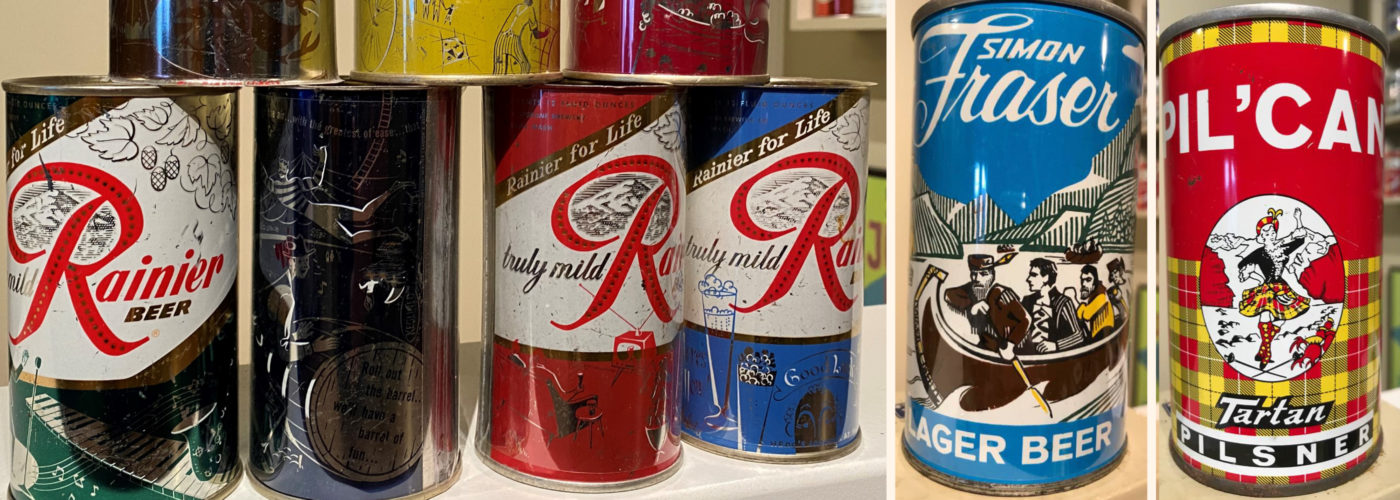
David’s current favorite beer vintage cans—Ranier’s “Jubilee” series.
Build a stronger brand.
Sell more beer.
Join 7,500+ other beer industry folks and sign up for our monthly Beer Branding Trends Newsletter.
Beer Branding Trends 2.0
< back