Resources
What is Gender Neutral Design? And could it make sense for your brewery’s packaging?
Exploring opportunities for attracting more diverse drinkers to the craft beer industry
Untold amounts of ink (pixels?) has been spilled reporting on whether Gen Z does, or doesn’t drink alcohol. And how this cohort—the most diverse in history—will shape the beverage alcohol (Bev Alc) industry moving forward.
Beer has historically been positioned as a blue collar, masculine thing. This isn’t historically accurate, of course, but the last 60+ years of American beer advertising has taken its toll. And there’s a lot of work to be done if we want to genuinely court and include younger drinkers (both men and women) in craft beer moving forward.
One thread that’s come up again and again in our work when discussing positioning or audience definition is the idea of being gender neutral. This is an interesting concept and one that we think will become more important as more Gen X and Millennials slow down and the need to recruit new legal drinking age (LDA) consumers intensifies.
To explore this idea, we sat down with Chloe Gordon, Content Editor & Social Media Manager at The Dieline for her perception on this emergent trend and whether or not it can work in the craft beer industry.

Let’s start with an easy(?) question: What is gender neutral design?
 Chloe
Chloe
For me, in the shortest answer possible, gender-neutral design is a system that’s completely free of cliched visual stereotypes.
Which industries do you see embracing this idea the most?
Chloe
Interestingly, right now, I’m seeing a trend in beauty brands embracing the ideals of gender-neutral design. It’s been slowly happening for a bit, but Harry Styles, yes, that Harry Styles, has a beauty brand called Pleasing that has allowed us to see a bit more beyond just the tip of the iceberg of gender neutral design. The brand embraces color, fun typography, interesting shapes, and is entirely void of gender-based cliches.
Traditionally, the beauty industry has been aimed at solely targeting women, specifically women the market believes are invested in script typefaces and pink-hued color palettes.
Yet, we’re now in a fascinating space where the beauty industry is becoming more and more accessible to those who don’t identify as female without tipping all the way over to a space designed for the formulaic “masculine” trope.
Have you come across any beer or beverage brands that do this well?
Chloe
I think the coffee industry is one of the only beverage categories that has mastered the art of gender-neutral design right now. Beer, seltzers, wine, whiskey, and all the other alcohol (and non-alc) brands have some catching up to do.
Let’s dissect the coffee space, though. According to Statista, in 2020, men in the United States drank about 1.93 cups of coffee per capita per day as opposed to female respondents’ per capita consumption standing at roughly 1.82 cups a day that year. And while this number is pretty close, men statistically drink more coffee, yet the packaging doesn’t lean toward masculine tropes. In my opinion, it does a fantastic job of being neutral while not being afraid of bright colors, interesting typography, quirky illustrations, and, sometimes, just simple, effective, and minimal design.
Where coffee packaging is experimental, beer packaging is trapped in a cycle of stereotypes. Often, beer packaging is geared towards the masculine drinker showcasing tropes such as skulls, sports, darker colors, rugged typefaces, etc. When beer tries to become “feminine,” it moves towards the cues of the seltzer space, think overusing white space, pink and green hues, and simple typography.
I don’t want the beer space to even look at the seltzer space for inspiration. I want it to move the needle entirely. In my dream world, we’d see the beer industry take cues from coffee packaging. We’d see experimental typography. Interesting color combinations. New, less rugged illustration styles. Maybe even minimalistic designs. It doesn’t take much to be different in the beer space right now, especially when taking inspiration from markets outside of alcohol, and that potential should really inspire designers.
Can you give us some of your favorite (non-beer) gender neutral branded projects that have been published on the Dieline recently?
Chloe
I’m picking three beverage brands, so there’s a bit of relevance with those interested in beer-related packaging.
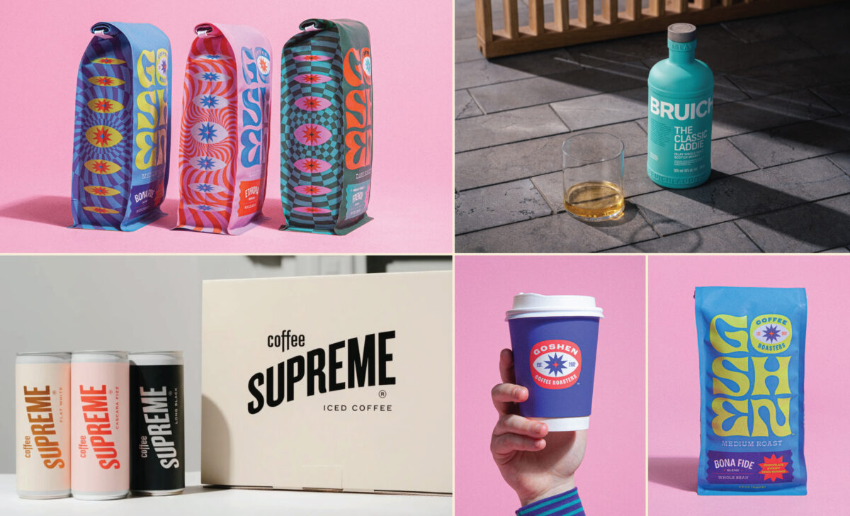
Bruichladdich, the progressive distiller, recently worked with Thirst to create a brand-new whisky packaging system. It’s stunning in all its blue-hued bottle magic, and the bold, white typeface really brings the whole design home for me. It’s an unexpected design for the whisky space, which frequently depends on masculine-leaning design aesthetics, but that’s exactly why this design works.
Porter Packaging and Think Packaging teamed up to design Coffee Supreme’s 3-piece coffee-in-a-can collection showcasing its offerings. Supreme was responsible for the branding, graphics, and artwork. While the design is beautifully minimal, the cascading type and gorgeous color palettes construct a balanced sense of order and precision while maintaining a whimsical attitude that doesn’t feed into feminine cliches.
Lastly, there’s Goshen. This coffee brand’s bags are, in my opinion, what every brand should be striving for. And yes, you can be both irreverent and minimalistic if maximalism isn’t your vibe. There are fun colors, playful patterns, interesting details, and, best of all, the maximalist design doesn’t feel overwhelming, thanks to the thoughtful use of white space. Just because a coffee bag is pink doesn’t mean it’s immediately feminine. Goshen has balanced a powerful punch with thoughtful details, thus creating an unexpected gender-neutral design.
Build a stronger brand.
Sell more beer.
Join 7,500+ other beer industry folks and sign up for CODO’s monthly Beer Branding Trends Newsletter.
Beer Branding Trends 2.0
Does packaging have to be monotone, beige and/or gray to be gender neutral? Can you be colorful and vibrant (or heavily illustrated and maximal) and still fall into this category?
Chloe
Absolutely not! You can 100% embrace color and still be considered gender-neutral. Just look at Goshen. If brands feel lost in figuring out how to be gender-neutral while still maintaining a sense of vibrancy and playfulness, it’s important to think inward. Don’t design packaging that’s meant to be for everyone. That’s never going to work, no matter what the brief is. Think about what you, personally, would want to buy as a consumer. What’s missing in the space? What aren’t brands and designers doing? Whatever’s not there, is what will likely work, it’s a missing market.
No matter what gender you are (or aren’t), if you like it and it’s something new, someone else likely will too.
Let’s go back to thinking about whisky packaging for a second. It’s clear that the shared belief between designers and brands is that whisky is for men. Almost all whisky packaging follows the same tropes: dark colors, rustic undertones, and regal, gilded details.
Yet, when a brand like Bruichladdich disrupts the market with something more gender-neutral (and colorful, for that matter), designers and brands can recognize that cliched design aesthetics aren’t the only ones possible. If designers are designing whisky bottles for who the perceived demographic is, as opposed to maybe what they personally are inspired by, there’s an undeniable missing link.
How does typography play in this concept? Should type be sans serif and down the middle or can you have more expressive faces?
Chloe
Typography is tricky. Some people think typefaces lean into certain gender buckets. There’s the thought that calligraphy and handwritten typefaces lean more feminine, while sans-serif, rustic typefaces appear more masculine. Maybe this is true for some, but I,personally, don’t like the idea of “gendered typography” at all.
It’s also especially hard with packaging because there are so many other elements in play. What’s the product within the packaging? What’s the color palette? Patterns? Illustrations? You can absolutely have a gender-neutral script font in packaging, and it’s equally possible for a rustic typeface to be gender-neutral.
Gender-neutral design needs to have more fun with fonts. Don’t feel limited to the simplest, most straightforward fonts because you’re afraid of potential perception. Gender-neutral design, specifically regarding typography, shouldn’t be played safe.
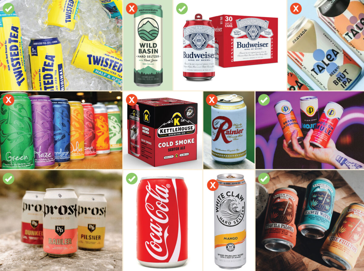
Rapid fire, here: Gender neutral design, or not. Go!
Chloe
Oh, fun! Yeah, let’s go…
Ranch Rider Spirits: Yes
Plain Spoke Cocktails: Yes
Ranier: No
Wild Basin Hard Seltzer: No
Talea: No
KettleHouse: No
Budweiser: Yes
Coca-Cola: Yes
Treehouse: No
Twisted Tea: Yes
Prost: Yes
White Claw: No
Is gender neutral strictly a tactic to appeal to Gen Z or is there any merit to exploring these cues to target Millennials and/or Gen X consumers?
Chloe
I think GenZ consumers have pushed brands to think outside of a preconceived “box.” They’ve helped prove that consumers aren’t afraid of gender-less or gender-neutral design, which, in turn, inspires other brands to retarget millennial consumers.
Is gender neutrality tied specifically to aesthetics or is this an ethos that should pull through all aspects of a brand—brand voice, website, broader marketing, messaging, etc.?
Chloe
No, gender neutrality goes way beyond how the packaging looks. It’s where advertising is being placed, who’s featured in the advertising, what kind of influencers a brand is working with, who’s showing up on the brand’s social channels in photography, and, really, anything the brand is presenting in the world.
Do you think nostalgic branding and packaging (e.g. beer packaging that looks straight out of the 1940’s or 1960’s) is gender neutral? I view these as being traditionally masculine, but realize that A.) This is shaped by my own worldview and preferences, and B.) These aesthetics are somewhat timeless. (So I’m not sure how that affects this either.)
Chloe
This kind of ties into the question of whether gender-neutral design is solely about packaging. While I think 40s and 50s beer packaging is quite neutral, I think where the masculine qualities come in is how this beer is being presented. For example, looking at 40s and 50s print ads for beer, you’ll find things like a man holding a hammer with a dolled-up blonde woman behind him pouring a can of Budweiser in his chilled glass. So it’s not the packaging that’s masculine, it’s the perception of the beer that has driven the packaging to appeal to men.
What advice do you have for a brewery or beverage brand that has never thought about their identity and packaging in these terms and is interested in appealing to a broader base through gender neutral design? Where should they start, how should they think about this, etc?
Chloe
Here’s the thing, why wouldn’t you want to be at least approachable to all genders? Beer, coffee, wine, etc. are all consumed by everyone, so why should the packaging of these products limit your demographic?
Of course, you’ll never be able to appeal to everyone, and that’s fine. But, I think it would be naive to completely close out certain genders because of what you perceive to be the truth (for example, thinking that no men like hard seltzers, no women like whisky, or non-binary folks don’t drink zero-alc beer, all of which are vastly untrue).
Build a stronger brand.
Sell more beer.
Join 7,500+ other beer industry folks and sign up for CODO’s monthly Beer Branding Trends Newsletter.