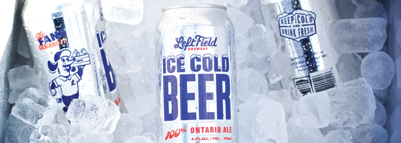
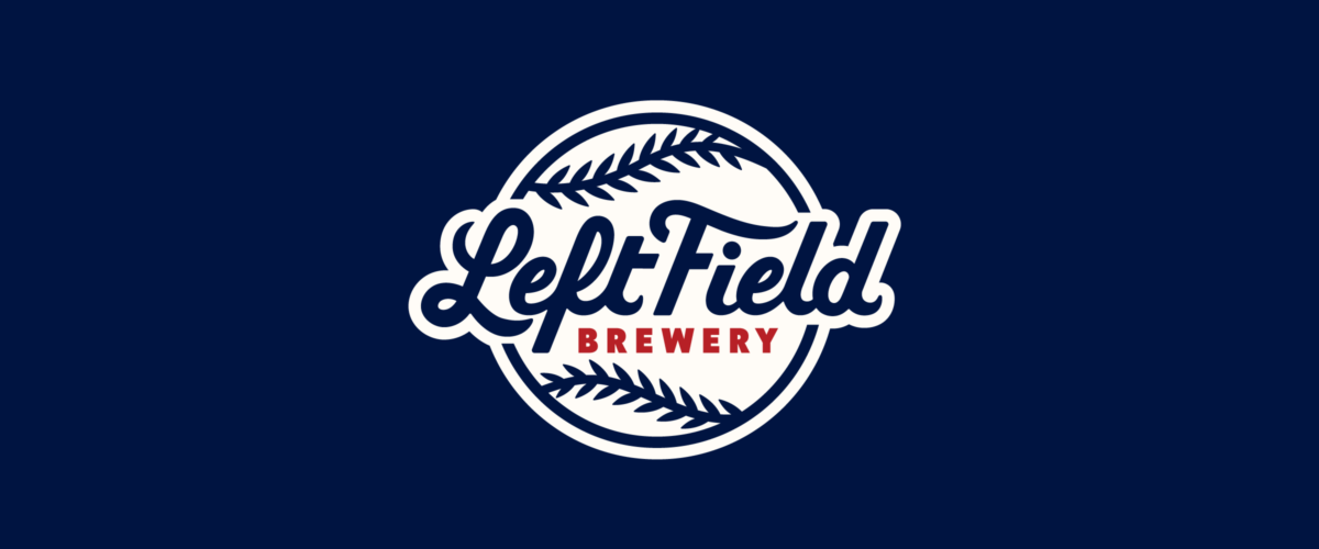
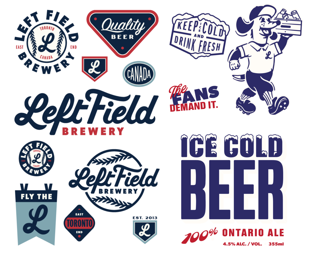
Left Field Brewery
Evolving a Popular Brewery’s Brand
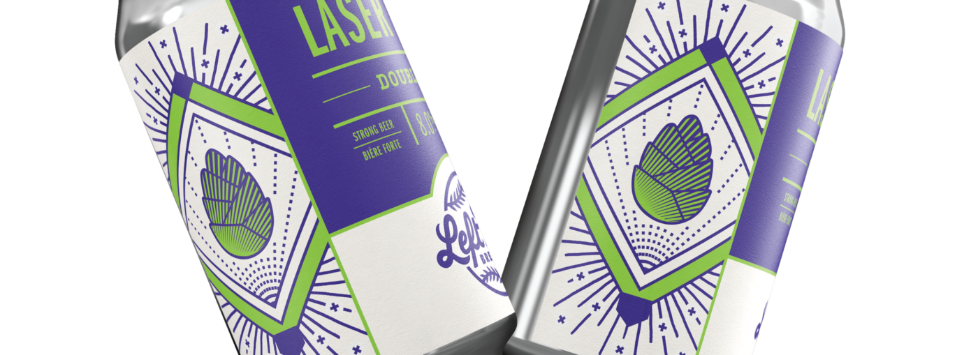
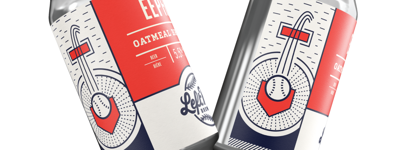
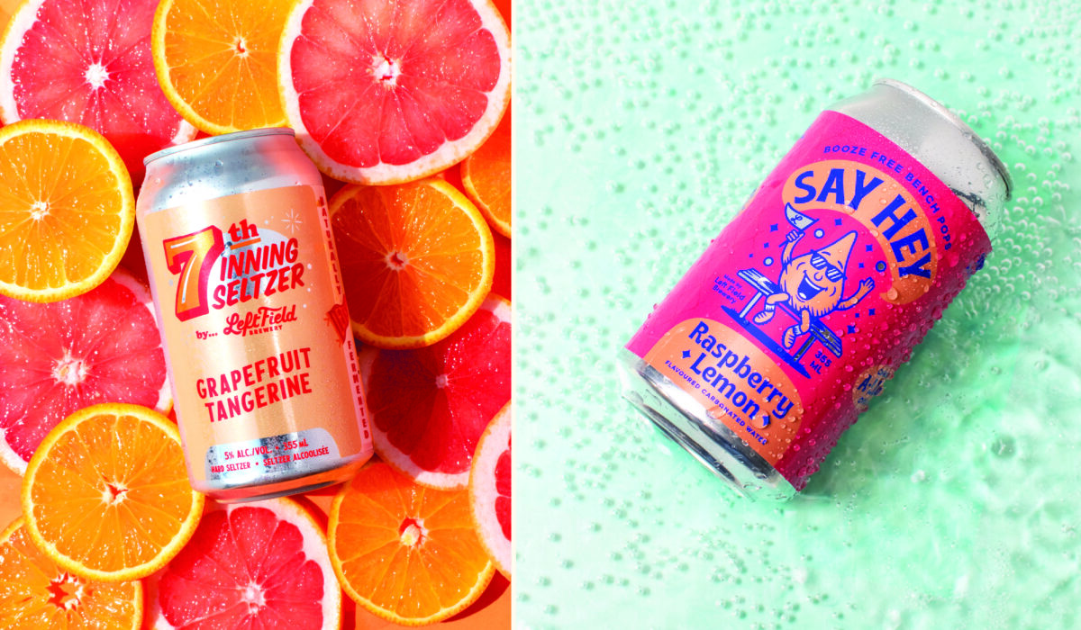
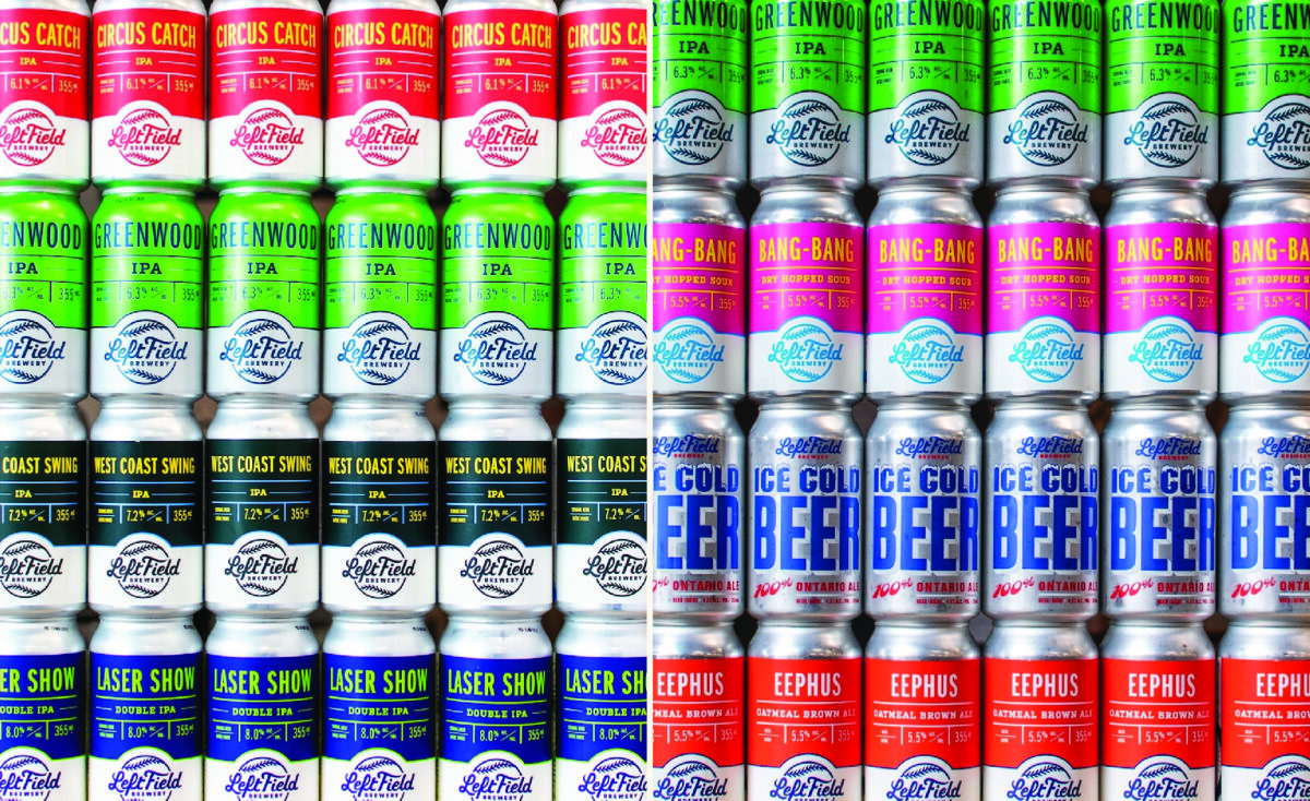
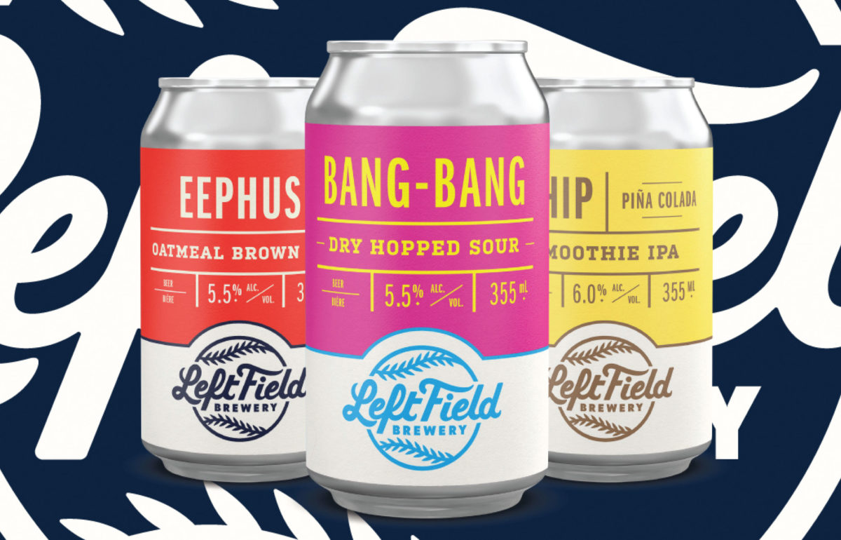
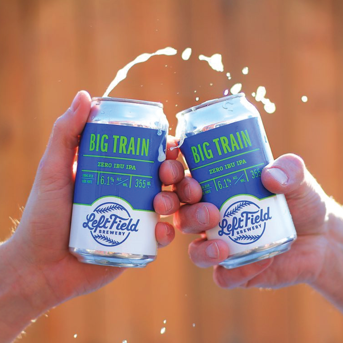
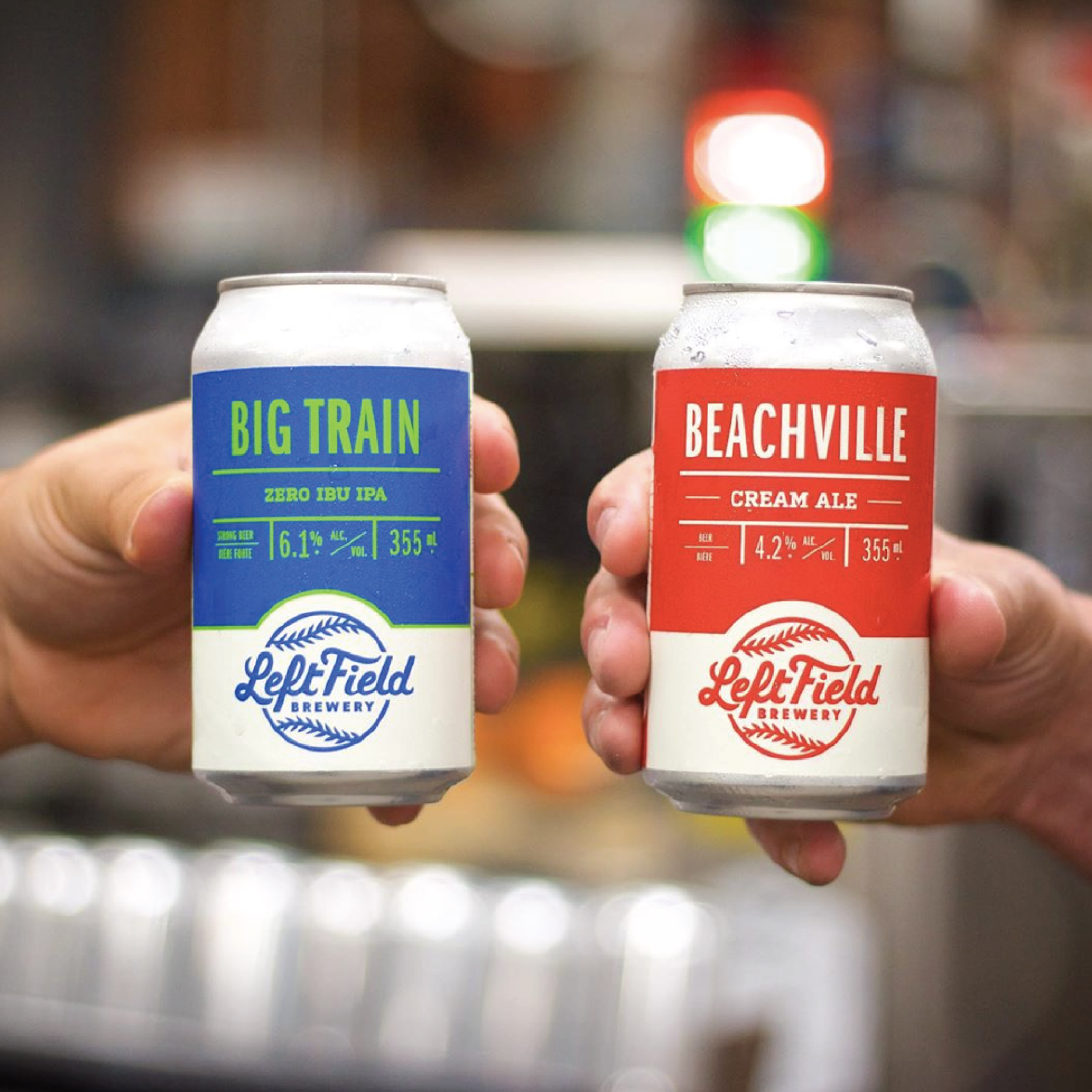
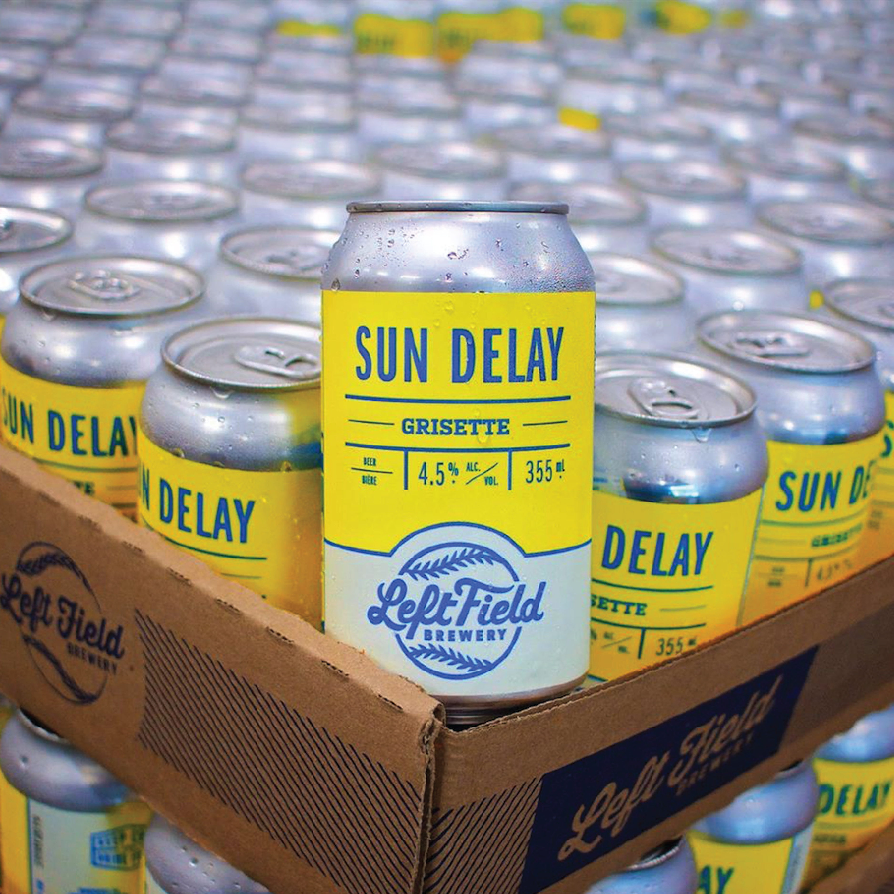
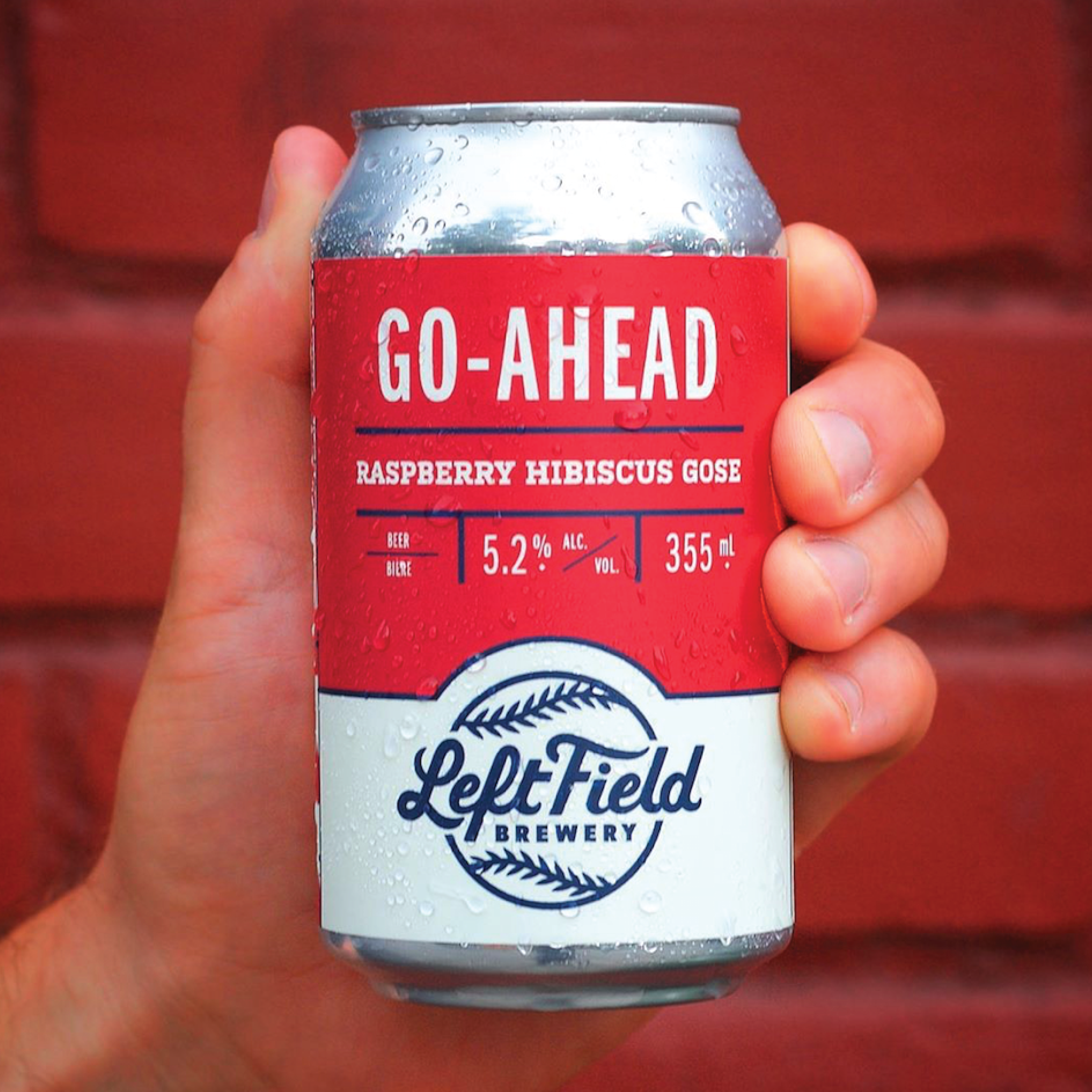
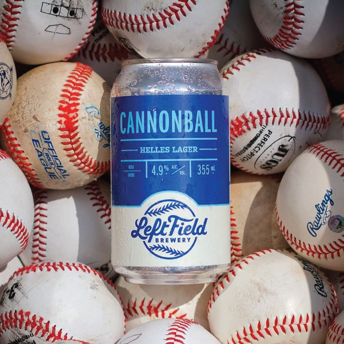
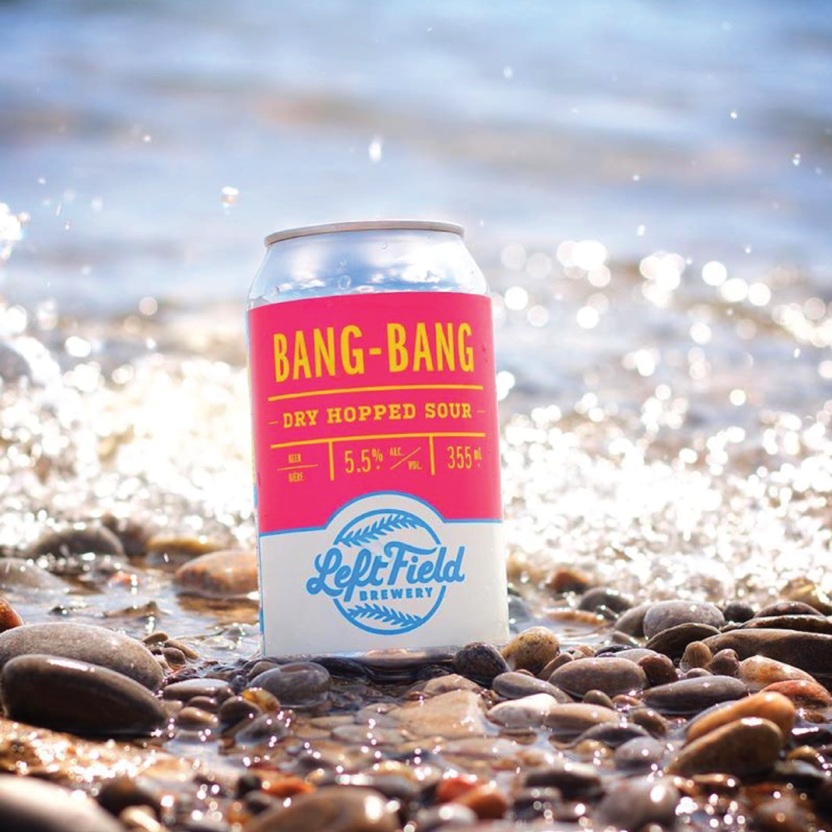
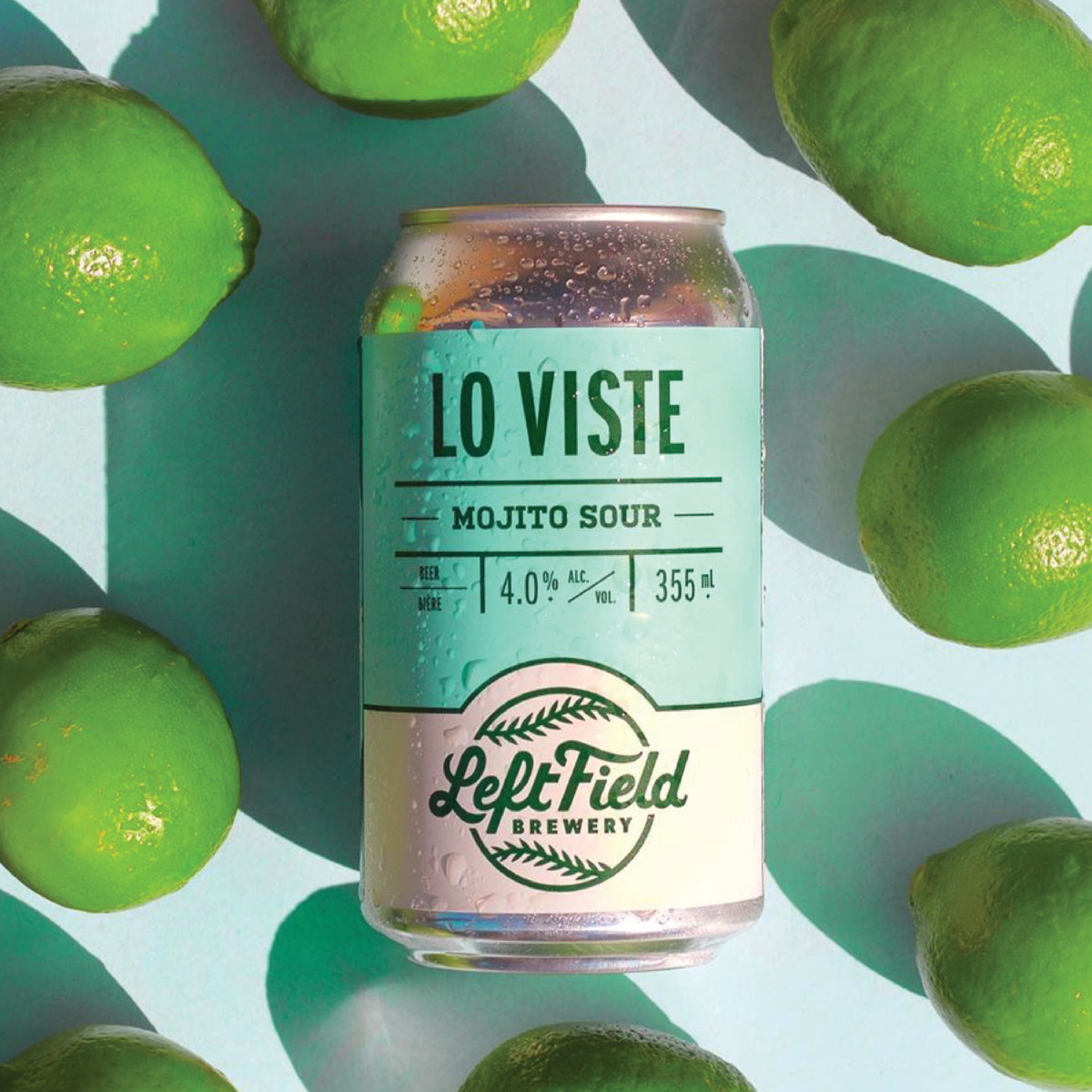
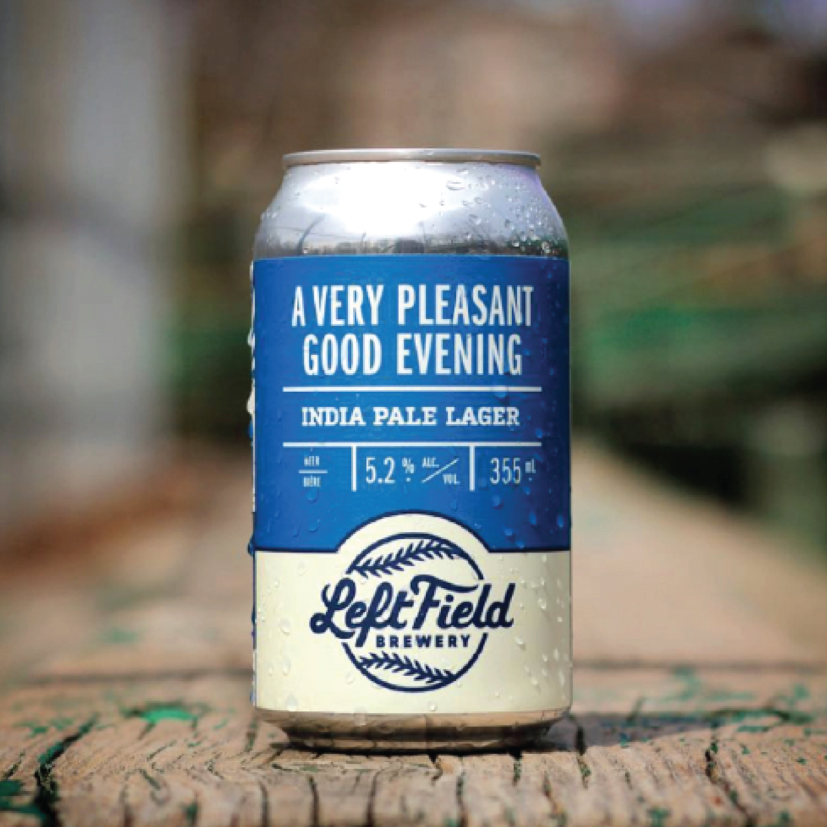
Left Field Brewery—named for their love of baseball—is one of Toronto’s most beloved breweries. After six years of business, they decided it was time to do some housekeeping. Left Field’s original logo was developed on a shoestring budget with the help of some friends. This approach worked for a while, but pernicious design and layout issues reared their ugly head with every. single. new. release. On a grueling “Rotation Nation” schedule—not to mention constant event promotion and merch design—these problems added up to one big headache.
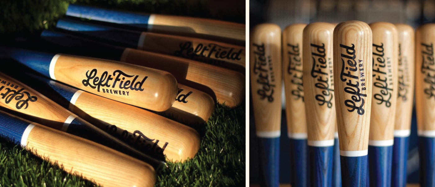
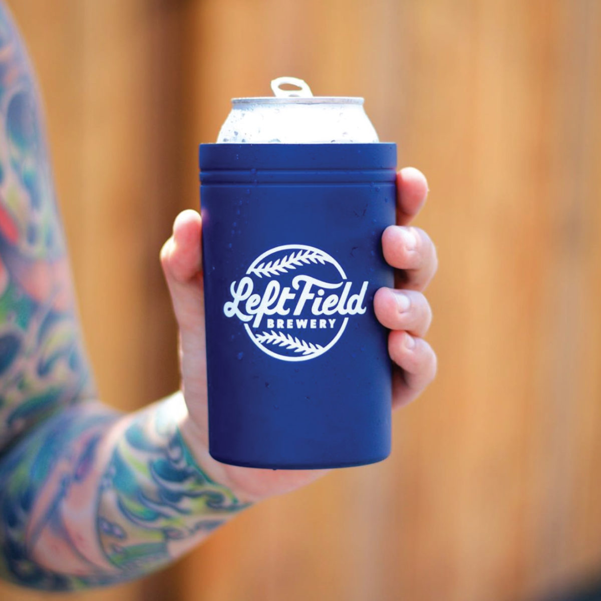
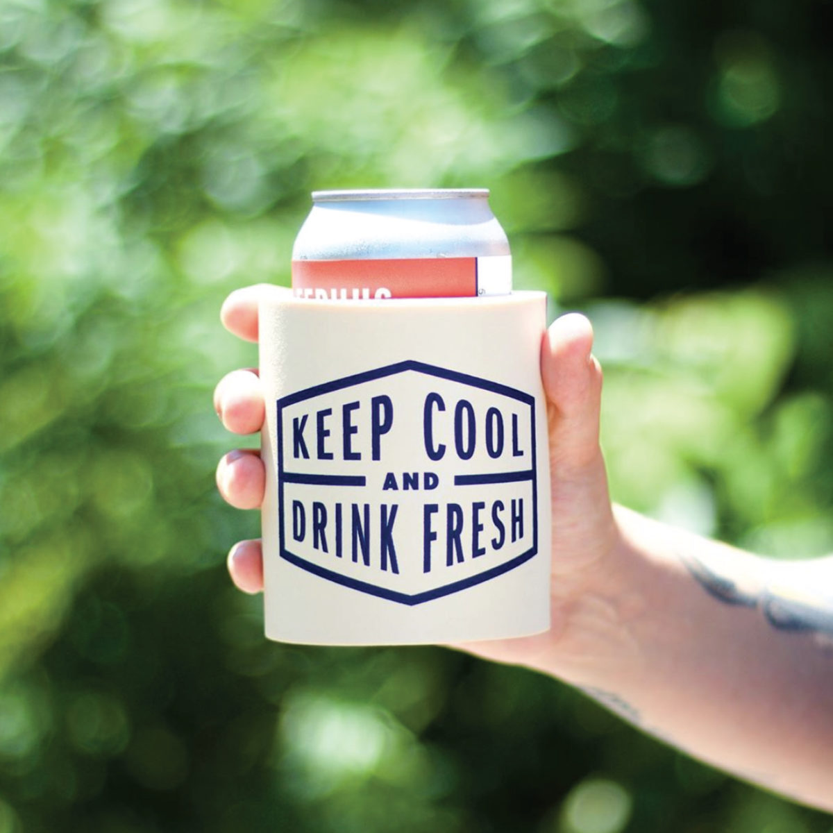
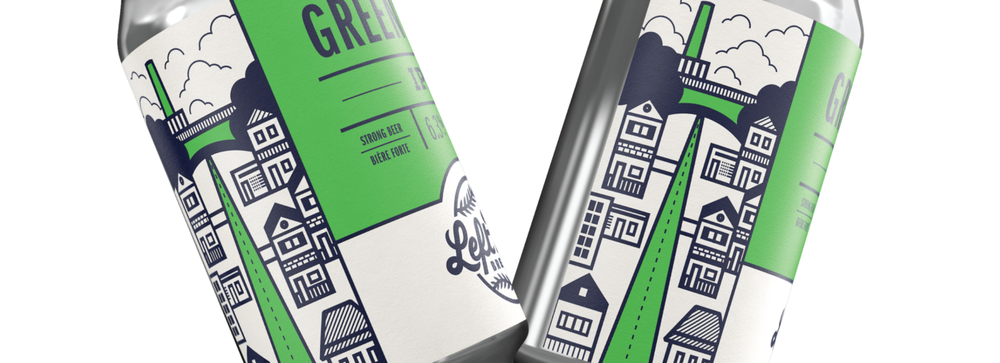
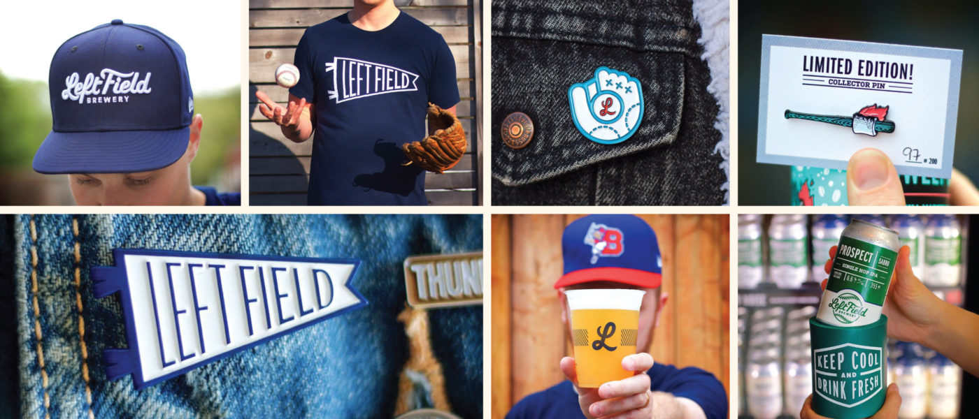
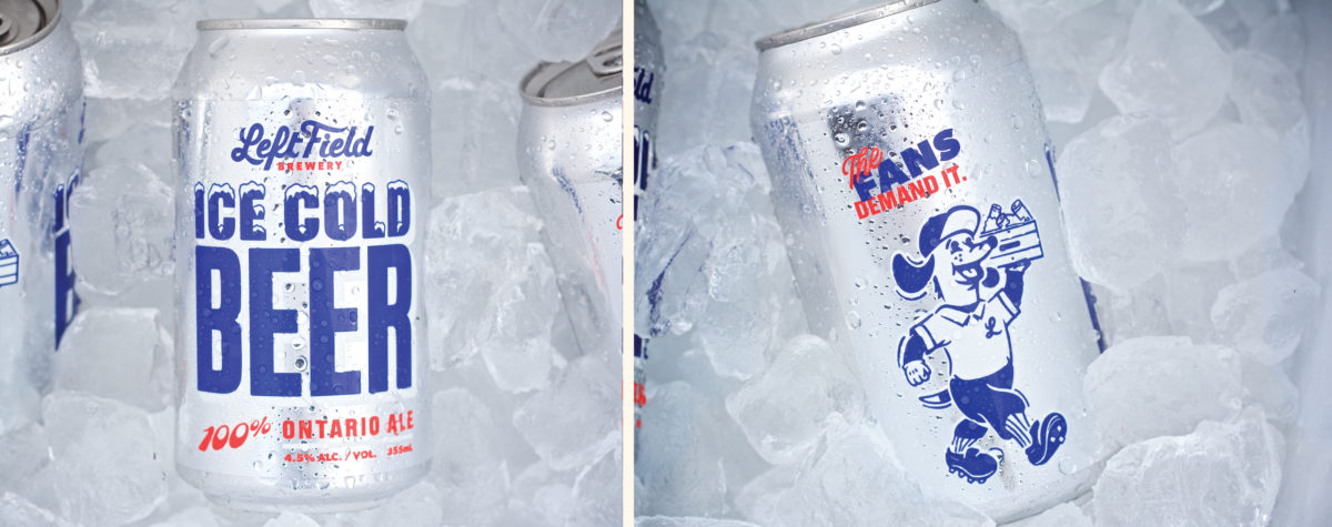
We flew up to Toronto and worked with Mandie and staff to dive into Left Field’s history and build on what was already working. Ultimately we created a robust new identity system (complete with merch-ready secondary and tertiary icons) and a packaging template that they can manage in-house (heartbreakingly) without having to work with an outside designer.
The work has been well-received, and the new look is helping Left Field grow into the next phase of their revered brewery.
Services
We are thrilled with our newly refreshed branding and with our experience working with the entire CODO team. They are true professionals with a holistic and strategic brand mindset. The up-front time spent getting to know us, our brand, our market and our business helped deliver insightful touches in the design and a level of authenticity that wouldn’t have been possible otherwise. The CODO team excelled at striking the perfect balance between keeping what was already working well with our brand and maintaining that equity in the brand while evolving the aspects that weren’t working as hard for us and that were holding us back. They helped us unlock some of our brand’s hidden potential through clean, simple design married with illustrations that tell the deeper stories which have inspired many of our beer names.