Resources

Beer Packaging Hierarchy Strategies

NOTES FROM THE FIELD

There’s an old saying in the design world: “If everything stands out, nothing stands out.” This is something we wrestle with often when designing beer packaging. Whether you’re tackling cans, bottles, or carriers, you have to weigh the size and position of the brewery brand against the specific style and fanciful name, while connecting the design to a broader beer portfolio and standing out on a crowded shelf. Easy, right? Let’s discuss a few different approaches to getting everything sorted out so that you can sell more beer. 

Starting out, let’s get granular and break down exactly, at the most utilitarian level, what your packaging is supposed to do on shelf.

1. tell people what brewery made it 

2. tell people what style it is

3. give them info on the specific beer (fanciful name / tasting notes / ABV)

4. carry requisite TTB / barcode / labelling warning info


Once we have those needs satisfied, we can begin to layer on more brand-focused goals.

1. give people a dose of your personality and brand voice

2. tell a deeper story about your brewery through fanciful names and copywriting

3. achieve billboarding on shelf (where individual packages visually “group” to increase shelf prominence)

4. be as environmentally-friendly as you can be


I wish I could give you one answer that works perfectly for every scenario. Your brand strategy, positioning, voice and competitive set should drive how you organize all of these elements. In some cases, maybe the brewery brand is the largest component on the can. In others, maybe it’s the fanciful name and style. Or a weird drawing of a walrus (YMMV).


Here’re a few standard approaches to consider for your brewery.
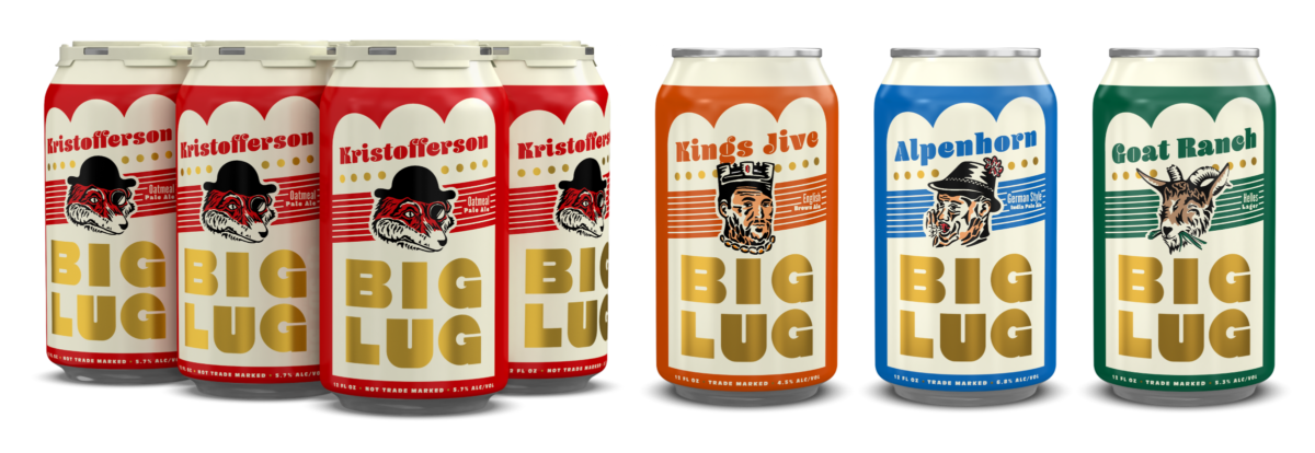
 

Templated Approach

This is a rigid system that differentiates between SKUs by changing colors, beer names, and not much else. 

Positives: creates great billboarding on shelf / easier to kick out subsequent styles with little investment / faster turnaround times

Negatives: individual beers tend to run together / there are only so many colors out there / can become boring over time / has become a major trend over the last five years 

Both Atlanta Brewing and Prost Brewing use colors to differentiate their SKUs on shelf. This approach works well when you have a strong and iconic brand mark to champion the packaging.


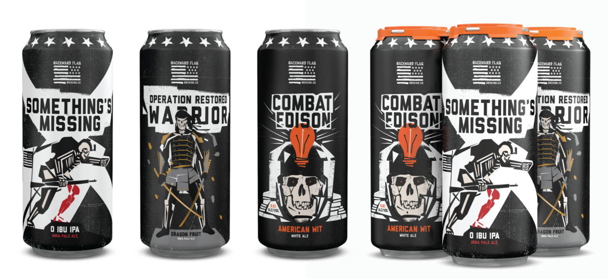
Completely Custom Approach 

This is a looser, more traditional approach where each beer has it’s own unique personality, colors, and illustration component.

Positives: colorful and full of personality / opportunity for deeper storytelling

Negatives: may not be as cohesive as a more templated approach / longer turnaround times and added expense to release subsequent beers / more challenging to maintain consistency of style over time (with different design partners, print vendors, shifting consumer trends, etc.).

Backward Flag Brewing‘s cans require a custom illustration for each new release (due to the different nonprofits they support with each new batch).

The Happy Middle Approach

This is a hybrid approach of both the templated and custom routes with design elements that stay the same across all vessels (color blocking, logo placement, type size, etc.). When executed correctly, this approach allows for strategic touches of customization throughout the portfolio.

Positives and negatives here are a mixed bag from each of the previous approaches. Overall, this can be a great way of getting some personality on the packaging while making subsequent releases efficient to develop. However, if you’re only changing a small element on each can, they can still run together and/or become repetitive (read: boring) over time.

Big Lug and Prodigy Brewing each use a hybrid approach to their packaging that incorporates custom elements into an otherwise templated label.


A note on standing apart from your competitive set

When you begin the package design process, it’s important to get a full lay of the land. Head out to local off premise accounts and gather anything you deem competition. (Pro tip, Uber there so you can drink all of this beer in the parking lot. Carrying that many cases of beer is heavy and you could hurt yourself.) Line these all up on a shelf in your office; a real shelf. You can include them in PDF presentations as well, but nothing beats putting a printed mockup next to the real thing and looking at how the different labels stack up in different lighting conditions, and from different distances and angles. This is a great way to test your prototypes as you make your way through the design process.


Sweat the details, and mind the land mines

If you’re not using an overbox or carrier, you may run into ‘facing’ issues, where the cans will spin and a customer might not be able to see the ‘front’ of your can. Make sure that your packaging can be read from any side. We’ve found ‘duping’ (duplicating) the face of the can—literally printing it on the can twice—is a good way to sidestep this problem.

‘Duping’ ensures that the main elements of your packaging can be seen no matter how the can is rotated on shelf. 


Make sure your carriers and cases communicate the essentials on any panel that may be presented to customer (within reason; hopefully a stocker won’t put your 6-pack box in the cooler upside down). We’ve seen boxes shoved into tight cooler shelves every way you can imagine. It would be a shame for someone to see the top of your 6-pack box and not know what style it is—or which brewery made it.

Make sure pertinent info isn’t covered by environmental obstructions like the lip on cooler shelves or the sides of your case tray. This last point is particularly important if your beer will end up in a floor stack: we often see these deployed as stacks of trays which can effectively cut off 1.5 to 3″ of real-estate from view. Again, all of your hard work will be for naught if people can’t tell that the beer they’re looking at is, in fact, an IPA.

Build a stronger brand.
Sell more beer.

Join 7,500+ other beer industry folks and sign up for our monthly Beer Branding Trends Newsletter.