Resources

Cannabis Branding Trends

From Stoner Culture to Lifestyle Branding

Cannabis has historically been mired in clichés; dancing bears, tie-dye smiley faces, and the ubiquitous (if not inescapable) pot leaf ruling the day. But as decriminalization and/or outright legalization sweeps across the nation, the industry has recognized the need to make inroads with people from all walks of life. This has resulted in any number of branding and positioning approaches for all sorts of cannabis products.

As a branding firm working with cannabis companies, it’s been remarkable watching the speed at which visual trends bloom and rise to full-scale adoption. For our money, this velocity is tied proportionately to the skyrocketing number of competitors in the market.

When the number of legalized markets was limited, and grow operations / purveyors were few and far between, branding wasn’t that important. But now that there are roughly 25 states where you can get some form of legal weed (recreational, medical, or decriminalized), you’re seeing an arms race of interesting visual trends emerge as companies jockey for positioning, segmented audiences and lifestyle activities. This is a fun space to work in because in many ways, it feels like the world is up for grabs.

We keep tabs on emergent visual currents as part of our design process and thought it would be fun to share some of the more pervasive branding and packaging trends we’re seeing in 2019.

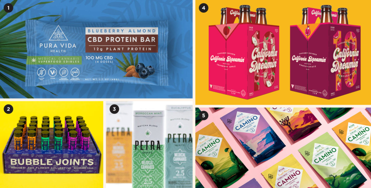
Your Friendly Neighborhood CPG

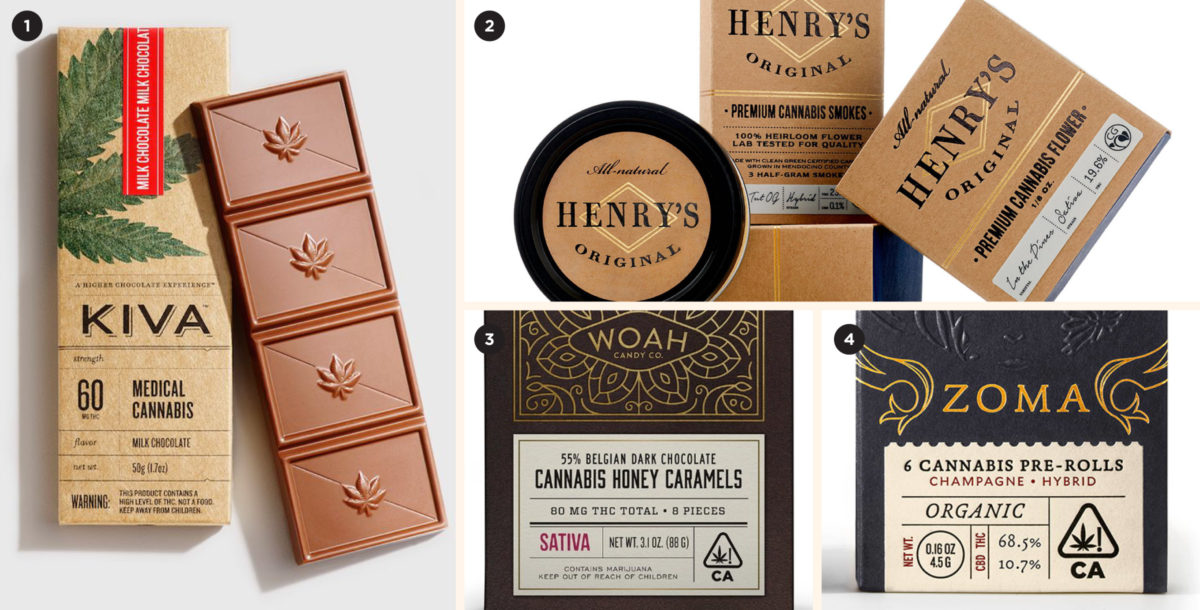
Is this weed or banana chips?

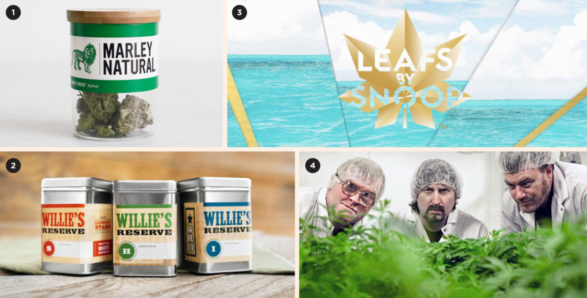
Early entrants in the cannabis space targeted connoisseurs and folks who knew what they were looking for. Everything became expensive and premium-looking—even a little fussy. This leaves a whole lot of people who might be “weed curious” but do not know where to begin, let alone the difference between an indica or a sativa.

Driven primarily by edibles, this approach does a great job of speaking to the newcomers. Eschewing the snooty and upscale for the bright and poppy, this positioning is, above all else, friendly and non-intimidating. This visual trend positions weed like any other unassuming Consumer Packaged Good (CPG) you’d find in your local grocery store. It will be (to borrow a craft beer term) sessionable and not smack of pretentious weed branding (and the stigma it can carry).

1. Pura Vida by Brewing Creativity, 2. The Flower Collective by Cast Iron Design, 3. Petra by MINE, 4. California Dreamin’ by CODO Design, 5. Kiva Confections by Stout

Health & Wellness

Spa Day

This visual trend positions weed as an escape, or a healthy lifestyle activity and often touts benefits including mindfulness and mental well being. This messaging is captured through minimal and calming colors, soft-touch packaging and metaphorical brand and product names. Expect products in the category to resemble—and in some cases, actually be—personal cosmetic care items like lotion, lip balm and cleansing scrubs.

1. Seven Point by La Tortilleria, 2. Milk KUSH, 3. Mowellens by Phoenix the Creative Studio , 4. Omura by Safari Sundays, 5. Monk Provisions by Boon Design

Couture Cannabis

For the discerning stoner

This trend positions cannabis as an expensive lifestyle purchase. It is aspirational and places an emphasis on well-designed, luxe packaging and an almost burlesque unboxing experience. Think gold and bronze, foil seals, stark fields of white and black, minimal typography, and an overall exclusive air. This is for those who own custom chef knives, beautiful watches, and drink fine wine (that is, if they still drink alcohol).

1. Venna by Urban Influence, 2. Mowellens by Phoenix the Creative Studio , 3. Bloom Farms by Pavement, 4/5. Serra by OMFGCo.

Scientific & Lab Tested 

Safe and Cutting Edge

This aesthetic speaks to cleanliness, safety and quality, with a singular focus on the medicinal applications of cannabis. If an edible claims to be 10mg, then each and every serving will be 10mg—no more, no less. Expect to see white space, clean sans serif typography and infographics that outline different physical effects and benefits. Akin to vitamin or medication packaging, this look brings us one step closer to seeing cannabis products on shelves in pharmaceutical aisles. Fingers crossed.

1. Défoncé by Lions & Tigers, 2/3. Select Oil by Potency, 4. Level Blends by Folklor, 5. Canndescent (done in-house)

Rough & Tumble

Tough guys only

Bold, all-caps typography paired with high-contrast, no-nonsense imagery, this aesthetic (common in men’s grooming products and bourbon packaging) reflects our culture’s persistent obsession with all things “masculine.” Mostly a lifestyle play, this look positions weed as the antihero choice amongst a sea of soft, friendly, outdoorsy weed brands.

1. Mirth Provisions by Sockeye, 2. Skunk Factory by Noise 13, 3. Elyon Cannabis by Lyon Visuals, 4. Daddy Gray Beard by Urban Influence, 5. Mule Extracts by Murmur

Vintage Dope
Your Dad’s Weed

Companies who employ this aesthetic are leaning on nostalgia and reverence to cut through a cluttered market. We suppose that by winding back the clock, we are connecting with something that is more “authentic” or original—in a cultural sense, we’re grasping for the “roots” of cannabis as a social phenomenon. Think lo-fi/analog typography, grainy polaroids, and simple, limited color palettes.


1/4. Electric Lettuce by OMFGCo., 2. Good Brands, 3. California Dreamin’ by CODO Design

Crunchy & Granola

Weed’s stock in trade

This aesthetic is kissing cousins to the easy riding, jam band-loving look and feel that defined the counter cultural movement of the 1960s. And whether you like it or not, to a certain extent, it will NEVER go away. Heavy on muted color palettes and kraft paper, it’s an outdoorsy, eco-conscious aesthetic aimed directly at those who choose to opt-outside and aligns with a bevy of outdoorsy activities from camping and hiking, to climbing, floating and fishing. Consider this the grown-up version of Baby Boomer folksy earthy reconnection with nature.

1. Phantom Farms, 2. Elevate Cannabis by OMD Agency, 3. Terp Tarts by Garry Veda, 4. LoveHemp, 5. Humboldt Seed Co. by Purple Line Media

Small Batch & Artisan

Heirloom this. Artisan that.

Similar to the craft beer beer industry or the artisan food space (chocolate, coffee, urban agriculture, etc.), this aesthetic romanticizes the provenance of a product by telling a unique origin story. The result looks less like an amalgamated corporate product and more like a gift packaged with love and care, often featuring hand-written elements like signatures and lot numbers, makers marks, stamps, ribbons and seals.

“This is an heirloom indica strain that was lovingly cultivated by our small group of blind farmers.” “This pipe was hand blown by an ancient coven of secretive Himalayan sculptors using a kiln from the 1500’s.” Mmmm, sign me up.

1. Kiva Confections by Stout, 2. Henry’s Original by Pavement, 3. Woah Candy Co. by Pavement, 4. Zoma Cannabis by Pavement

Name Brand

Willie / Snoop / Marley

This trend follows some of the oldest advertising tricks in the book. Find a celebrity, apply their name and/or likeness to a product, profit! Cynicism aside, this is an effective way for longtime proponents of weed to lend their name to the industry, and we’ve seen everyone from old vanguards like Willie, Snoop, Tommy Chong and Cypress Hill to newer folks like Freddie Gibbs and the Trailer Park Boys (RIP Mr. Lahey) jump into the space.

Whether you’re bullish on this trend or roll your eyes at it, celebrity endorsements do work. So strap in and watch as the next Fortnite phenom releases their proprietary line of edibles over the next few years. What a time to be alive.

1. Marley Natural, 2. Willie’s Reserve, 3. Leafs by Snoop, 4. Trailer Park Buds

Your Annoying Cousin

Shit Posting Made Manifest

Earlier when I said the industry had moved beyond iffy branding into a golden age of packaging design… I should’ve said that most of the industry has made this shift. For every beautifully branded edible company, there are ten weed brands that look like gas station condoms—fun in an unrestrained sort of way, but garish, cartoonish, and downright ugly. And much like those gas station condoms, they can be a gamble. Is it really 20mg per skull-shaped gummy? Will I get waaay too high, or not even catch a buzz? With so many reliable brands on the market it’s best not to chance it.

Build a stronger brand.
Sell more beer.

Join 7,500+ other beer industry folks and sign up for our monthly Beer Branding Trends Newsletter.