Resources

2019 Craft Beer Branding Trends

MINIMALISM, MAXIMALISM, ROTATION NATION & ‘LITE CRAFT’

When our team first sat down to map out this year’s craft beer branding trends, the conversation quickly ballooned into several full whiteboards and the frustrating refrain, “So, everything is a trend, then?” And there’s something to that idea. From a strictly aesthetic standpoint, it’s harder than ever to call out specific visual trends, considering there are 7,000+ breweries in the United States, all constantly jockeying and innovating to grab consumer attention. 

Visiting a crowded liquor store or grocery set lends little clarity to the conversation. Nor does the absurdly fast rate at which beer styles are now rising to national prominence—and the even faster rate at which breweries shift their distribution and sales models to accommodate. With so much going on at the same time, one could make the (not entirely useful) argument that everything is, indeed, a trend.

This being said, we have noted several specific visual trends that are cool, beautiful, or otherwise interesting to look at. Beyond this analysis, there is important stuff happening just behind the aesthetic front. What are the machinations that are driving such continual, fast-paced change in the beer industry? How does this turnover effect visual styling, and what does this all mean for 2019? Perhaps most importantly of all, how might you apply these ideas to your own brewery’s storytelling? 


Let’s begin by discussing a few of the visual trends we’ve seen rise in prominence this year.


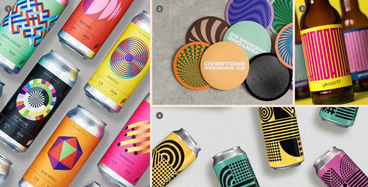
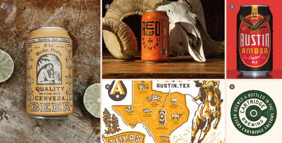
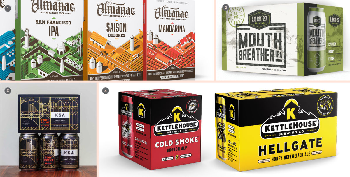
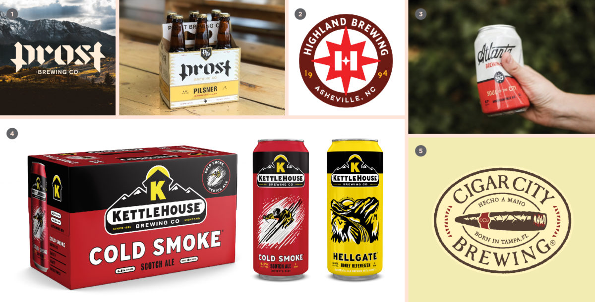
MAXIMUM DESIGN, MINIMAL BRANDING 

This is awesome! Wait, who made this again?

This colorful styling took root as a way to denote a brewery’s special releases by seeking to stand starkly apart from core flagship packaging. Originally, this created a one-off sense of “beer as art”—often signifying an extremely experimental beer, or a limited release that stands apart from business as usual. We are now noticing that smaller/younger breweries are applying this approach to their core/flagship offerings, for better and for worse.

Such an approach produces vibrant cans that leap off the shelf with incendiary full-scale patterning, vibrant color and few (if any) branding elements to clutter things up. But this abstraction cuts both ways: without careful implementation, customers are left with no idea who made the beer, or (perhaps more concerning) are easily wooed away by upstart competitors who will inevitably release similar style-driven packaging.

1. Halo Brewery by Underline Studio, 2. Overtone Brewing by Thirst Craft, 3. Yeast 17 by Matteo Di Iorio, 4. Craft Recruitment by Ollie Langridge

GRIDDED

Everything in its place

This regimented, organized approach to information design is sure to satisfy your inner neat freak. As craft breweries grow and evolve, the methods and context behind the production of beer become more complex. What started as a mere refreshing beverage can quickly morph into a history, geography, chemistry and sociology lesson—all rolled into one. This makes a lot of sense: on the other side of the equation, consumers are increasingly interested in growing their knowledge and seeking a deeper understanding of the beer they love so dearly.

The “Gridded” approach is an efficient way to convey a wealth of information without overwhelming the eye. We see this executed in a variety of flavors, be they mechanical/engineering focused, influenced by historical apothecary ledgers, or even borrowing from mid-century comic book design.

1. Copper Kettle Brewing by Emrich Office, 2/3. Left Field Brewery by CODO Design, 4. Finkel & Garf by Cast Iron Design

PRESSURE SENSITIVE

We can’t stop here—this is Rotation Country

At some point over the last several years, a pressure sensitive label (essentially a waterproof sticker) applied to a brite can became the official trade dress of nimble craft breweries everywhere. It’s easy to see why: smaller players can’t afford truckloads of printed cans, let alone warehouse them. Plus, what happens if the beer destined for those cans loses sales velocity in the meantime? The pressure sensitive label has given these breweries a quick, no-minimum platform that remains affordable and looks decent on the shelf.

Standard for the ubiquitous Hazy NE IPA (and increasingly Brut IPAs or mixed fermentation beers), the pressure sensitive label has become emblematic of something special and ephemeral. This beer is fleeting, grab it now—because it might not be here tomorrow. It has now become such a marker for “cool NE IPAs” that Sam Adams even faked it on their printed NE IPA cans for a period of time. That’s correct: at one point Boston Beer Company direct printed their cans to appear as cheaper pressure sensitive labels. We see you, Koch!


1. Sam Adams NEIPA, 2. Other Half Brewing, 3. 450 North Brewing by CODO Design, 4. 2Kids Brewing by Chargefield

GOLD

All that glitters

This just in: CODO Design’s hot beer branding trend to watch for in 2019… “Gold!” Sorry. I know calling out a single color may not sound like a major trend, but we’ve seen it all over the industry from small to large breweries, on cans and bottles, printed and embossed with metallic foil—even adorning beer brewed with gold flakes, Goldschläger style. It’s everywhere. Maybe it’s an echo of the Gilded Age revival of the early 2010s. Maybe it’s a throwback to old regional beer brands that went heavy on gold to suggest luxury and decadence. Hell, maybe people just like to look at shiny stuff. Listen, we’re trying our best over here.

1. Coldfire Brewing by Drawn, 2. Thornbridge Brewery by Thirst Craft, 3. Copper Kettle Brewing by Emrich Office, 4. Big Lug Brewing by CODO Design

SLASHES

Welcome to the Diagonal

Hot on the tail of “Gold,” slashes (or similar diagonal elements) are another drilled-down graphic approach that we’re seeing crop up all over the place. Slashes could be a means of adding a dynamic swath of color to an otherwise stark, minimal design. Or, they could be a Swiss-inspired abstraction of downward-slanted ribbons found in traditional beer packaging. Whatever the origin, we expect this approach to become more common as breweries look to simplify their image without sacrificing visual impact.

1. West Brewery by Thirst Craft, 2. Titsey Brewing Co by PB Creative, 3. Prost Brewing by CODO Design, 4. Jubel Beer by Pearlfisher

AUSTIN DESIGN WAVE

Something something something, Sam Elliot

There’s a surge of similar, weatherworn Texas-looking branding coming out of, well, Texas (and particularly, Austin). It has been championed by a few shops and breweries in the state for the last several years and is now making its way across the country. It’s distinctive, young and cool—one part sun-faded sign painting and Tex-Mex-Americana, another part tattoo flash, austere Cormac McCarthy landscapes and expressive, mish mash letterpress typography. What makes these identity systems particularly cool (and well suited for younger brands) is a somewhat hard-to-pin-down main mark. Instead, the identity systems are comprised of a robust set of iconography and textures that can be slotted in as needed across social, merch and advertising channels.

1. Calidad Beer by LAND, 2. Red Gap Brewing by Matchbox Studio, 3. Independence Brewing by Keith Davis Young / Lauren Dickens / Drew Lakin, 4. Austin Beerworks by Helms Workshop, 5. Cartridge Brewing by Helms Workshop

OVER-BOXING

Lower margin. Higher impact.

Over-boxing cans is by far the most effective way of achieving billboarding (a big solid block of your branding) on a retail shelf. Another clear benefit: over-boxing eschews the frustrating facing issues that come with PakTech or Hi-Cone binding. While it certainly cuts into a given SKU’s margin, we’re starting to see a number of breweries (new and old) take the plunge by introducing over-boxed six-, eight- and twelve-packs at retail.

Bonus points awarded for breweries who print an easy-to-spot canning date on the box itself to prevent me from buying a 9 month old sixer of stale IPA.


1. Almanac Beer by DKNG, 2. Lock 27 Brewing by CODO Design, 3. Fort Point Beer Co. by Manual, 4. KettleHouse Brewing by CODO Design

FORMAT CHANGES

Little Kings are dead; Long live Little Kings

Vessel changes used to be the domain of big beer. Throw your beer in a bottle with a twisted neck? Boom, see a profitable quarter. Serve up swill in a can that turns blue when it’s gotten so cold that you can no longer taste it? Now you’re cooking with gas.

For those of us who are getting older and can no longer put away high-gravity DIPAs 16 ounces (or even 22oz) at a time, we expect to see such beer presented in smaller, more manageable portions (think 8oz cans). Along with format change comes an increase in specialty printing techniques that affect the form factor of the package itself—die cuts and embossed texture abound. And don’t discount a unique bottle shape (or other non-traditional package) for its power to stand out on a shelf full of the standard fare.


1. Hopewell Brewing by OMFGCo, 2. AND UNION (in house), 3. Oskar Blues’ ‘Stovepipe’ (in house)

AUGMENTED REALITY

Because you’re not on your phone enough

Consider this a bonus, on-the-horizon trend (prognosticators that we are). Augmented reality is an intriguing (if not somewhat gimmicky) interface to spur customers to interact with your label in a retail setting. First implemented in the wine industry, this technology has garnered so much mainstream attention that there’s no way breweries won’t follow suit. Prediction: Big Beer will use Augmented Reality as part of a huge campaign before this time in 2020. You can take these odds to Vegas, baby!!!

1. 19 Crimes Winery by Tactic, 2. Anchor Steam, 3. The Walking Dead Wine, because of course there’s a Walking Dead Wine

Now let’s go beyond visuals to discuss some of the larger trends that are effecting all three tiers of this industry.


MAJOR REBRANDS

Getting your house in order

The bulk of our work this last year has been rebranding established breweries. These projects have ranged from folks who have been open a few years to breweries celebrating their 25th anniversary. We’re only five months into 2019 and have already kicked off several more of these engagements around the country. We’ve heard from many breweries that this can be attributed to tighter competition. To run a successful brewery in 2019, you have to orchestrate everything flawlessly—make stellar beer, execute a nimble marketing/sales plan and have awesome branding. Expect to see more of this over the next several years, particularly at the middle / regional echelons of the craft market as breweries fight to avoid the ‘Jaws of Death.’

1. Prost Brewing by CODO Design, 2. Highland Brewing by Helms Workshop, 3. Atlanta Brewing Co. by CODO Design, 4. KettleHouse Brewing by CODO Design, 5. Cigar City Brewing by Ebbing Branding. + Design

‘LOW CAL & LITE’ CRAFT BEER WAVE

For your health!

We touched on this trend a few years ago, and are now seeing real deal (Top 50) craft breweries tout the low carb, ‘Lite’ nature of certain beers in their portfolio. This follows a societal trend towards more mindful and healthy eating and will only ramp up when (or if?) cannabis becomes more competitive with beer. And don’t forget about the Voluntary Disclosure Initiative—give it a few more years and this will likely become a required labelling element, which means that consumers will see exactly how many carbs and calories are lurking inside that can.

Beer has been slowly losing market share to wine and liquor for the last few years. If we want to stop the bleed, then we need to work to make the beverage more amenable to consumers’ lifestyles. There will always be a place for 11% DIPAs and lovely imperial stouts. But to the vast majority of beer drinkers in the US, “Lite” beer is the expectation, both in terms of flavor as well as overall health impact. There’s nothing wrong with meeting your customers where they are and giving them a well-made, local option.

Out of this trend we expect interesting positioning opportunities for categorical differentiation in a crowded space. We’ve seen terms like “Recovery Beer,” “Functional Beer,” and even the ambitious moniker “Wellness Beers” used in the market. How that last one makes it past the TTB, I have no idea. But this is very smart from a brand strategy standpoint.


1/2. This has been so successful that Dogfish Head is doubling down on the trend. Other entrants include (3.) Kona Brewing and (4.) Lagunitas.

SHARE OF THROAT

As many brand extensions as you can cram

Over the last year, we’ve fielded inquiries from breweries who are getting into everything non-beer, from distilled spirits, seltzer and hard seltzers, cider, kombucha, RTD cocktails, cold brew coffee, FMB’s, and CBD/THC-infused everything. From a larger industry perspective, we’re seeing the biggest of big beer companies making moves into non-beer markets (and the BA itself editing its definition of “craft” to better accommodate this new phenomenon). Inversely, we’re seeing traditionally non-alcoholic brands move into the space as well. And in general, it seems to be on everyone’s mind—we’ve seen several presentations on these various beverages, particularly kombucha and seltzer, at craft brewers conferences around the country this year.

Whether to fill excess brewhouse capacity, or to move into another category that the brewery team is passionate about, we only see this trend ramping up over the next few years as breweries scramble to bolster sales. A word of advice for those who are considering making something aside from beer: make sure to think about your brewery’s brand architecture and how adding a new extension might affect your overall footprint.


TURN-ON-A-DIME STYLE PROMINENCE

Blink and you’ll miss it

This trend took root 3 or 4 years ago with the small batch can release model (driven in large part by the Instagram / ISO culture / NE IPA phenomenon). It quickly transcended fad status and led to several new style categories from the Brewers Association. One style that perfectly encapsulates this phenomenon is the Brut IPA.

I was in Montana recently doing field work for a brewery rebrand and saw a Brut IPA on draft. I’d never heard of the style, so I ordered it and loved it. I flew home to Indianapolis a few days later and immediately saw the style at breweries all over town. I’m not exaggerating when I say that this style descended upon Indianapolis in a matter of weeks, seemingly taking hold even faster than the haze craze.

If tastes and whims are shifting this quickly, how is a craft brewery supposed to keep up with the latest and greatest styles? The anticlimactic answer that we’ve heard from brewers all over the country; Instagram. Something as simple as periodically following the #craftbeer hashtag will help you keep an eye on what’s coming next.


A MOVE TOWARD SUSTAINABILITY

Saving the whales, one IPA at a time

During the brewing process through transportation and final packaging, the beer industry creates a lot of waste. As consumers, we’ve got our fair share of bloodplastic on our hands as well. We can dutifully slice up all of our 6-pack rings, sheepishly return a four-foot tall stack of PakTechs to the brewery from whence they came, or, if you’re feeling nostalgic: simply use a growler. But real impact will come when the production side of the industry becomes more mindful of this issue.

It’s been heartening to see an uptick in brewery clients discussing this topic openly over the last year. The options for smaller breweries are somewhat limited right now, but we’re seeing mega breweries make moves in this direction. And as these big guys move toward sustainable packaging, we expect cheaper solutions to become more mainstream and available for smaller craft brewers.

1. Victoria Bitter’s 4-sided can carrier, 2. Corona’s plastic-free 6-pack carrier, 3. Saltwater Brewing’s edible 6-pack carrier, 4. Carlsberg’s new “Snap Pack”

EVOLVING ON PREMISE THINKING 

Lead with the right

Even as recently as 5 years ago, it was normal for us to design standalone tap handles for a brewery’s best selling beers—a unique handle for the horse and a generic handle that can be updated as new styles come on. Now that draft accounts are at such a premium, we’ve started to hear breweries of all sizes walk this idea back. Directly from the mouth of one of the larger breweries we rebranded this year, “If we get one handle on at an account, it’s going to be our best seller, so we need to make sure we push our brewery’s brand there as much as possible [as opposed to the specific beer itself].”

Atlanta Brewing’s tap handles.

FLAGSHIP vs SEASONAL vs SPECIALTY LOOK & FEEL

Bringing it all together

When kicking off a package design project in the past, it was almost a given that a brewery would have a look for their flagship packaging which would then inform a similar, but slightly differentiated seasonal/specialty design. The thinking at the time was that a consumer would be familiar enough with the mainstays to realize that this was 1. from the same brewery, and 2. a special release.

But as more breweries are shifting portfolio strategies, we’ve seen a move toward ‘heavy rotationals,’ that is, making and selling a beer as long as there’s a demand for it (not tied to a specific season or permanent portfolio). After a year or so, if velocity is still there, you can make it an official year round item. Or, if you’re starting to see a decline in sales, you can replace it with something else.

What we’re seeing in the market challenges the long standing model of flagships vs seasonals, which has significantly altered our approach to packaging. Like the aforementioned approach to tap handles, brewers want to make sure that if someone sees their packaging on a retail shelf, they immediately recognize who made it. Thus, we’re seeing a move toward selling the main brewery brand itself to customers—as opposed to selling an individual beer or a series of specialty releases.


NEAR BEER IS HERE

The ultimate in Session

Similar to the ‘Lite Craft’ trend, we’ve had four non-alcoholic ‘beer’ branding inquiries come in since the start of the year. Four might not sound like a lot, but that’s four more than we’ve received in the last ten years of business. If that’s not telling of a looming trend, I don’t know what is.

As we step outside of the beer category for a moment, this trend runs parallel to the explosion of the seltzer category (as well as the burgeoning ‘Zero Proof’ cocktail movement). While anecdotal, most of the people I chat with are open to this idea. We love beer and want to drink it regularly, but aren’t too keen on getting hammered on a Tuesday night (not to mention the 3,000 calories that come with it). This is a wide open space and I imagine we’ll see some big players make moves to cover it over the next year.


DEEP DIVE DIFFERENTIATION

Doubling down on terroir and provenance

We’re seeing a rise on the B2B side of the industry in craft maltsters, yeast manufactures and hop farms. Talks of “heritage” this and “heirloom” that abound. I imagine we’ll see more breweries begin touting the provenance of their ingredients like car manufactures call out specific parts—Cummins Engine in a Dodge, etc.

This makes a ton of sense to us. If a brewery is willing to spend significant money on its branding and packaging, it would follow that they would also seek other avenues to differentiate their products. Using imported, local, or otherwise craft malts, hops and yeast is an attention-grabbing approach to add to your beer’s uniqueness, quality, terroir and story. All this, while supporting like-minded businesses in your supply chain.

Admiral Maltings by Gamut

SALES, BRANDING & DISTRIBUTION ALIGNMENT

Great beer still matters. But so does branding

Our recent brewery rebranding projects have involved distributors in the conversation, which has allowed us to make more impactful work. Distributors have taught us to ask better questions of our clients regarding growth and market expansion. Before expanding outward, have you actually gone deep enough in your home market? Do you need to launch other states to continue growing? Are you prepared to lay down the capital to buy new tanks, square away new distributor partners, and hire the new sales people it will take to pull it off properly?

Over the last 8+ years of working in this space, we’ve seen a lot of breweries chase the mile wide/inch deep distribution model to achieve volume. We would like everyone reading this to think about their current market—what services and value (beyond great beer) can you offer your customers and current accounts? We’re hearing directly from distributors that breweries should be doubling down on local. And this makes sense—with over 7,300 breweries in the United States, you have to own your block / neighborhood / town / city / state (now more than ever) before you even consider expanding.


***


We used to design a lot more sale sheets. Beyond your typical merch—t-shirts, coasters, tin-tackers, etc., breweries would want a series of sheets they could use to take to key accounts that would run down pricing and tasting notes. Now, what we’re hearing is that most retailers and on-premise beer buyers don’t necessarily want to be sold to; they just want to see what you have and make their own decision. In the words of one distributor we spoke with recently, “The beer quality and brewery’s reputation precede most sales literature you might have. All I need from that is the keg price and availability. In many ways, the beer [and its reputation] is going to sell itself—all I’m doing is getting it in front of the buyer.”

In other words, “make great beer and put it in a great-looking package.”

Indeed.

Build a stronger brand.
Sell more beer.

Join 7,500+ other beer industry folks and sign up for our monthly Beer Branding Trends Newsletter.